Harbor Health - Web Platform Design

Veerendra Pal

Project Overview
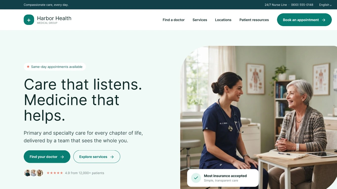
Harbor Health is a patient-centric web platform designed to streamline primary and specialty care access. The goal was to build a clean, reassuring visual design that reduces patient anxiety and simplifies the appointment discovery process.
Key Work Completed
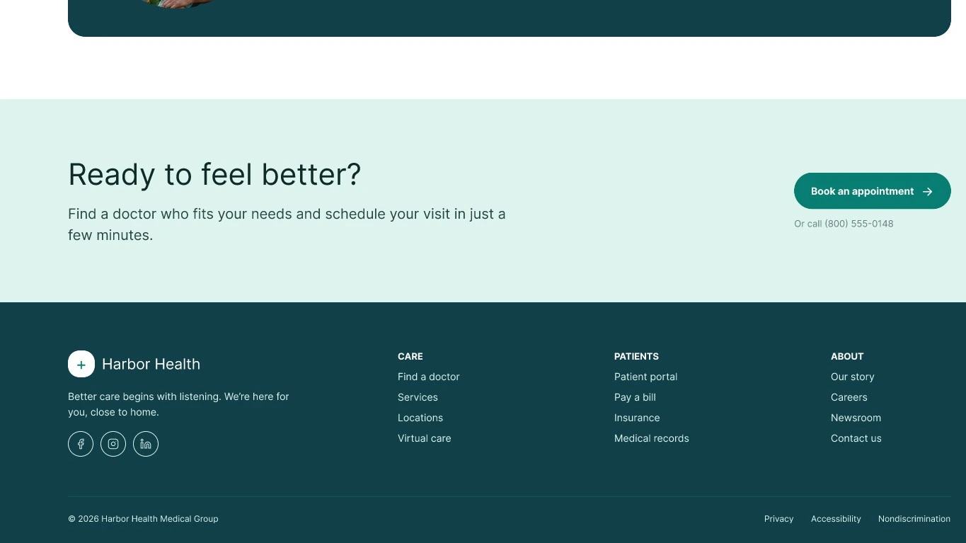
Hero & Value Proposition: Designed a warm, empathetic hero section with high-contrast Call-to-Action (CTA) buttons ("Find your doctor" and "Explore services").
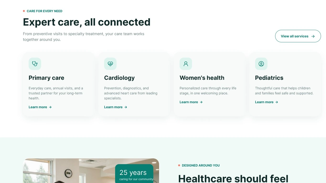
Service Architecture: Categorized health offerings under "Expert care, all connected" to ensure users can navigate to relevant medical fields without clutter.
Trust & Social Proof: Integrated real patient ratings ($4.9/5$ rating from 12,000+ patients) and testimonials to strengthen platform trust.
Design System & Auto Layout: Built structured vertical components with precise spacing, flexible content frames, and standard desktop layout guidelines ($1440\text{ px}$ width).
Challenges & Problems Faced (And How They Were Solved)
Challenge 1: Balancing Medical Professionalism with Warmth
Problem: Standard healthcare sites often feel too clinical or cold, while overly casual designs lack authority.
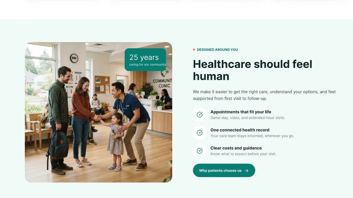
Solution: Combined clean typography with soft background tones (
#F7FAF9) and approachable photography to balance trust with comfort.Challenge 2: Visual Hierarchy & CTA Priority
Problem: Placing multiple actions ("Find doctor", "Explore services", "Book appointment") created visual noise and user hesitation.
Solution: Established clear primary vs. secondary button styles (solid dark green for primary actions, outline style for secondary actions).
Challenge 3: Accessibility & Text Contrast
Problem: Ensuring small taglines (like "Same-day appointments available") remained readable across light green backgrounds.
Solution: Adjusted font weights and contrast ratios to meet WCAG AA readability standards.
Like this project
Posted Sep 15, 2026
Designed a patient-centric platform for Harbor Health to improve healthcare access and user trust.