

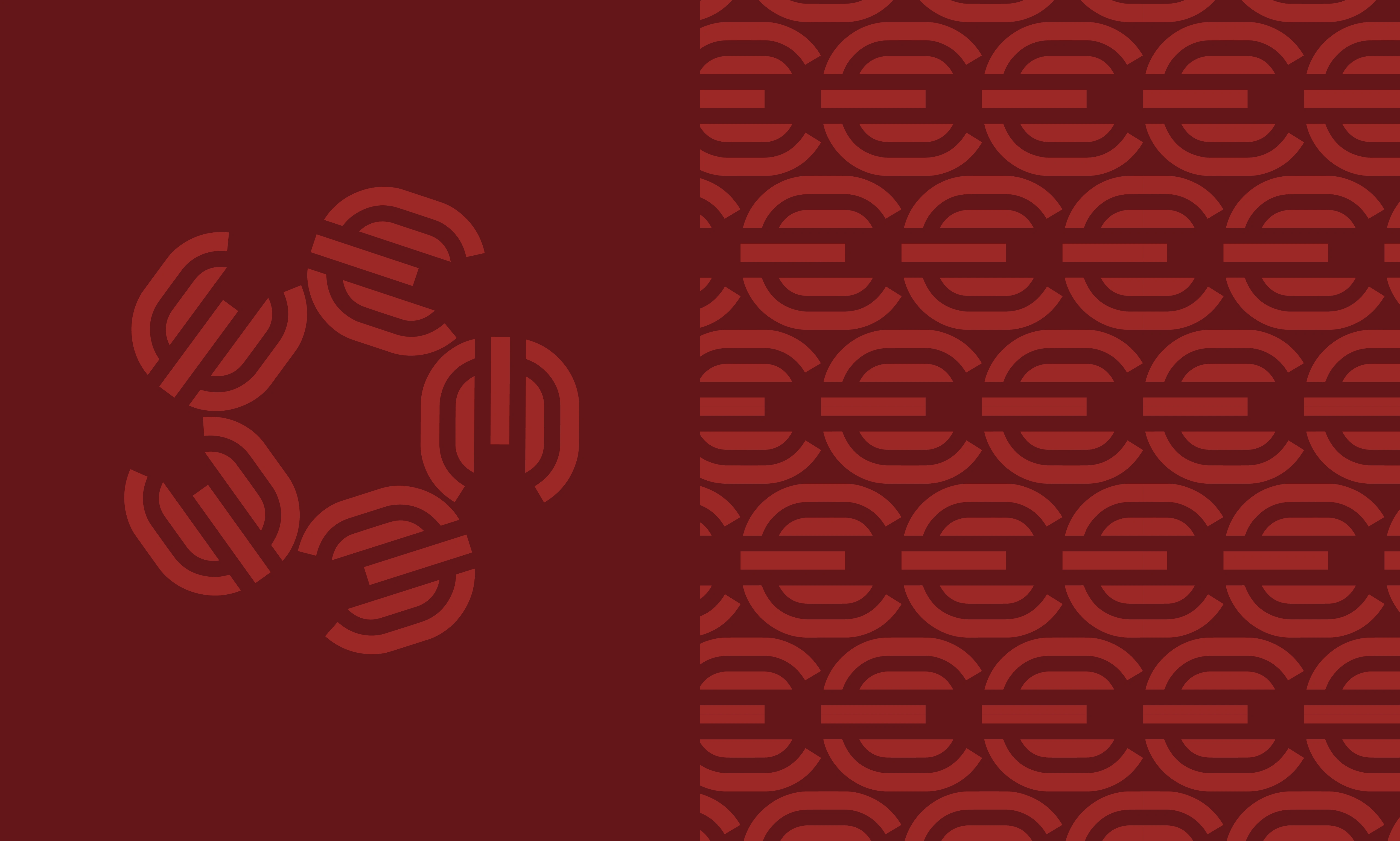
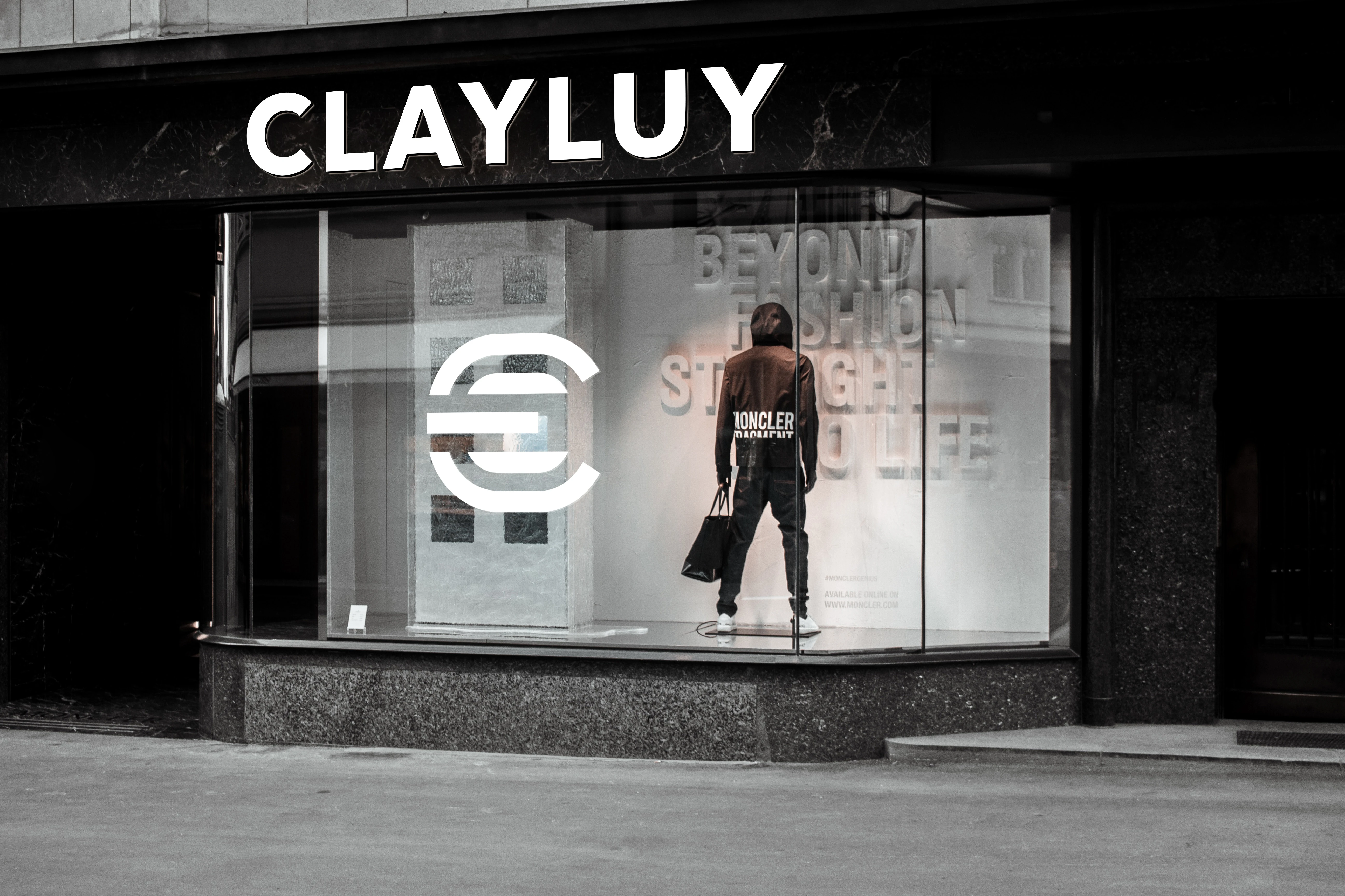
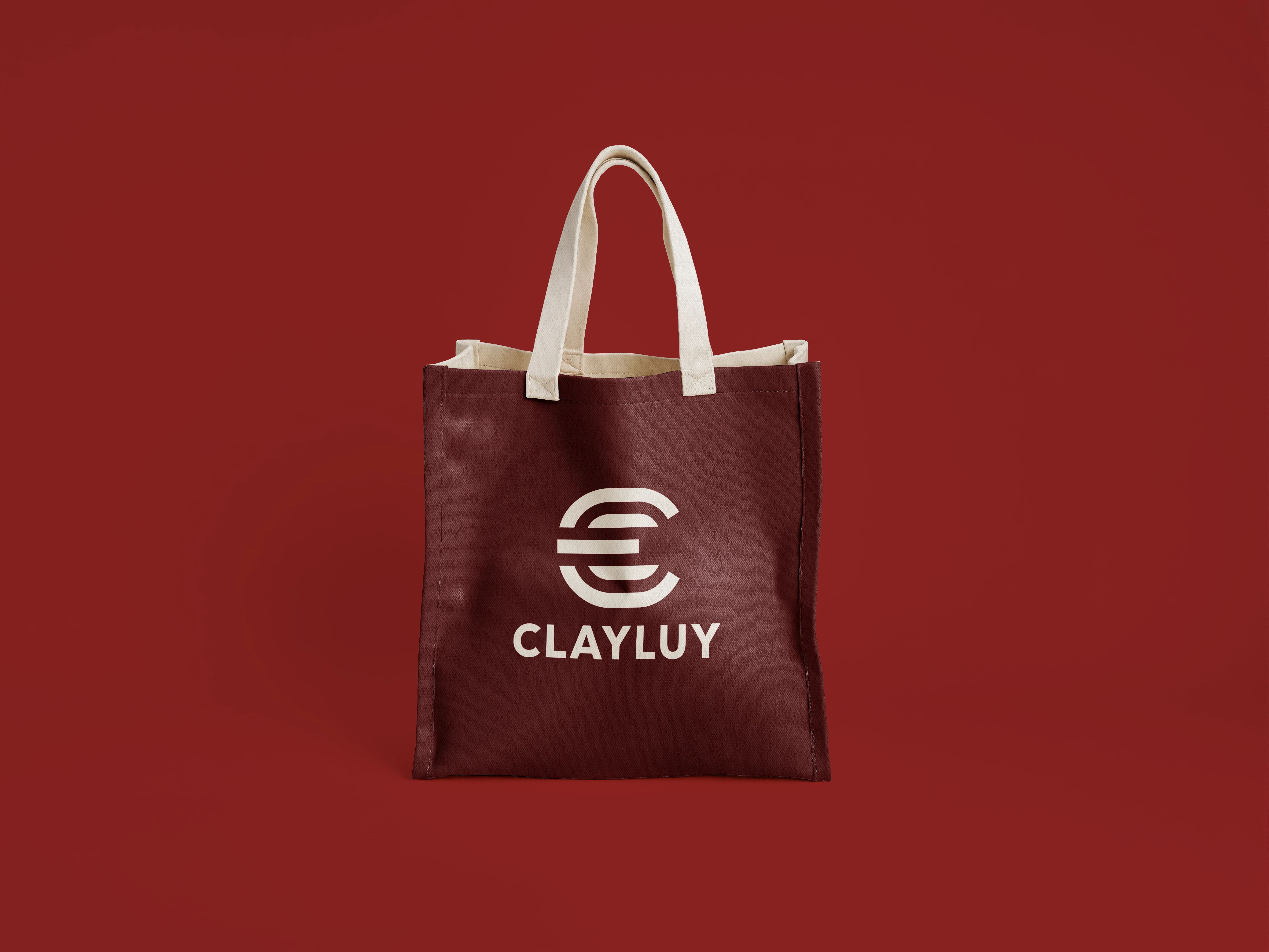
CLAYLUY is a modern lifestyle and fashion brand requiring a cohesive, versatile visual identity. The goal of this project was to design a clean, recognizable logo mark and an adaptable design system that works across digital applications, packaging, and physical retail spaces.
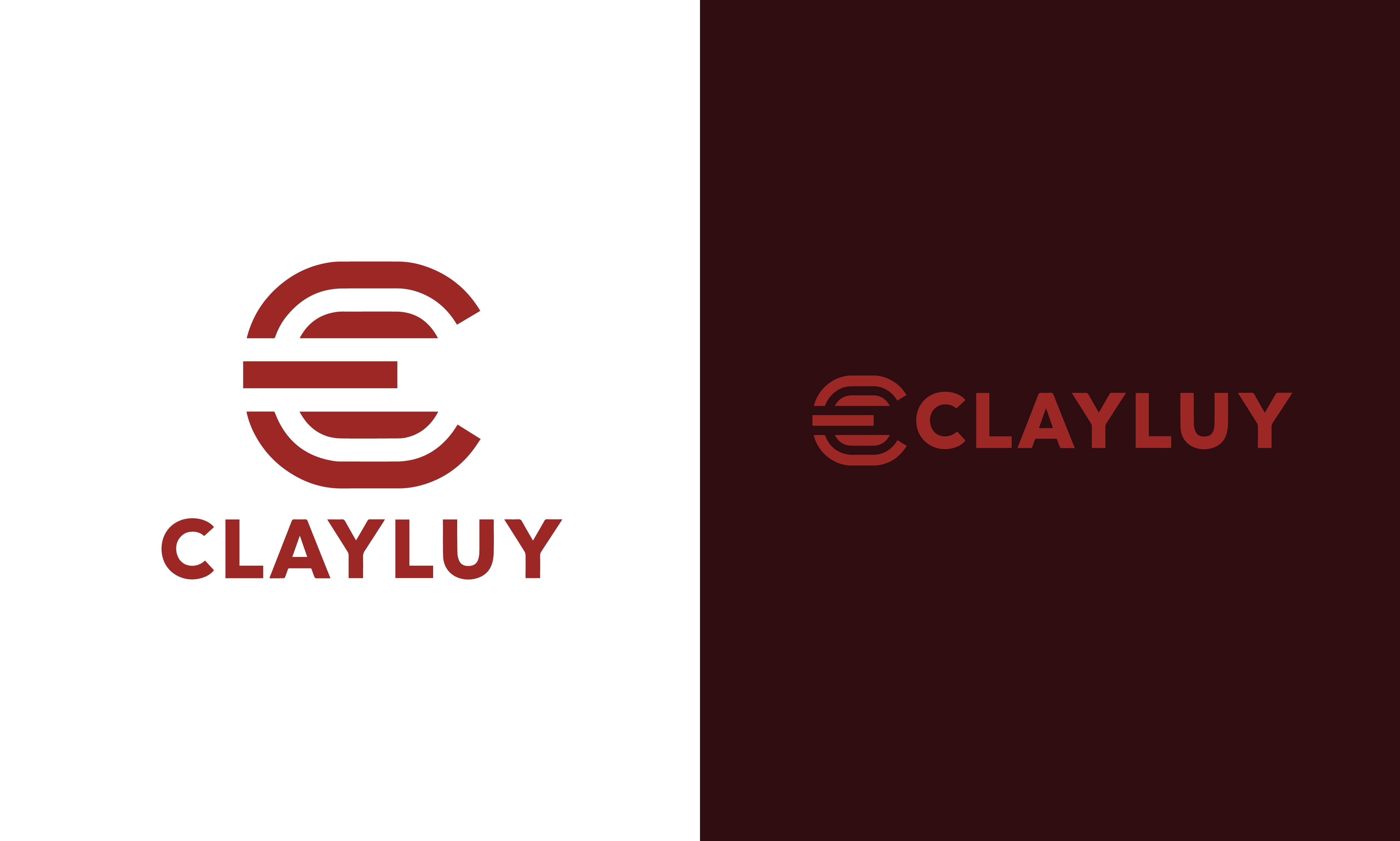
Typography: The wordmark uses a clean, geometric sans-serif typeface to complement the structured nature of the central icon.
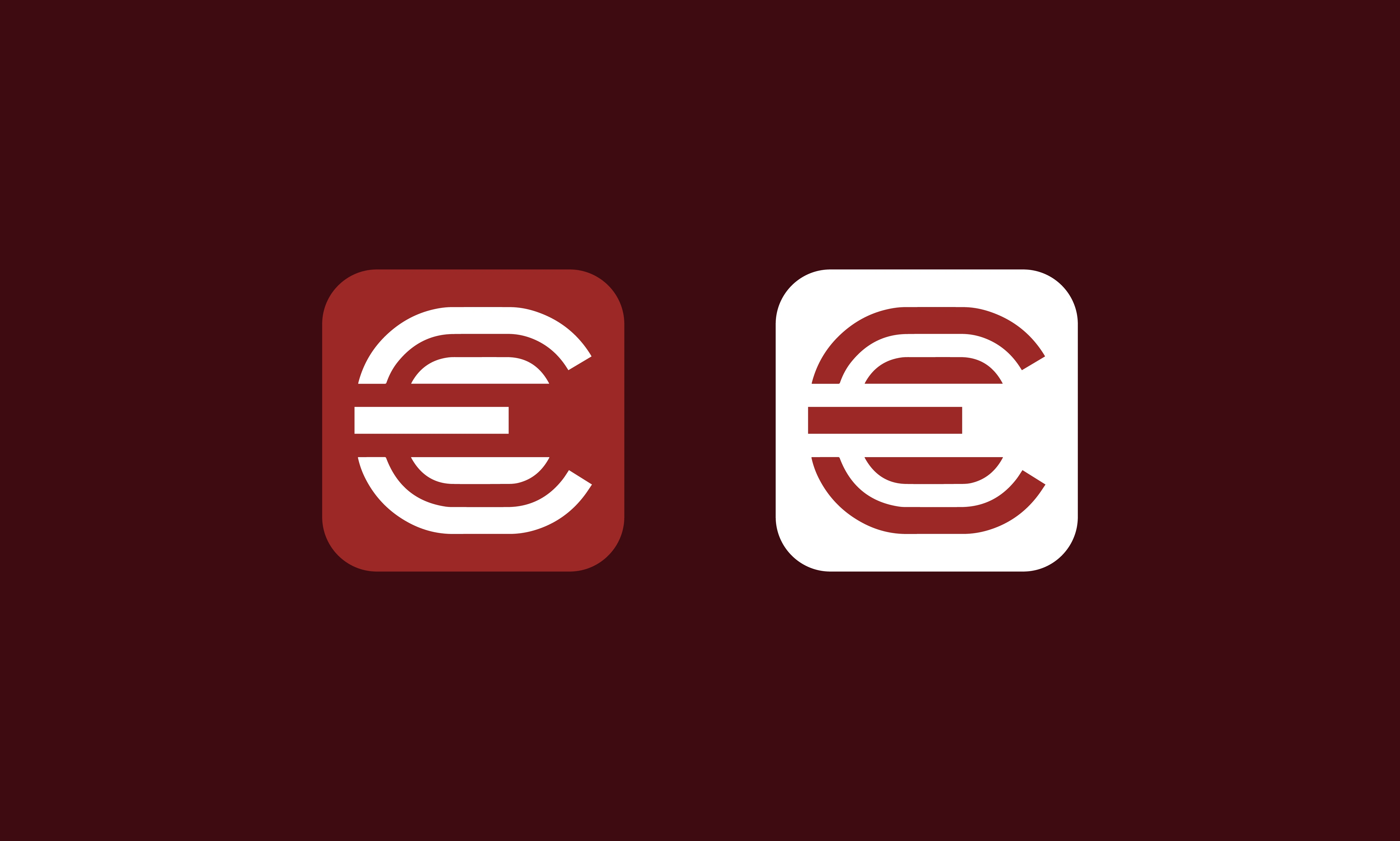
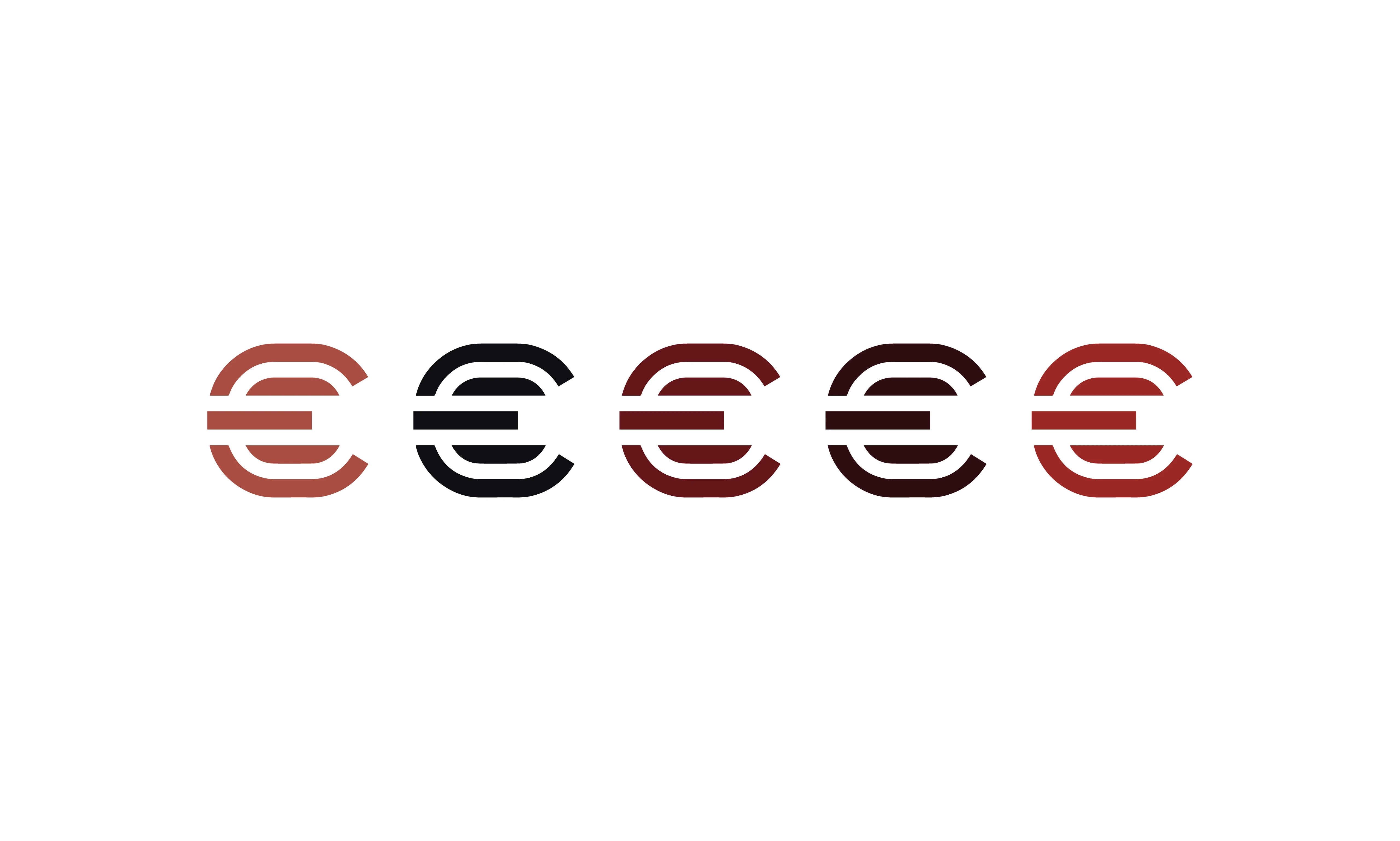
The Mark: The primary icon is a geometric monogram based on the letter "C." Built with clean, parallel lines and structured curves, it offers a balanced, architectural feel that remains legible at small scales, such as app icons.

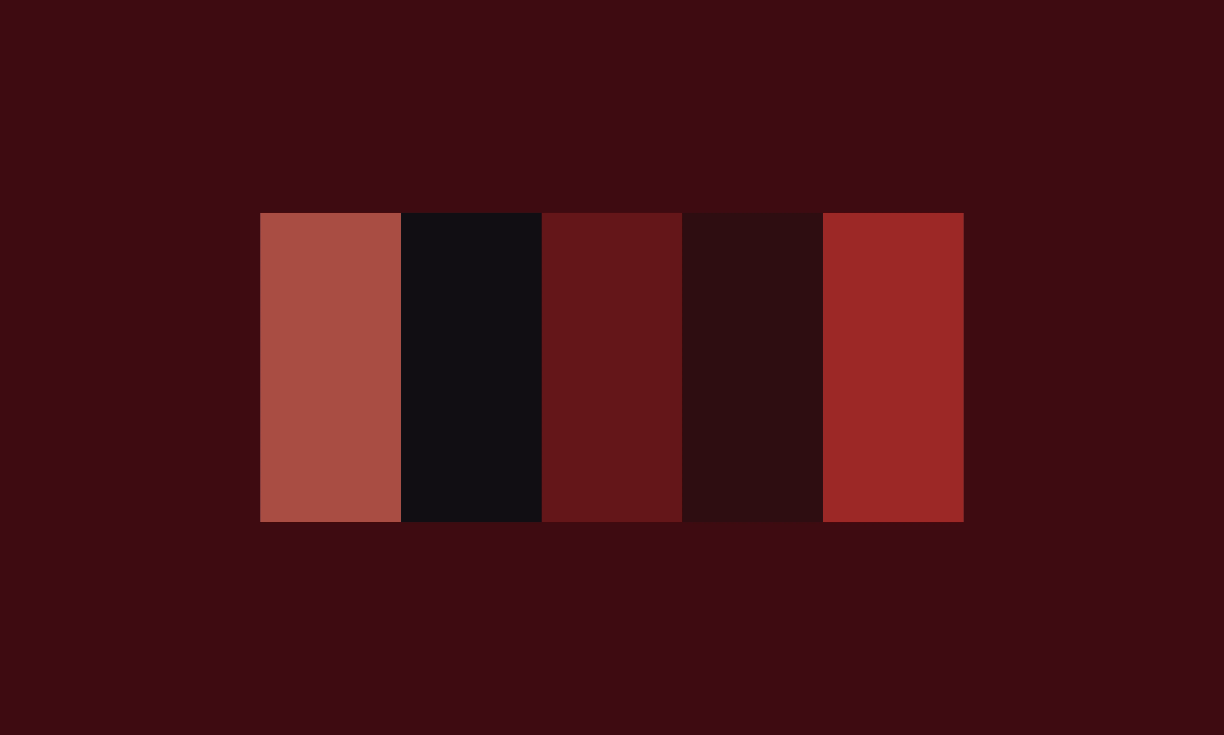
Color Palette: A warm, refined palette consisting of terracotta, deep burgundy, rich brick red, and dark charcoal. This selection provides depth and aligns with a premium retail aesthetic.
0 likes · 9 views · Jun 28, 2026
Designed a cohesive visual identity for CLAYLUY, including a logo mark and adaptable design system.
