rebranding Erasmus+ Ukraine | Identity design

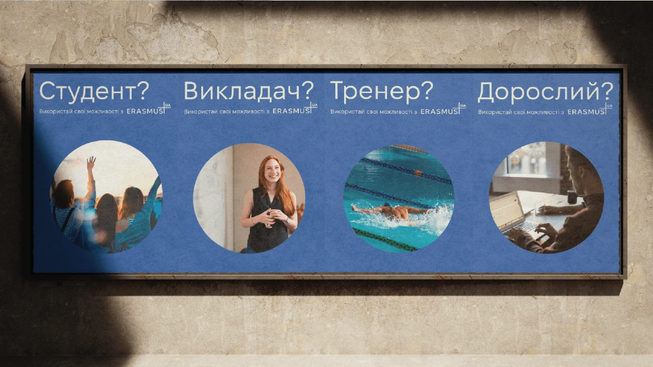
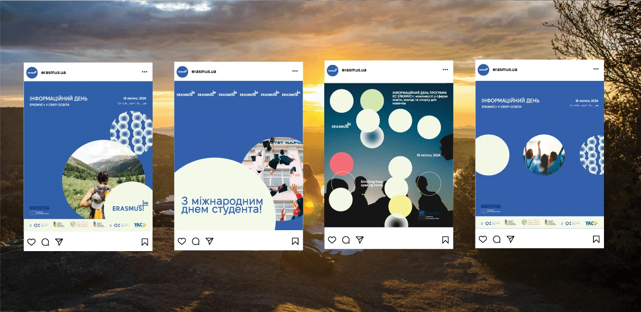
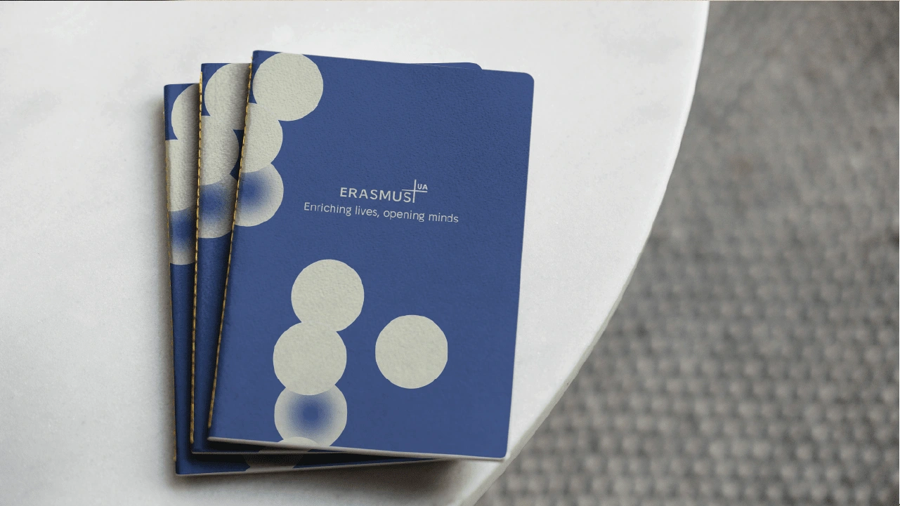
This rebranding initiative for Erasmus+ in Ukraine aims to modernize and align its identity with the global organization's standards while ensuring inclusivity across demographics. Embracing the iconic circle motif from the headquarters, my design strategy emphasizes connectivity and universality. By incorporating vibrant colors and dynamic typography, I evoke a sense of energy and opportunity, appealing to both students and professionals. This reimagined identity serves as a beacon of unity, empowering individuals from all backgrounds to participate in Erasmus+ programs and fostering a culture of cross-cultural exchange and personal growth.
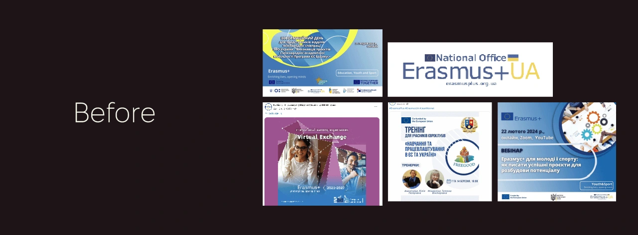
Before
There is no unified structure in the visuals, templates from different organisations are used. The design of the posts looks outdated and complicated, and gets lost among the partners' information.
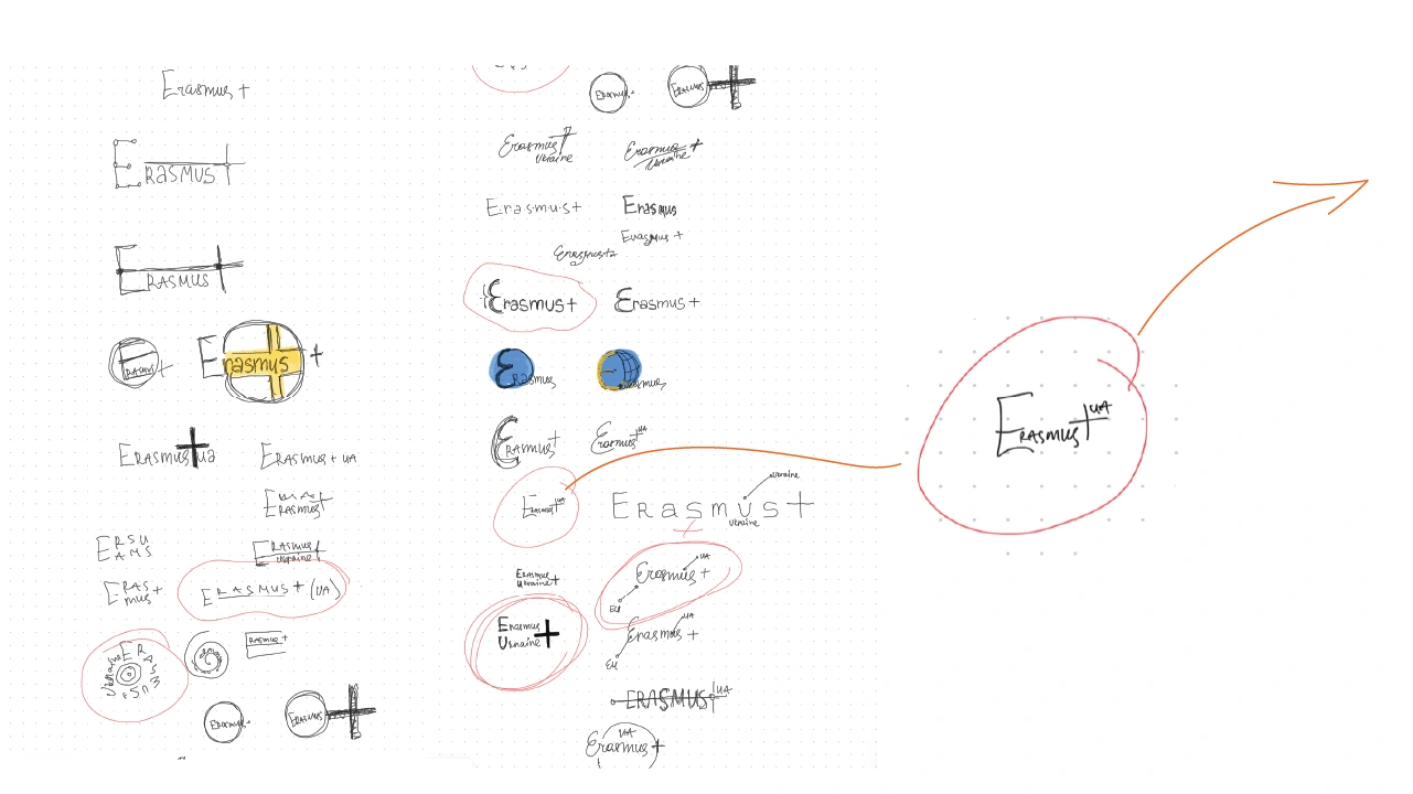
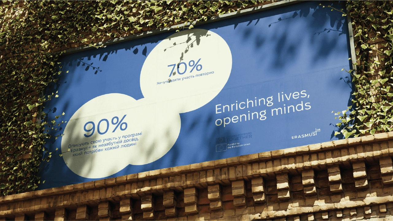
Our collaborative approach began with comprehensive research and stakeholder engagement, gaining insights into the organization's mission, values, and target audience. Drawing inspiration from the headquarters' iconic branding elements, particularly the use of circles, we conceptualized a modern and versatile visual identity that symbolizes unity, inclusivity, and opportunity:

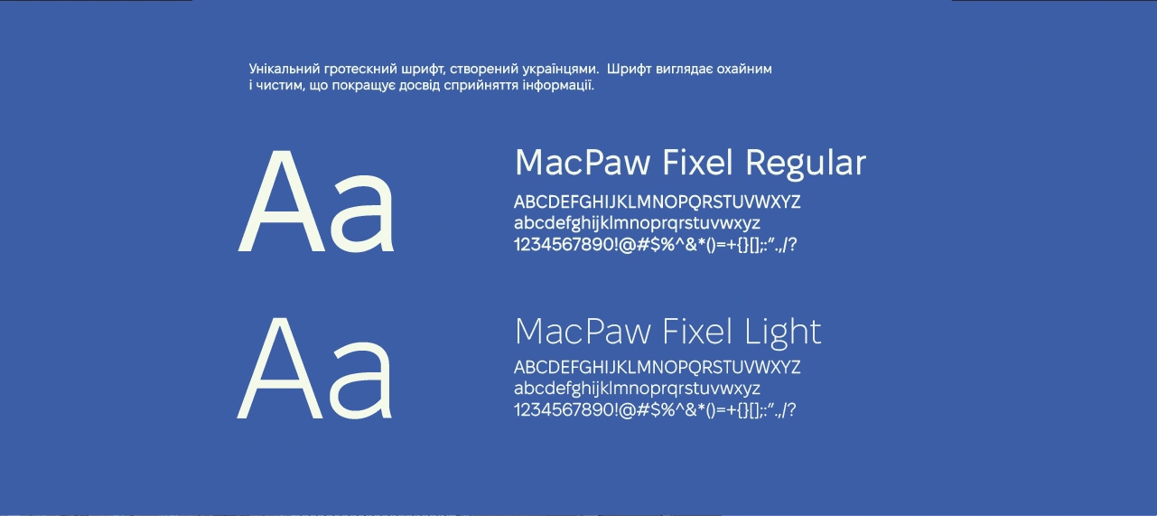
The logo is based on the Ukrainian font (see below), it fulfills its main function and is memorable and easy to understand for all segments of the population.
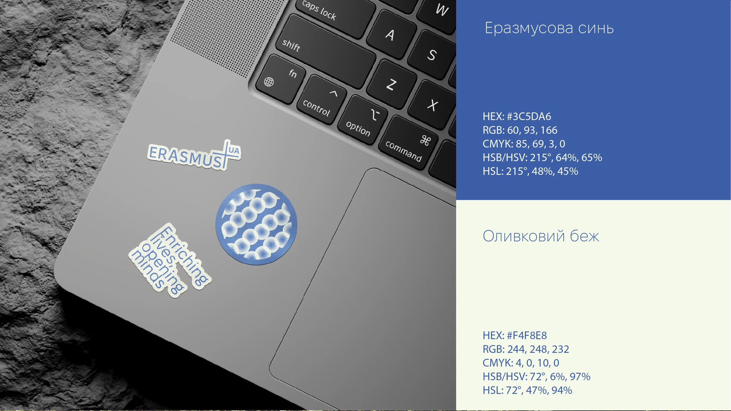
Main colors of the identity

Like this project
Posted Apr 18, 2024
Graphic Design,Branding,Logo Design,Adobe Photoshop,Adobe Illustrator
Likes
0
Views
26
Clients
Erasmus+

