Pump – Website Design

Valeriya NōME

Pump Website Design
Web Design · Design System · Product Pages
Pump is an intelligent cloud platform that manages and optimizes cloud spend across AWS, GCP, and Azure, at no cost to their customers. Their value proposition is clear: enterprise-level savings, automated, with no engineering required.
Working as lead designer alongside the Pixel-1 design team, my role was to create a design style guide and design layouts for the homepage and product pages.
Home page
Design Language
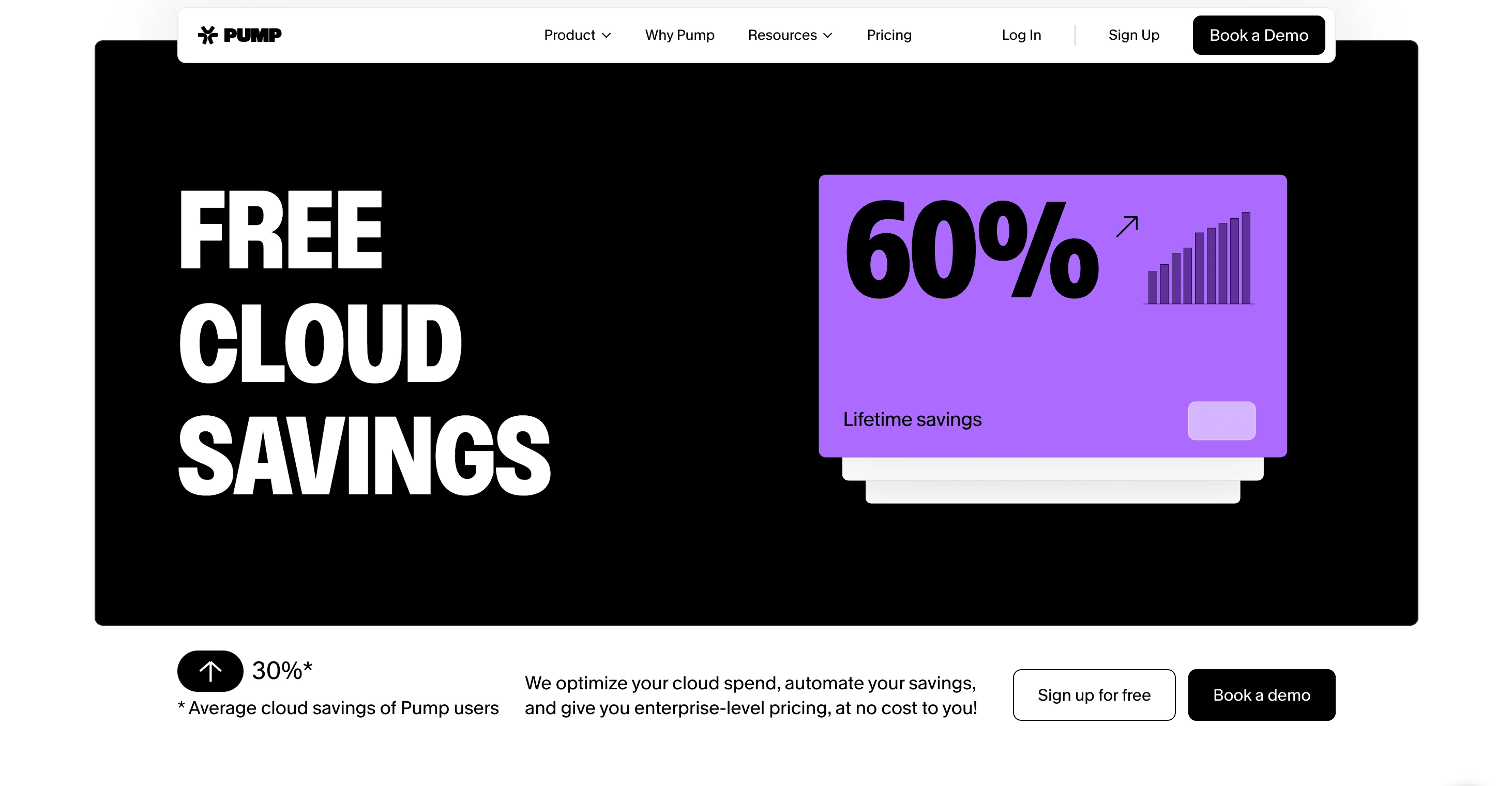
Pump has a distinct personality on the web: playful, colorful, and energetic. This is a fintech product in a category that tends toward sterile, corporate design. Pump deliberately goes the other way, using bold color, lively layouts, and a visual tone that feels approachable without sacrificing credibility.
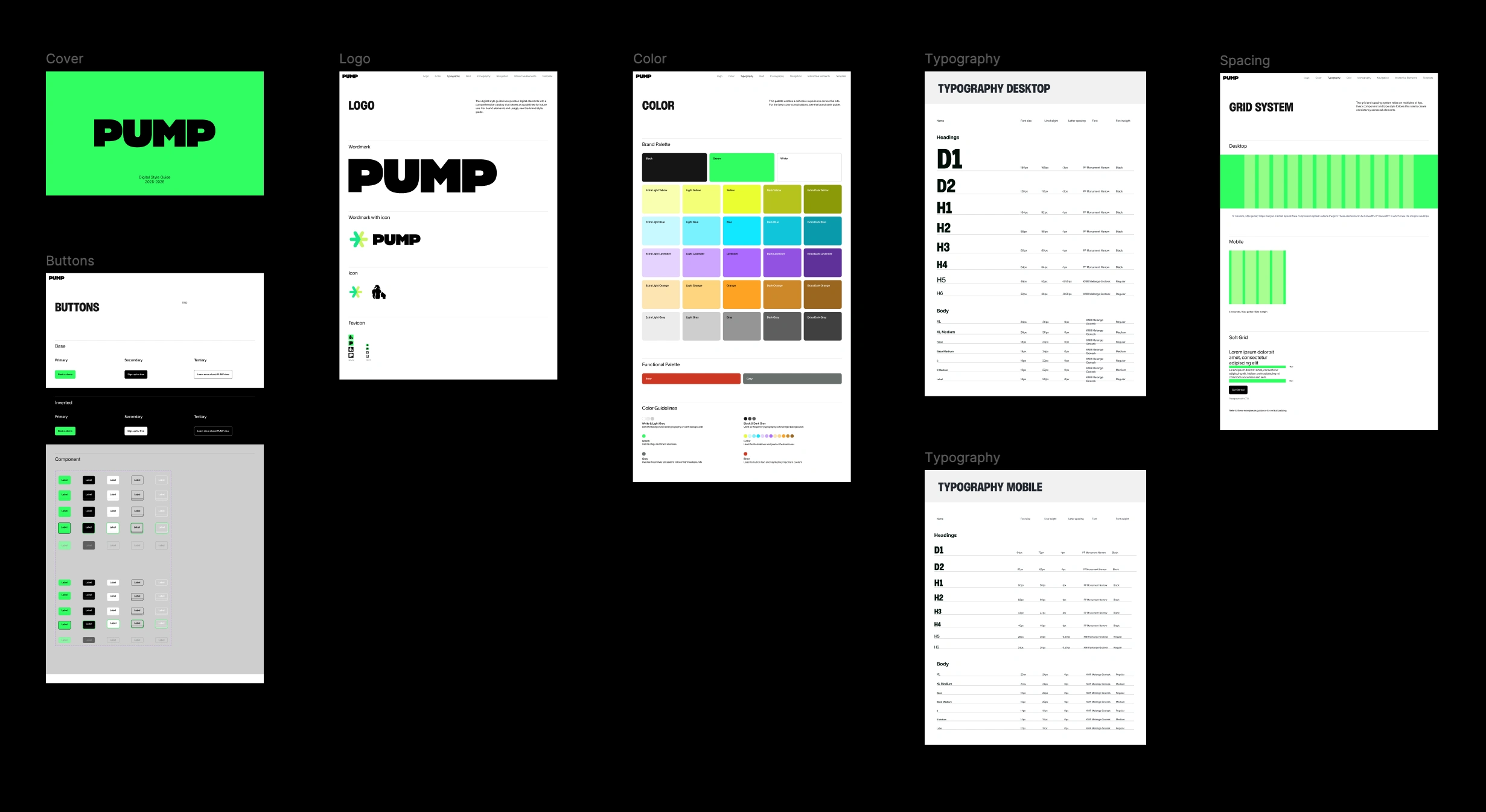
The style guide I developed gave the team a consistent foundation to work from, defining how that playful design language would translate across every page and component.

Design Process
With the style guide in place, I moved into layouts for the homepage and product pages. Each layout had to balance Pump's energetic visual personality with the clarity needed to communicate a technical product to a fast-moving audience of engineering and finance teams.
Pump is a good example of a technical product that earns trust through design confidence rather than restraint. Working within their established brand direction while bringing structure and consistency through the style guide was the core contribution of this project.
Product page
Tools & Process
The design system was built in Figma, where I structured all components, styles, and layout patterns into a shared library the team could build from consistently. This gave Pixel-1 a single source of truth for colors, typography, spacing, and interactive states across every page.
Style guide
See the full website
Thank you
If you are working on something that needs strong design direction and a consistent visual system, I would love to hear about it.
Book a discovery call and let's explore what's possible.
Like this project
Posted Jun 22, 2026
Led website design for Pump, a cloud savings platform, creating a style guide and page layouts with a playful, colorful design language.