Resboard – Revolutionizing Academic Content Sharing
📂 Overview
😥 Challenge
🔍 Research
🎤 User Interview insights
🗂️ Analyzing Responses
🩻 Prototype
✏️ Design
Overview
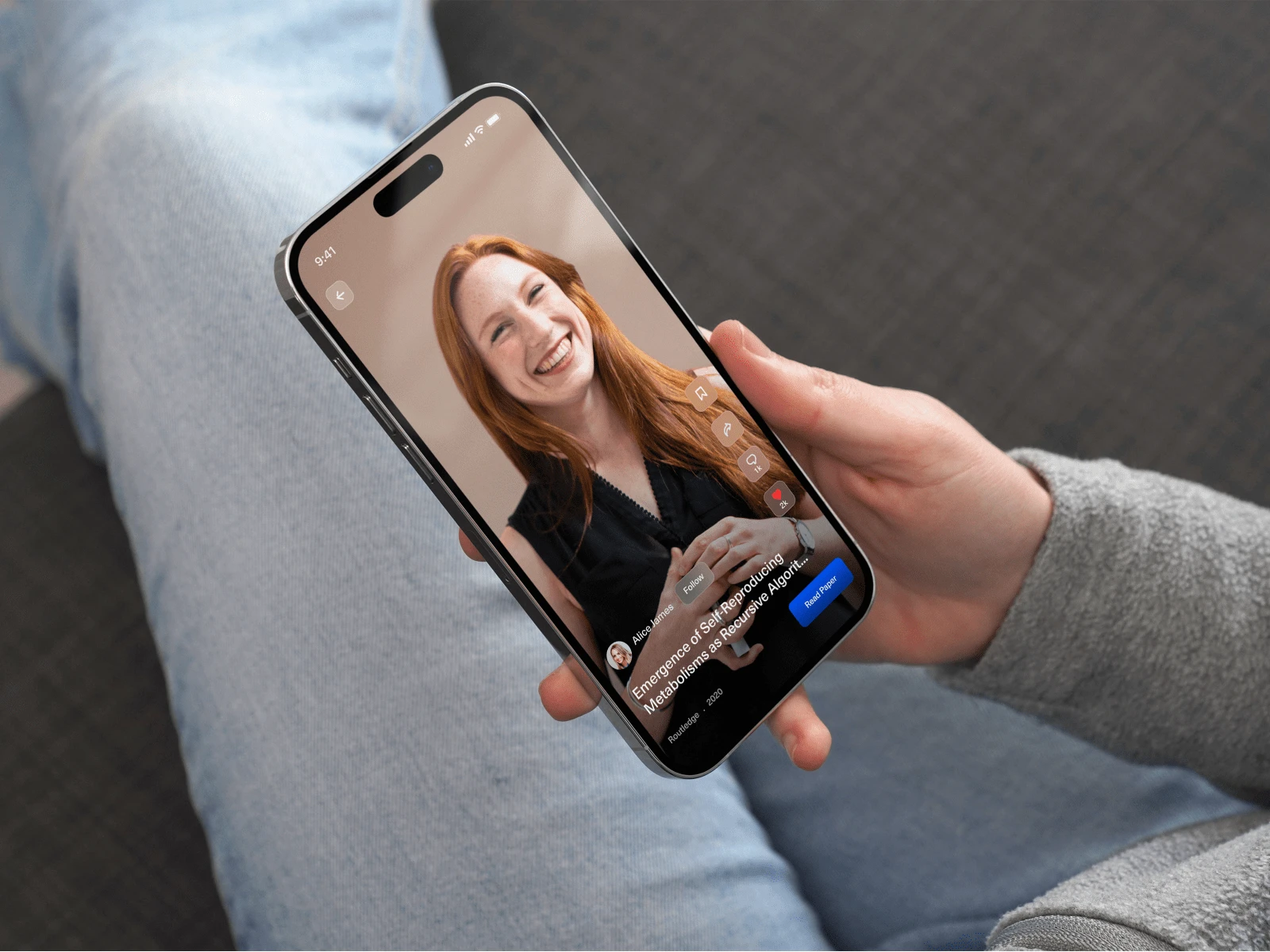
Resboard is an innovative educational platform designed to bridge the gap between traditional academic resources and engaging social media formats.
Targeted at students, educators, and scholars, Resboard allows users to share educational content through short-form videos, akin to popular social apps but with an academic focus. The platform supports note-taking, collaborative study, and downloadable resources, creating a rich, interactive learning experience.
Challenge
In an era dominated by non-educational content, students and scholars often struggle to find and share high-quality academic resources without extensive searches or complex publishing routes.
Research
To ensure Resboard met the needs of its target users, thorough research was conducted. This included:
User Surveys and Interviews Engaged with a diverse group of students, teachers, and researchers to understand their challenges in finding and sharing educational content.
Competitor Analysis Reviewed existing platforms (e.g., TikTok, Coursera, and academic journal sites) to identify gaps, particularly the lack of short-form educational content combined with collaborative tools.
Key Insights Users expressed the need for a streamlined way to discover educational resources and collaborate with peers, with an emphasis on usability and content curation.
User Interview insights
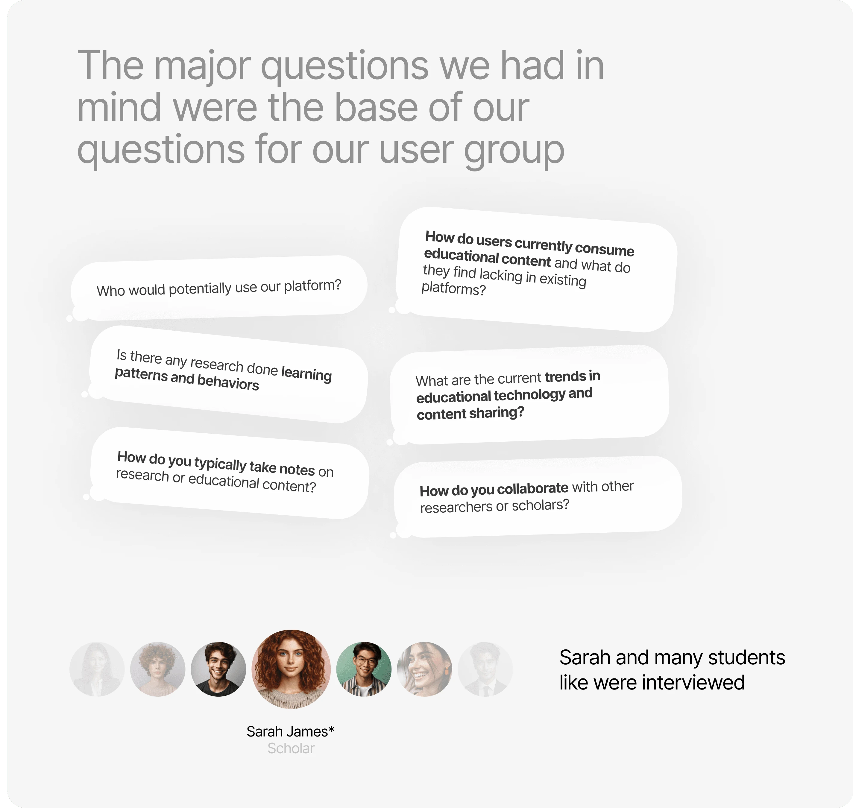
To get started, we dived into the world of educational platforms like a detective in a noir film, trench coat and all. We scrutinized the top players, learning how they served up educational content. User interviews were our magnifying glass, revealing how users interacted with these platforms, their learning patterns, and the secret sauce that made learning enjoyable for them. Armed with these insights, we plotted our course.
Analyzing Responses
Users found it time-consuming to go through resources, keep up with new content, and document learnings. Managing this in traditional ways was a hassle, even with tablets and apps. Attempts to curate educational content on social media were disrupted by unrelated posts. These insights guided us on how to make Resboard truly effective.
Prototype
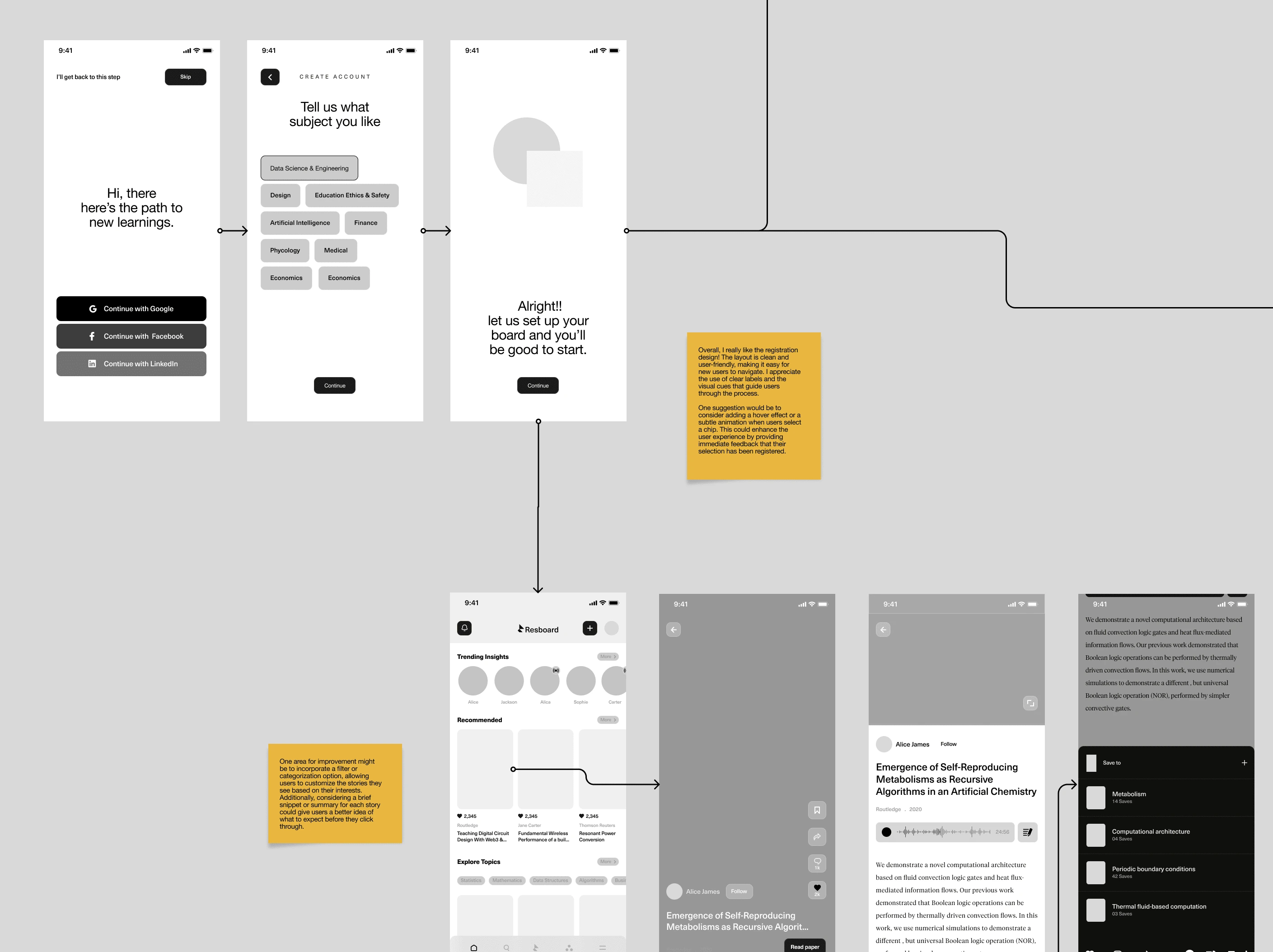
After completing the research and design phases, the next step was creating interactive prototypes to test and refine the user experience. The Resboard prototype was developed with the following focus:
High-Fidelity Prototyping: Ensured that the prototype closely resembled the final product with detailed visuals and interactive elements. This approach allowed for realistic user testing to gather actionable feedback.
Iterative Refinements: Based on user feedback, adjustments were made to improve navigation, content organization, and interaction with features such as note-taking and resource downloads.
UI Design
The user interface (UI) design of Resboard prioritizes clarity, accessibility, and engagement, enabling seamless navigation and interaction with educational content. By employing a clean aesthetic with a balanced color palette, the design maintains a professional yet inviting atmosphere that keeps users focused on the material. Intuitive navigation, responsive design, and interactive elements enhance the overall experience, while a strong emphasis on accessibility ensures inclusivity for all users. With a well-defined visual hierarchy, important features are highlighted, guiding users effortlessly through the platform. This thoughtful UI design approach fosters a productive learning environment, empowering users to engage meaningfully with educational resources.
The UI design of Resboard combines clarity and engagement, creating an inclusive space for users to interact with educational content effectively."

Like this project
Posted Nov 3, 2024
Resboard is an innovative learning platform that enables users to create, share, and engage with educational content through short videos, notes, and community.
Likes
0
Views
37

