Radient: Full-Cycle Design for Crypto Banking

Ihor Muntian


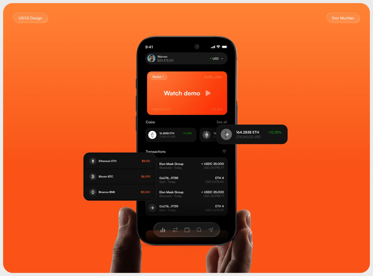
Radient: Full-Cycle Design for Crypto Banking
Radient is a crypto banking platform for managing digital assets and moving money globally — custody, payments, and portfolio management in one place, for individuals and businesses.
The problem:
Crypto banking, as a category, is fragmented and hard to trust. Most platforms split custody, payments, and portfolio tracking across different flows, different visual languages, different levels of polish. Users end up doing the integration work themselves, piecing together what should already feel like one product. For something asking people to trust it with real money, that gap isn't a UX detail — it's the whole risk.
The brief wasn't "add more screens." It was: build one system that holds together end to end, so managing your assets never feels like guesswork.
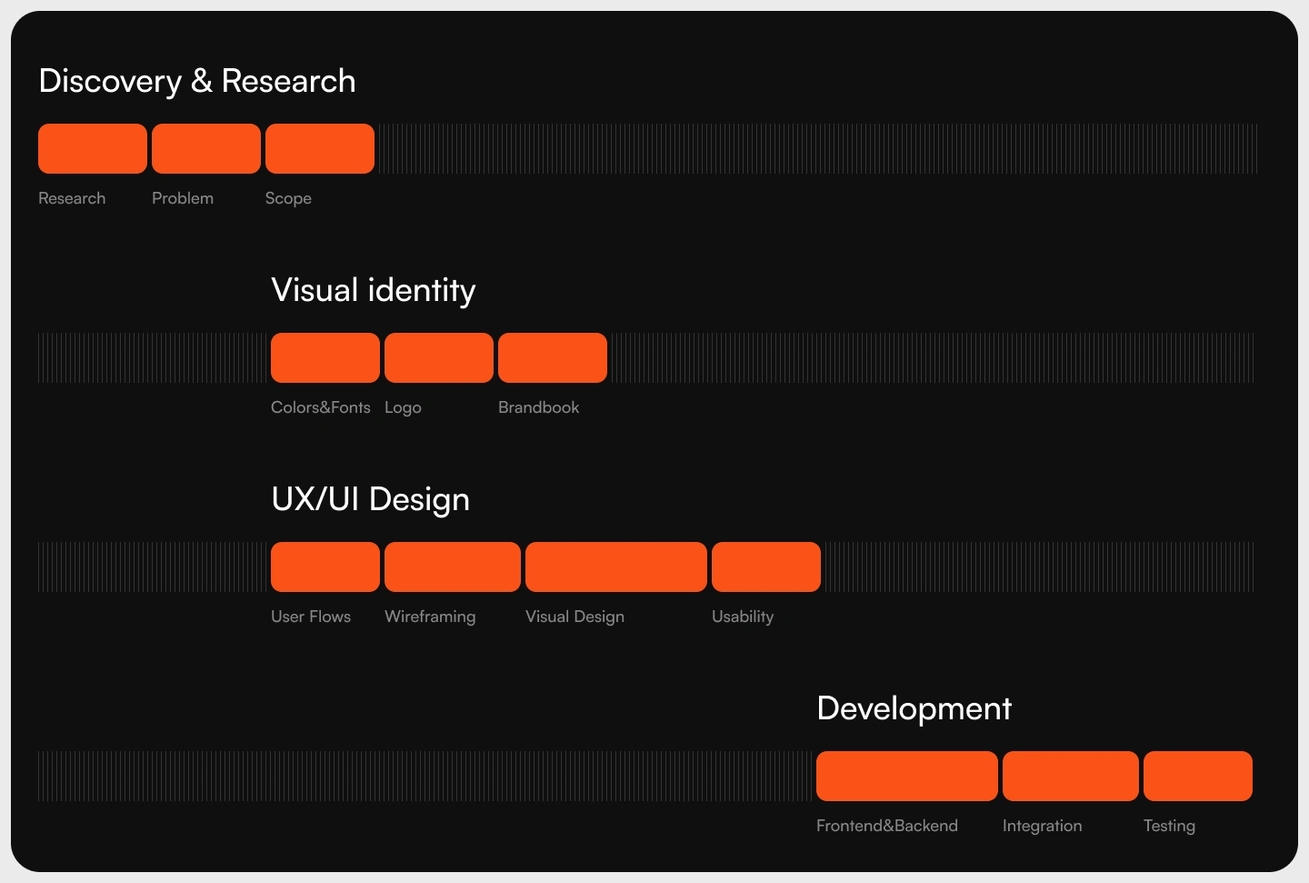
Process:
Four phases, one system. Discovery and research to define the real problem before touching a single screen. Visual identity — logo, color, typography — built to feel like trust, not decoration. UX/UI across the full product: user flows, wireframes, visual design, usability passes. Then development handoff — frontend, backend, integration, testing — so nothing gets lost between design and code.
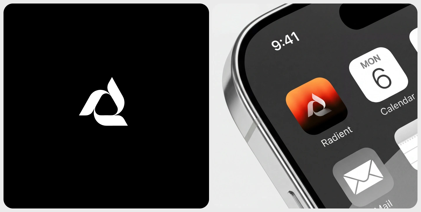
Visual Identity:
The logo is a looping shape in warm orange — a mark built around flow, connection, and seamless movement of money. It had to work as a symbol before it worked as decoration: something that reads instantly at 16px in a nav bar and still holds up at full scale on a splash screen.
The palette stays deliberately narrow — Radient Orange as the single accent against Charcoal Black, Jet Black, Concrete Gray, and Soft White — so the color never competes with the data it's sitting next to. Typography runs on Satoshi Variable, a clean sans-serif chosen for one reason: it stays legible and calm whether it's a $25,000 transaction or a 12px label.
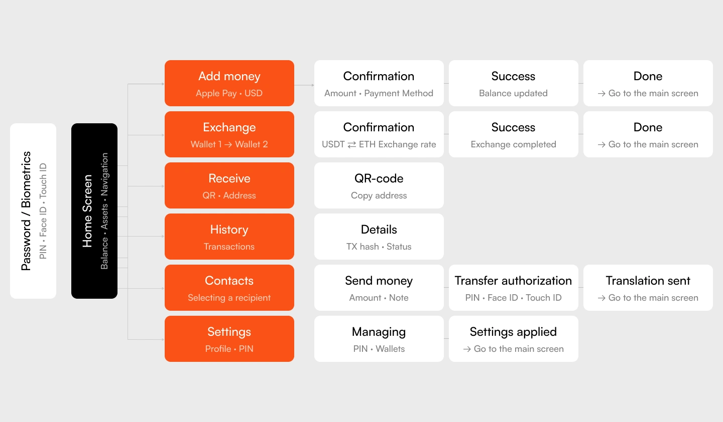
User Flow:
We mapped every core scenario end to end before designing a single screen — onboarding, adding funds, exchanging assets, sending and receiving, transaction history, account settings — so no interaction dead-ends and no screen behaves like it belongs to a different product.
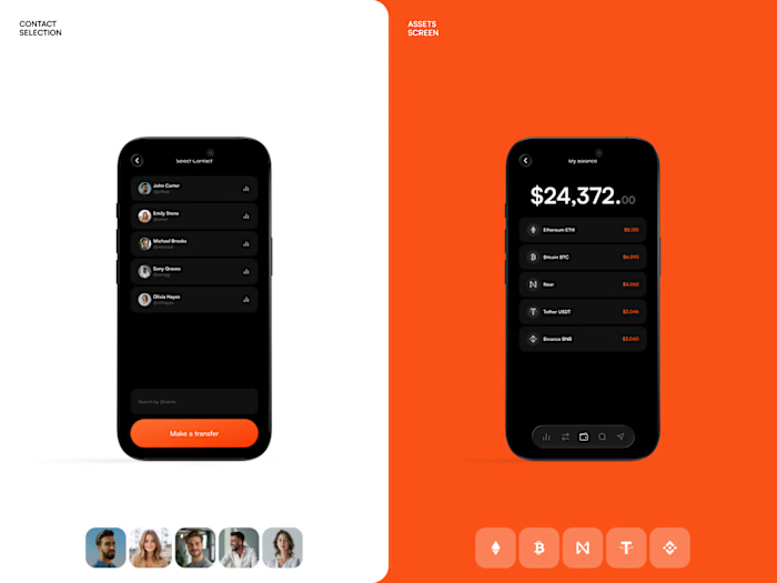
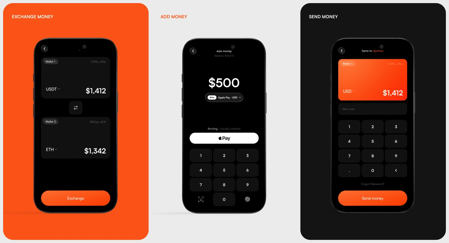
Onboarding runs through biometrics or PIN straight into the home screen — balance, assets, and navigation visible at a glance. From there, every action follows the same logic: pick the action, confirm the details, get a clear success state, return home. Add money through Apple Pay, exchange between wallets at a live rate, send with a transfer authorization step, receive via QR or wallet address — each flow short enough to complete without thinking twice, but with enough confirmation at each step that nothing feels rushed when it's real money moving.
Mobile App:
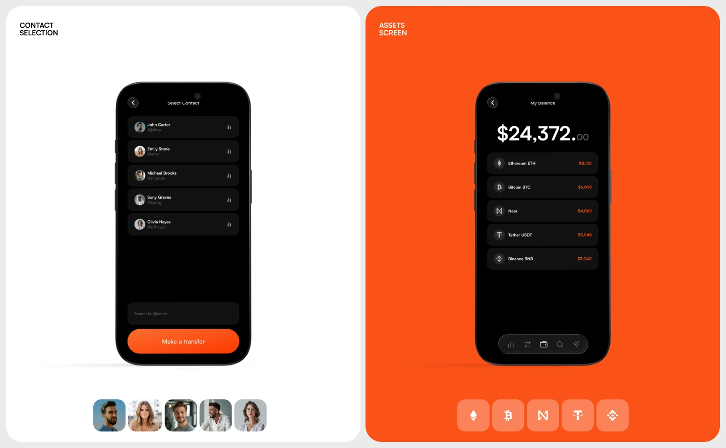
The mobile app is where Radient does most of its work — it's the screen people open to check a balance, move money, or watch a trade complete in real time. Every core screen was designed around that pace: balance and portfolio value visible the instant the app opens, coins and recent transactions one scroll away, exchange and transfer flows built to complete in a handful of taps.
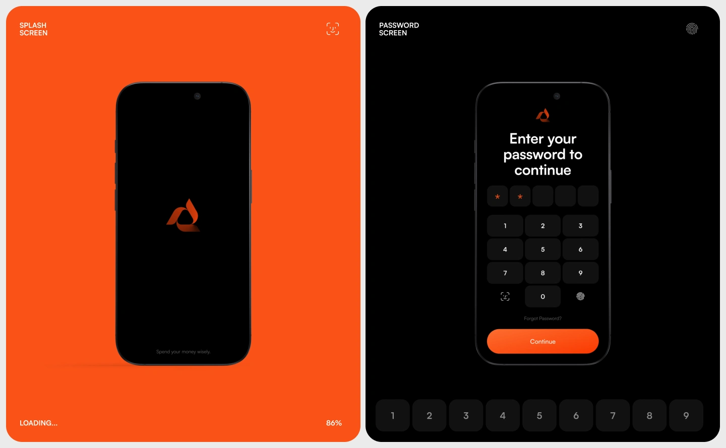
Security sits at the entry point, not buried in settings — PIN, Face ID, or Touch ID gate every session and every transfer, so the app never asks for trust it hasn't earned yet. From there, the interface gets out of the way: clean balance cards, clear transaction states (received, sent, pending), and a navigation that stays identical whether you're checking ETH or reviewing a $25,000 transfer.
Website:
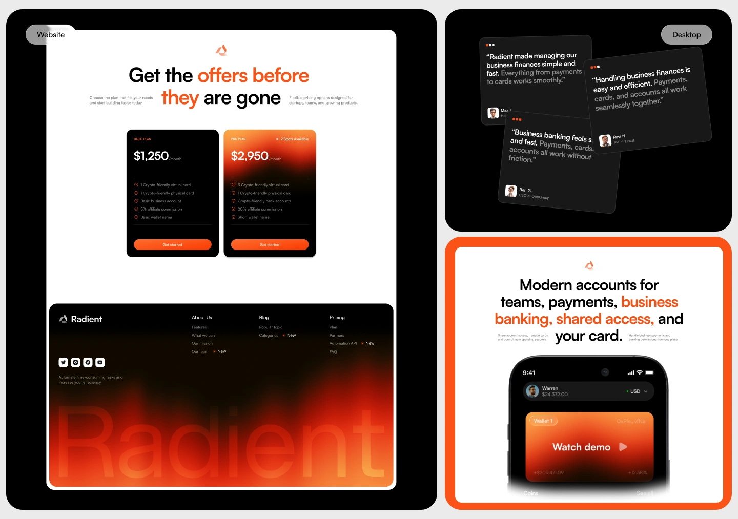
The website carries the same identity as the product — the looping orange mark, the same restrained palette — but its job is different: turn a visitor who's cautious about crypto into someone who trusts Radient enough to sign up. Every section earns its place instead of competing for attention: a clear pitch on what Radient does, real testimonials from people already using it, pricing that's upfront about what each plan includes, and a features section that shows the product instead of just describing it.
Business banking gets its own framing — shared account access, team spending controls, card management — because a founder deciding whether to move company funds onto a new platform is a different kind of visitor than someone opening their first wallet, and the page speaks to both without diluting either.
Multi-Platform:
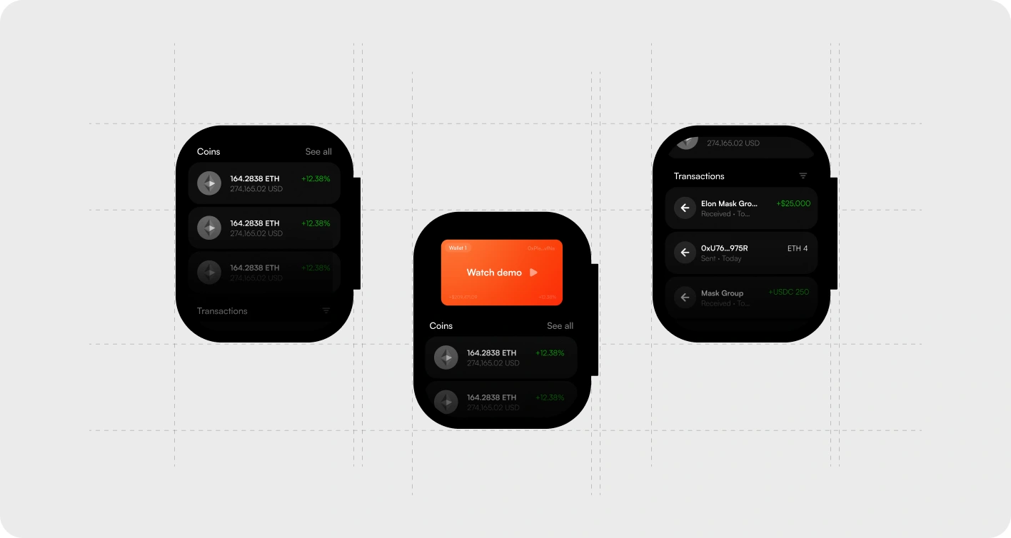
Radient runs across mobile, desktop, and Apple Watch — not as three separate builds, but as one system that adapts to how much attention each device gets. Desktop handles the full picture: portfolio, transaction history, exchange, and account management laid out with room to breathe. Mobile carries the same logic in a faster, thumb-first version built for everyday checks and quick transfers.
Like this project
Posted Jul 25, 2026
Designed a unified crypto banking platform with cohesive UX/UI and visual identity.
Likes
1
Views
8
Timeline
May 1, 2026 - May 30, 2026