VEYRO Visual Identity and Brand System Development

Muhammad Ibrahim


Project Overview
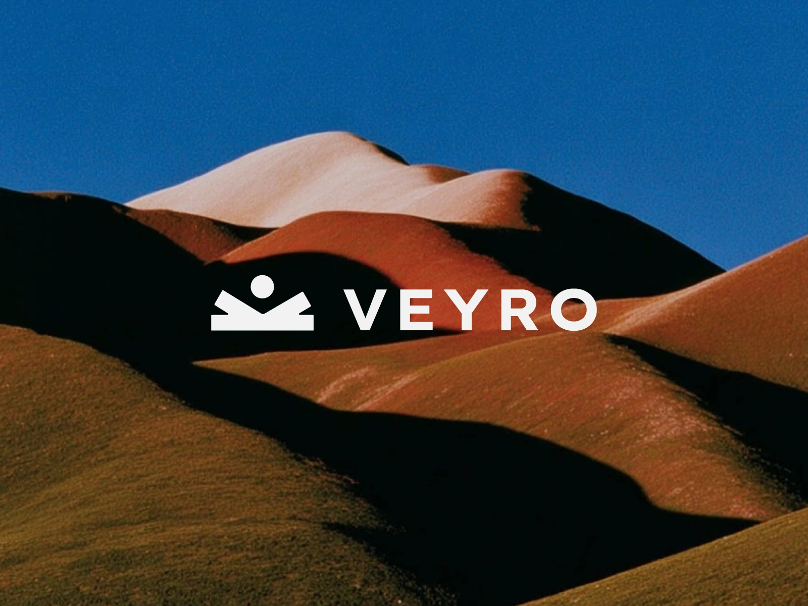
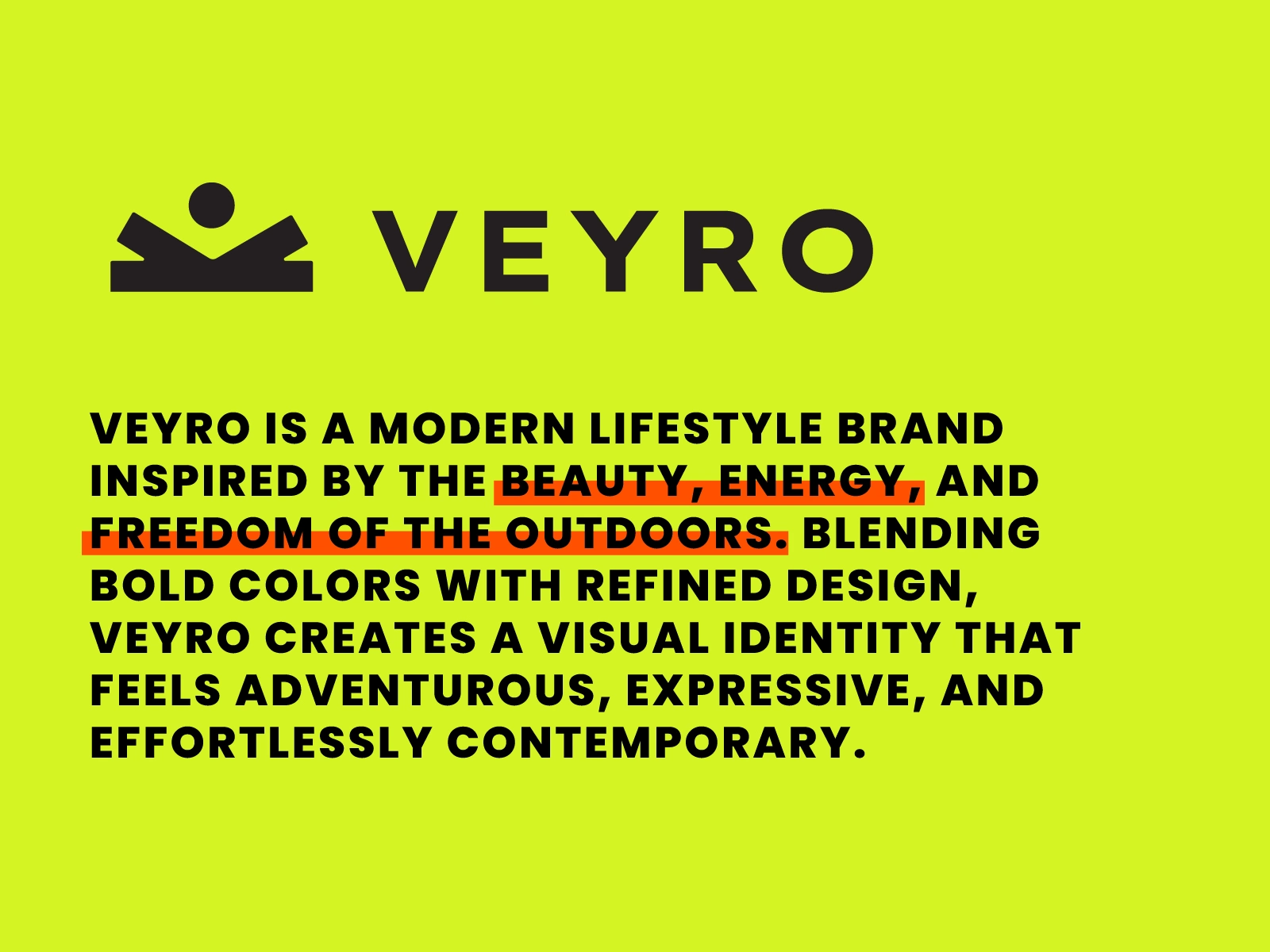
VEYRO is a contemporary lifestyle brand inspired by the energy, beauty, and freedom of the outdoors. The project focused on building an expressive visual identity that bridges rugged exploration with elevated, modern minimalism. The resulting brand system delivers high impact visual storytelling across physical product packaging, technical accessories, editorial prints, and digital platforms.
The Problem
Many outdoor and lifestyle brands rely on muted earthy tones and predictable vintage tropes that blend into the background. VEYRO required a distinct visual presence that could appeal to design conscious adventurers and modern urban explorers. The identity needed to feel energetic and bold in digital spaces while maintaining an elevated, high craft feel across physical apparel and packaging touchpoints.
The Solution
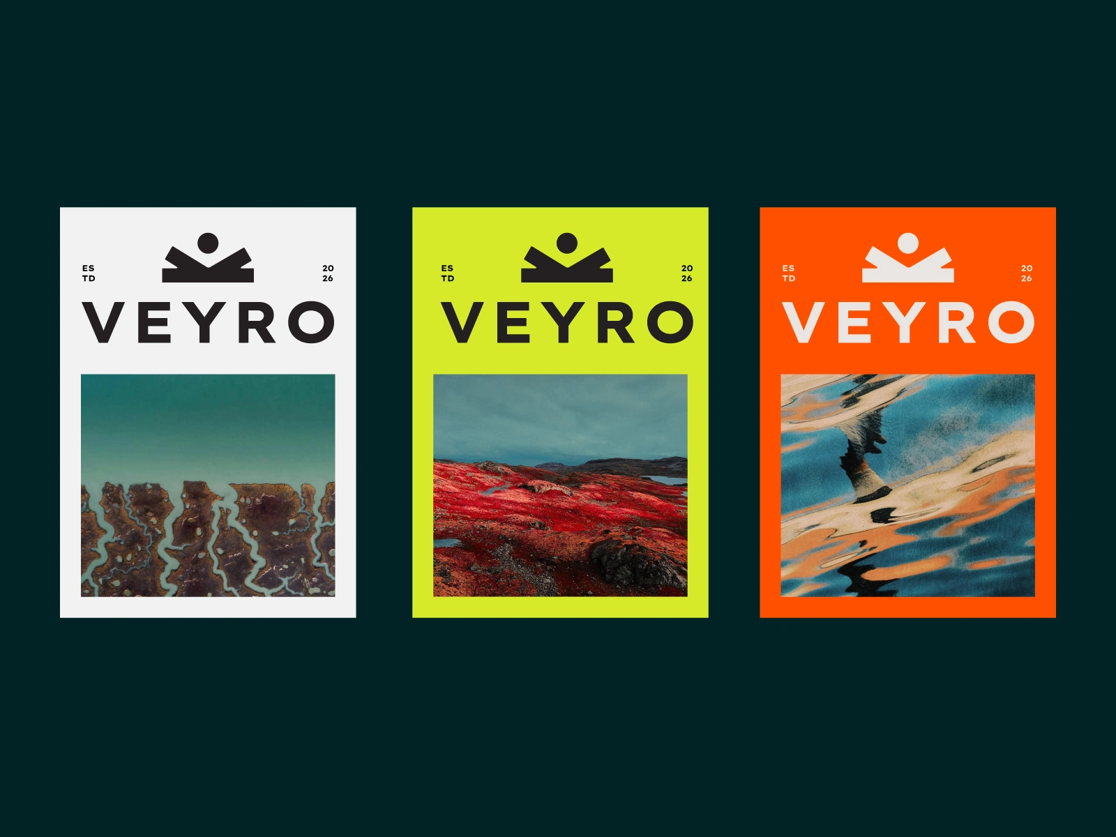
An electric, high contrast visual language powered by a precision engineered geometric mark, hyper saturated colors, and clean typography. By balancing striking neon lime and vivid solar orange against deep carbon black and refined editorial grids, VEYRO achieves a progressive aesthetic that feels adventurous, expressive, and effortlessly contemporary.
Scope and Deliverables
Brand Strategy and Positioning: Defining an elevated lifestyle narrative centered on freedom, vitality, and refined living.
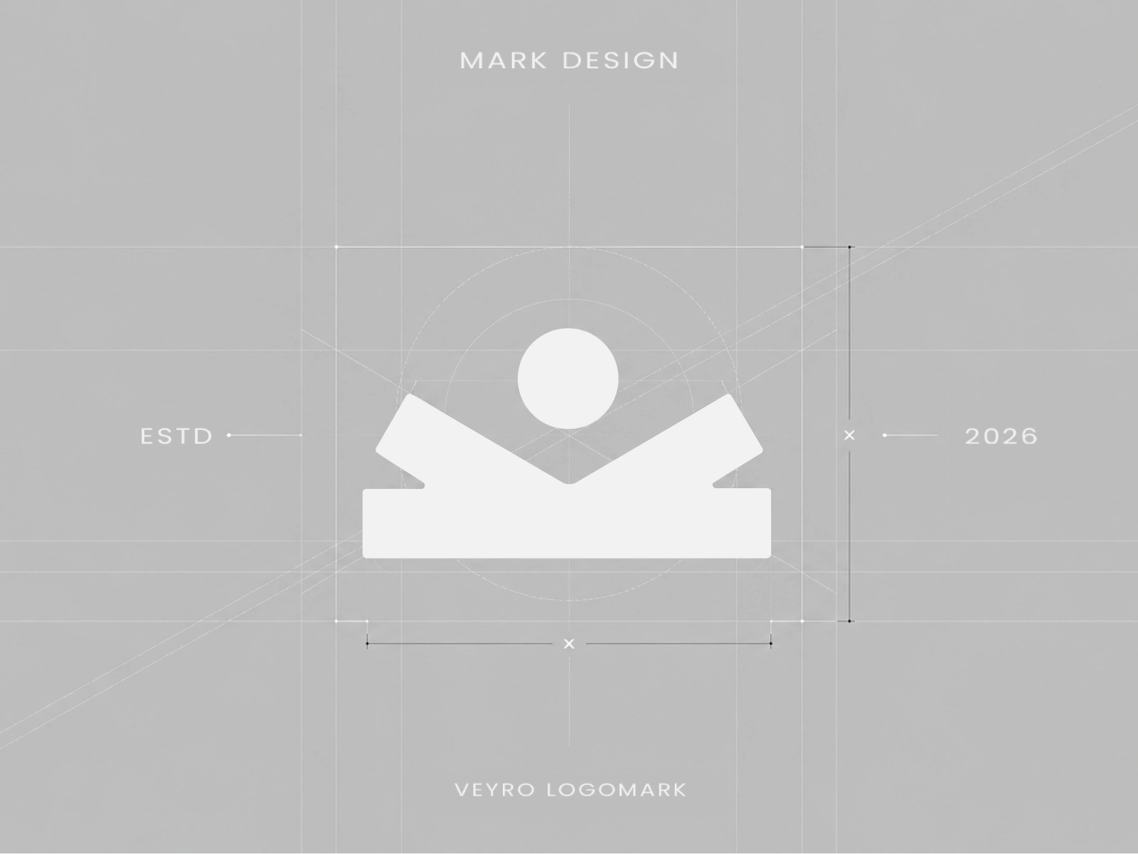
Logo Design and Grid Geometry: Engineering a versatile abstract logomark constructed on balanced radial and angular lines.
Color System and Visual Hierarchy: Pairing high visibility neon lime and solar orange with deep obsidian black and clean off white neutrals.
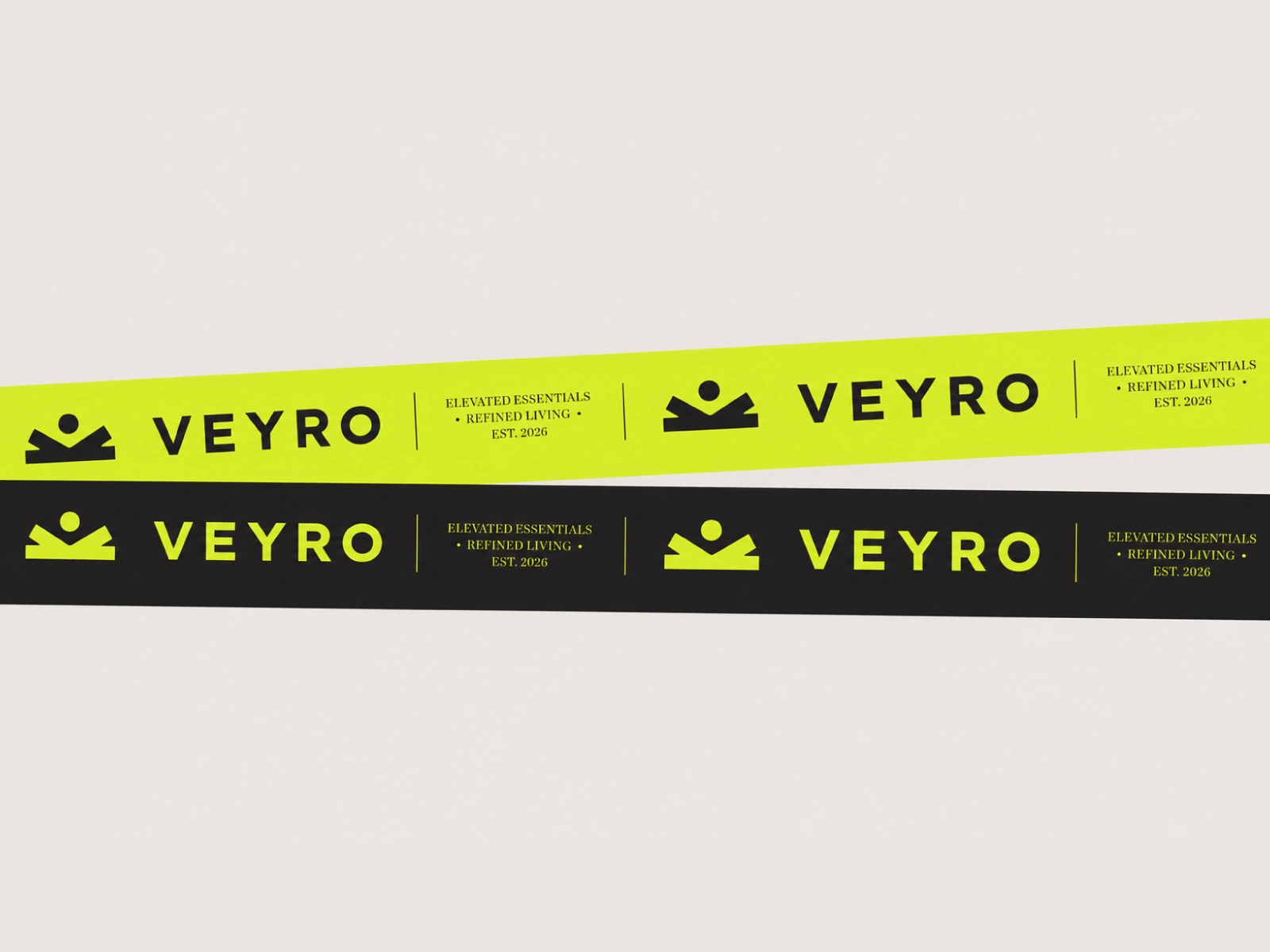
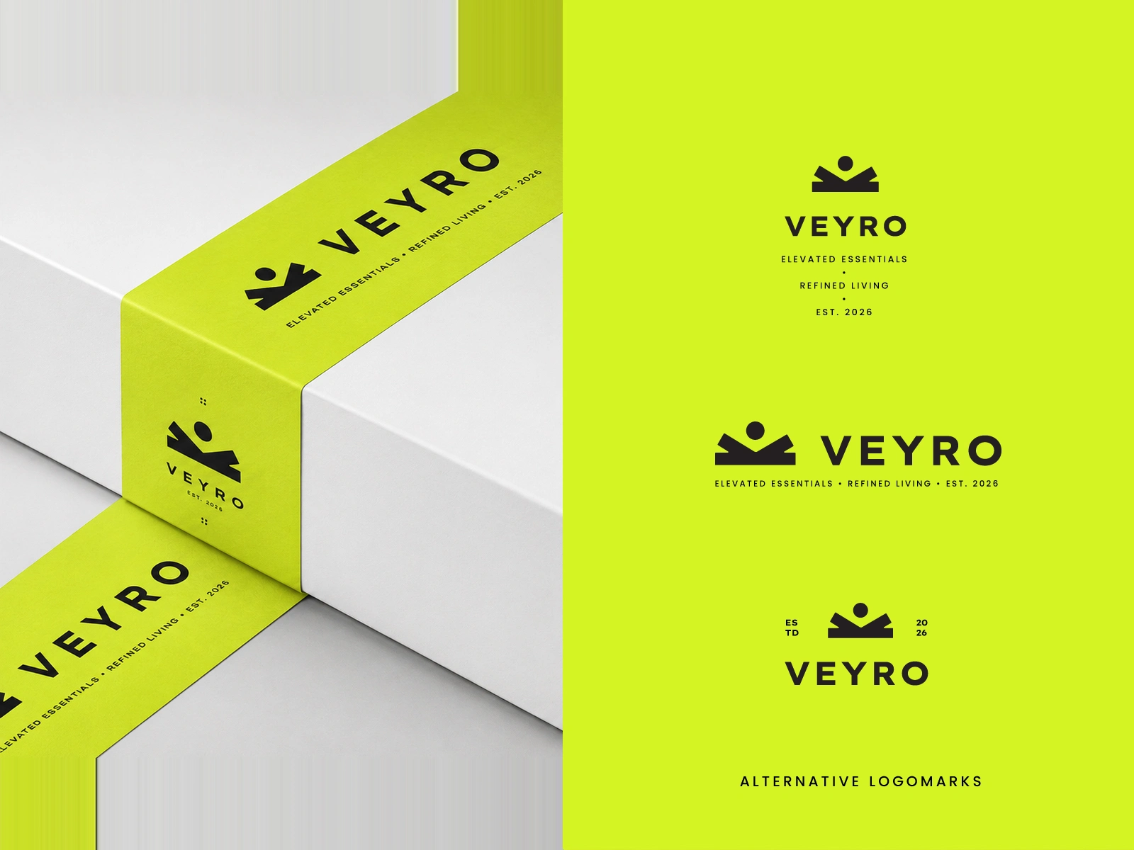
Packaging and Tactile Touchpoints: Designing minimalist unboxing packaging, branded belly band sleeves, patterned tissue wrapping, and technical woven straps.
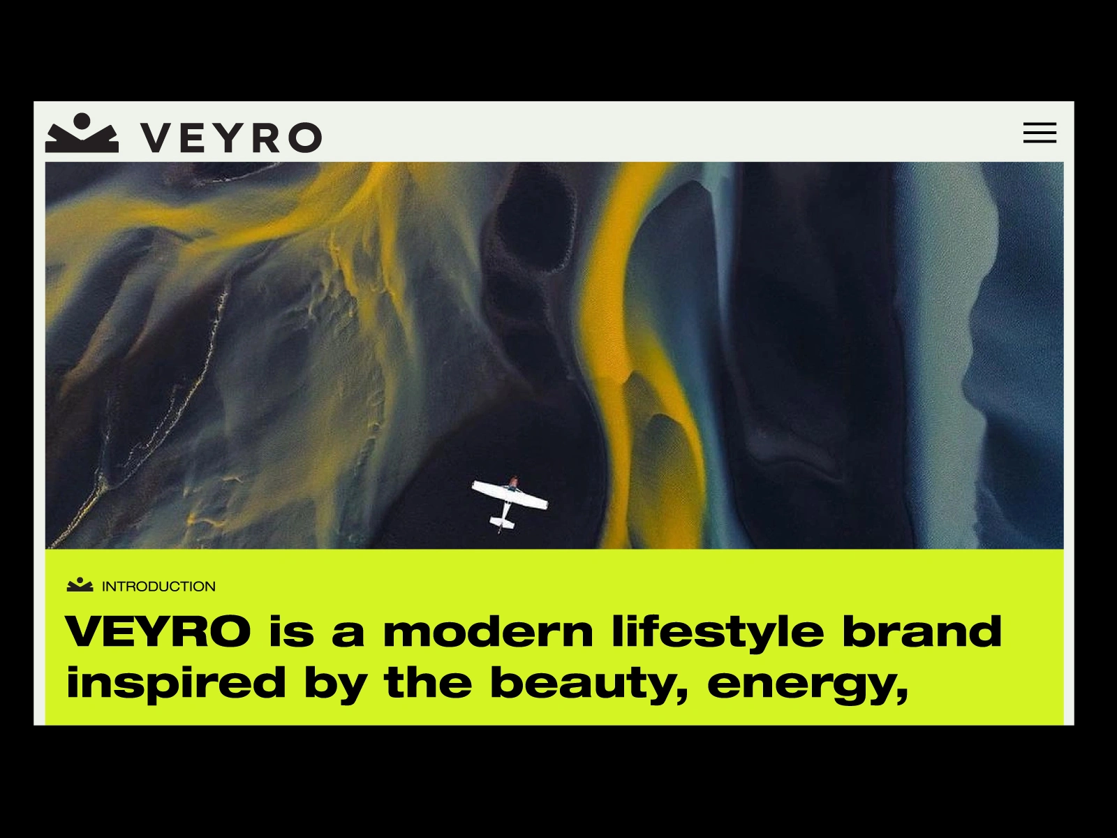
Digital UI and Editorial Direction: Establishing layout structures for web storefronts, publication covers, and landscape photography art direction.
Design Breakdown
The Geometric Logomark
The mark is constructed on a precise geometric grid featuring an anchor baseline, dual upward angled wings, and a central focal circle. The icon symbolizes motion, expansive horizons, and personal freedom. Its balanced proportions guarantee sharp legibility across micro garment labels, woven ribbons, digital app interfaces, and large scale exhibition posters.
High Contrast Color Palette
Electric Lime and Solar Orange: Provide vibrant visual energy, nodding to technical outdoor apparel and high visibility trail gear.
Carbon Black and Warm Bone White: Create stark editorial contrast, grounding the vibrant accents in modern luxury.
Muted Sage and Slate: Act as supporting transitional tones for lifestyle imagery and background environments.
Tactile Packaging and Editorial System
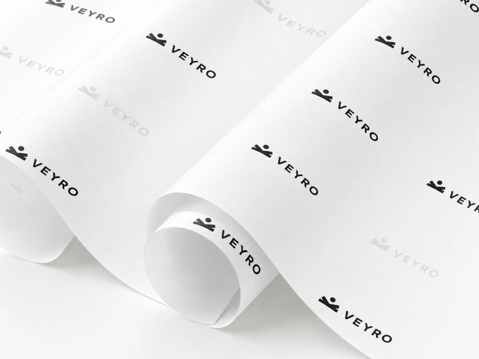
The physical packaging pairs utilitarian durability with sleek luxury details. Minimalist white boxes are wrapped in vibrant branded sleeve bands and paired with custom printed tissue paper. High contrast typography and structured grid systems tie together magazine covers, technical gear straps, and responsive web layouts into one unified lifestyle brand.

Like this project
Posted Aug 28, 2026
Modern brand identity and packaging system for VEYRO, an outdoor lifestyle brand combining bold neo fluorescent energy with refined minimalism.