Admin User Dashboard for a Hospitality Platform (SaaS)
Kehinde Oyekanmi
🍽️ UX Audit Case Study – Restaurant Admin Dashboard (🚧WIP)
Overview
Conducted a full UX audit of a restaurant admin dashboard to improve day-to-day operations, align workflows with real-world needs, and boost efficiency for owners and staff.
Project Goals
Identify friction points across modules
Make key actions faster and more intuitive
Improve operational visibility (sales, staff, inventory)
Create a flexible, scalable foundation for restaurant management
My Role:
UX Auditor · Product Design Strategist · Workflow Mapping · Information Architecture Recommendations
Audit Scope
Dashboard, Inventory, Finance, Staffing, Table Management, Business Hours, and others ongoing
Key Findings & Solutions
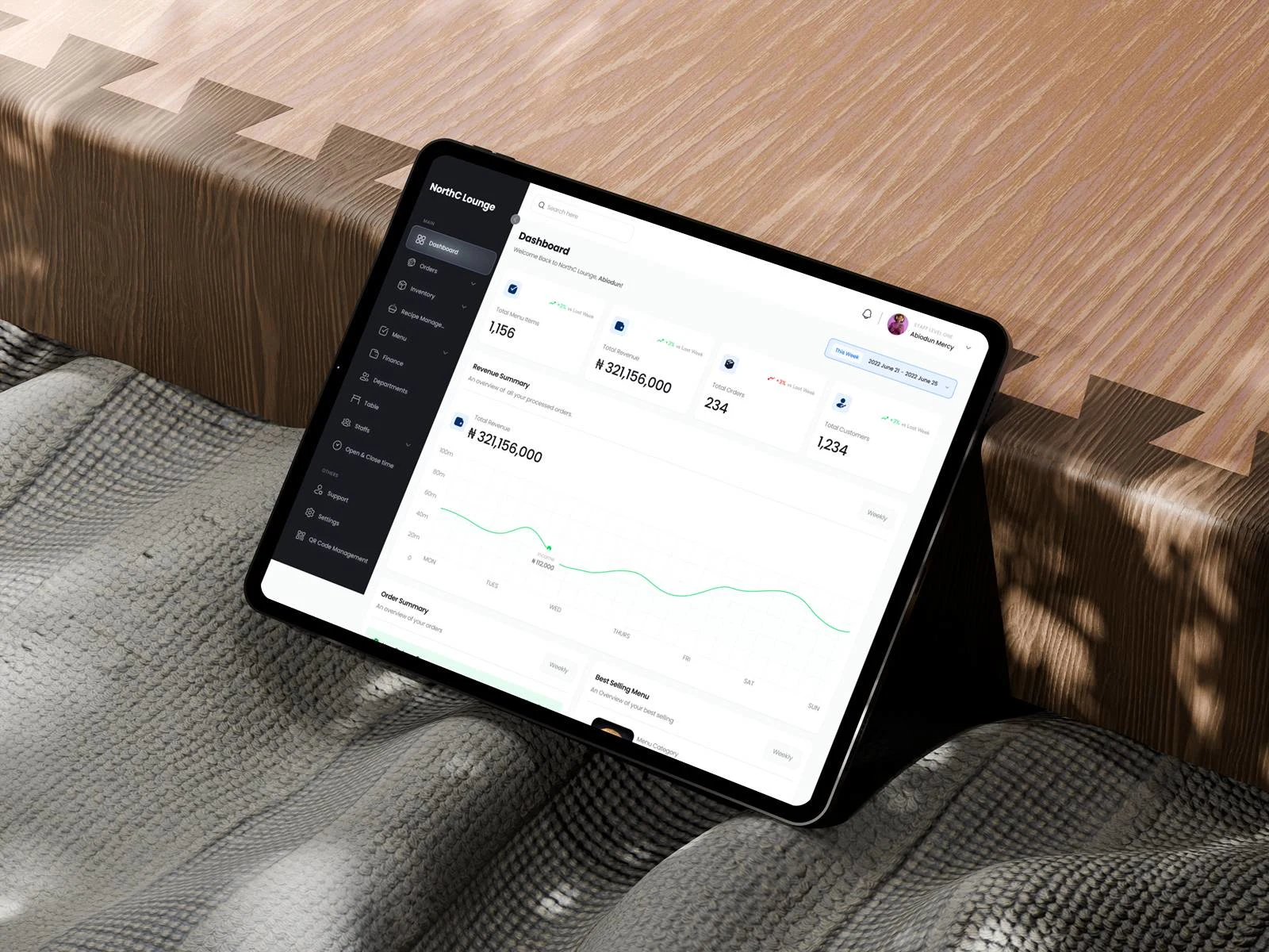
Dashboard Overview
Current Dashboard
Improved Dashboard
Issues Found
Displayed only basic stats with no historical context or trends
Visual hierarchy was flat, with no emphasis on priority metrics
No performance charts or order behavior insights
Order log was inactive and lacked depth (e.g., no staff link or status tracking)
No segmentation for processed vs unprocessed orders or revenue over time
Key functions like bestsellers, recent activity, or menu data were missing entirely
Improvements Made
Introduced high-level KPIs (menu items, total revenue, orders, customers) with percentage growth
Added dynamic filtering by time period (daily, monthly, yearly)
Included a revenue summary graph with hourly income patterns
Separated order summary into processed, unprocessed, and new orders with visual charts
Showcased best-selling menu items based on real data (category, order count, revenue)
Integrated recent activity logs with timestamp, order amount, table number, status, and staff responsible
Created a structured, visually clean layout to reduce cognitive load and improve scanning
WIP 🚧
Work still ongoing, and I will continue to share updates here...
Like this project
Posted Feb 6, 2026
UX audit of a restaurant admin dashboard to improve clarity, data visibility, and efficiency across inventory, staff, orders, and daily business operations.