Logo & Brand Identity for NY-based flower boutique
Valeriia Tymoshenko
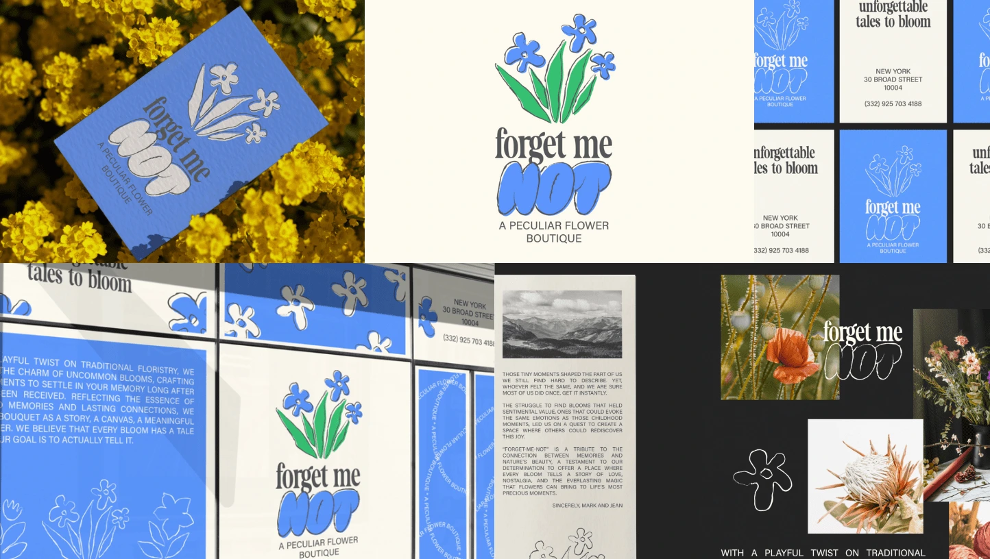
Logo & Brand Identity for Forget Me Not, a NY-based flower boutique
For this project, we stepped away from the usual floristry cliches. Our goal was to create an identity that would speak for itself and stand out bold and vibrant. A hint of nostalgic typography with a contemporary edge, vibrant colors, and lots of dynamics in shape and layout formed the core. We pushed it further by creating a set of illustrations — vivid forget-me-nots and other flowers, depicted as stamps and outlines.
Like this project
Posted Mar 4, 2025
A hint of nostalgic typography with a contemporary edge, vibrant colors, and lots of dynamics in shape and layout formed the core.
Likes
0
Views
4
Timeline
Jan 1, 2025 - Jan 5, 2025