Three states, one seamless experience | Semiotic
Yeti
Three states, one seamless experience.
Two production-ready Lottie animations for Semiotic — crafted in 20 hours.
The brief
Michael reached out through Contra with a direct question: "Do you know how to make Lottie animations?" Simple ask, but the real challenge lived underneath it.
Semiotic's identity is built around three dots — their logo, their mark, their entire visual language. Michael wanted those three dots animated in two states: one for loading, one for thinking. His brief came in two layers. First, video references that showed the mood and feel he was after. Then, a Figma file with photographs of hand-drawn sketches — pen and paper breakdowns of how the dots should move, frame by frame. No motion specs, no design system. Just a clear vision communicated through two very human formats.
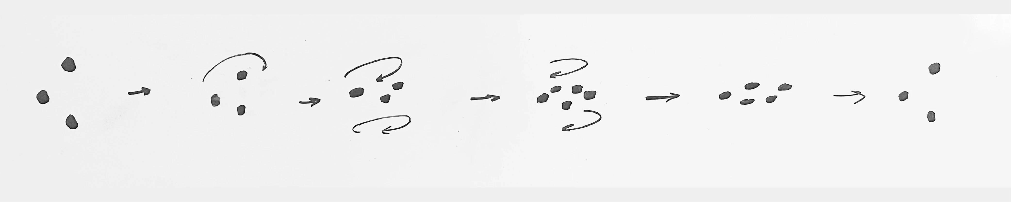
"Spinning" animation first storyboard draft
That combination told me a lot about Michael as a client: he knew exactly what he wanted, and he'd done the work to show it — not just describe it.
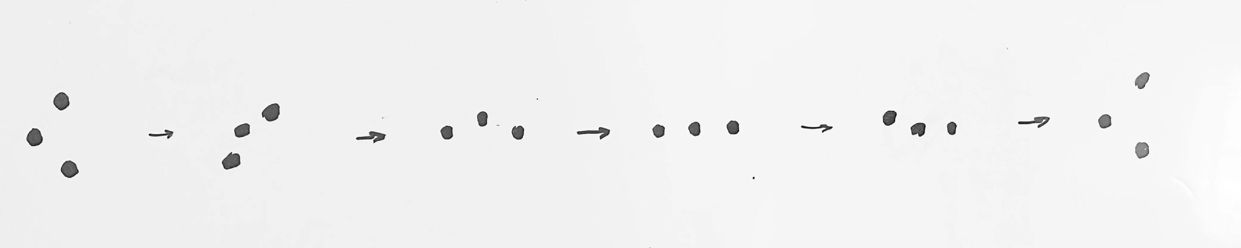
"Thinking" animation first storyboard draft.
The structure
Each animation isn't just a loop: it's a three-state system designed to work in a real product environment, where you can't predict how long a process will take.
Intro
Plays once when the service starts loading or thinking.
Infinite Loop
Repeats seamlessly for as long as needed — 2 seconds or 2 minutes.
Outro
Plays once when the process finishes and the UI moves on.
The real challenge wasn't making the animation look good — it was making the middle state loop so organically that users would never notice it repeating.
The process
Figuring out the right tool. My first instinct was Rive — great for interactive animations and web-ready output. But after exploring the motion I had in mind, I switched to After Effects, where I could control every curve and timing with the precision this project demanded.
Translating references into motion. The video references set the emotional bar. The hand-drawn sketches set the technical direction. My job was to merge them into something that felt inevitable — like the dots couldn't move any other way.
Obsessing over the loop. The infinite middle state had to be invisible at its seams. I spent hours adjusting keyframe velocity curves until the motion felt completely continuous — no restart, no hitch, just organic movement that could go on forever.
Back and forth with Michael. Several rounds of feedback, always pointing in the same direction: make it more organic. That consistency made iteration efficient — we weren't chasing a moving target, we were homing in on something precise.
What made this one different
I've done loops before. But I've never been pushed to make one this pixel-perfect. Adjusting keyframe velocity at that level of detail. The difference between "good" and "right" is almost imperceptible. Michael's standards pushed me further than I expected to go, and the result is something I'm genuinely proud of.
Full thinking animation
Full spinning animation
If you made it this far, you already know how I work.
Close attention to detail, honest communication, and a commitment to getting it right, not just getting it done.
If that sounds like what you're looking for, I'd love to hear about your project.
Yeti | Semiotic | 2026
Like this project
Posted Apr 12, 2026
Created seamless Lottie animations for Semiotic's product environment — intro, infinite loop, and outro states.
Likes
3
Views
31
Timeline
Jan 22, 2026 - Feb 5, 2026
Clients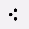
Semiotic