Self-assessment report: Data visualization
Project Overview
I was requested to develop an interactive graph for client's startup development program.
The startup will conduct a self-assessment among different criteria with the scale of 1 - 4 and deliver a pitch in front of accelerators,accelerators will rank the startup's performance in different criteria, the startup will then receive the assessment report with feedback of accelerators and some informations for startups to know better about their own status.
Their are 30 different criteria and they can classified as 5 categories, the accelerators will rate the startup based on their performance with a scale of 1-4, and the criteria can also be classify into two buckets: progress and opportunity.
The startup which went through the startup development program can classify funded and non-funded, since to receive a fund is the startup's primary goal.
Customer painpoint
The previous version of their report was a PDF file, with no interaction, difficult to understand and lack of insights.


Project Approach
Data cleaning with Alteryx
Data visualization with Tableau
Data Cleaning
I utilized an data analysis application called Alteryx, it's a drag-and-drop application allow us to utilize data analysis process effortelessly.
The data contains: startups criteria/category percentile within both funded and all companies, the overall progress and opportunity, and the average score for each criteria and categories.
Data visualization
We create 5 different interactive chart, allowing the startups to have a more comprehensive understanding about their current status comparing with other companies.
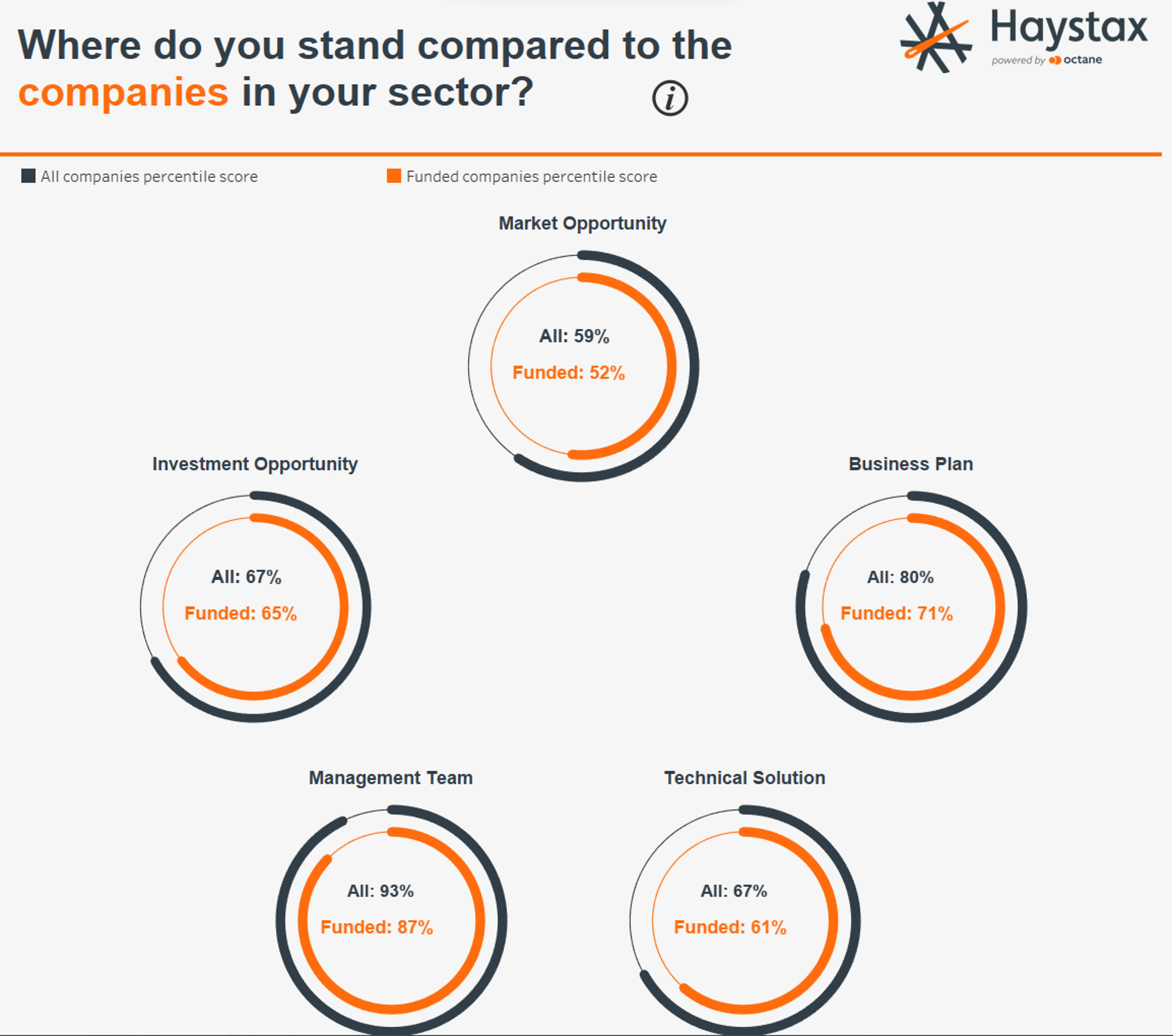
The first one is the chart demonstrating the startup's category percentile between all companies and funded companies. The chart allows the company to understand their strenghs and weakness in different category.

The second chart is a lollipop chart representing with both category and criteria percentil within funded and non-funded companies. The chart not only can help the company to know about their competiveness, and they can also dive into criteria to know which part they can improve.
The third chart is the organized perceptual map of overall opportunity and overall progress. The size of the circle also representing the deal size that the company received, so we may see that the more right-upwords the company is, the more investment they could get, this chart gives startups a goal to improve themself to receive more funds.
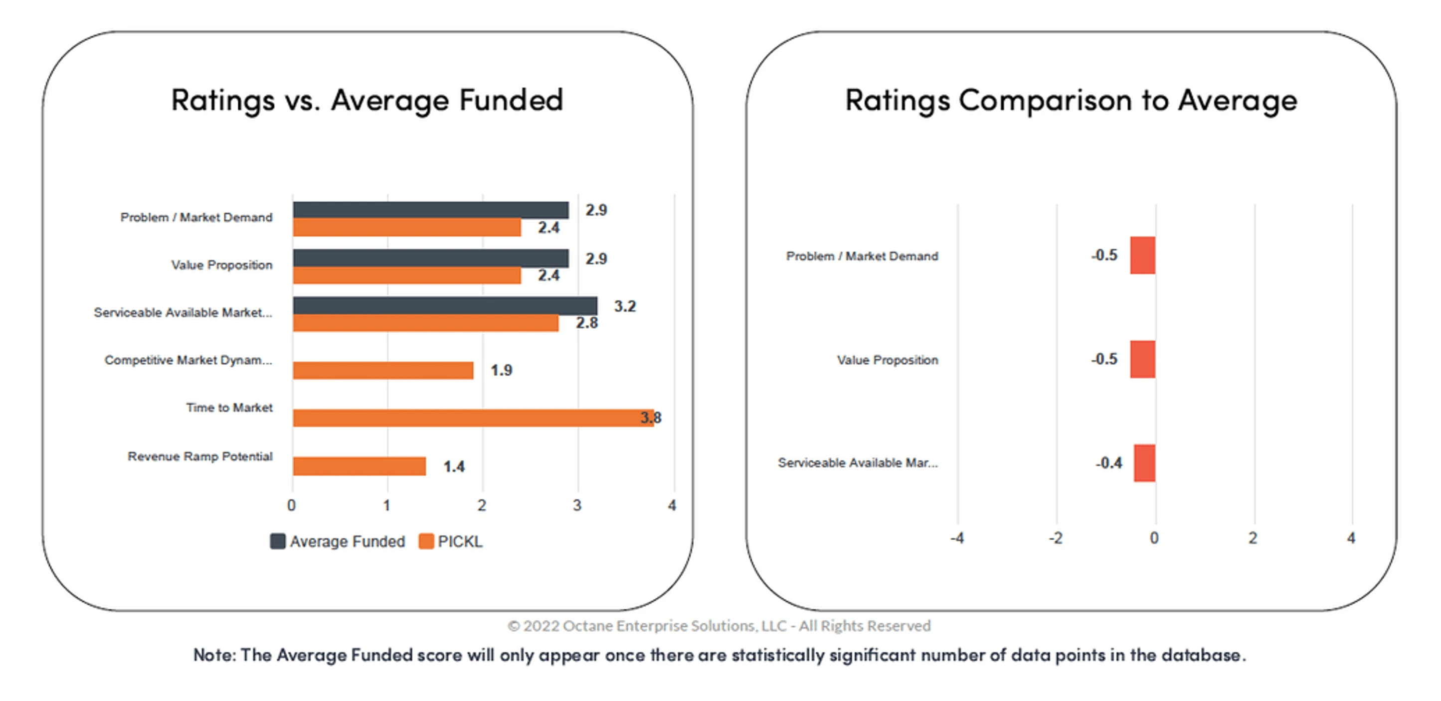
The Fourth chart representing the gap analysis among different criteria, allowing the startup owner to understand the difference between their own preception and the acclerator's thought on their performance.
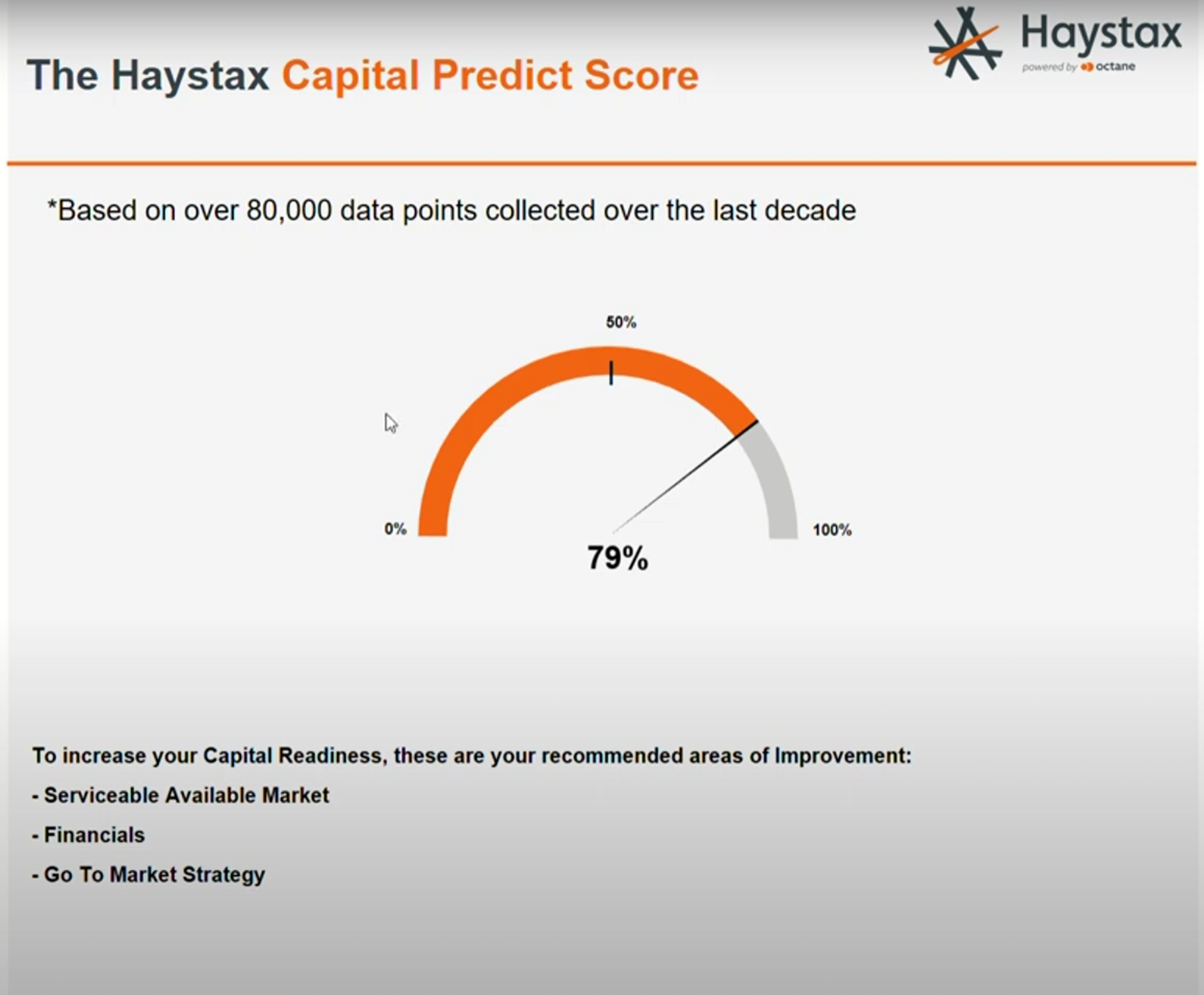
The last one is the core of this report, allowing the startup to aware that with their current performance, their likelyhood of being funded. And the text also allow them to understand which specific criteria they should include to boost their likelyhood of getting investment.

Like this project
Posted Aug 15, 2023
Using Tableau to deliver a interactive graph embedded in the startup's report.
Likes
0
Views
13


