
MOVENA: Activewear Store Website
MOVENA is a website design for an activewear brand that sells clothing for everyday movement. I designed it to feel energetic, confident and easy to shop, with a clear message: “Move freely. Look powerful.”
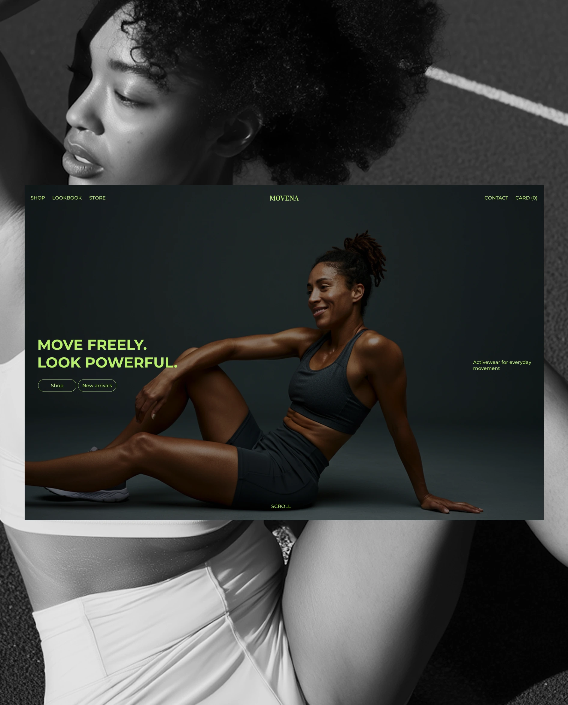
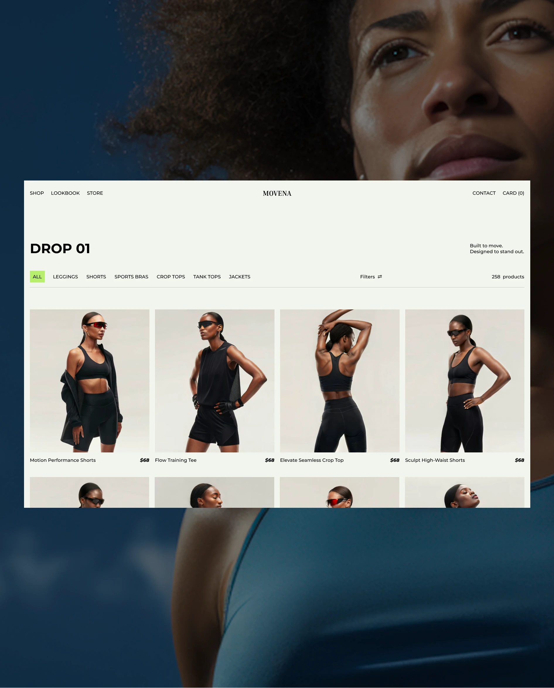
The look is dark and sporty on the home page, with a lime green accent for the headline, menu and buttons. Large photos of athletic women take center stage, and the green stands out against the dark background. The shop page switches to a light background, so the products are easy to see and compare.
The desktop home page has a simple menu (Shop, Lookbook and Store), a cart counter and two clear buttons: “Shop” and “New arrivals.” The “Drop 01” shop page shows a grid of products, each with a photo, a name and a price. Category tabs (All, Leggings, Shorts, Sports Bras, Crop Tops, Tank Tops and Jackets) and a Filters option help visitors find what they want fast, and a product counter shows the size of the collection.
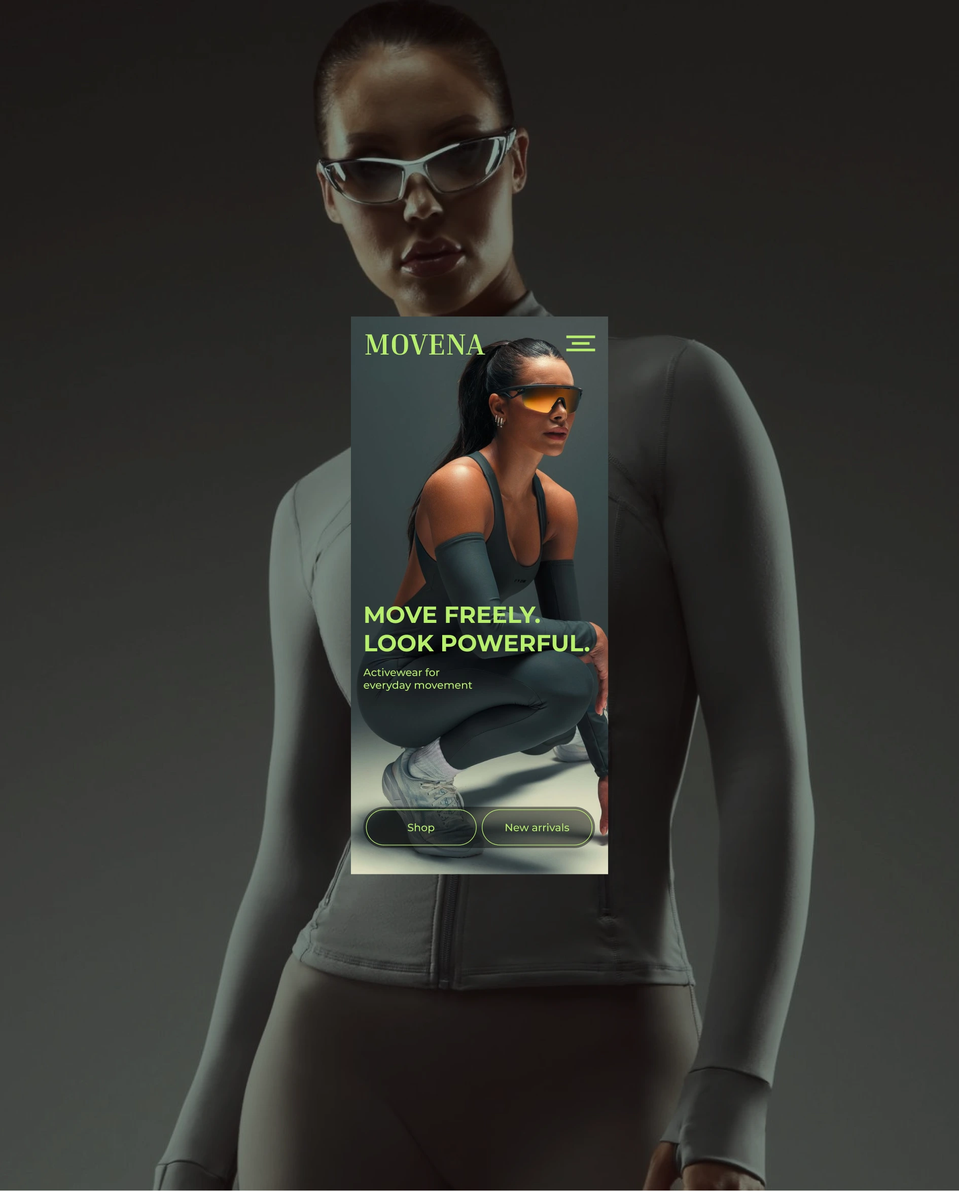
I also designed the mobile version, with a big logo, a compact menu button and the same bold message over a full-screen photo, with the two main buttons within easy reach of the thumb.
Concept e-commerce site for an activewear brand. Dark, high-contrast visuals with neon green accents and a clean product catalog. Built in Framer.
The challenge
Self-initiated concept. Activewear sites often rely on busy layouts and generic “fitness” visuals. The goal was to design a brand experience that feels powerful and premium, where movement and confidence lead, and shopping stays effortless.
My process
I built the look around a dark, near-black palette with a single neon green accent, so headlines, buttons and navigation stand out without extra decoration. The hero pairs large, direct copy (“Move freely. Look powerful.”) with full-bleed photography of athletes in motion. On mobile, I kept the same hero with a simplified header and two clear actions: Shop and New arrivals. For the catalog, I switched to a light, neutral background so the product photography takes center stage, with category tabs (Leggings, Shorts, Sports Bras, Crop Tops, Tank Tops, Jackets), filters and a clean four-column grid with name and price. Designed in Figma and built in Framer.
The result
A complete concept e-commerce experience: desktop home, mobile home and the “Drop 01” product catalog. [Live Framer link]
Tools
Figma, Framer
0 likes · 2 views · Nov 2, 2026
Website design for MOVENA, an activewear brand. Dark sporty look, lime green accents, a product grid with filters and a mobile version.

