A-A Architecture Studio
Mark Smith
Brand Design for Architecture and Design Studio from Melbourne
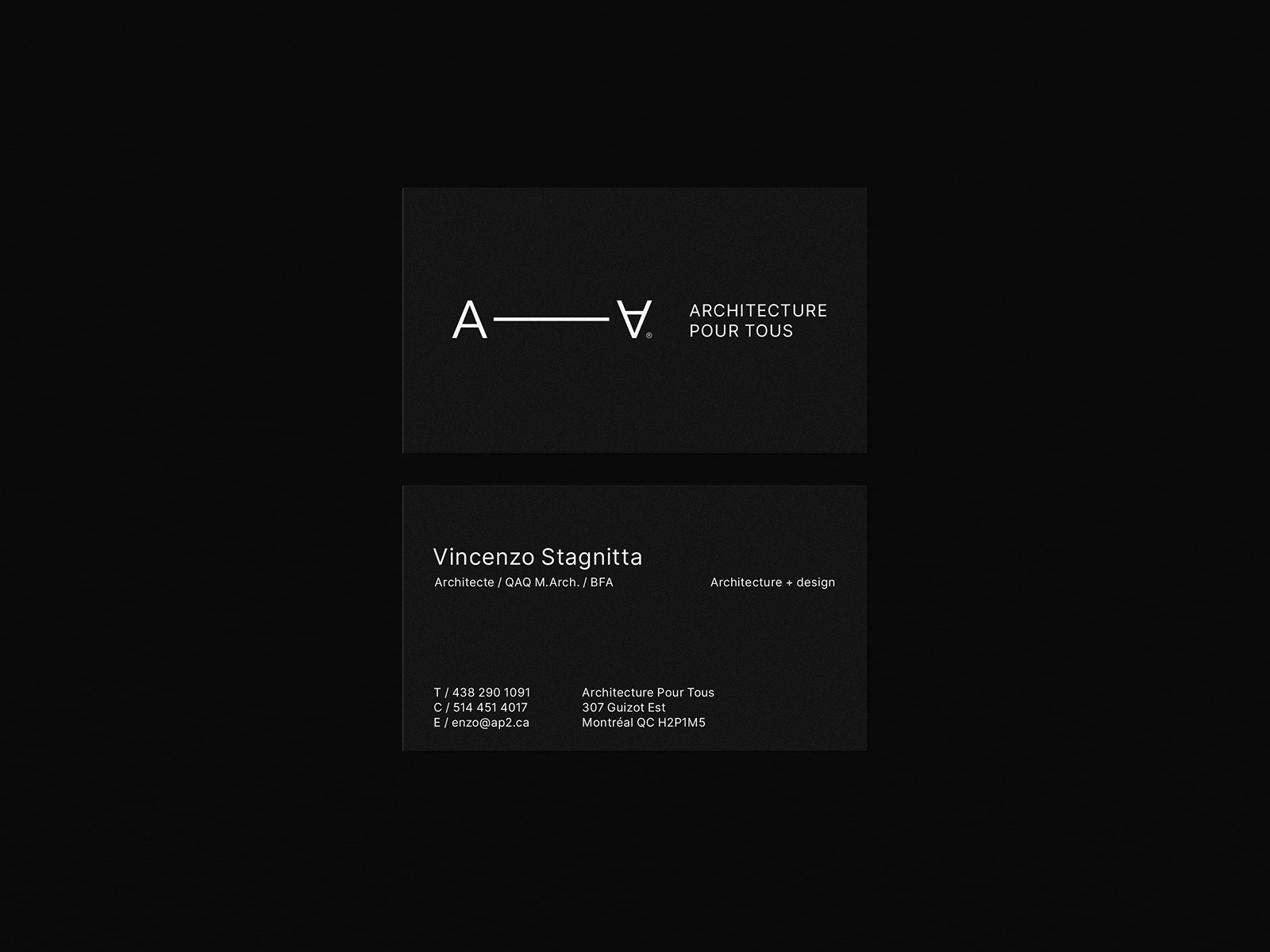
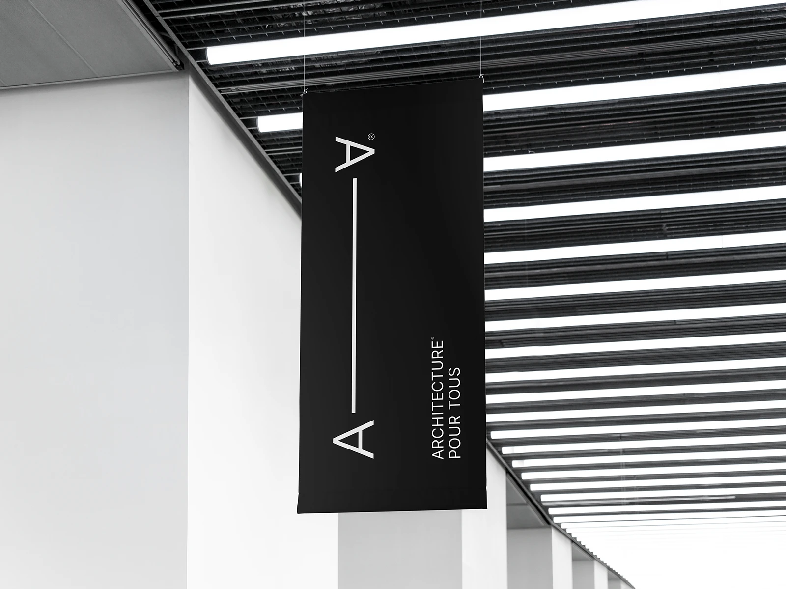
The biggest challenge was to effectively communicate the studio’s core message: "Architecture is for everyone." This concept, which is also the name of the studio, inspired us to incorporate a visual element that represents variety and inclusivity, while staying true to the studio’s initials. We chose the mathematical symbol ∀ (meaning "for all") as a key design element, symbolizing accessibility and the broad reach of architectural services.
The design concept connects the letter with diverse individuals who benefit from architectural services, reinforcing the studio’s mission to make architecture available to all. The versatility of this approach lends itself seamlessly to animation and motion graphics, offering dynamic visual opportunities.
The brand attributes are: Clean, Modern, Minimal, Constructive, and Creative. These values are at the heart of the design, ensuring the brand feels both approachable and professional.

Like this project
Posted Jul 15, 2025
Clean, modern brand identity symbolizing inclusivity, versatility, and accessibility, perfectly aligned with the brand mission: Architecture for everyone.