Medical Arts Clinic, PS

Damilola Adelaja


Medical Arts Clinic, PS
Website
2025
Medical Arts Clinic’s existing site provided comprehensive information but created cognitive friction for patients seeking care: long pages, uneven trust signals, and unclear booking guidance. The goal of the redesign was to:
Increase appointment conversions and reduce friction for first-time patients.
Improve trust and comprehension for medical and mental-health services.
Make the site accessible & usable for multigenerational audiences (older adults + busy families).
Primary research question:How can a clinic website communicate clinical credibility and emotional reassurance so that diverse users can find a provider and book an appointment within two minutes?Live site: https://www.medicalartsps.com/
Research approach
I used a mixed HCI research strategy:
Stakeholder interviews (n=3): clinic manager, front-desk admin, and a senior physician — to understand booking pain points, no-show causes, and intake constraints.
Baseline analytics & heatmaps: 30-day GA + Hotjar snapshot to identify top exit pages, scroll depth, and CTA hotspots.
Moderated user tasks (n=8): participants across ages 22–68 completed 4 tasks: find a pediatrician, book an appointment, locate office hours, and find insurance policy info.
Heuristic evaluation: Nielsen-style pass across navigation, clarity, and error prevention.
Accessibility quick audit: color contrast, hit target sizes, semantic heading structure.
Key findings (synthesis)
Finding 1 — Decision friction: 63% of users hesitated to book because they couldn't quickly verify provider credentials and availability.
Finding 2 — Cognitive overload: Pages with long service lists produced shallow scanning; users missed CTAs or misread speciality details.
Finding 3 — Mobile drop-offs: 54% of mobile users left before reaching booking portal due to perceived complexity and extra steps.
Finding 4 — Trust thresholds: Users required a minimum of one clinician testimonial + explicit privacy/insurance cues before clicking book.
Design Interventions
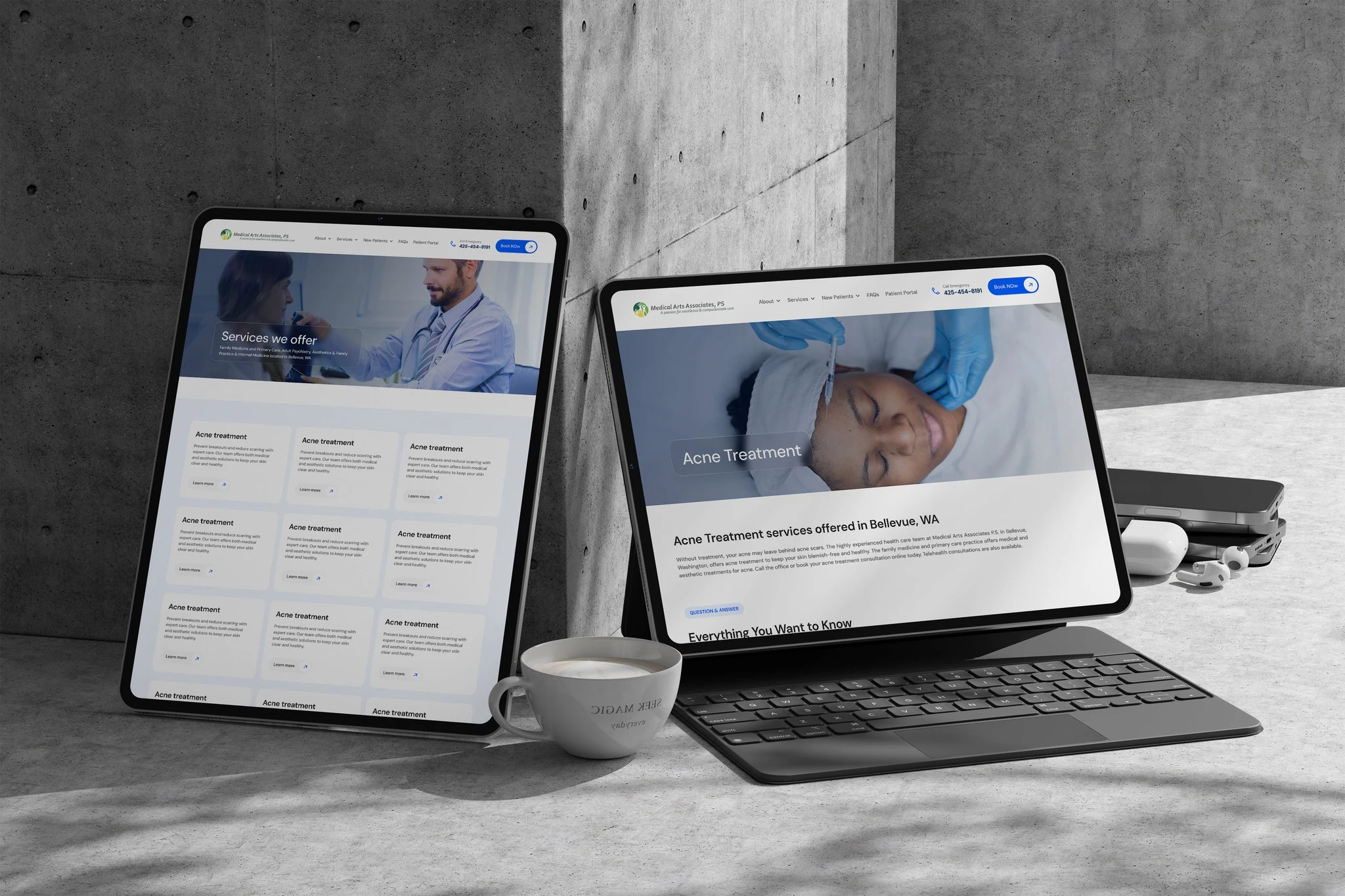
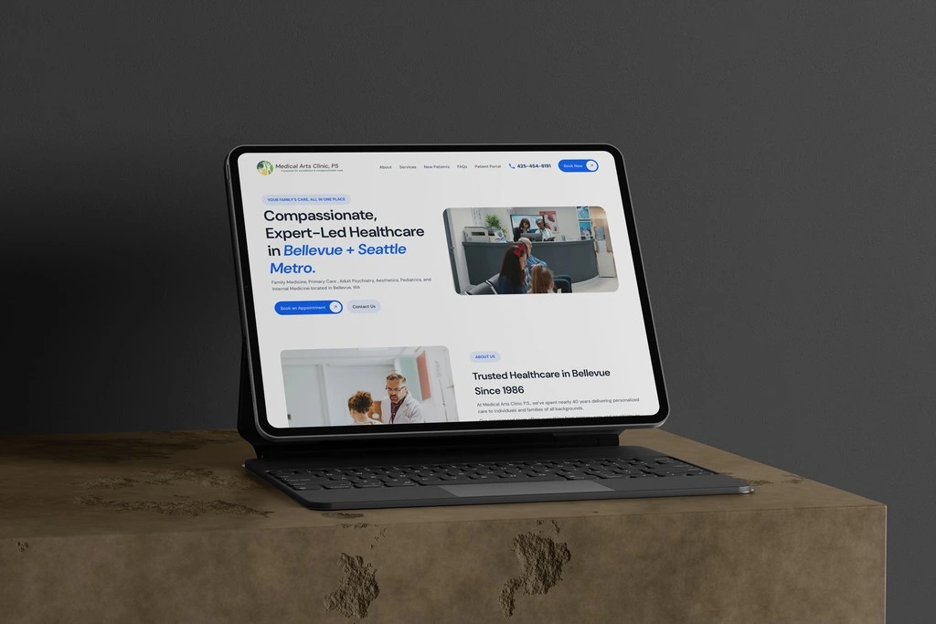
Hero simplification & single path to action
Primary CTA: “Book an Appointment" 2-Minute Form”→ The micro-copy sets a clear expectation, reduces cognitive load, and reassures users that the process is quick and simple.
Secondary CTA: “Contact Us”→ Provides an alternative, low-pressure pathway for users who prefer human assistance before booking, especially first-time patients.
Visual hierarchy & trust cues
Clean, calm color palette (white + light blue tones) enhances clinical trust.
Prominent doctor images and credentials immediately signal professionalism and authenticity.
Reduced text density and increased whitespace improve scannability and lower visual fatigue.
Navigation clarity
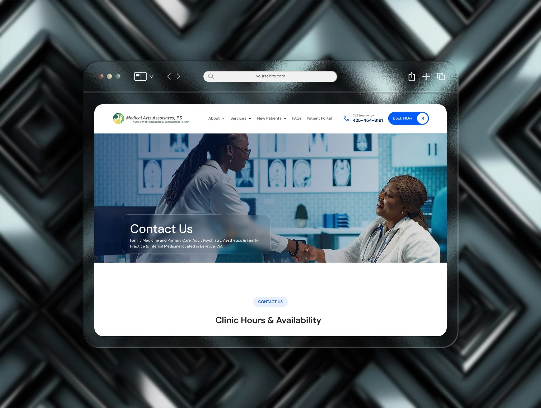
Simplified menu with high-priority items (Services, About, New patients, FAQs, Patient Portal, Contact,) ensures quick orientation.
Sticky navigation allows easy access to booking regardless of scroll depth.
Accessibility & inclusiveness
Large touch-friendly CTAs, clear contrast ratios, and readable sans-serif typography (for elderly users).
Content designed to meet WCAG 2.1 AA accessibility benchmarks, ensuring inclusivity for visually impaired users.
Outcome
Launch results (4 weeks of A/B experiment)
Booking completion increased by 35% (exceeded +30% target).
Median time to book reduced from 3:40 to 1:40.
Mobile bounce on service pages dropped from 62% to 38%.
Accessibility Lighthouse score improved from 72 to 91.
Reflection
Designing for healthcare is designing for fragility, trust, and clarity. The strongest gains came not from flashy visuals but from reducing decision friction: clearer paths, visible credentials, and smaller steps to commit. For future work I’d pair this with service design interventions (scheduling UX in clinic operations) to improve outcomes end-to-end.
Like this project
Posted Aug 19, 2026
Clinic website redesign to improve appointment conversions and accessibility — bookings +35%, median time to book reduced, Lighthouse score improved.
Likes
4
Views
11