InnoLogic Website UI/UX Design & CMS Development
Yousuf Raza
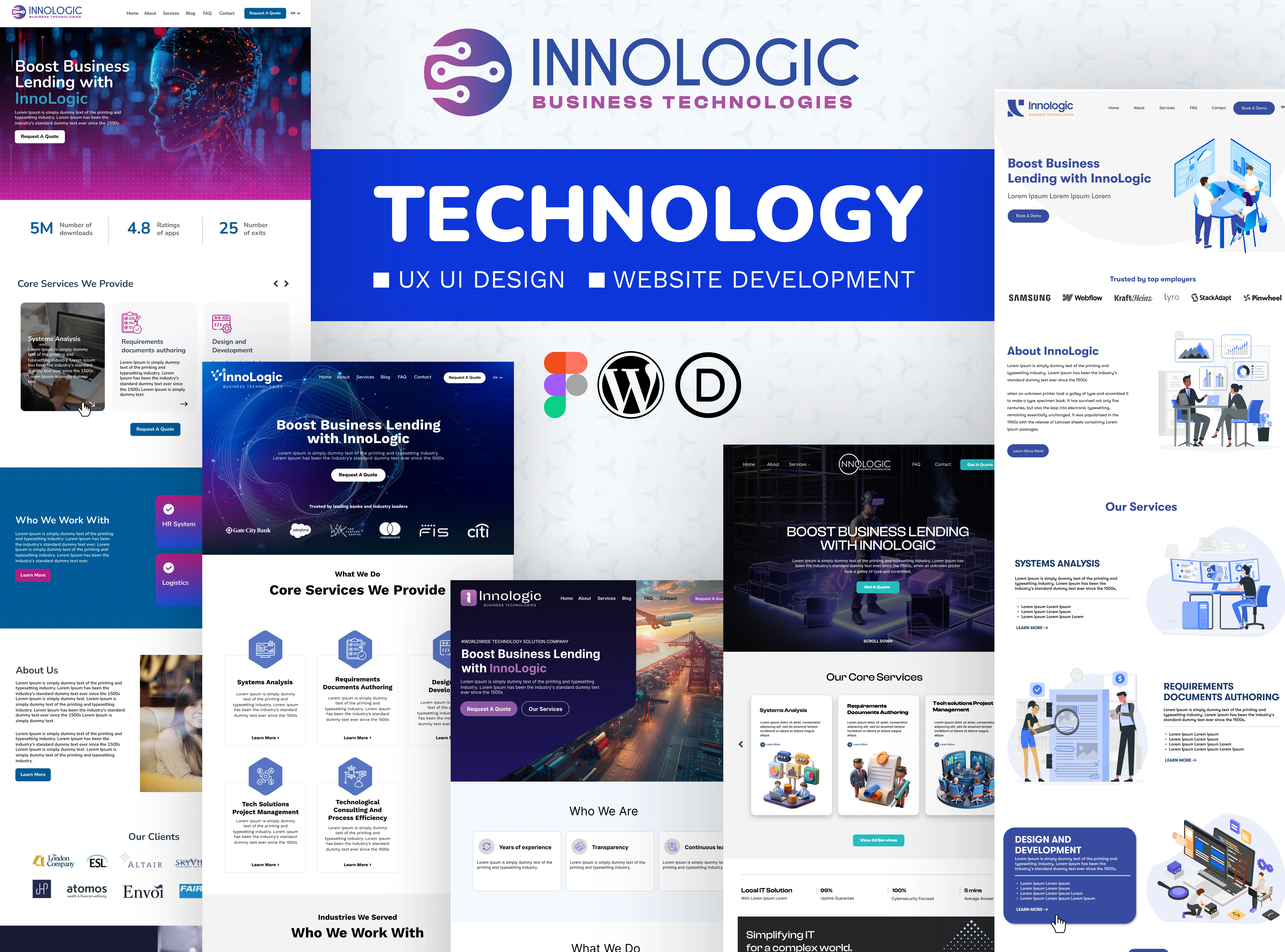

Crafting Digital Experiences: A Journey Through UI/UX and Web Design
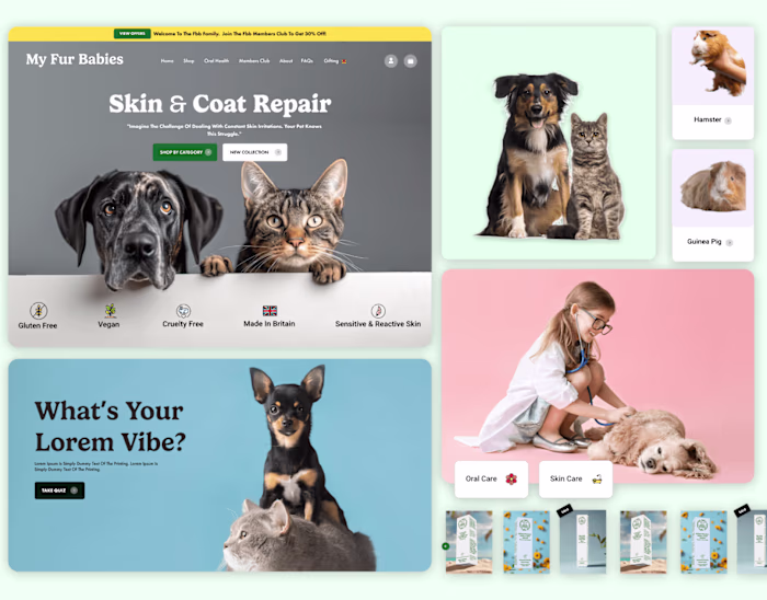
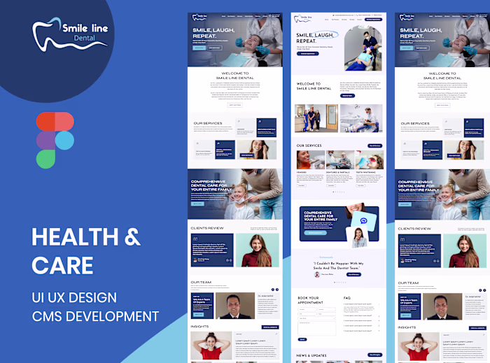
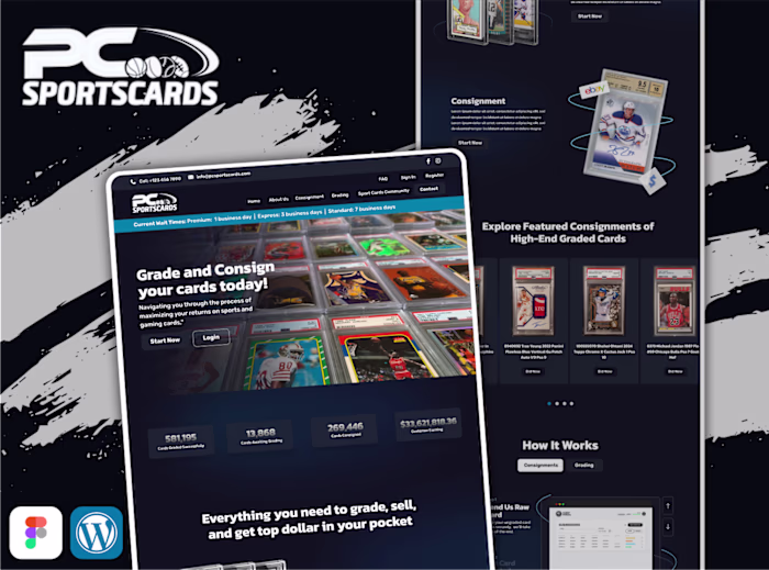
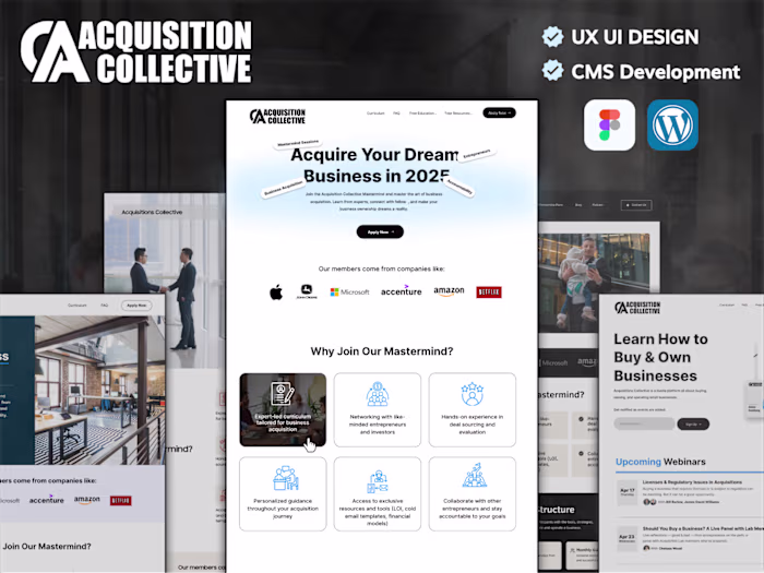
When I embark on a new project, my goal is always to create more than just a website; it's about building a digital experience. For this particular project, designed for a leading tech solutions provider, the challenge was to translate their innovative spirit into a custom WordPress website that felt both cutting-edge and incredibly intuitive. My process began, as it often does, in Figma, where the initial sparks of UI/UX design came to life.
My Design Philosophy: Intuition Meets Innovation
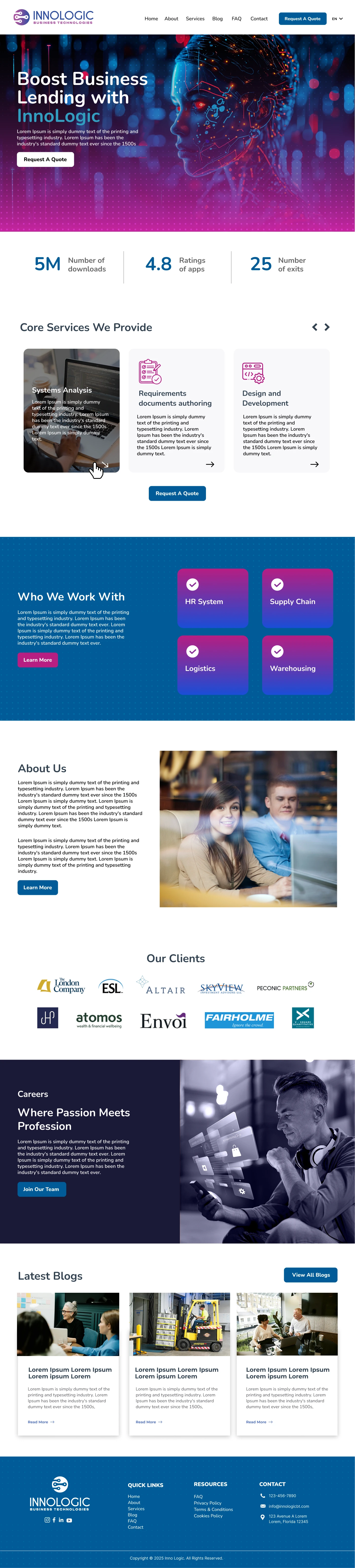
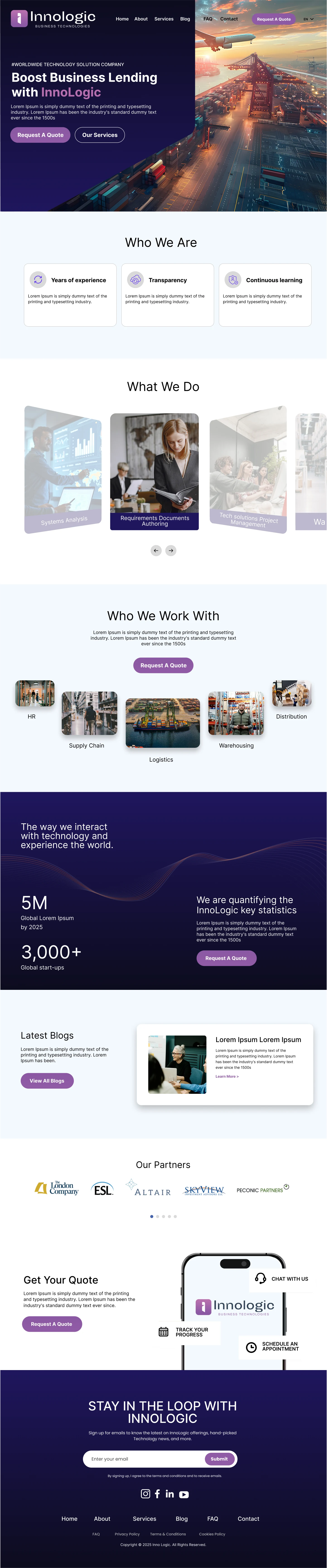
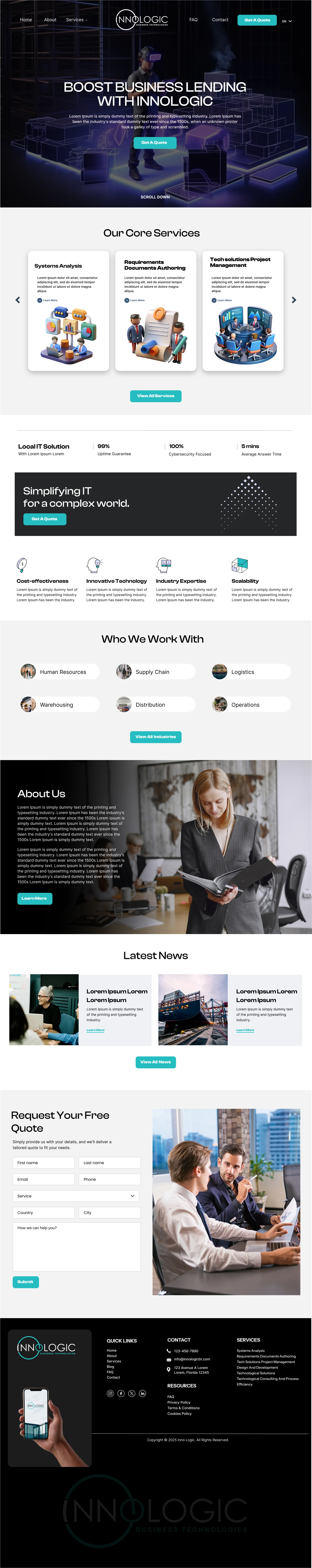
My approach to UI/UX is deeply rooted in understanding the user. I believe a great website should guide visitors effortlessly, anticipate their needs, and leave a lasting impression. With this project, every element, from the layout to the smallest interactive detail, was meticulously crafted to ensure clarity, engagement, and intuitive navigation. It's about blending sleek aesthetics with purposeful functionality, ensuring that users not only enjoy their visit but also easily find the information they're looking for. This project truly showcases how I leverage modern UI/UX principles to create engaging digital platforms.
Bringing Designs to Life: The Power of Custom Development
Once the design vision was crystal clear in Figma, the next step was bringing it to life with robust development. Opting for custom WordPress development allowed me to build a backend precisely tailored to the client's unique content structure. This means they have a powerful yet incredibly easy-to-use content management system, making updates and future scalability effortless. It’s about empowering clients with control, ensuring their online presence can evolve as quickly as their business.
Designing for a Connected World: Responsive and Optimized
In today's multi-device world, a website must perform flawlessly everywhere. That's why a mobile-first approach is non-negotiable in my design process. This website was built to be responsive across all devices, delivering a seamless Browse experience whether you're on a desktop, tablet, or smartphone. Beyond adaptability, performance is key. I focus on fast loading times, an SEO-friendly structure, and streamlined user flows to enhance both the user experience and discoverability. The result is a visually sophisticated, high-performing platform with a sleek, tech-inspired aesthetic that truly reflects the client's brand identity through clean lines, modern typography, and a forward-thinking color palette.
Discover How I Can Elevate Your Digital Presence
This project is a prime example of how I combine thoughtful UI/UX design with powerful custom WordPress development to create websites that are not only beautiful but also highly functional and optimized for success.
Are you looking to create a website that truly connects with your audience and reflects your brand's unique identity? Let's discuss how my approach to website design, user experience, and WordPress development can help you achieve your digital goals.
Home Page Concept 1
Home Page Concept 2
Home Page Concept 3
Like this project
Posted May 10, 2025
Custom UI/UX and WordPress website design expert. I create modern, responsive, and SEO-optimized digital experiences for business growth.