AraiZen | Brand Identity
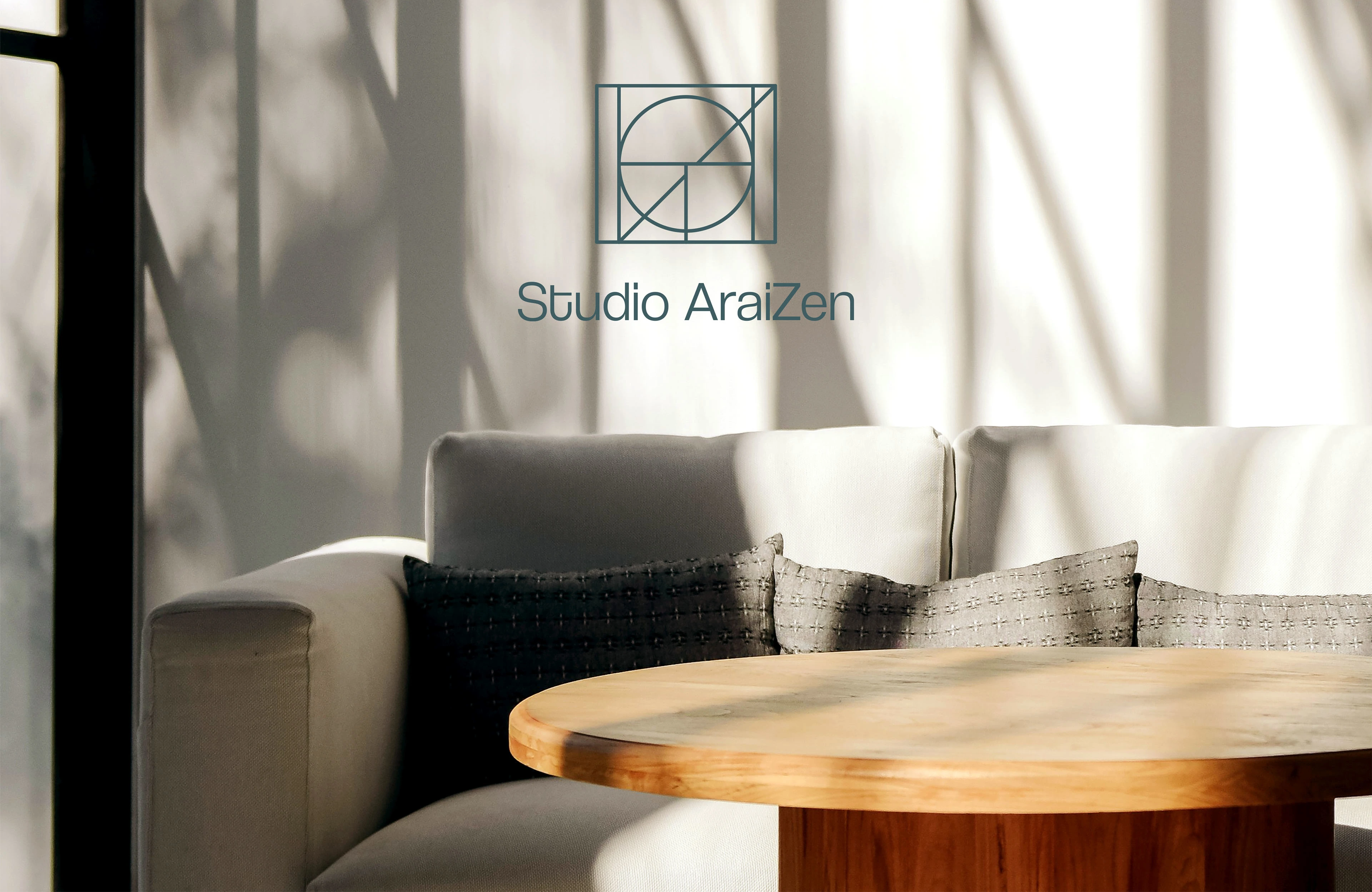
Inspired by the ever-changing facets of life and a commitment to excellence, AraiZen Studio stands as a contemporary interior design house led by Siddhi Chhajed. Focused on addressing the fundamental needs of their clients, Studio AraiZen dedicates itself to crafting spaces that seamlessly blend functionality and enhance ergonomics, all while maintaining a steadfast commitment to aesthetic value.
The brand draws its name from the fusion of two words: "Areté," a Greek term connoting excellence, and "Kaizen," a Japanese term representing continuous improvement—coincidentally, both embodying the core values of any creative process.
Upon delving into the studio's portfolio and its distinctive personality, we observed a pronounced inclination toward crafting spaces that accentuate the inherent geometry of a given area. This discovery served as the primary muse for developing AraiZen's brand identity.
By extracting letter forms and seamlessly integrating them with geometric shapes, we generated a visual representation reminiscent of a blueprint—a pivotal element in any interior and space design project.
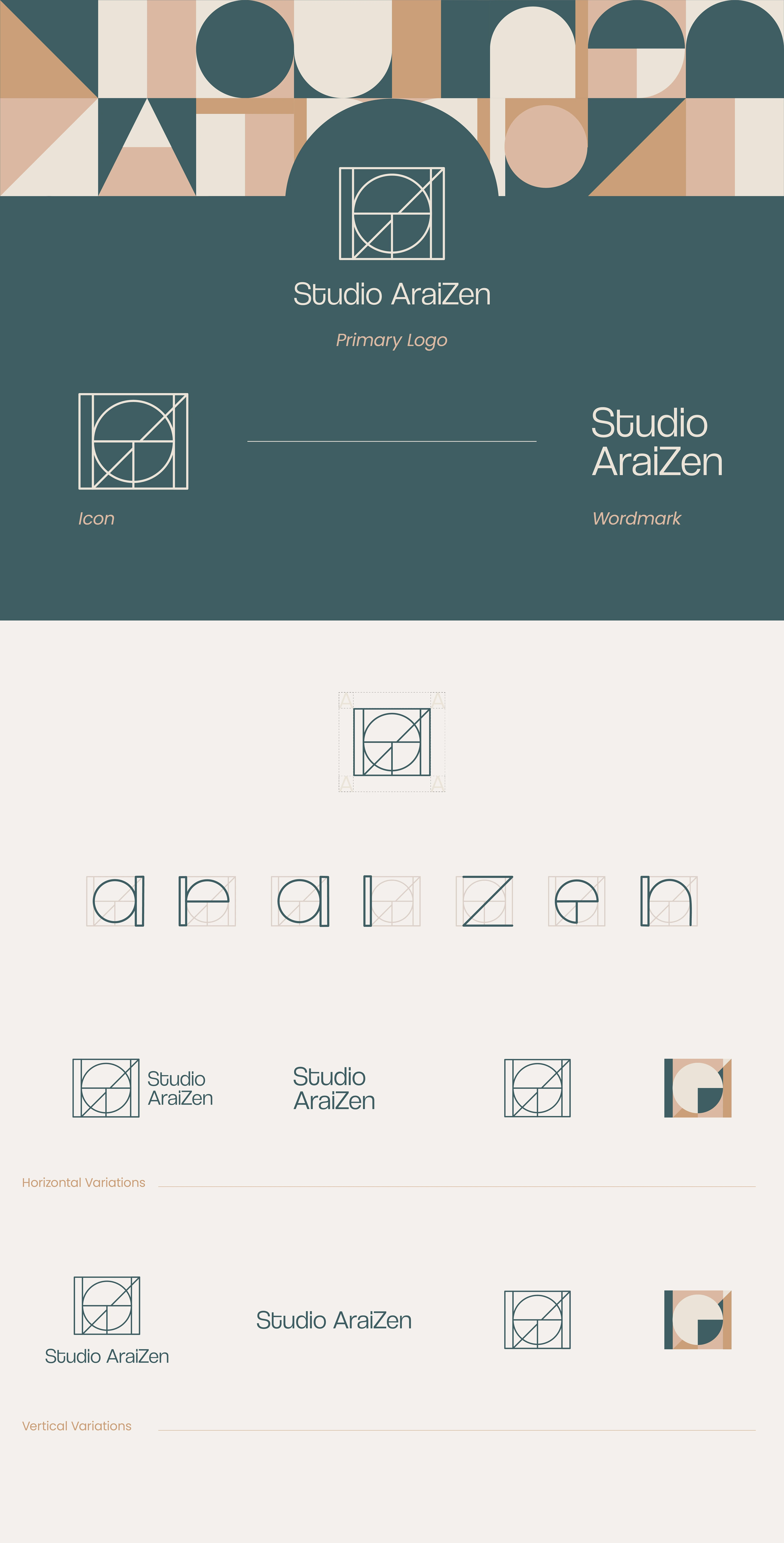

The Studio AraiZen logo creatively integrates the letters of the brand name into a geometric design through grid-play, symbolizing a strong foundation essential for homes. Triangular shapes represent excellence and change, core principles of the brand. This design choice also reflects the importance of geometry in space design, offering a visually appealing and innovative touch to the brand identity.
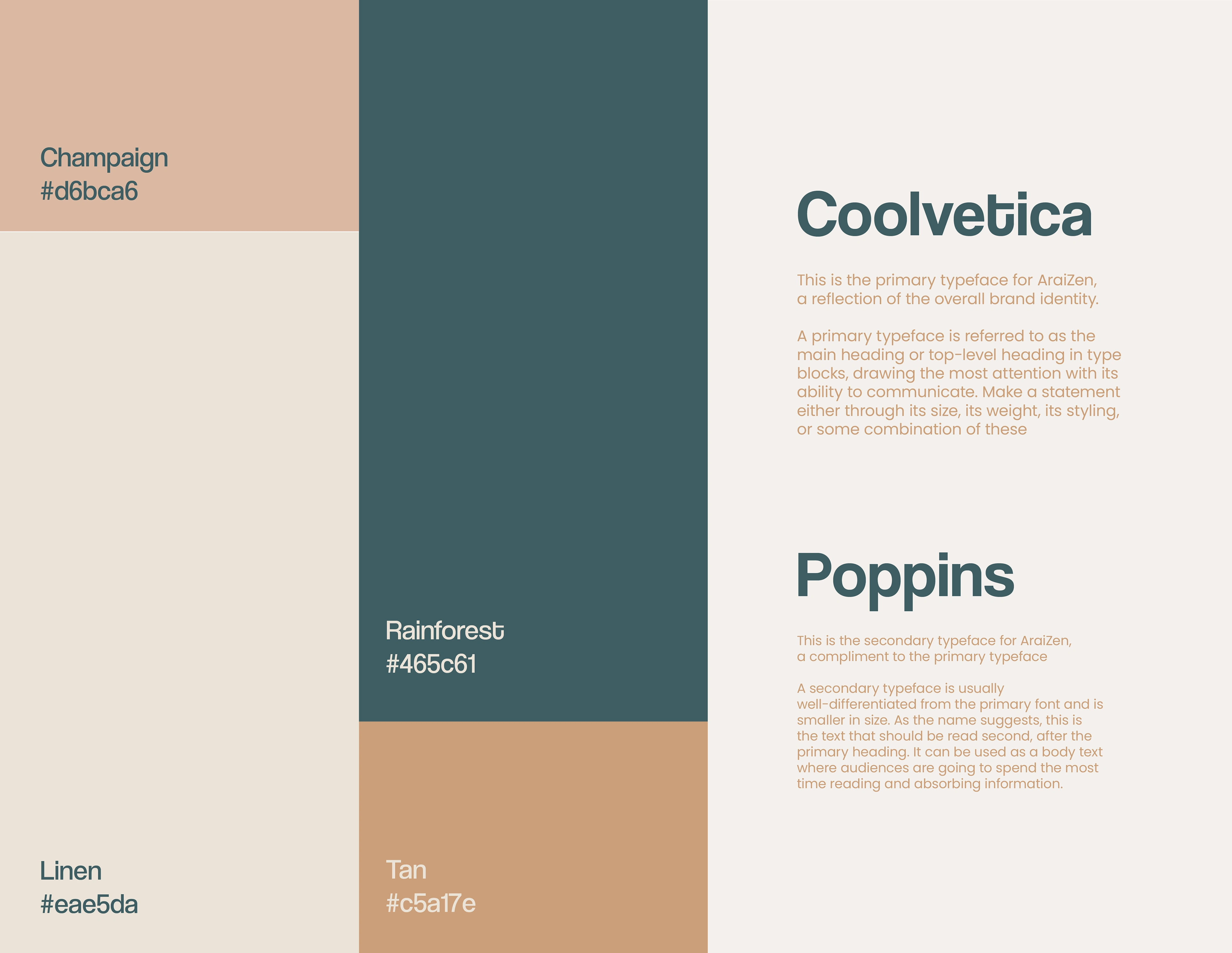
The curated palette creates a seamless fusion of aesthetics and psychology. Linen, a soft and neutral tone, forms the foundational canvas representing limitless possibilities. It blends effortlessly with Rainforest, a deep and tranquil green, instilling sophistication and trust. Champagne's gentle rose adds warmth, while Tan's earthy tones infuse natural harmony and sustainability.
Collectively, these colors evoke a harmonious balance, instilling trust, comfort, sophistication, and warmth. Reflecting the essence of our interior design expertise, they aim to evoke these emotions within our clients' living spaces.
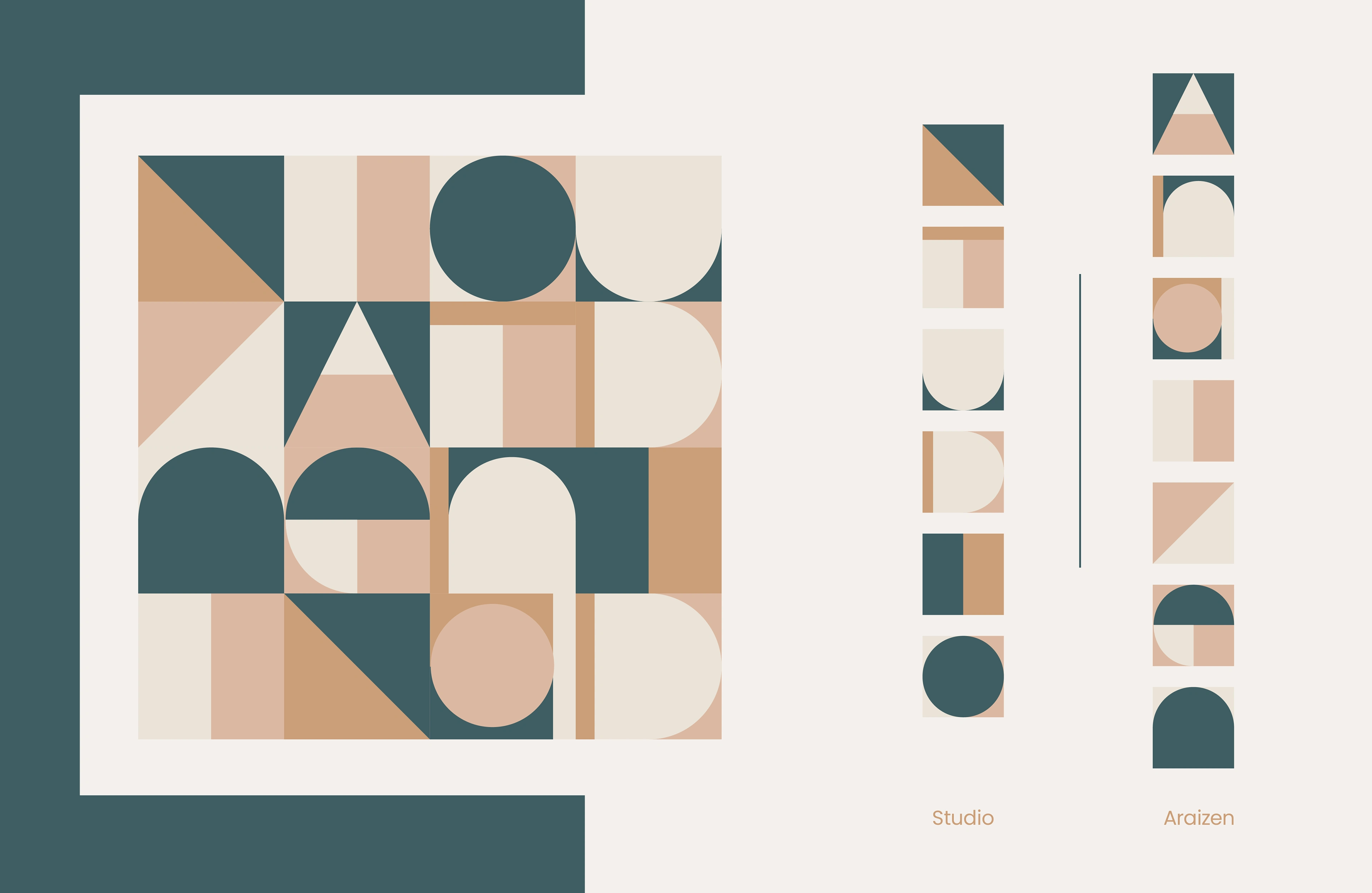
The brand name has been transformed into an illustrative pattern, meticulously crafted into a geometric form that embodies its design ethos. This intricate pattern weaves together the letters, creating a visually captivating and dynamic brand asset. Its geometric precision conveys order, balance, and attention to detail fundamental to the design philosophy of the studio. This distinctive pattern serves as the visual signature, encapsulating the essence of the design studio.
Like this project
Posted Feb 24, 2024
Brand Design for AraiZen, an interior design studio
