Built with Framer
Tech Hardware E-Commerce Website Revamp: Blok
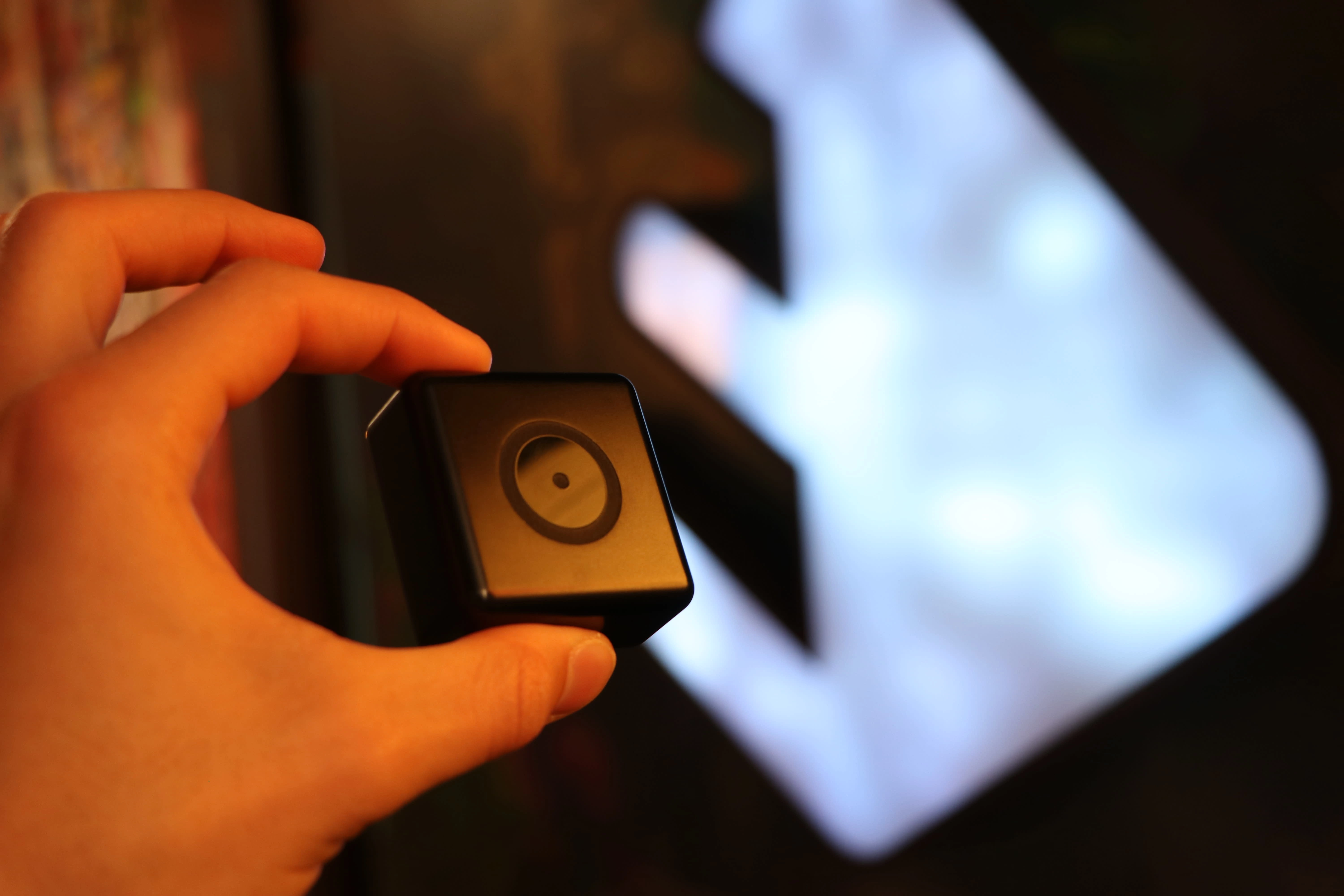
Blok: The device that helps block distractions from your phone
Blok, a San Francisco-based startup, helps people reclaim their time by blocking distracting apps on their phones. Blok is more than just a gadget; it’s a lifestyle tool that helps people take control of their digital lives and focus on the present moment.
But, their website was a big blocker for business growth.
Problem: A website that didn't reflect product value and lacked functional e-commerce integration
Before the redesign, Blok's website didn't live up to the company's vision. Lacking in branding, storytelling, and proper e-commerce (Shopify) functionality, the website was a major roadblock to the company's growth.
The Website Before
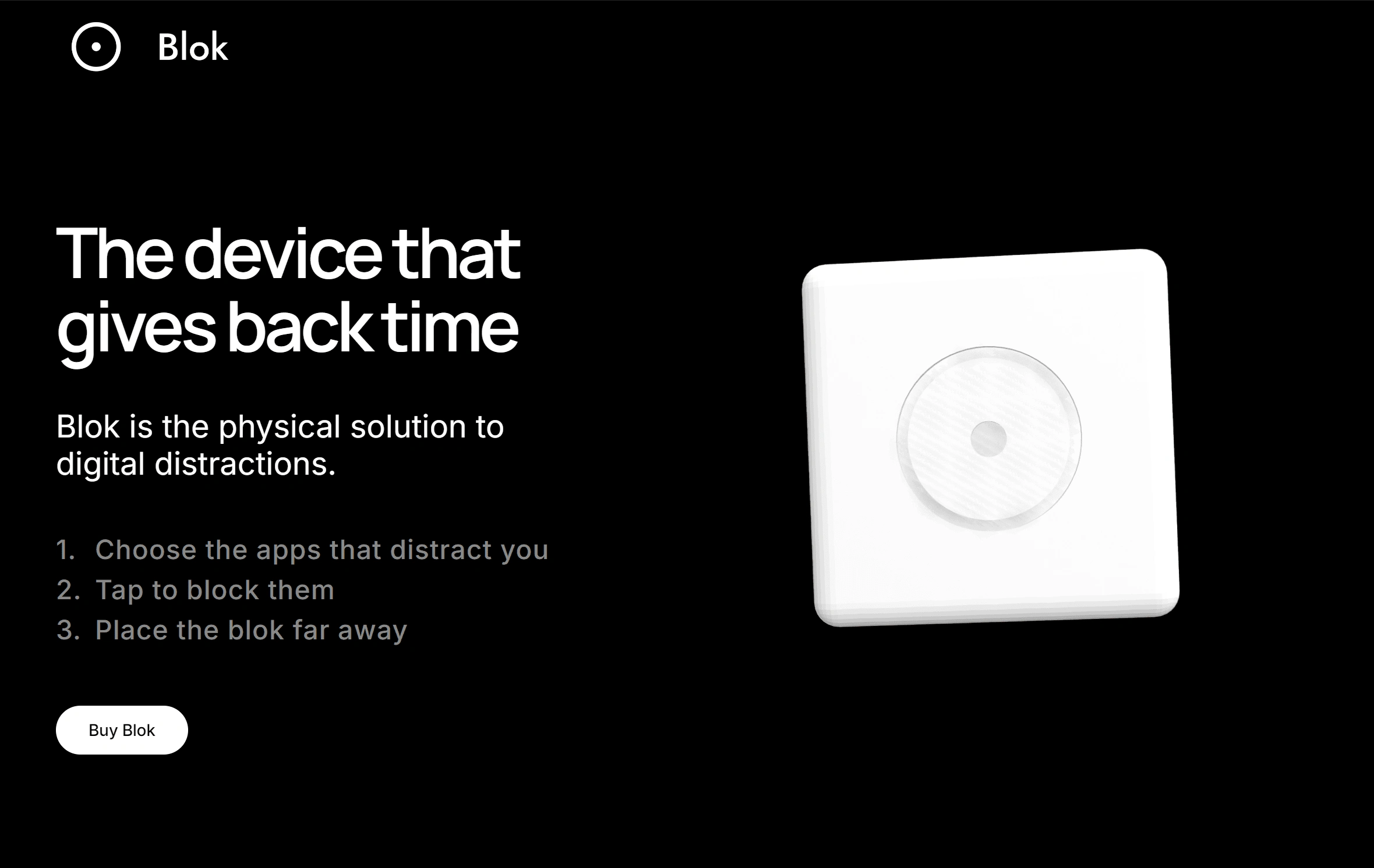
Existing website that lacked strong brand identity and Shopify integration
Daniel Belfort, Blok's founder & CEO, felt the disconnect between his vision and the execution:
The current website looks bad and unpolished. I don't even want to invest in ads because I know the site just won't convert visitors to customers.
Without a strong visual identity or seamless Shopify integration, Blok faced challenges in scaling. Post-purchase issues created friction for the business, and the site’s design didn’t inspire the confidence needed to invest in ads or drive traffic.
The result? Lost sales opportunities and the CEO reluctant to promote the product, knowing the user experience wasn’t good enough to convert visitors into customers.
Solution: A complete visual and functional website transformation to reflect Blok's elevated vision
Blok needed an e-commerce website that aligns with the premium brand vision and drives sales.
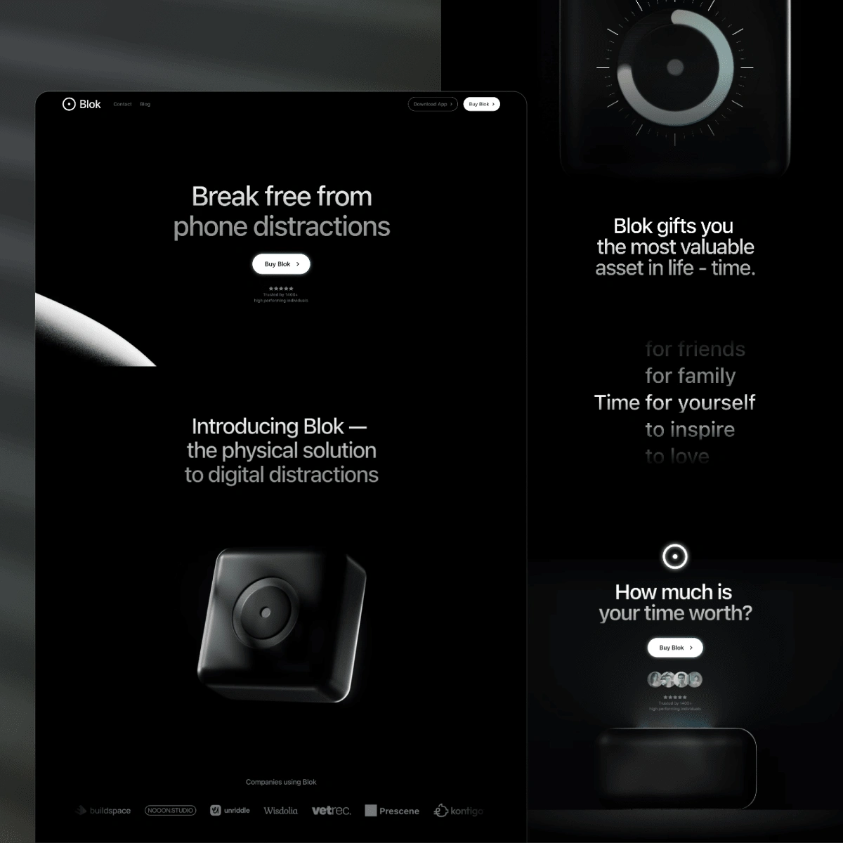
Revamped website
Project Team
Miya Zhang from Sweeter Design led the web development(Framer), e-commerce integration(Shopify), interaction effects/design, and website copy. We partnered with the talented Ben Woodring (web design and branding) and Tino Zhabinskiy (3D renderings and animations) to make the website come to life.
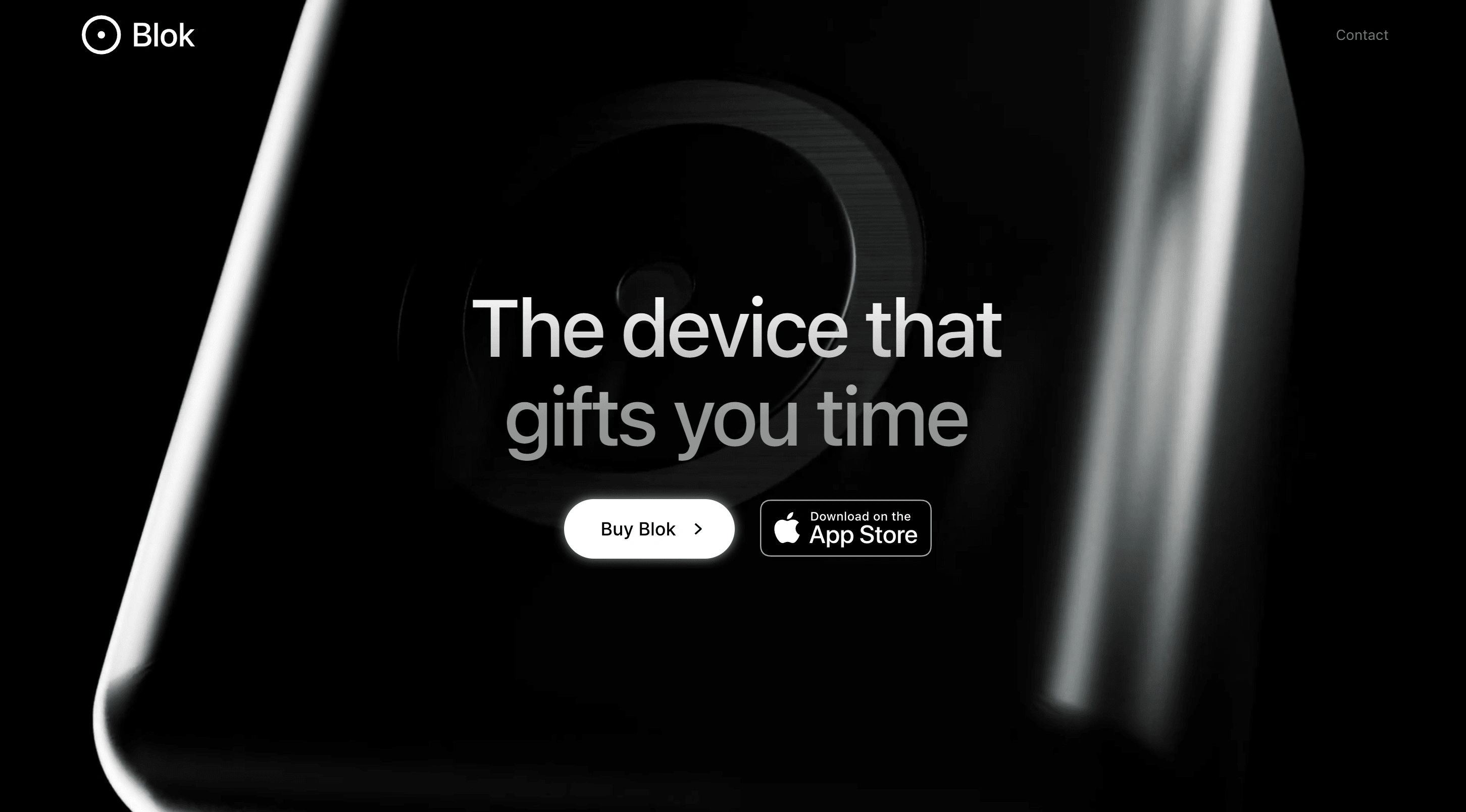
Hero Section with 3D rendered video
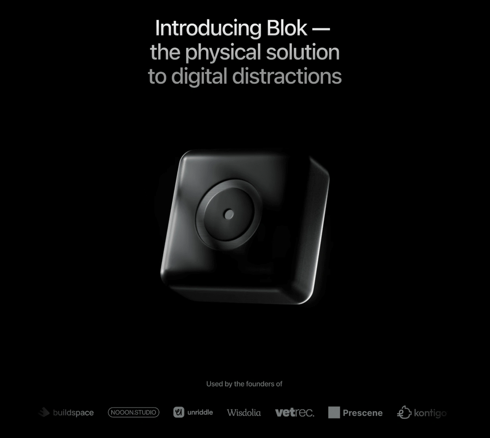
Introducing Blok & social proof - The live site has scroll effects and animated components
Redesign Highlights:
Hero section with 3D renderings: stunning hero video draws users in, showcasing the sleekness of the product
Powerful brand voice: Through carefully crafted copy and animations, the site communicates Blok's values clearly - helping visitors connect emotionally with the brand.
Dynamic scroll effects: Every interaction on the site was designed to give visitors a sense of fluidity, and polished experience to reflect Blok's sleek brand.
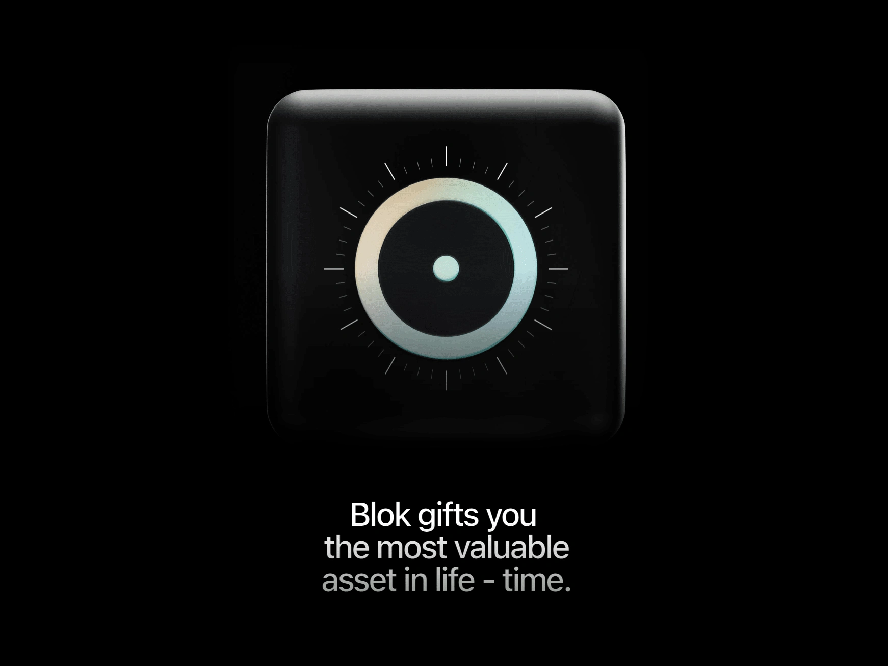
Powerful brand voice with animated scroll effects on the live website
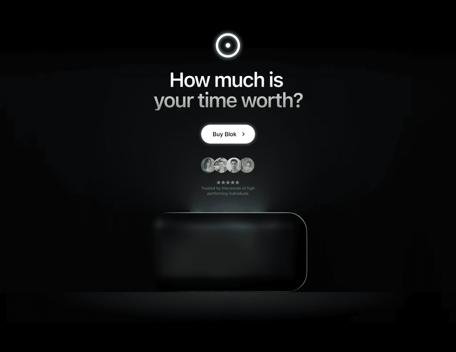
Mid-section CTA that entices viewers to buy blok - The live site contains scroll effects
Functional Highlights:
Seamless Shopify Checkout Integration: By integrating Shopify with Framer, we streamlined Blok’s post-purchase operations, simplifying order management and enhancing the overall customer experience. Additionally, we implemented quantity-based discounts to encourage higher cart values and drive sales growth.
CMS for Blog & Case Studies: We implemented a fully customizable content management system (CMS), allowing Blok to easily publish blogs and case studies without the need to build new web pages from scratch. This empowers the team to keep the site updated with fresh content, improving SEO and engagement.
Contact Form: A user-friendly contact form enables potential customers and leads to easily reach out to the Blok team via email, ensuring seamless communication and supporting lead generation efforts.
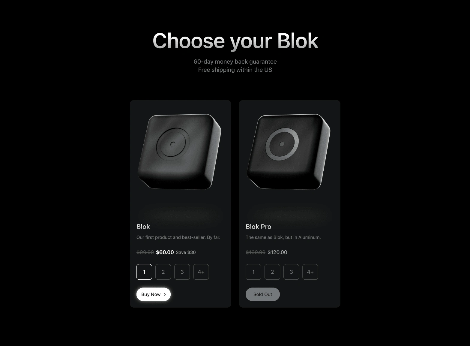
"Choose your Blok" copy to shift viewers' mindset from buy or not to which one to buy.
Checkout is integrated with Shopify with quantity-based discounts.
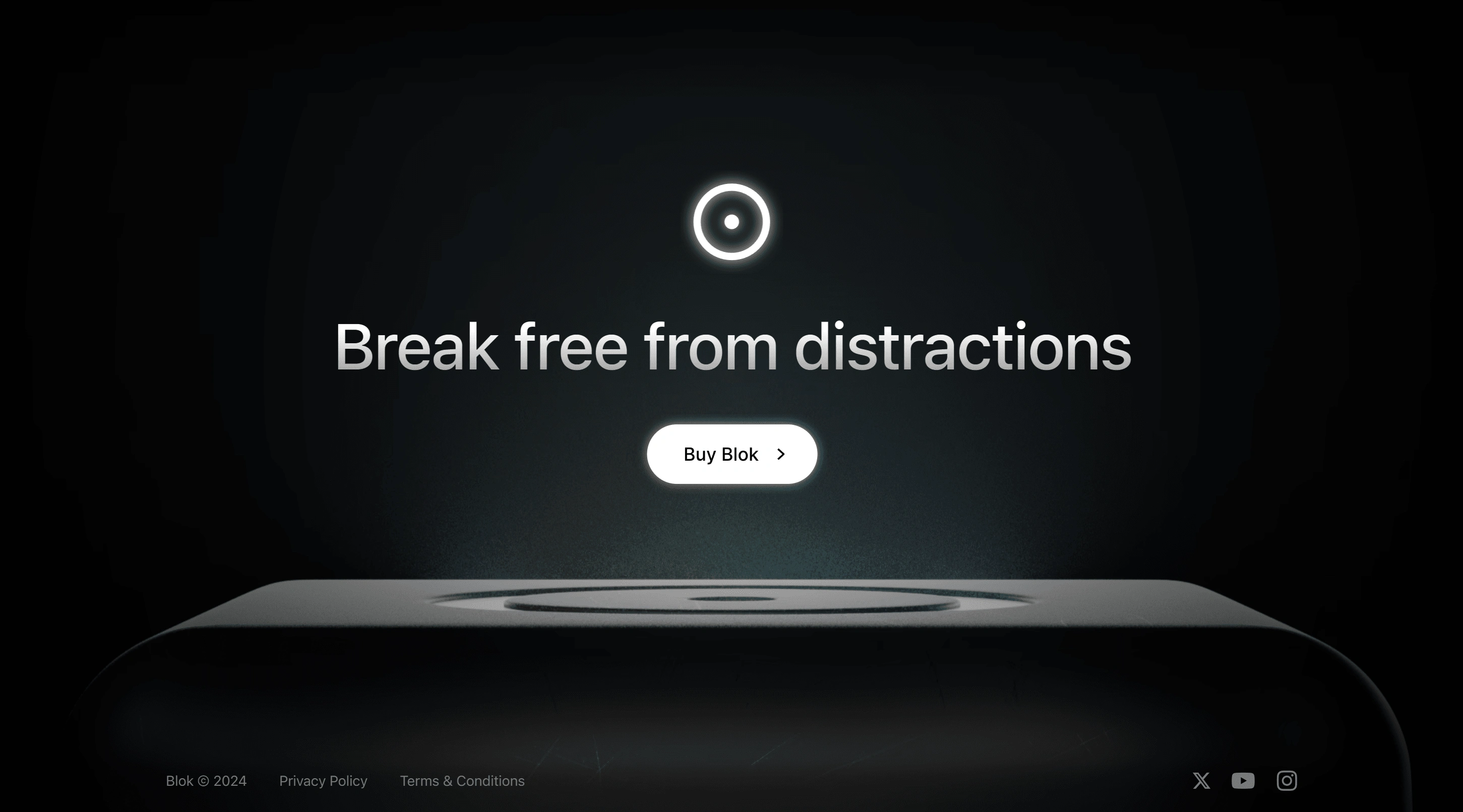
Beautiful footer to leave a lasting impression
Responsive design across devices
Whether users visit the site on mobile, tablet, or desktop, the experience remains fluid, polished, and responsive, making Blok accessible anywhere, anytime.
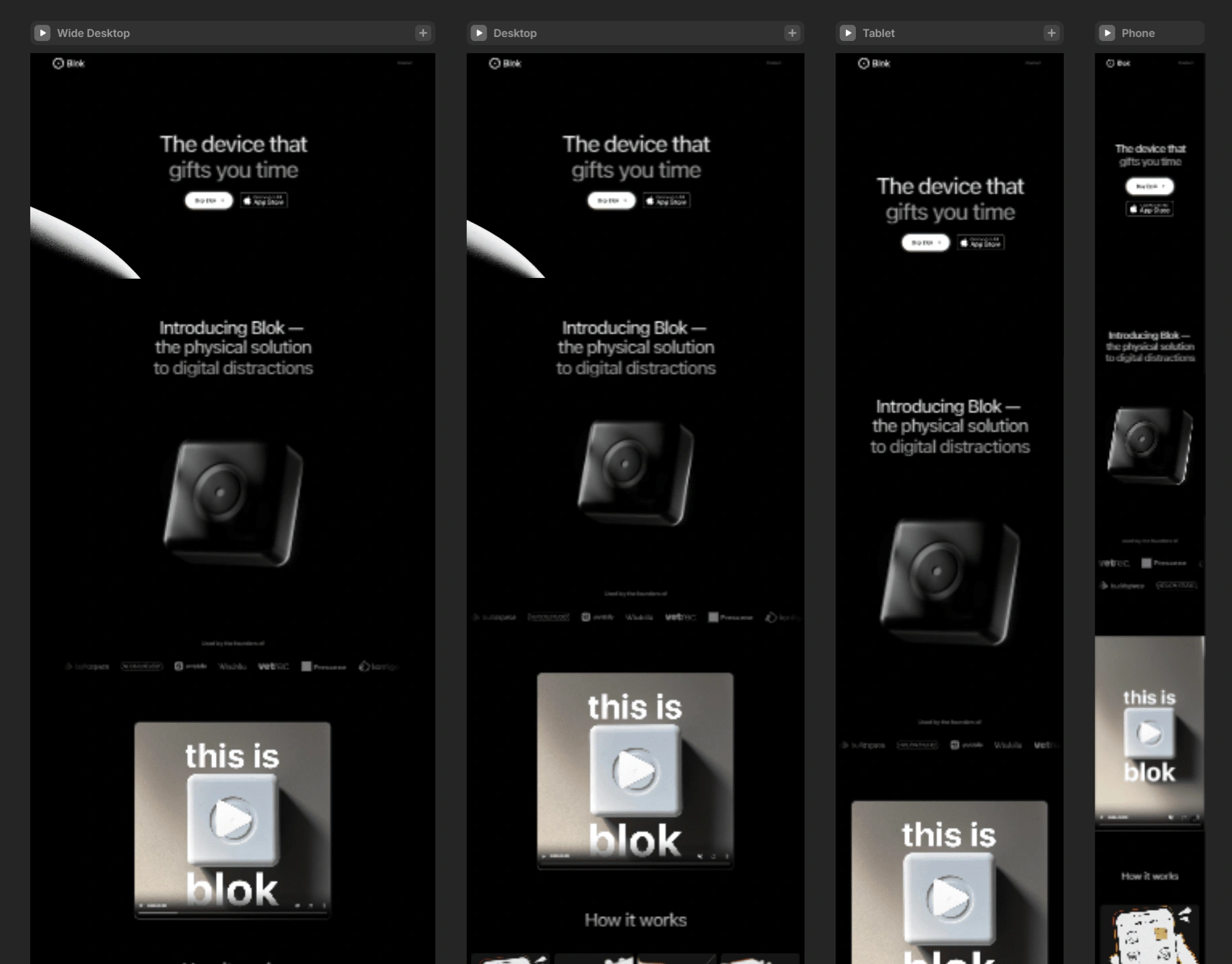
Fully responsive to different screen sizes
Result: A sleek, e-commerce website that increased sale conversions by +70%
The revamped website aligned with the premium brand vision and ultimately drove sales.
Daniel (Founder & CEO of Blok) is thrilled with the result:
When I show off the new site, I feel proud. It's beyond what I had envisioned - and more importantly it drives sales. Since the revamp, our sale conversions increased by over 70% and the first month of the new site launch was the highest sales month in Blok's history.
See the live website with animations and dynamic scroll effects below.
Disclaimer: since the project hand-off, the company has made changes to the website that may not reflect the original redesign in this case study.
Want to bring your website to the next level? Let's collaborate
Contact me and let's chat about how we can elevate your website.
Like this project
Posted Aug 4, 2024
Increased sales conversion by +70% by revamping the Blok e-commerce website with Framer web development and Shopify-integration.

