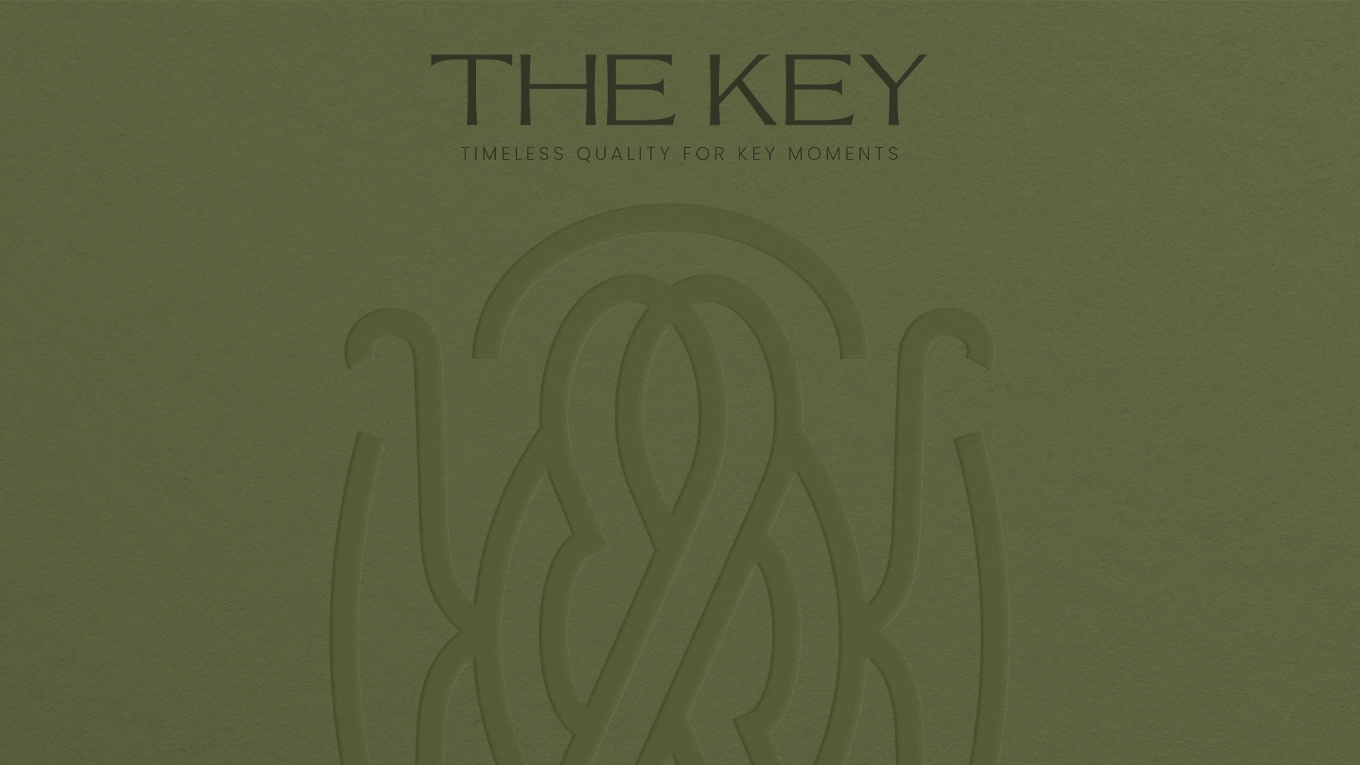
Brand Strategy and Visual Identity for The Key

Anna Gudvin


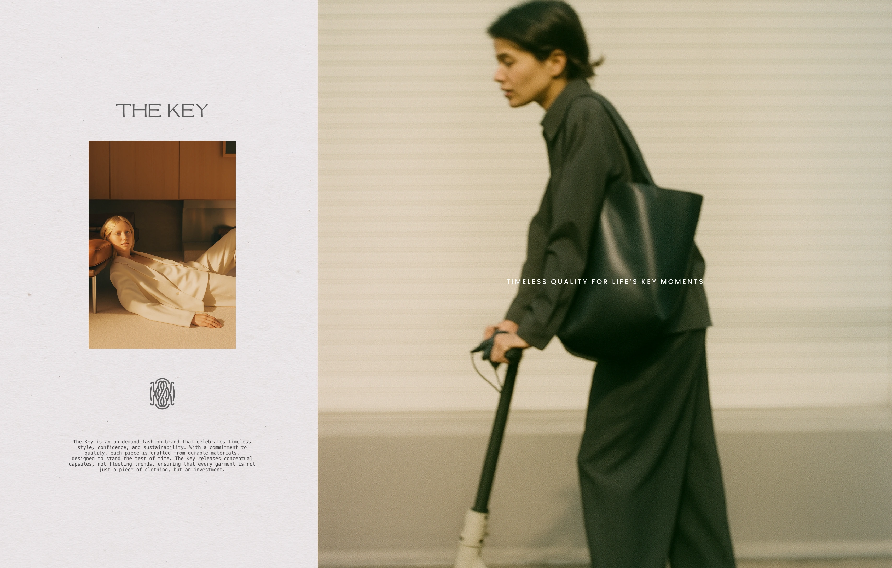
The Key is an on-demand fashion brand that celebrates timeless style, confidence, and sustainability. With a commitment to quality, each piece is crafted from durable materials,
designed to stand the test of time. The Key releases conceptual capsules, not fleeting trends, ensuring that every garment is not just a piece of clothing, but an investment.
Services:
- Brand Clarity Session
- New positioning development
- Visual Identity development
We began with a Brand Clarity Session, diving beneath the surface of the product to understand what truly lives at its core. Through guided exploration, we uncovered not just what the brand sells, but what it stands for.
Following this, we conducted in-depth research and mapped insights from the session. From this foundation, a new positioning began to emerge—rooted in meaning, memory, and material integrity.
At the heart of this repositioning was what we defined as the brand’s Ethical Insight:
*"Remember the sting of letting go of that skirt—This was my first date with the love of my life. Or the jacket that held a milestone—This is the one I wore the day I moved to a new city.
Clothing has the power to capture life’s most meaningful moments.
But when garments are made with poor quality, they can’t carry that meaning forward—no matter how much they meant to us."*
This insight became the emotional and ethical foundation for the brand’s new narrative—honouring clothing as vessels of memory, and quality as an act of care.
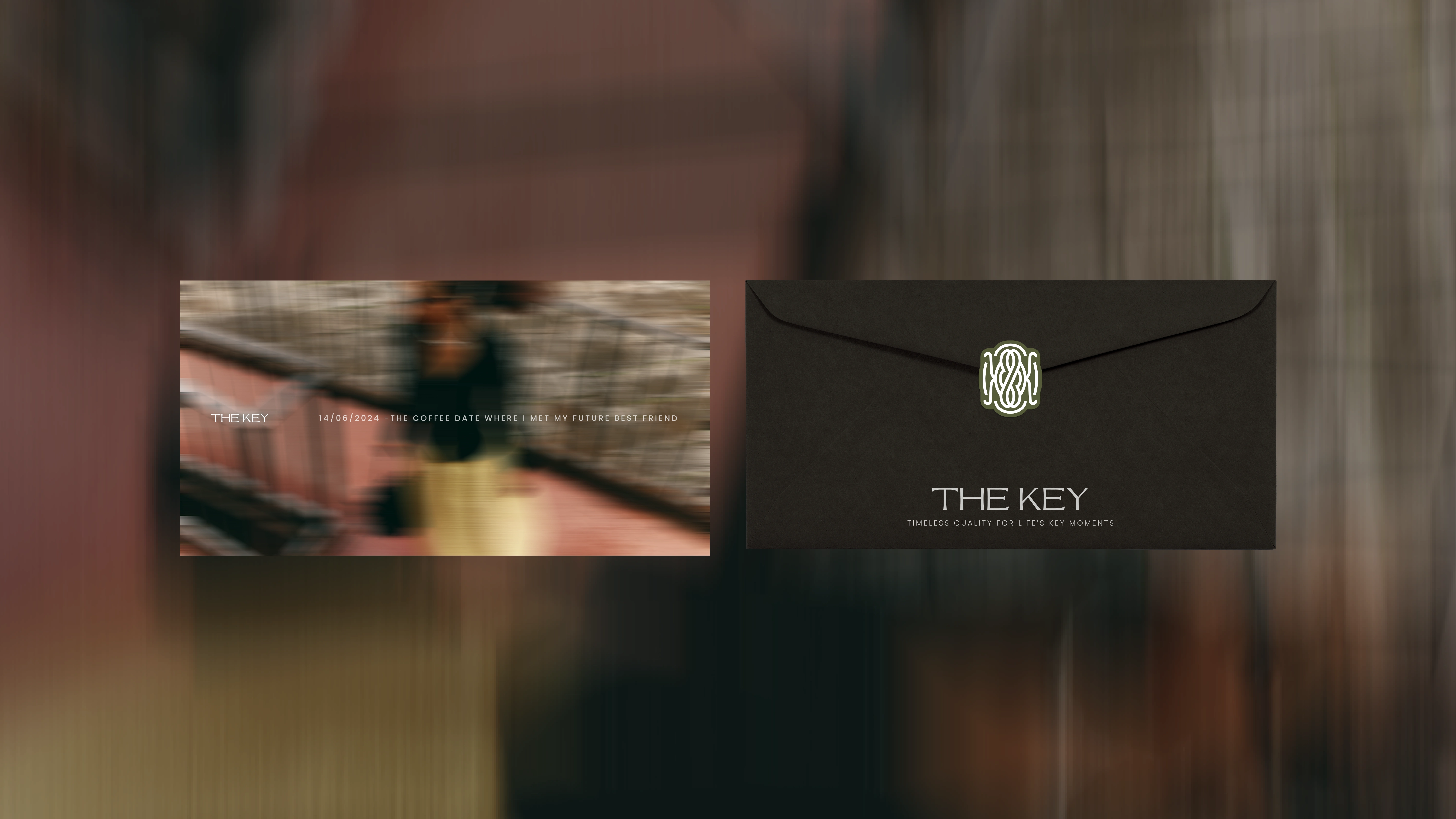
Envelope with a Card for Clients
From Ethical Insight to Identity
Following the discovery of the brand’s Ethical Insight—that clothing can hold life’s most meaningful memories, but only if made with the quality to last—we began shaping how this could live within the brand’s identity.
As we explored expressions of this idea, a story surfaced.
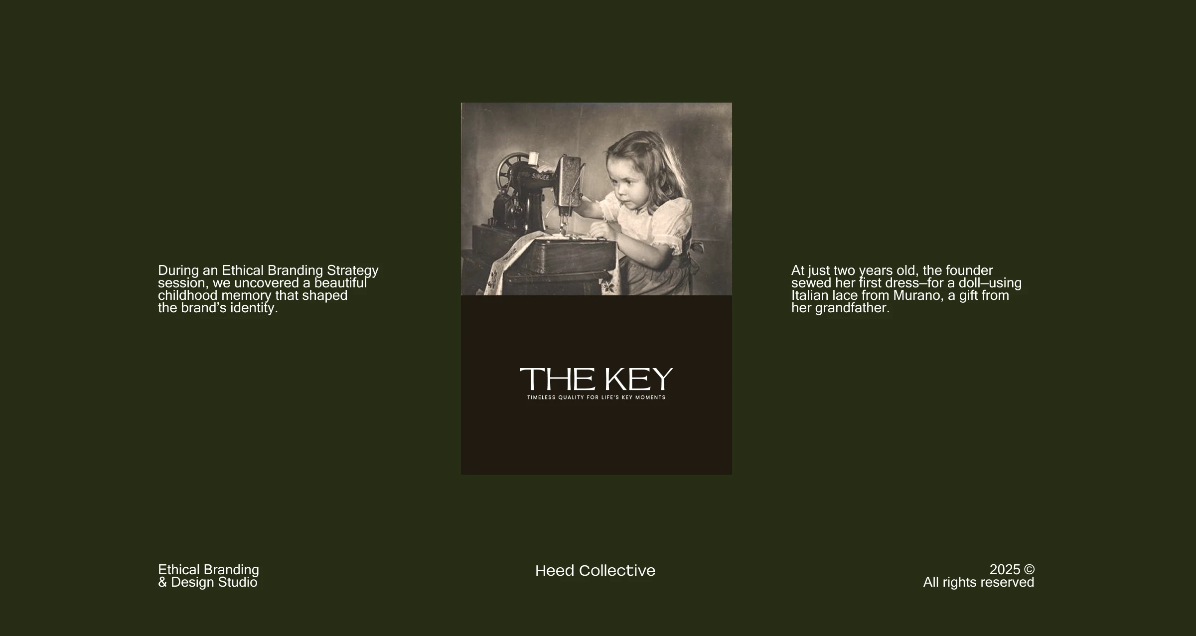
During an Brand Clarity session, the founder shared a memory:
At just two years old, she sewed her first dress—for a doll—using fine Italian lace gifted by her grandfather.
That moment, stitched into her earliest experience of creation, became the emotional thread that shaped the brand.
This story became more than a memory—it became a metaphor.
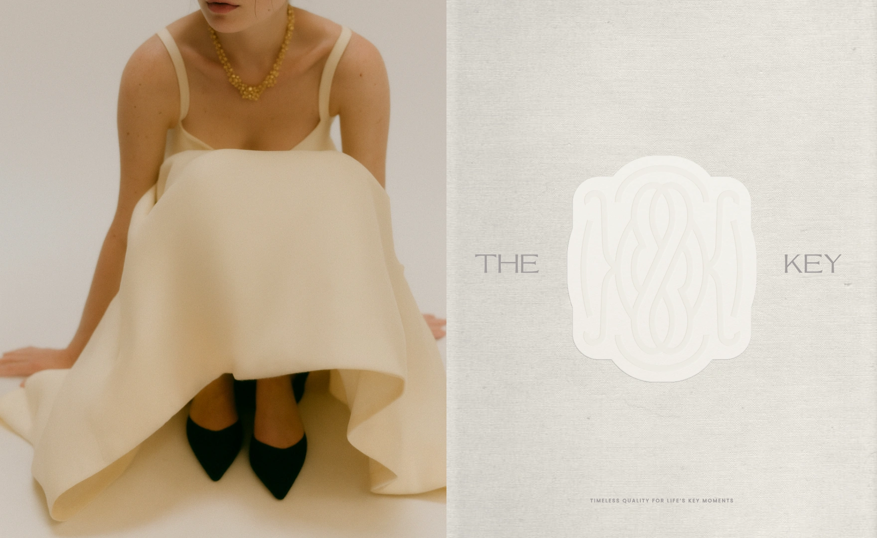
Inspired by the delicacy and symbolism of lace, we designed a logomark that wove together:
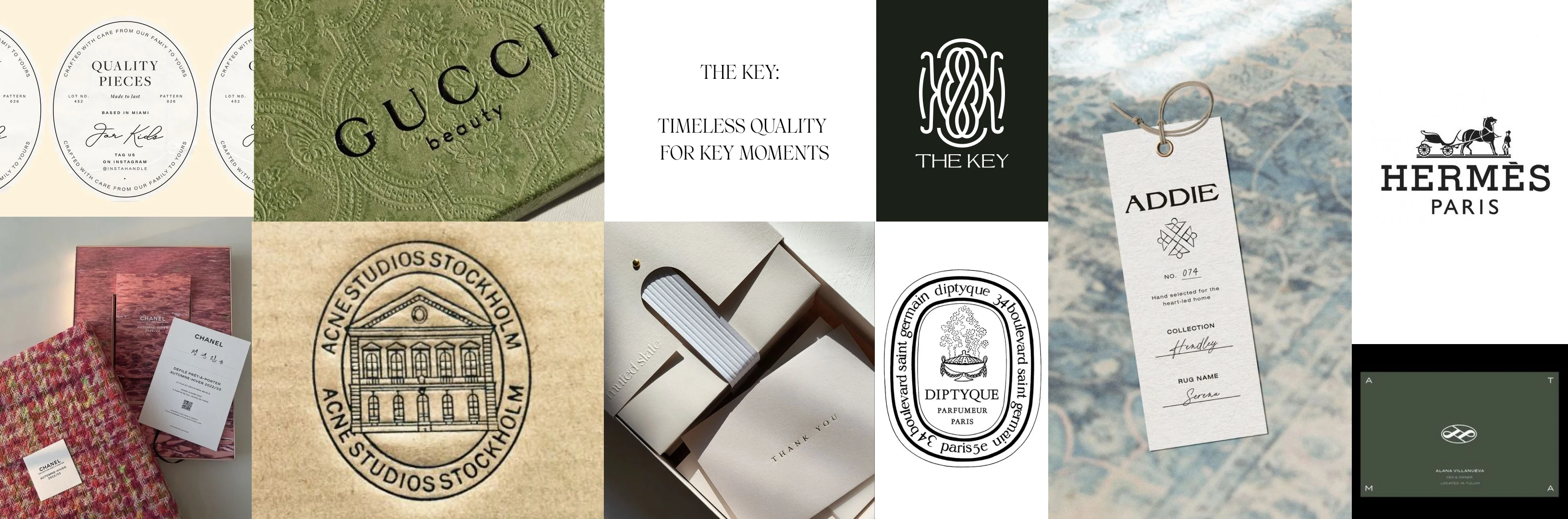
Creative Direction: Mood and Feel Board
Founder story
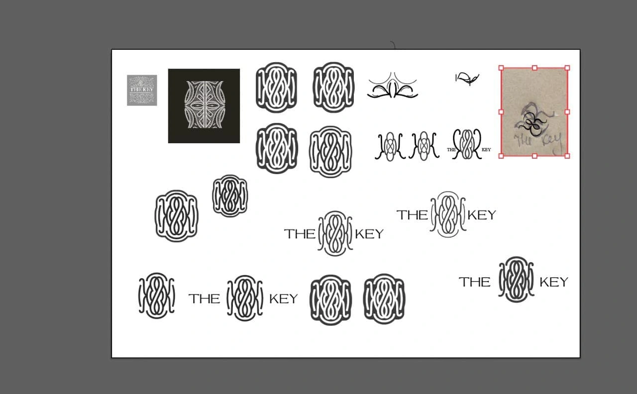
Logo Sketches
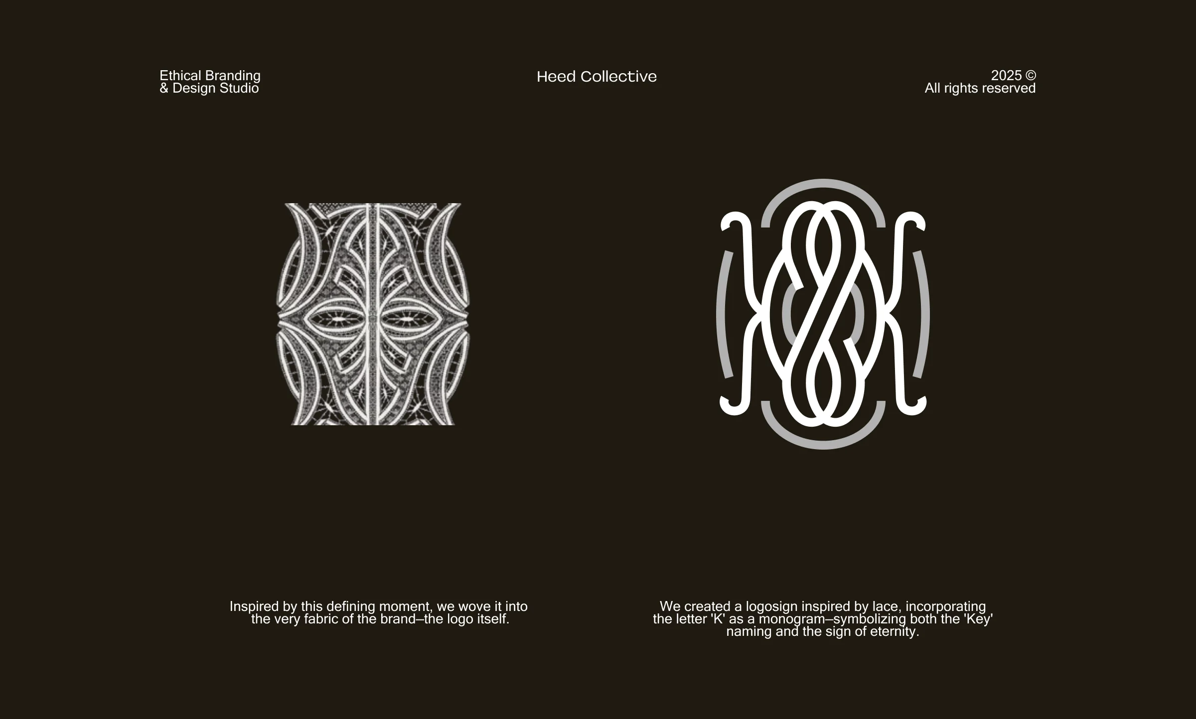
Logo Sign Meaning
Positioning
Follow me @annagudvin and the team I lead @heedcollective on Instagram for more.
To collaborate, fill out the inquiry form on our website.
Like this project
Posted Jun 12, 2025
Developed new brand positioning and visual identity for The Key on-demand sustainable fashion brand, focusing on quality and memory.
Likes
7
Views
35
Clients
The Key


DW.A ZERO Brand Identity and Web Design
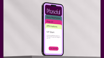
Brand Identity Phaseful
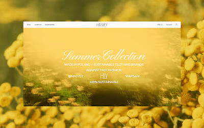
Sustainable Clothing Brand Halvey

spaceOs - Proptech Saas