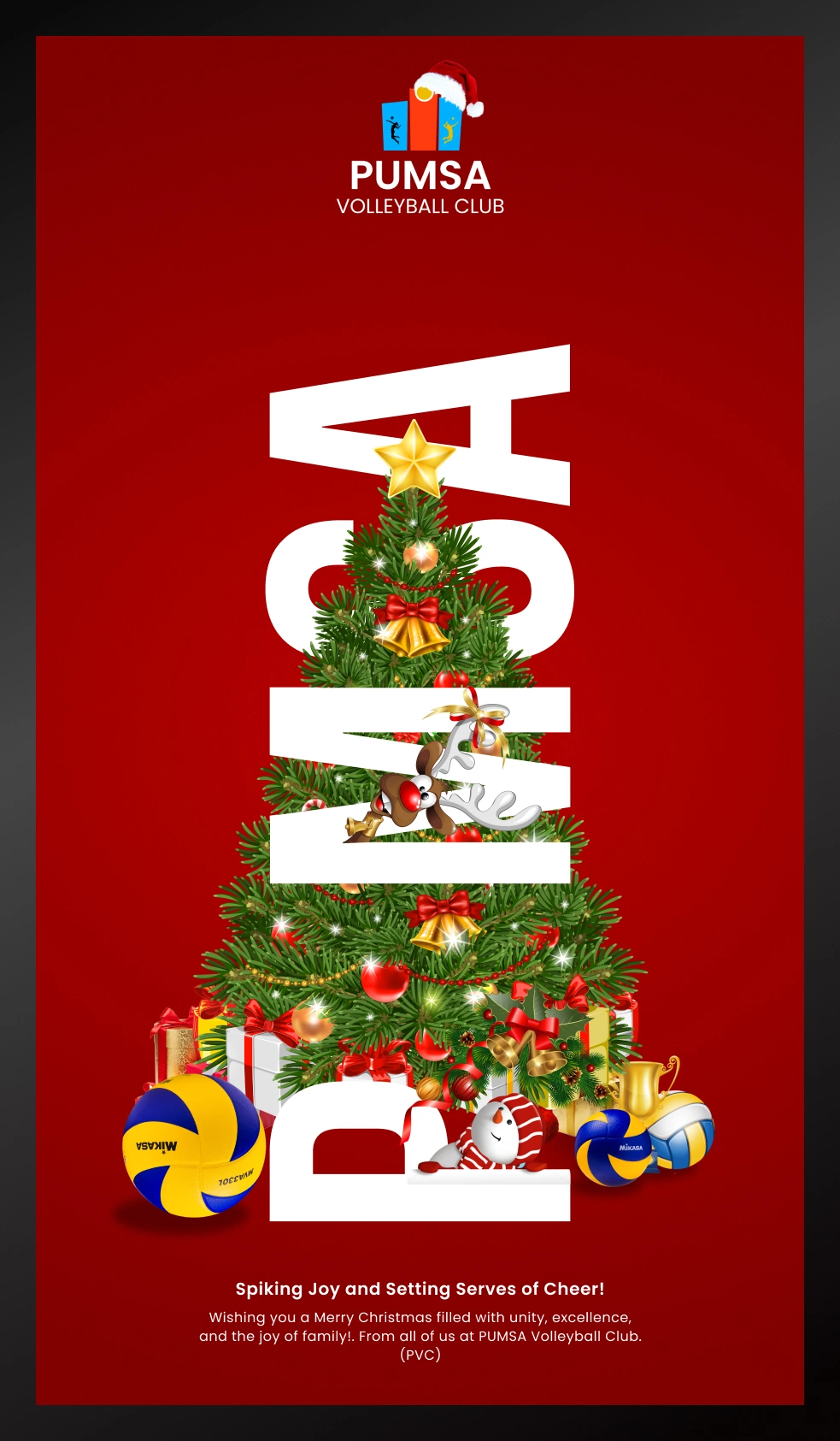
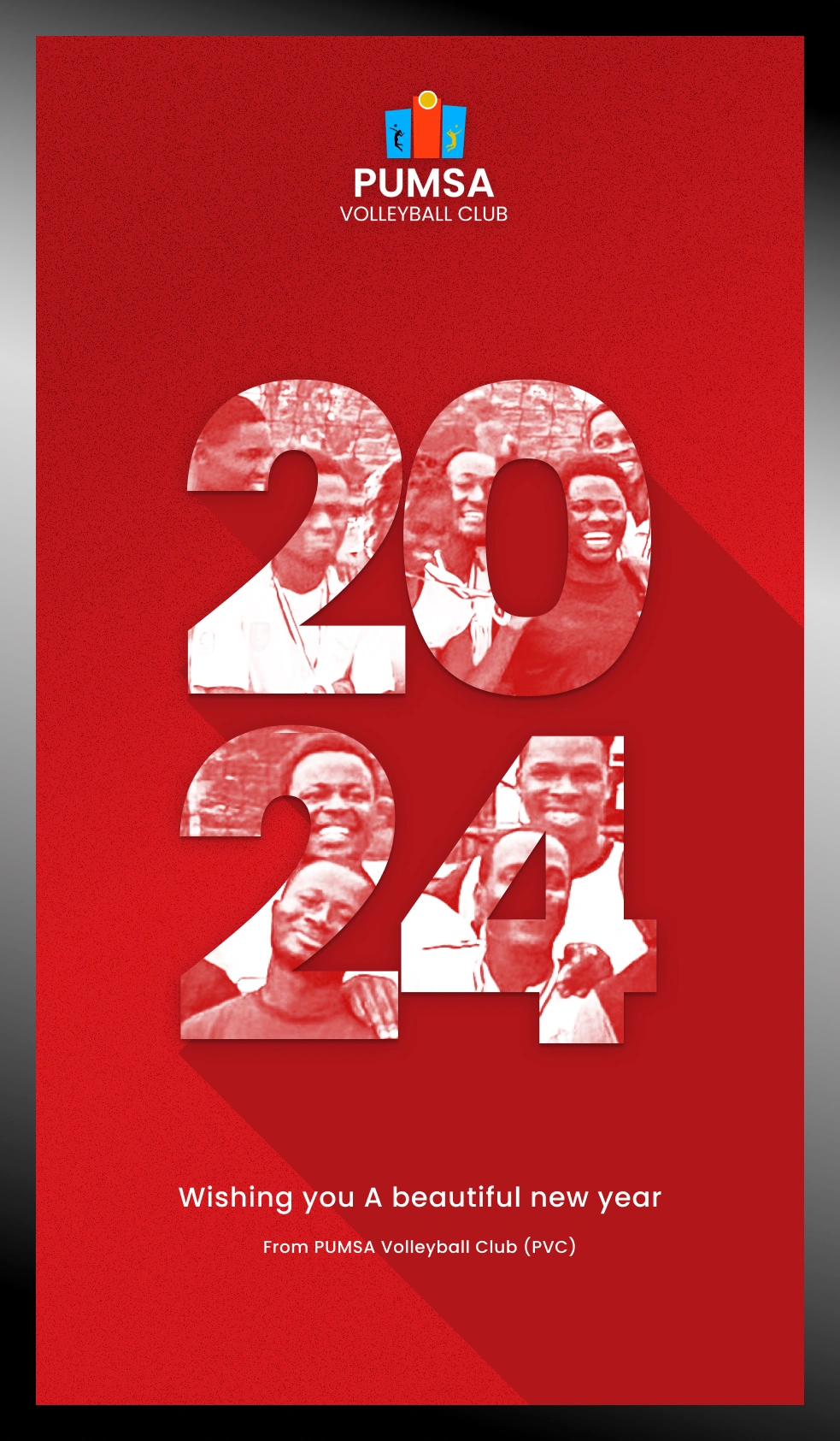
Brand Identity Design - PUMSA Volleyball Club
Onyekachukwu Adeshina

Elevating the essence of sportsmanship and academic excellence, the brand identity design for the Port Harcourt University Medical School (PUMSA) Volleyball Club encapsulates the vibrancy, unity, and commitment that define this dynamic community.
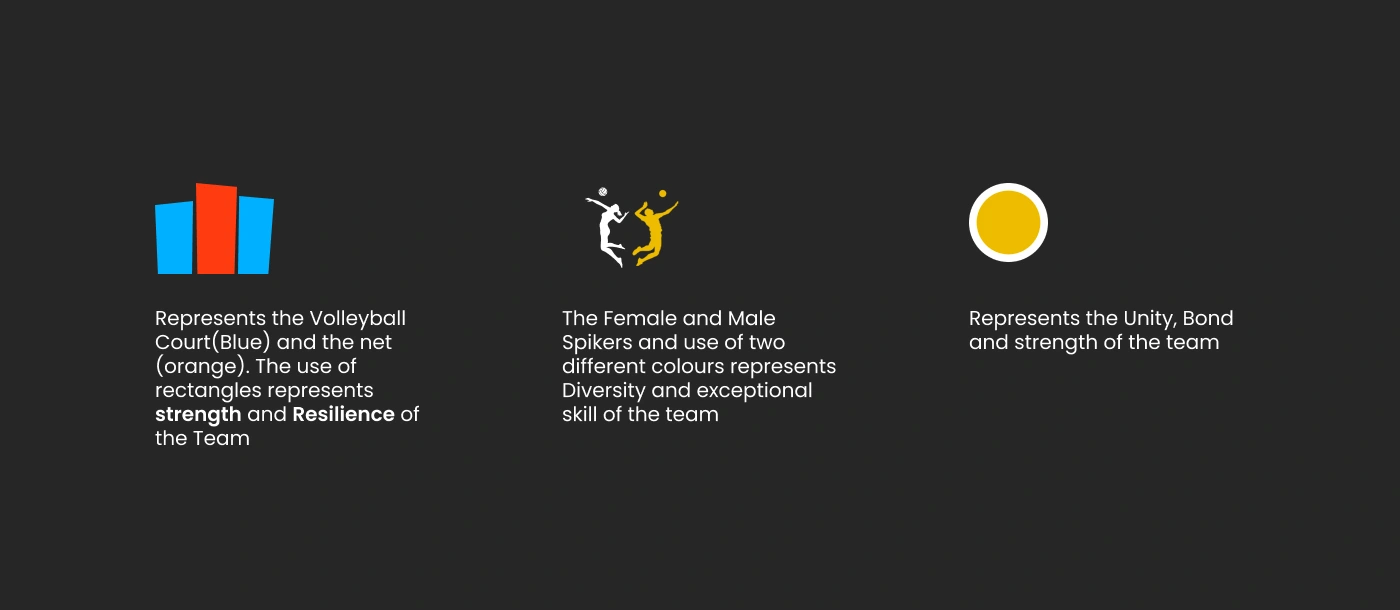
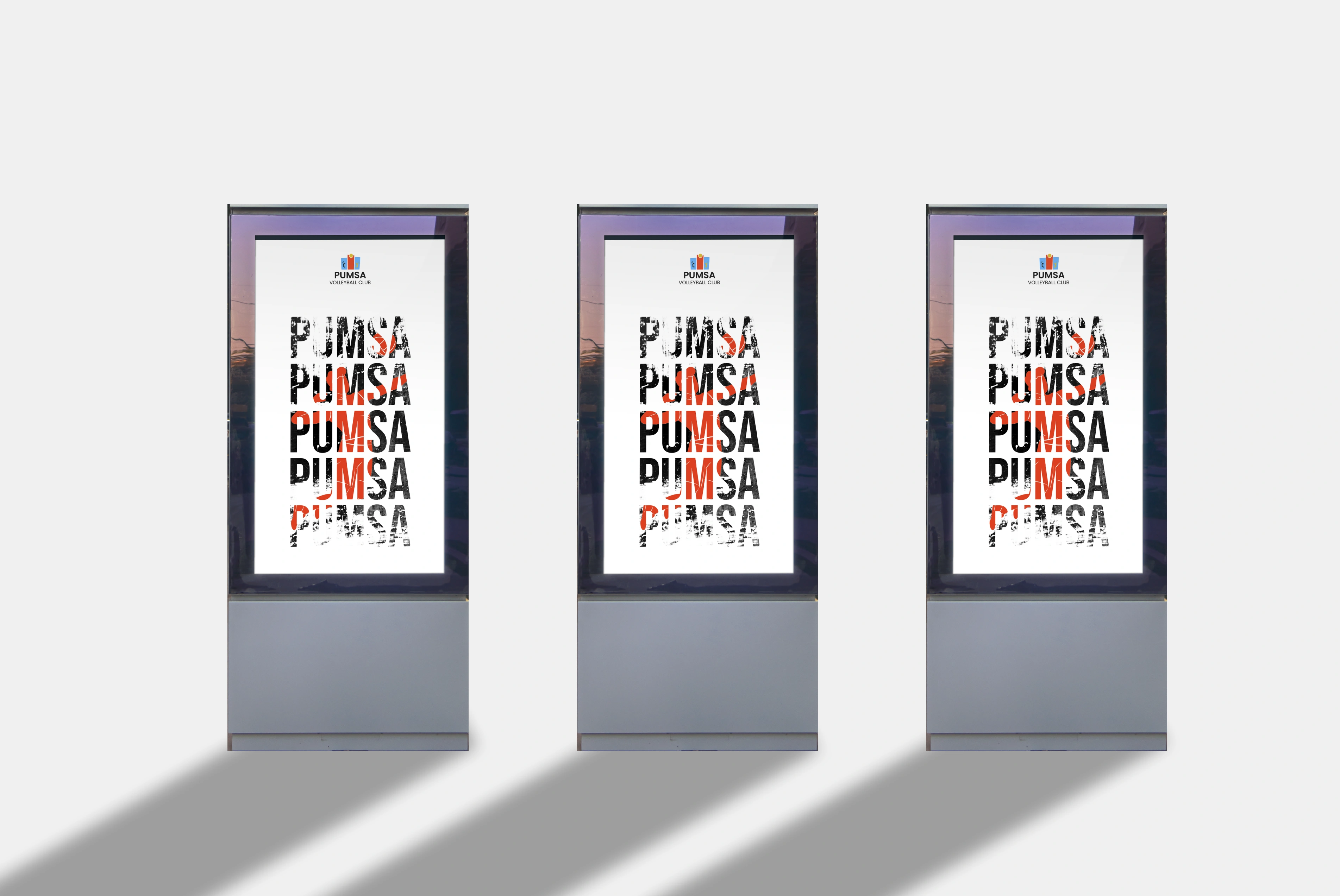
Logo: The logo is a fusion of symbolic and dynamic volleyball elements, reinforcing the club's unique identity within the university.
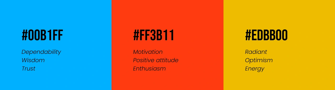
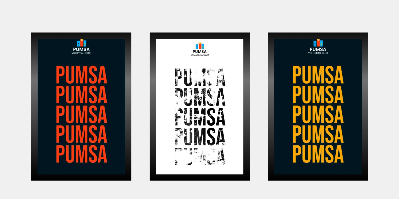
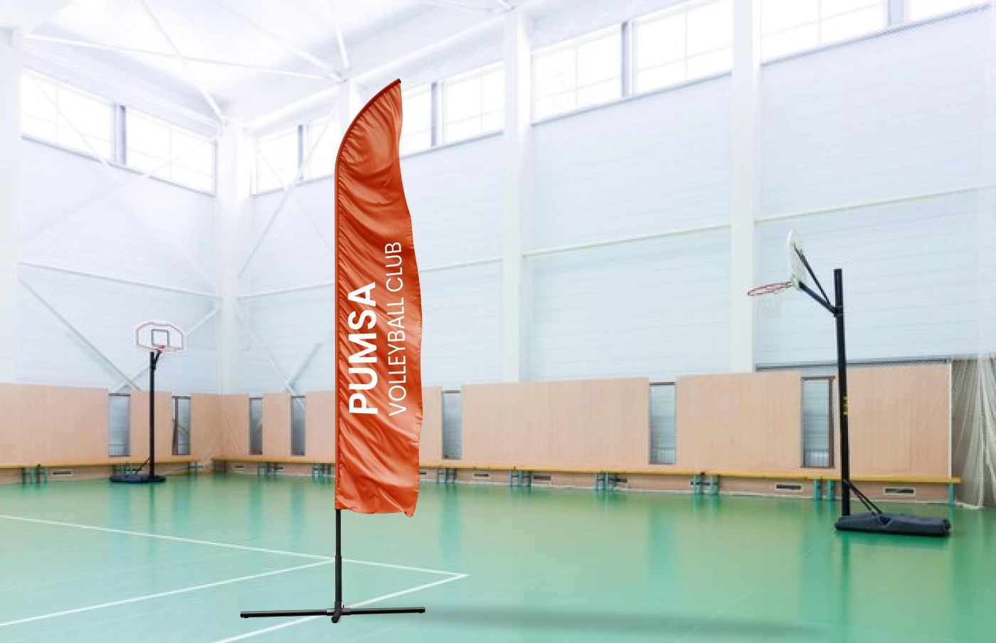
Color Palette: Drawing inspiration from the university's colors as well as bold colours, the palette infuses energy and professionalism. Deep blues evoke a sense of trust and reliability, while vibrant orange accents convey the club's passion and determination.
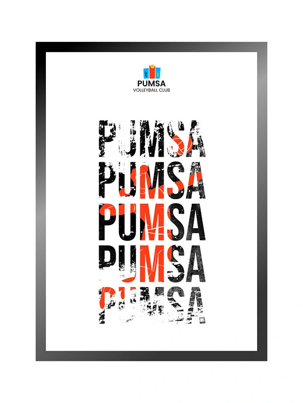
Typography: Clean and modern typography reflects the club's forward-thinking approach. The chosen fonts strike a balance between professionalism and approachability, capturing the essence of the club's diverse and talented members.
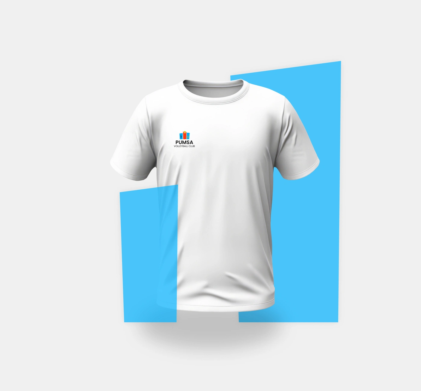
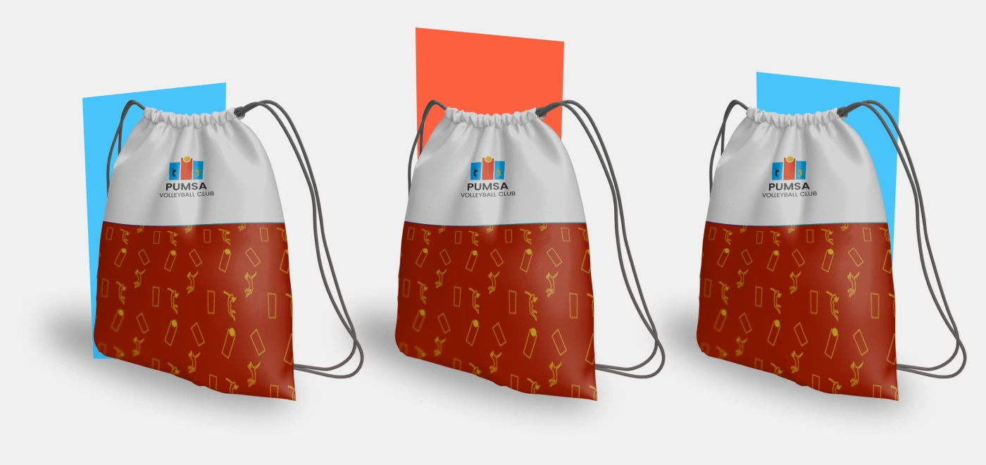
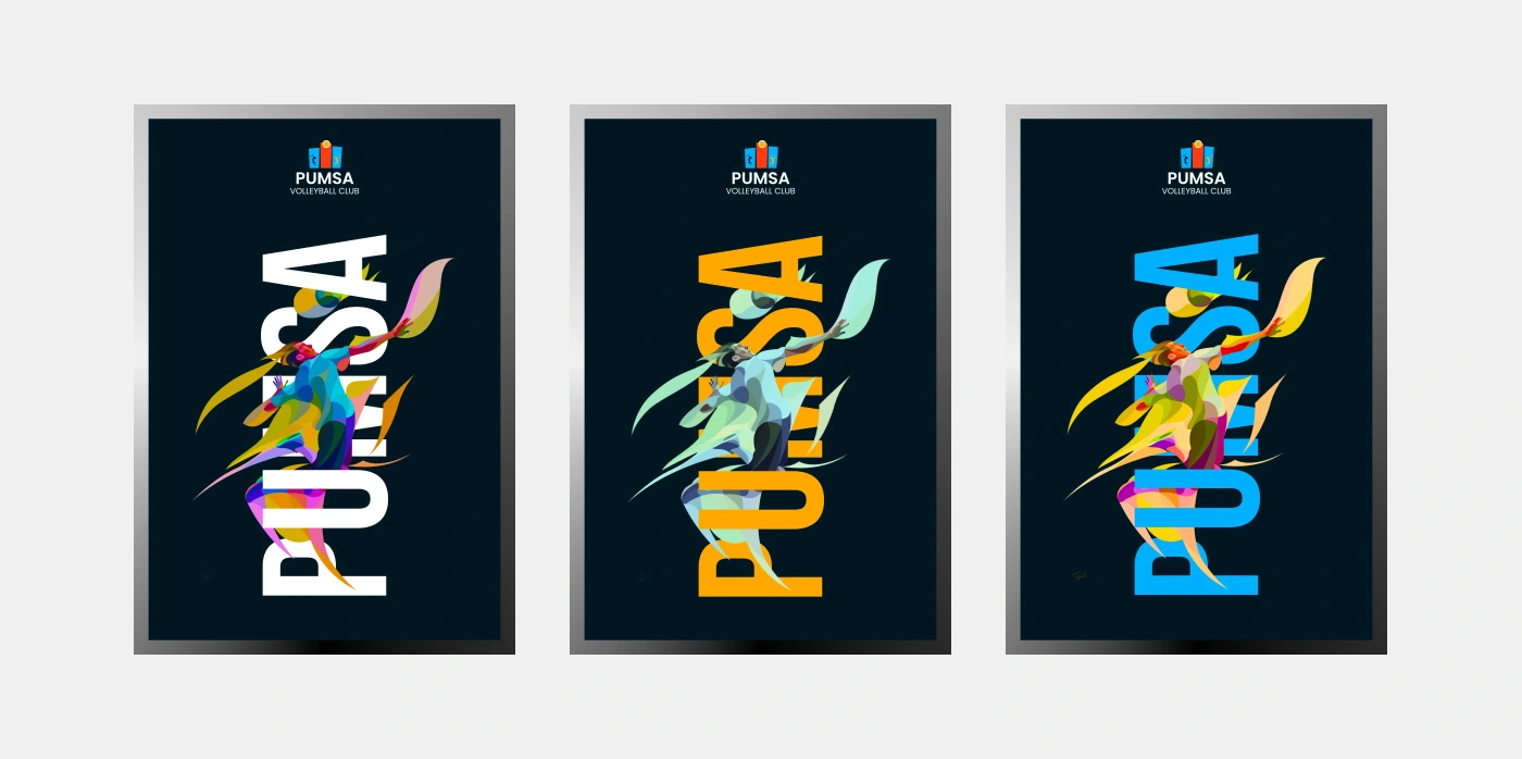
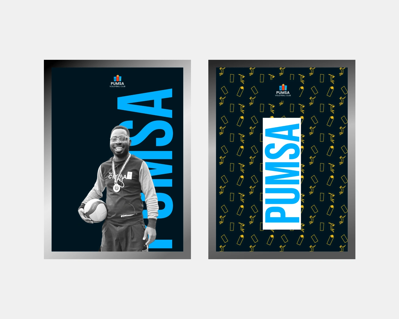
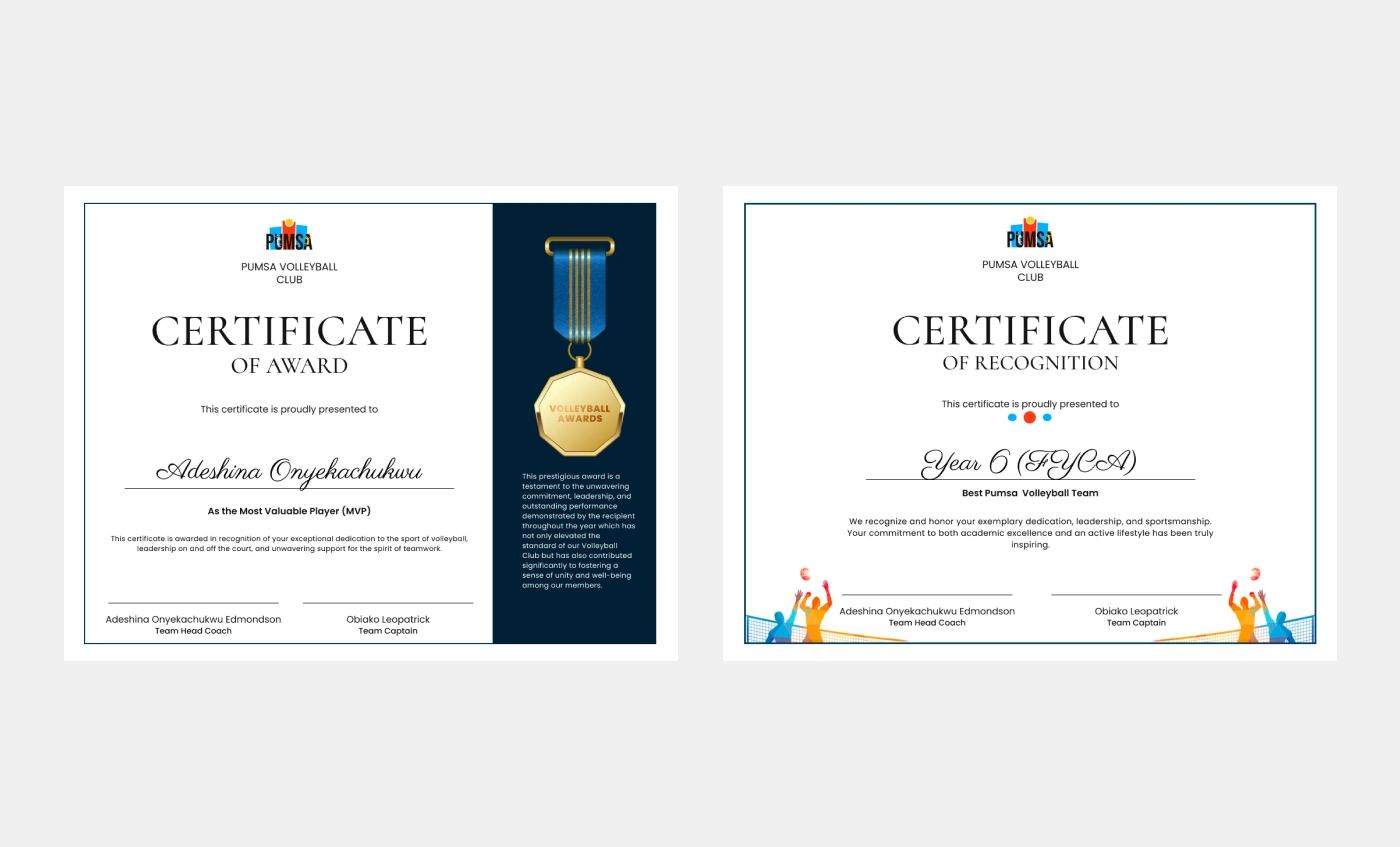
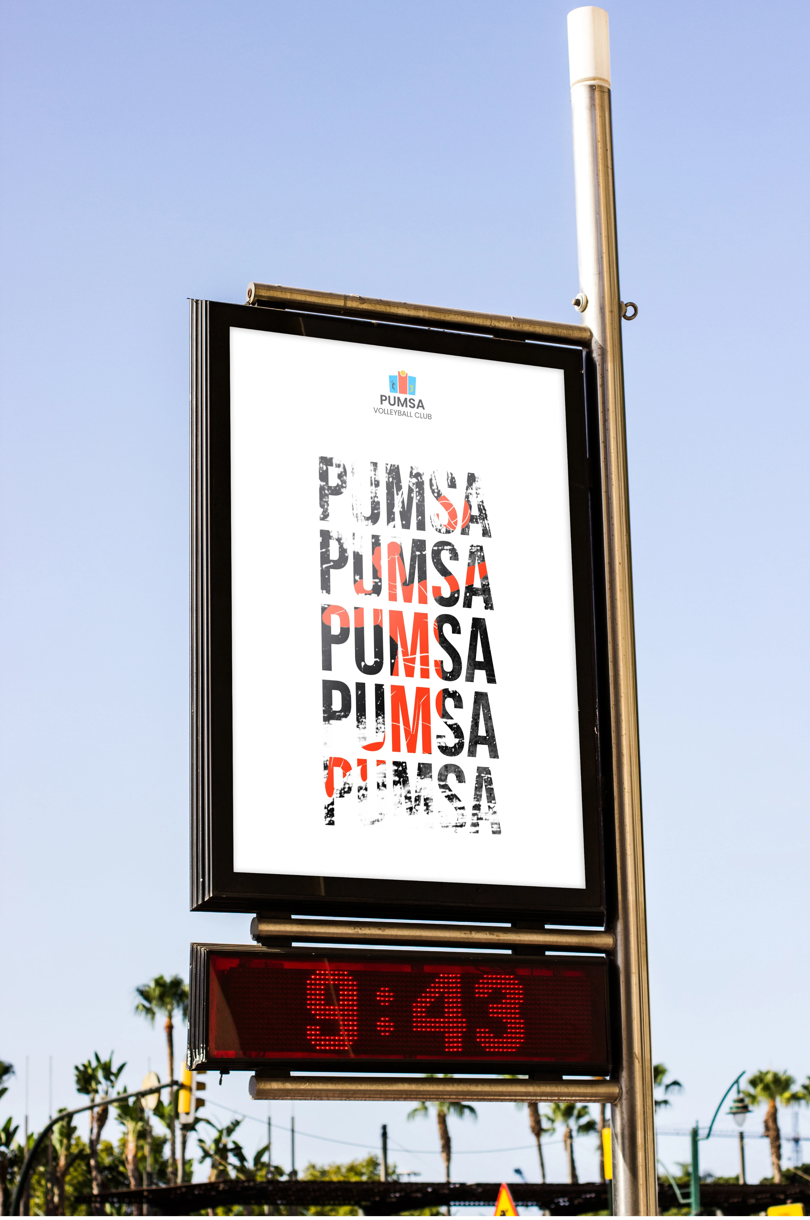
Collateral: From certificates to event posters, the brand identity seamlessly extends across various collateral, fostering a cohesive visual language. Consistency in design elements reinforces the club's image, creating a lasting impression on members and spectators alike.
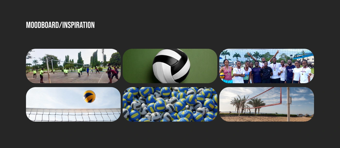
Photography Style: The brand photography captures candid moments of unity, action shots on the court, and the camaraderie that defines the Port Harcourt University Medical School Volleyball Club. These images are carefully curated to reflect the spirit and values of the club.
Overall Impact: This brand identity design aims to inspire pride and a sense of belonging among club members. It speaks to the dedication of these student-athletes, their pursuit of excellence both academically and athletically, and the enduring legacy they leave behind as they graduate from medical school.


Thank you
Contact me
https://twitter.com/OnyekachukwuEd3
https://www.linkedin.com/in/onyekachukwu-adeshina-7b7909209/
onyekachiedmondson@gmail.com


Like this project
Posted May 6, 2025
Redesigned PUMSA Volleyball Club’s identity to inspire unity, pride, and excellence—boosting engagement and leaving a bold, lasting impression.
Likes
1
Views
1