How I Redesigned The Logo For A Tech Startup

Em Shaveen
Brand Designer
Graphic Designer
Brand Strategist
Affinity Designer
LONGWApps
Throughout this article, we are going to explore how I redesigned a new logo for Sri Lankan tech startup LONGWApps. I hope this will support you as a case study to have a look at the process of a brand identity design project.
If you are a business owner, this will be valuable for you to understand the specific uses & challenges of a brand identity.
WHY A NEW LOGO?
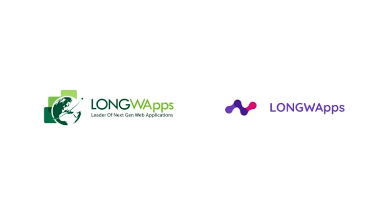
LONGWApps already had a logo but not much of a brand identity. There were several reasons why we decided to revamp the logo. The old logo didn’t function well and here are the reasons.
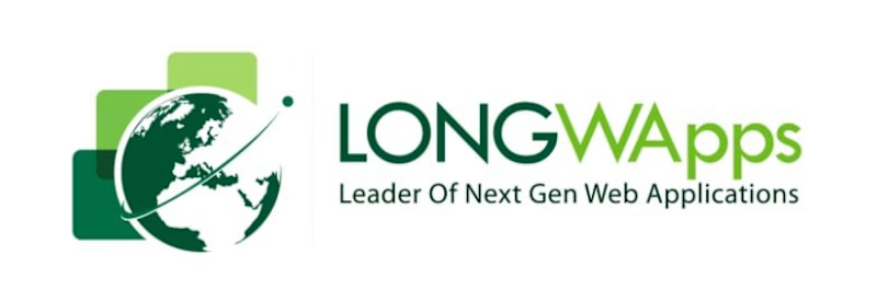
1) Size and details
One of the biggest issues it had was, being unable to recognize properly when scaled down. We needed the logo to be recognizable even when we used it as a favicon. Too many little details made the logo unrecognizable.
2) Black & White
There will be times that we get to use the logo in black-and-white format. But there was no B&W version of the current logo. Simply using a grayscale version was not a good option because of the range of colours and details.
3) Logo placement
Using the logo on an image was not a good option with the current design. The only suitable option was to use it on a white background.
There were times when we needed to use the logo on different types of backgrounds. When we did, the logo wasn’t clearly visible

4)No brand identity
The only thing we had was a logo. There was no consistency throughout the brand's appearance.
These issues lead us to redesign the logo and come up with a whole new brand identity.
Background story
LONGWApps provides custom web application solutions and several SaaS products called Uniwor, SmartClass, & BizGroomer. The major value we provide to our customers is delivering extremely easy-to-use software solutions. Simplicity is one of the brand's core values.
Process
Research and concept
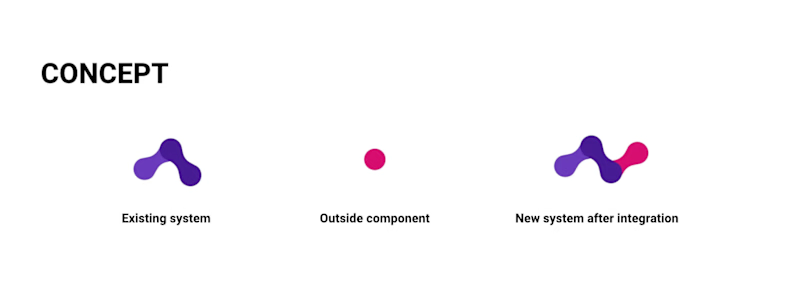
LONGWApps specialises in software integrations and we decided to explore and work in this direction.
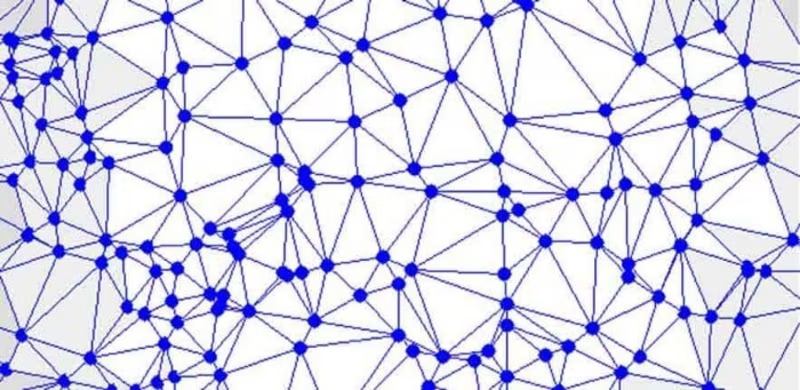
My initial thought was to design a concept based on what the company specialises in so that it would be useful when telling the brand story.
A software is basically a system with many components and you could extend the functionalities by integrating other external components. That is the concept I tried to portray but the challenge was how to turn that idea into a visual form.
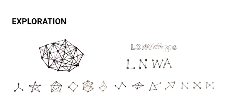
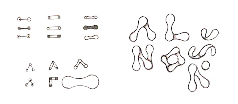
I got inspired by the idea of dots connected by lines and I continued working on improving that idea. After a gazillion of sketches, This is what I came up with,

Design attributes
The same typeface of the logo will be used as the titles and headlines throughout the brand identity. Having rounded edges in this typeface was a key reason for choosing it. Circles and curved edges are being used in the visual identity to have a friendly look & feel to it.
LONGWApps is known for creating quality product solutions with high standards. According to colour psychology, Purple stands for royalty and evokes the sense of a superior, high-quality product. Magenta is being used to give more contrast and create emphasis on specific elements.
Problem solved
We faced many issues when using the old logo as I mentioned above in this article. With the current design, we solved all of these issues.


