
Most dashboards stop at visualization.
KODO goes further.
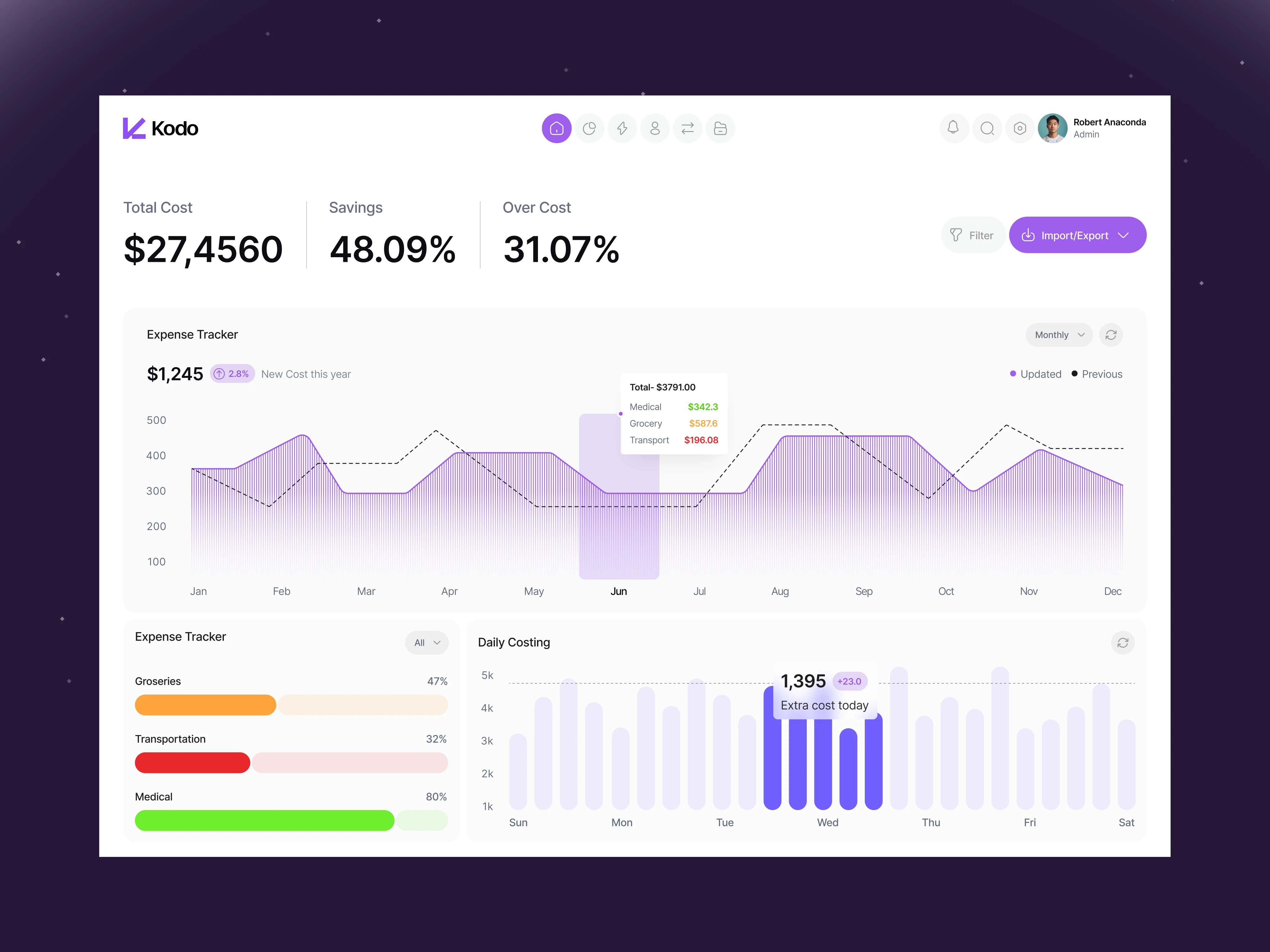
This Dashboard is designed to help users not just see financial data - but understand and act on it.
With a focus on clarity, structured insights, and real-time visibility, it turns complex information into something usable and decision-ready.
This is where dashboard design moves from display to impact.
Open to new projects. Building a data-heavy product?
👉 Let’s collaborate and design something that truly works.
0 likes · 8 views · Apr 7, 2026
Most dashboards stop at visualization. KODO goes further. This Dashboard is designed to help users not just see financial data - but understand and act on it...


