Article: Small things that make a big difference
Incase you haven't noticed - there are tons of apps and websites popping up for entrepreneurs and job seekers to network, collaborate and find career opportunities.
Competition is tough and each platform is looking to create value and stand out from the rest.
I've been an Entnest member for over a month and I'm enjoying it. (This isn't a paid article 😂 )
The design changes, even though small, were pretty cool, it felt like I had just watched Optimus Prime transform. Here's what I could immediately notice...
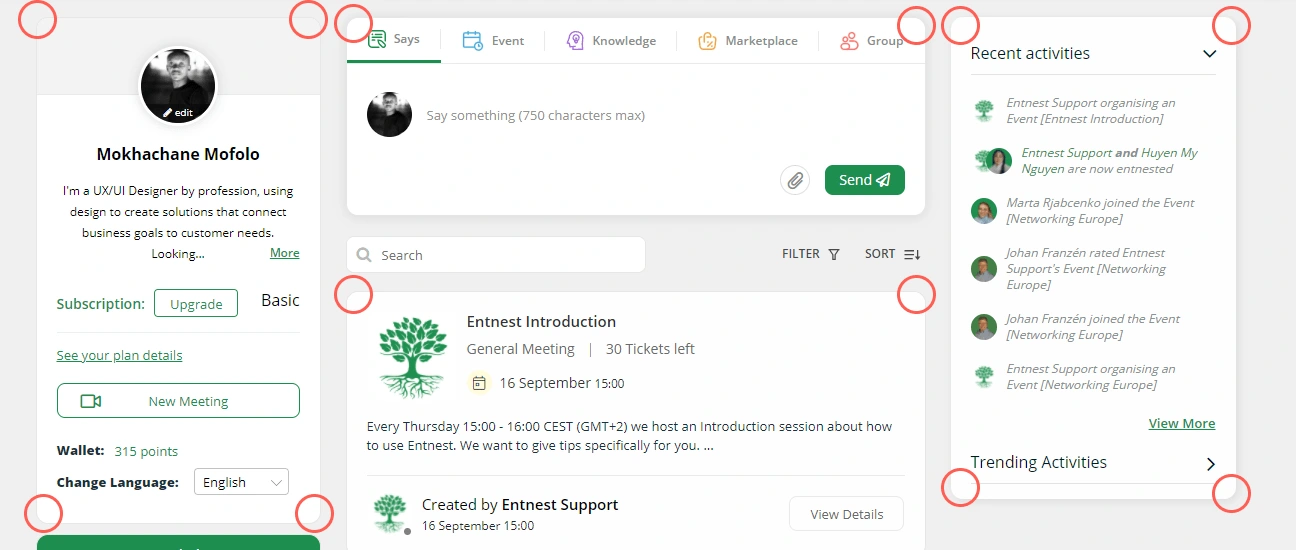
1. ROUNDED EDGES/BORDERS

The Entnest homepage user interface
This makes the app look and feel more modern. The previous design had hard, square, "windows 95 style" edges...which aren't really popular anymore.
This enhances the user experience - people perceive designs with great aesthetics as easy to use...and the visual qualities of the design are just as important as it's function.
2. SMOOTHER INTERACTIONS
I could be completely wrong about this...but after the interface upgrade I've started noticing how smooth the interactions are. Moving around the app feels easier and faster, and this also enhances the user experience.
When people enjoy using an app or website, they'll probably use it again and tell others about it.
Users adapt easier to small incremental changes so it's great that Entnest is rolling them out gradually and not all at once.
Like this project
Posted Sep 10, 2021
Likes
0
Views
11
Tags


