Coffee Business Rebranding
Nhelsen C Jo
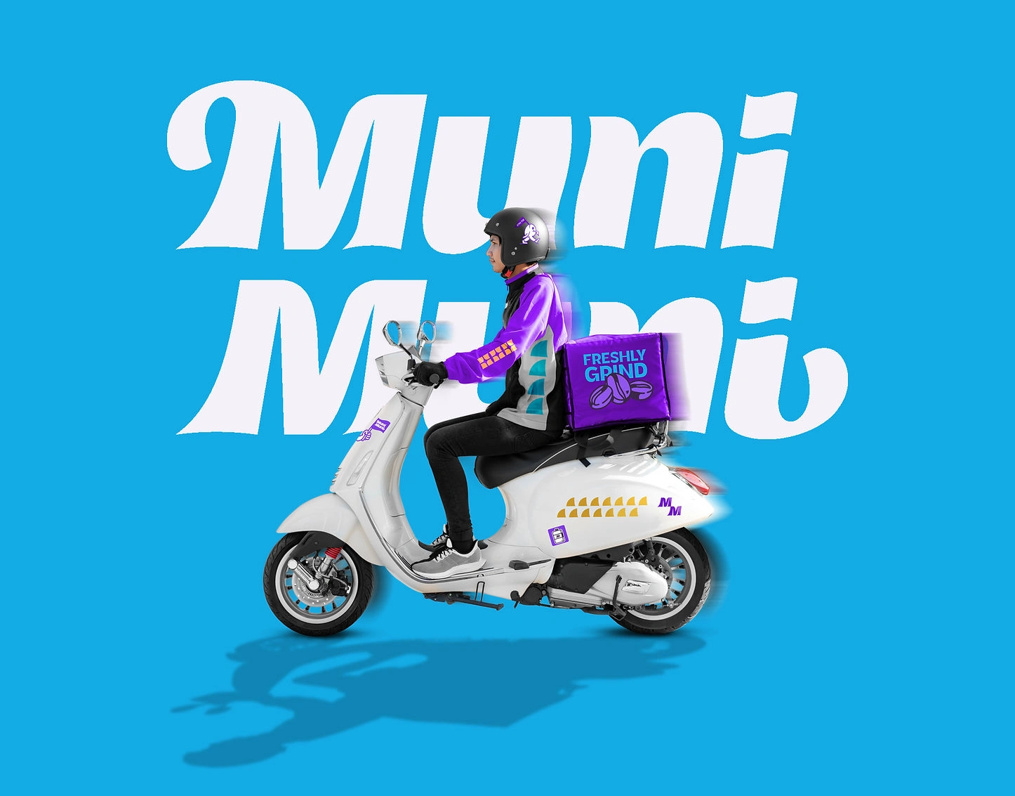
Muni Muni
Muni Muni was a branding project inspired by the idea of slowing down for a moment — a local coffee brand created for people who simply need a small and comforting break within a busy day.
The direction combined modern visuals with subtle cultural patterns to give the brand a sense of familiarity and warmth while still feeling fresh and contemporary.
I explored a balance of calm and friendliness through color, illustration, and visual storytelling to create something approachable for everyday office workers and coffee drinkers alike.
Project Goal
Since we are a low-budget starting business, our goal is to create a brand that has an appealing identity and an authentic aspect for our beloved target audience. Aside from identity, we desire a coffee product that has an experimental flavor but eventually develops a good familiarity taste. As we value our roots respectively, we wanted everything we made to be connected to our history.
Objectives
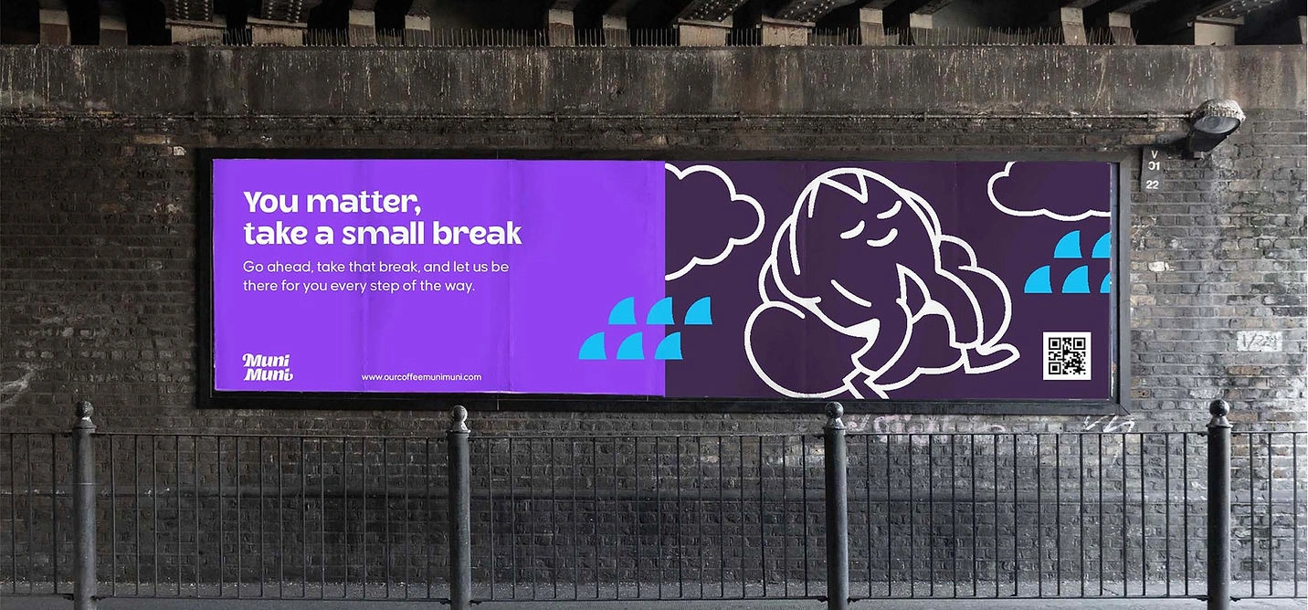
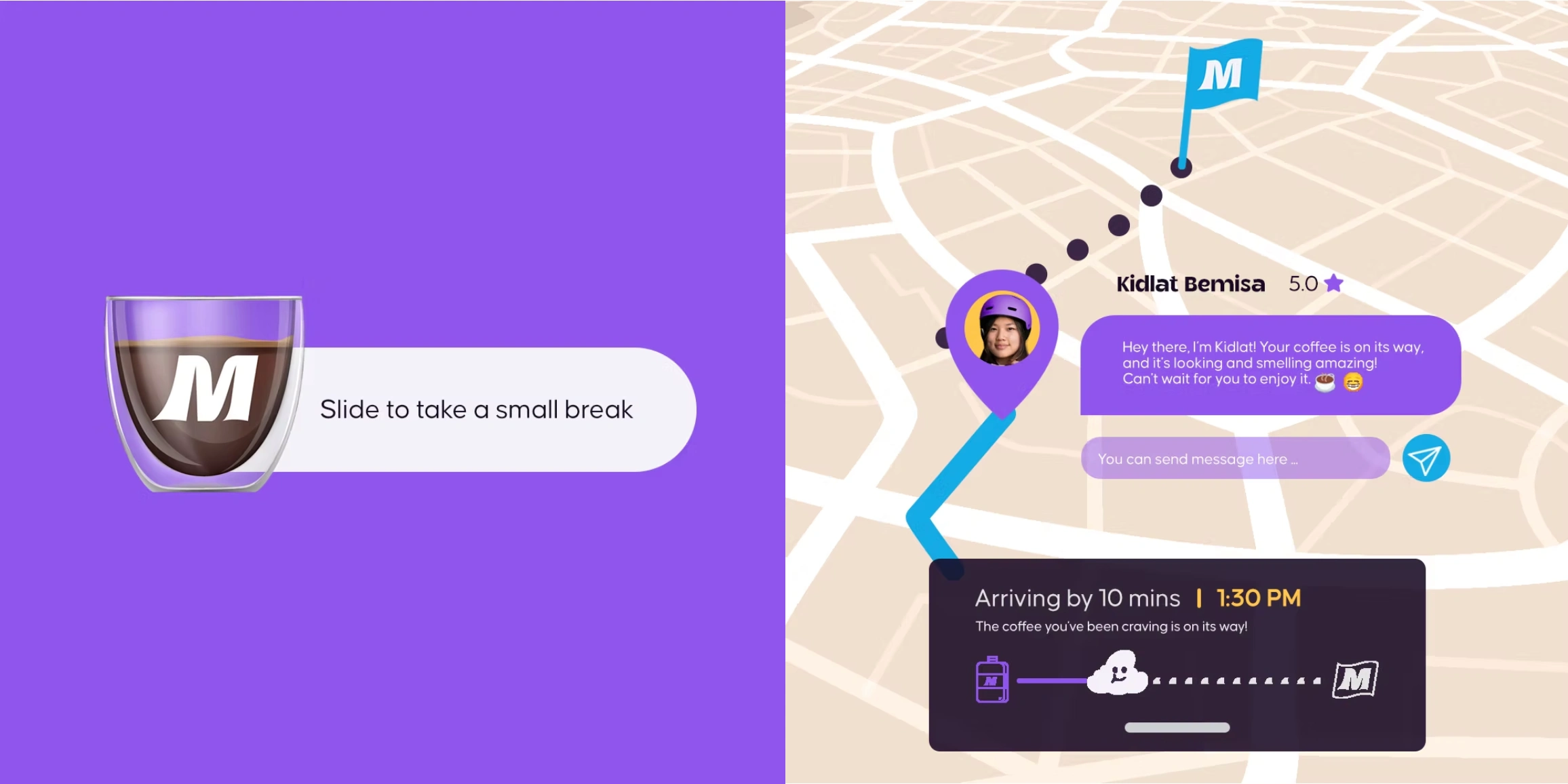
Produce a brand identity that is connected to our tagline “You Matter, Take a Small break”.
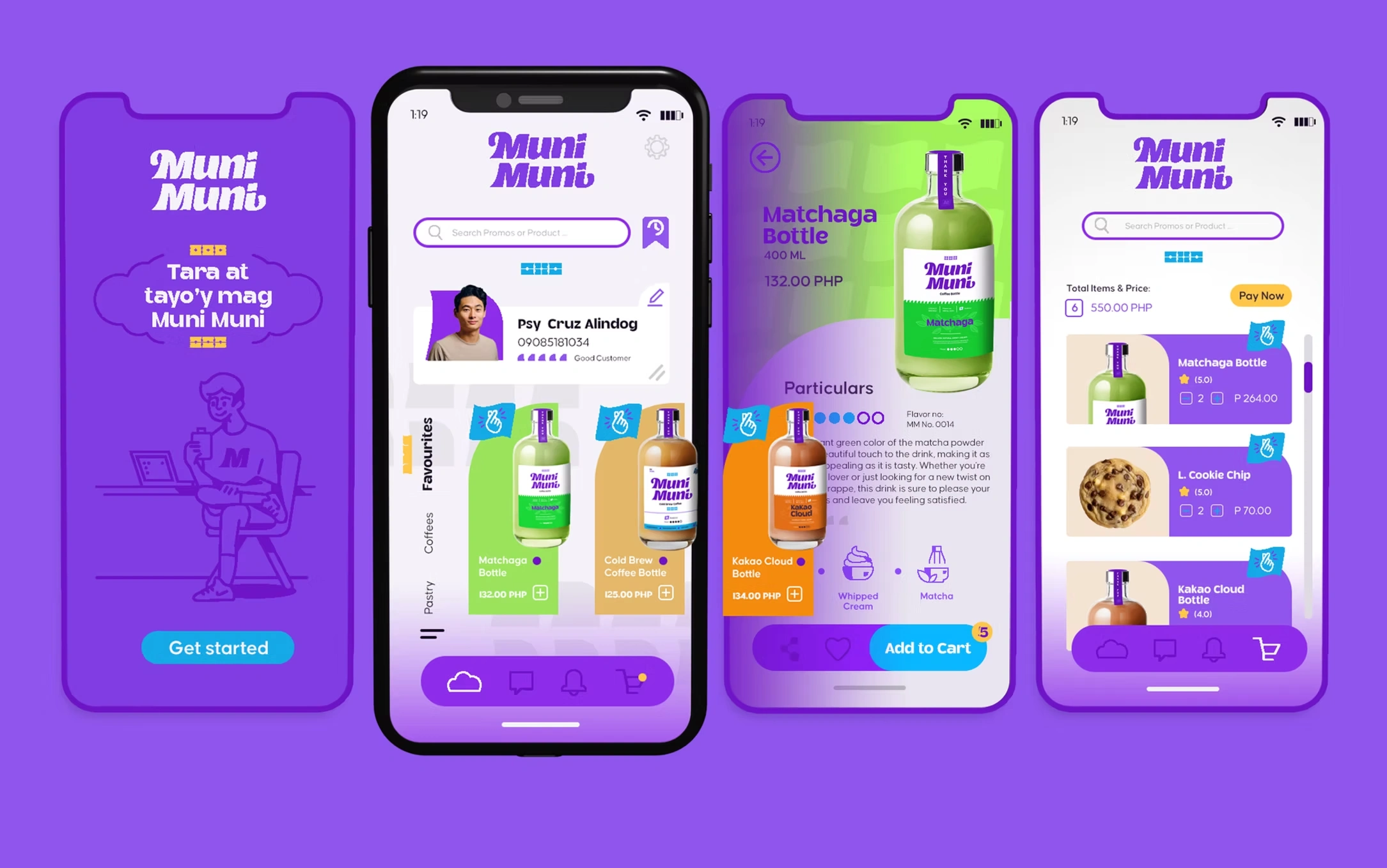
Muni Muni branding must contain the following:
Brand questionnaire and research
Tagline
Brand Attributes
Mood Board
Stylescape
Logo
Brand Guide
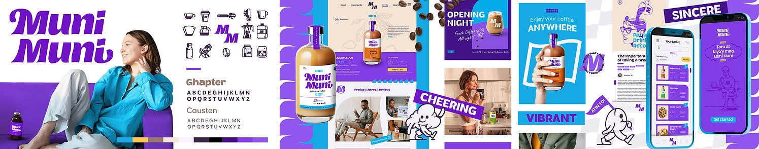
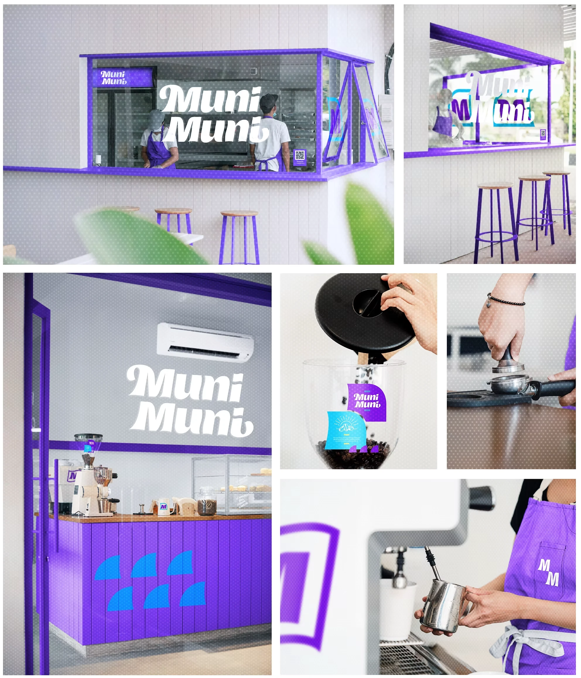
Mockups
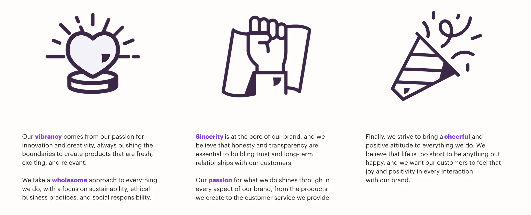
Through the process of conducting branding activities, we have been able to identify the unique attributes that define our brand. These attributes are vibrant, wholesome, sincere, passionate, and cheerful.
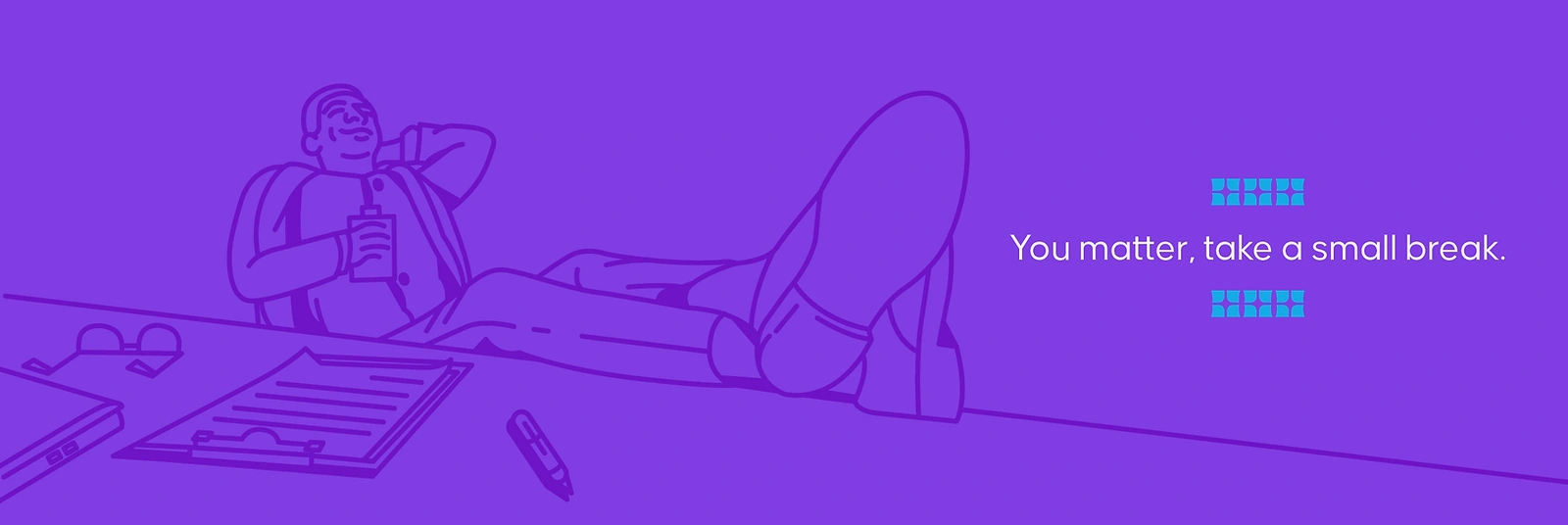
At our coffee bottle brand, we're passionate about promoting self-care and taking a moment to recharge. Our brand tagline, "You matter, take a small break," isn't just a catchy phrase - it's a belief that we discovered through our own experiences. We know how easy it is to get caught up in the hustle and bustle of everyday life, but we also know that taking a small break is essential to maintaining a healthy lifestyle. That's why we've made it our mission to encourage this practice and what better way to do it than with our flavorful coffee bottle? Our brand story is all about celebrating the little moments and making time for yourself, and our tagline embodies that sentiment perfectly.
Stylescape
By plotting all the brand attributes and connecting them to our tagline we were able to create this stylescape that contains our whole visual brand identity.
By plotting all the brand attributes and connecting them to our tagline we were able to create this stylescape that contains our whole visual brand identity.
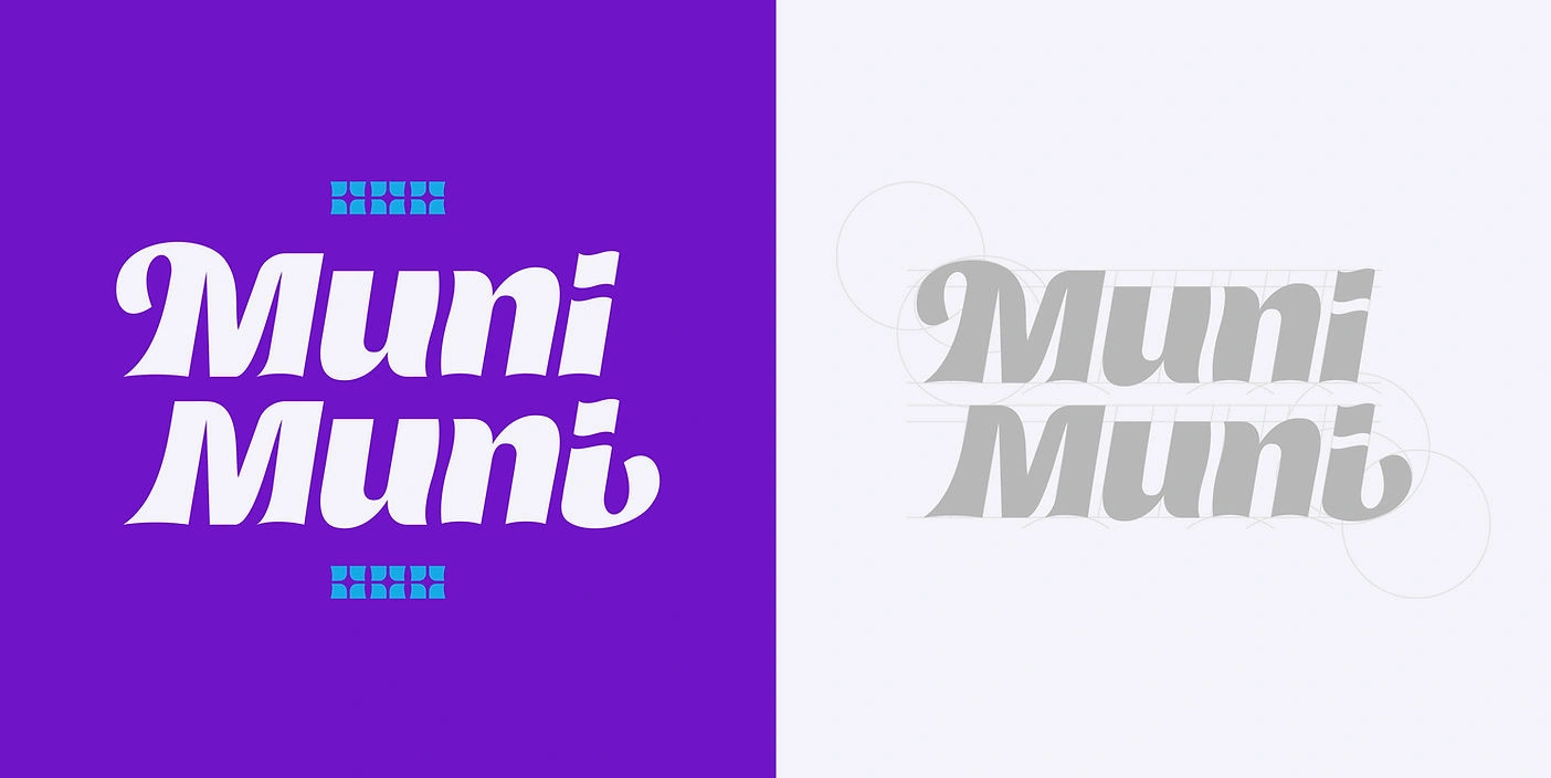
Logo Construction
The tagalog word Muni Muni stood out to us during the process of choosing our name since it is remarkably memorable for our target audience due to repetitiveness and corresponds to how we wanted to be represented as a brand. Muni Muni is an easy-to-remember word, therefore we decided to use the wordmark as the brand's logo to increase our recognition. This bold and wavy letterform we design is mimicking the wave of the cloud, and its boldness is creating a strong desire for attention. In addition, we added a hidden coffee bean symbol between the letters ‘u’ and ‘n’ to connect our industry, making every decision we made here remarkably related to our goal.
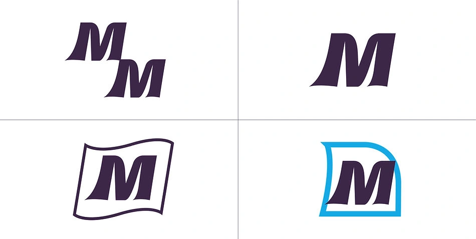
Logo Responsiveness
A creative approach to remain responsive across small mediums.
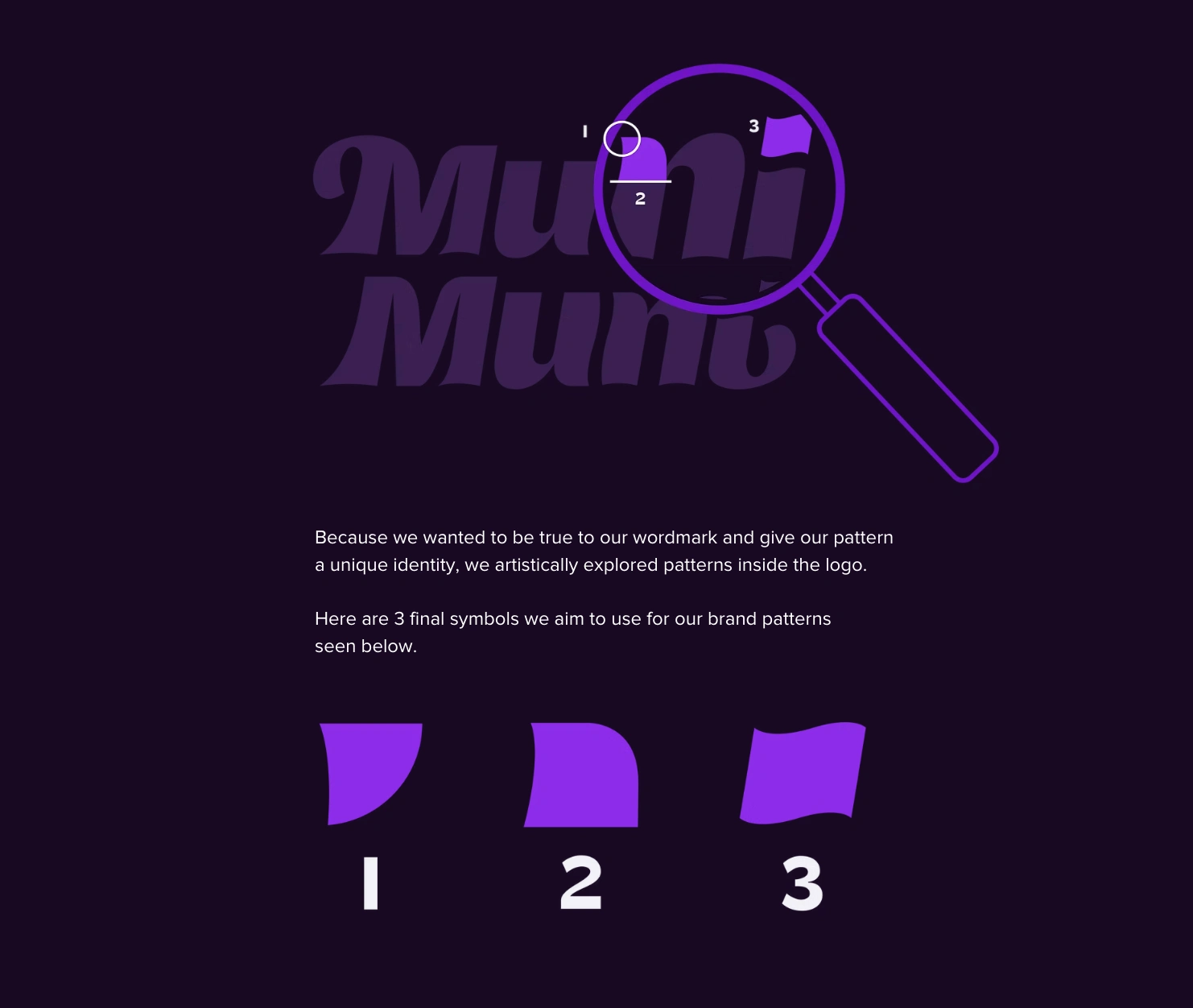
Credited Pattern
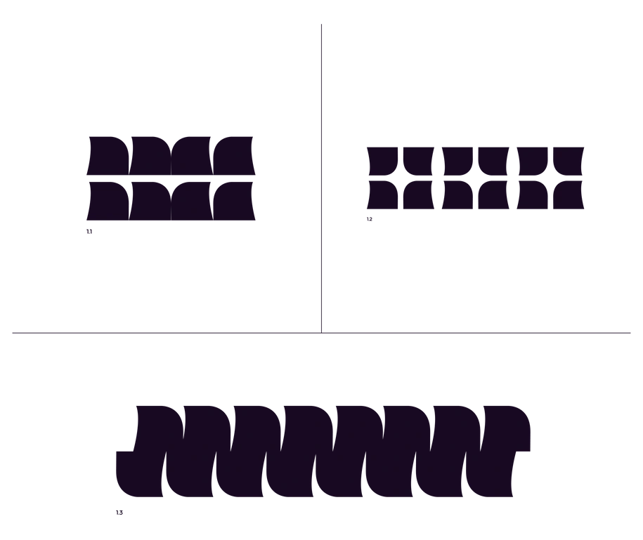
1.1 Pattern is utilized as an accent for a design and is typically employed for paragraphs with sincerity in the tone, usually in the highlight color.
1.2 Pattern can be used in any type of design but implemented minimalistically and creatively.
1.3 Pattern this stands as a divider for design but also acts as an accent shape.
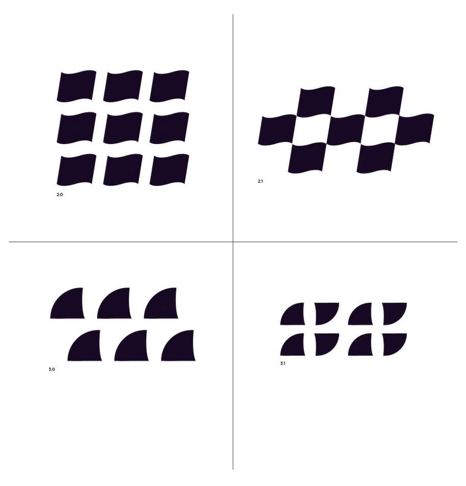
2.0 Pattern and 2.1 Pattern flags are used a lot for designs that contain empowerment, passion, and rewards.
3.0 Pattern and 3.1 Pattern another type accent shape used for design and ideally this shape means flow.
Muni Muni Halftone
1.2 Pattern are only credited pattern used for half-tone, an added layer for our photo.

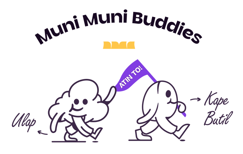

The Creation
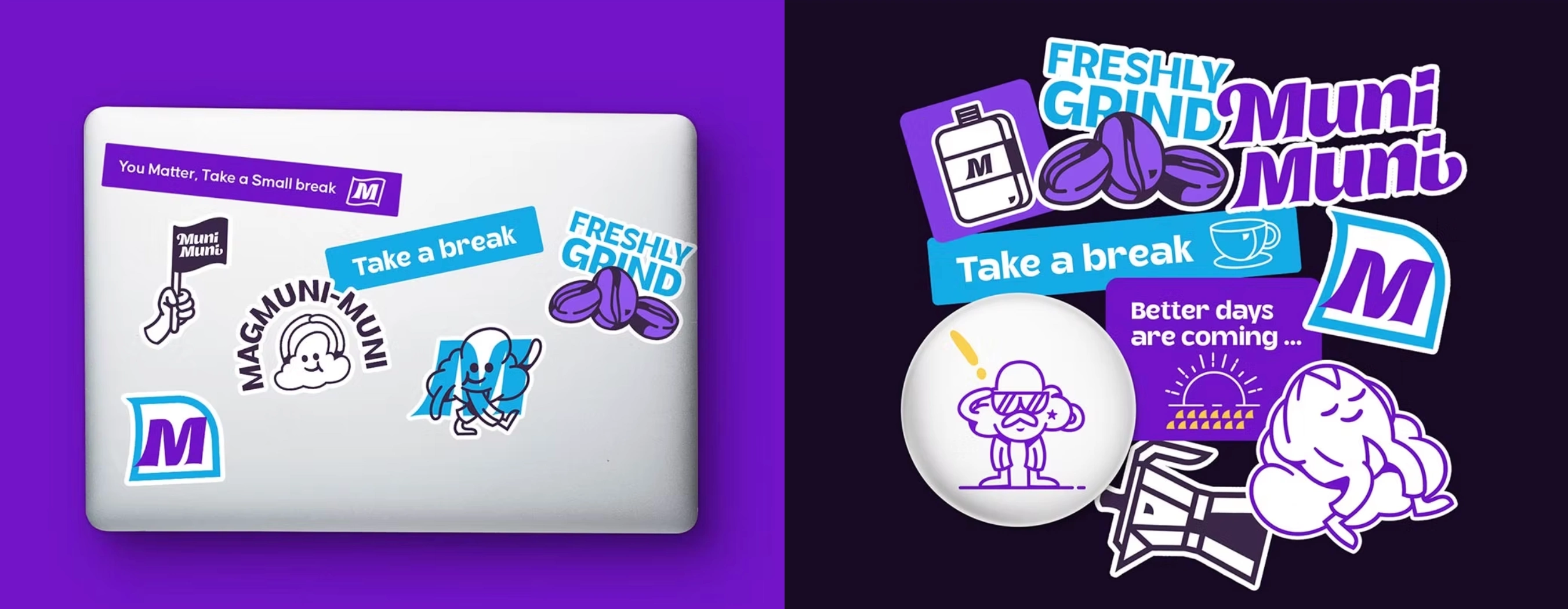
We are working to give our brand an approachable identity and a sense of companionship for our target audience. So we've introduced these endearing characters for our brand, Ulap and Kape Butil.

Ulap and Kape Butil has a variety of appearances; they’ll be in stickers, on product labels, t-shirts, social posts, website, ad posters, and even stuff toys we consider in the future.
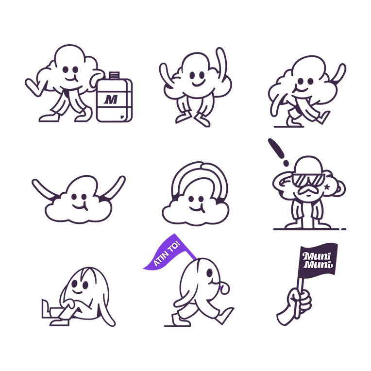
Illustration
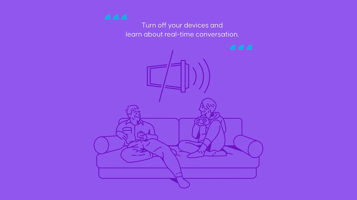
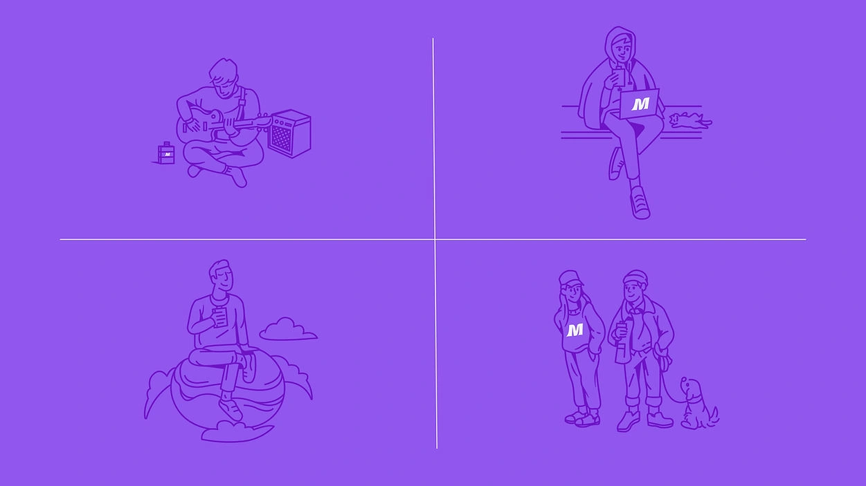
We create this to visually communicate the importance of taking a break and the various activities one can enjoy while sipping on their coffee. The simplicity of the illustrations ensures that the message is communicated clearly to the target audience, creating a strong visual impact. By using this style of illustration, the brand can establish a unique visual identity that differentiates it from competitors and appeals to its target audience. Additionally, the use of single line weight illustrations can make the brand's message more memorable, further increasing brand recognition and customer engagement.
Like this project
Posted May 14, 2026
Muni Muni blends modern and subtle cultural visuals into a calming coffee brand made for small breaks, comfort, and everyday connection.