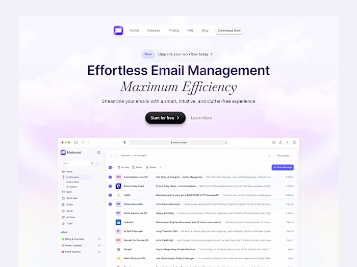
Driply - Landing Page Redesign
Emura Studio
Building a smarter email marketing experience with Driply — simple, powerful, and made for growth.
Fresh Look, Clear Message
We gave Driply a bold, modern identity that’s clean, friendly, and focused—instantly communicating what the product is about with personality and clarity.
User-First Design
The landing page is fast, simple to navigate, and guides users through Driply’s value without friction—just smooth clicks and clearer emails.
Target Audience
Driply is built for marketers, small business owners, and growing teams who want powerful, intuitive email tools without the complexity.
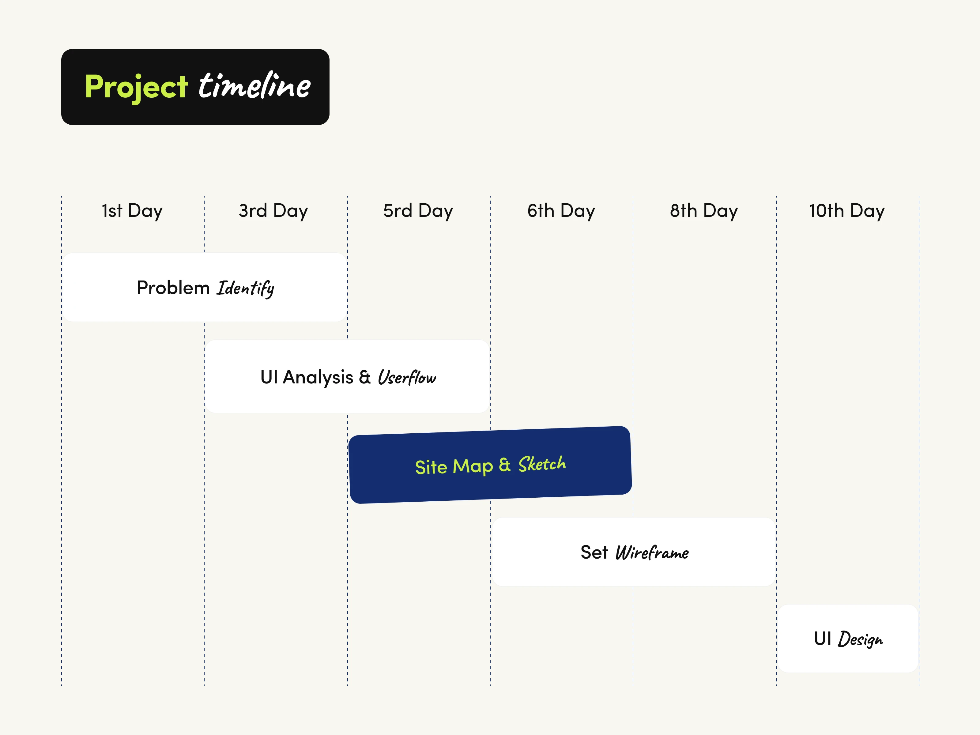
Project Timeline
A compact 10-day sprint with focused steps to bring Driply’s landing page to life — structured, agile, and results-driven.
* Day 1 — Problem Identify: We started by defining the core problem: what users need, what’s missing, and where Driply can make a difference.
* Day 3 — UI Analysis & Userflow: Mapped out user goals and crafted a smooth, logical user journey to guide visitors from interest to action.
* Day 5 — Site Map & Sketch: Built the structural foundation with a site map and early layout sketches — keeping everything intentional and scalable.
* Day 6–8 — Wireframe: Turned sketches into low-fidelity wireframes to test structure, flow, and usability before diving into visuals.
* Day 10 — UI Design: Wrapped it all up with a clean, vibrant, and user-friendly interface — ready to communicate Driply’s value at a glance.
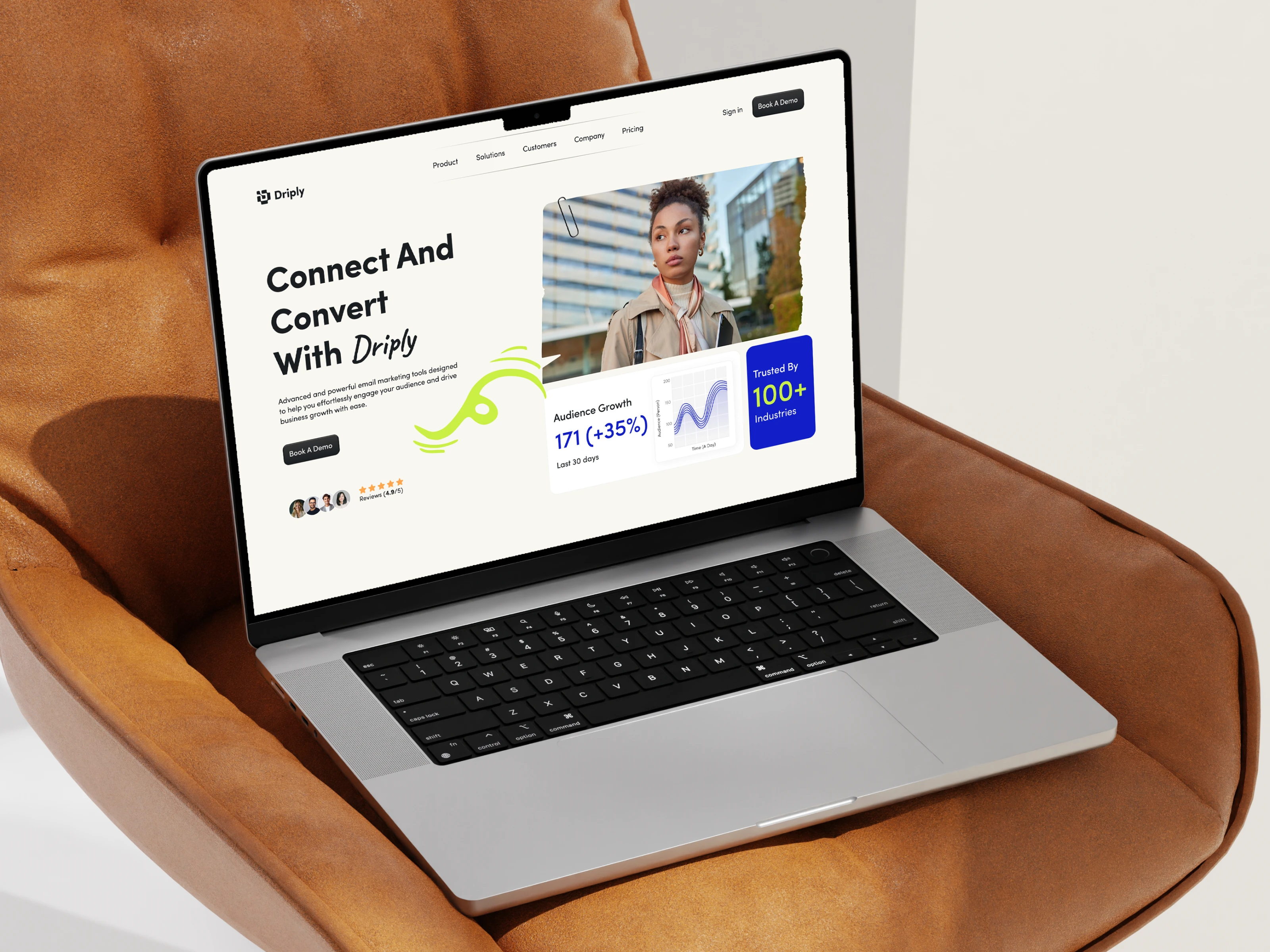
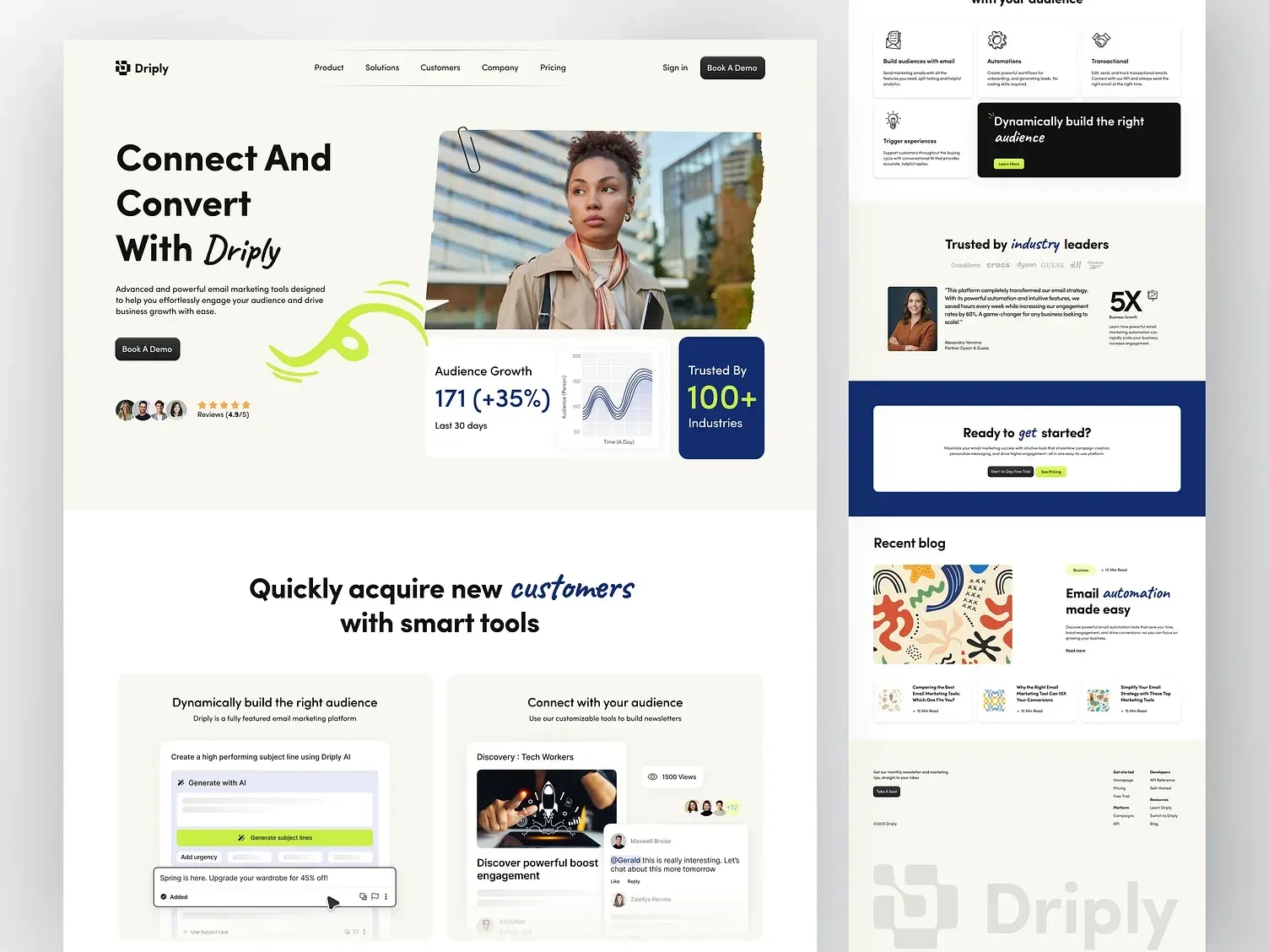
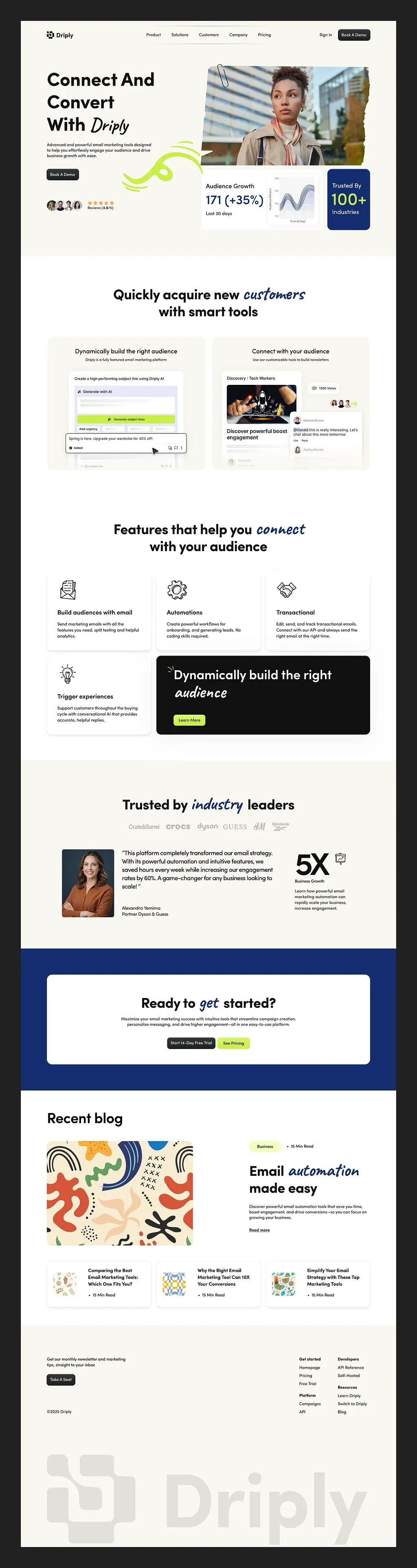
Showcasing the Design
To bring the concept to life, I crafted a set of mockups that show how Driply looks and feels in action — across desktop and mobile. Each layout highlights how the system adapts, stays consistent, and keeps the experience smooth no matter the screen size. From hero sections to UI cards, every detail was designed to stay clean, clear, and conversion-focused.
Results & Key Learnings
This project proved that clean, focused design makes complex tools like email marketing feel simple. Clear hierarchy, consistent UI, and breathing room helped highlight Driply’s value without overwhelming users. The key takeaway? Clarity converts.
Thank you for looking into it!
Ready to create something amazing together?
Like this project
Posted May 1, 2025
Driply landing page redesign focused on clarity, clean design, and intuitive navigation, resulting in a more seamless user experience
Likes
4
Views
18
Timeline
Sep 10, 2023 - Oct 10, 2023