
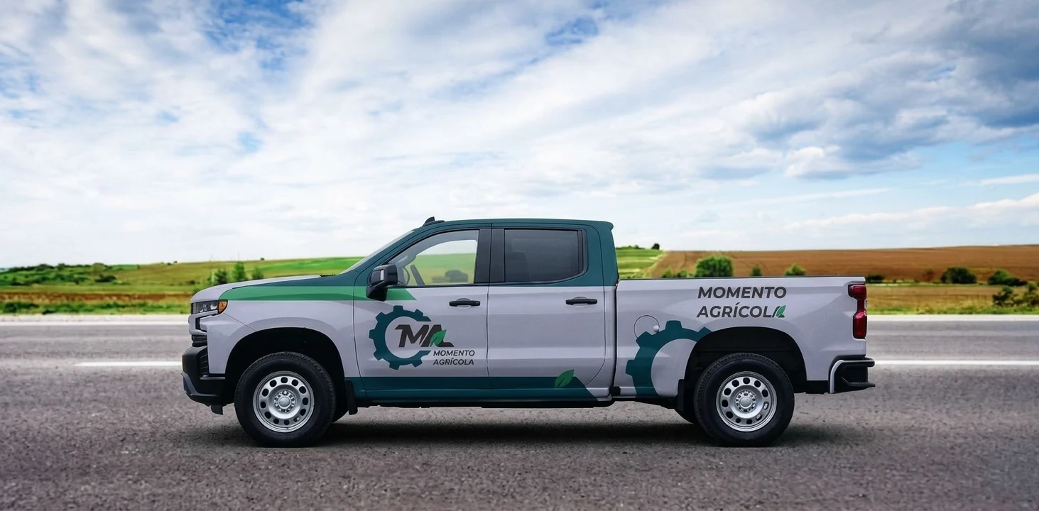
Where engineering meets the field
Momento Agrícola brings together expertise in agronomy and mechanical engineering with a shared passion for hands-on problem-solving. Founded by a group of friends, the company develops practical solutions across agricultural and mechanical projects — from strawberry greenhouses and wheat cultivation to work on vehicles.
As the team prepared to enter the market and introduce itself at events such as Agrishow, it needed a brand identity update — a rebrand — that could bring these capabilities together under one strong recognizable brand.
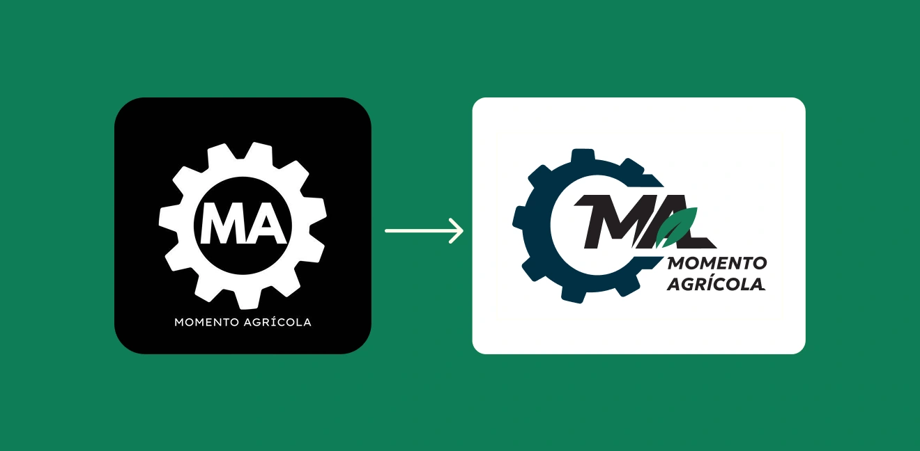
The challenge was to express technical precision without losing the energy and collaborative spirit behind the business. My goal was to create an identity that felt robust, distinctive, and rooted in agriculture, with the flexibility to grow alongside the company.
Approach
I built the identity around the connection between engineering and agriculture: structure and growth, machinery and nature, technical knowledge and field experience.
Rather than treating these as separate disciplines, I brought them together in a shared visual language. Bold forms and directional lines express strength and movement, while organic details keep the company’s agricultural roots at the center. The result is a practical, cohesive system designed to work across uniforms, printed materials, and digital communications.
Visual Identity
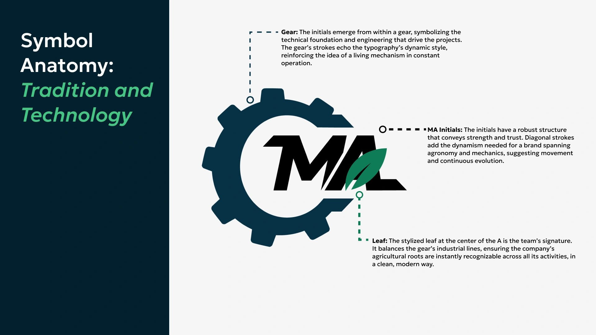
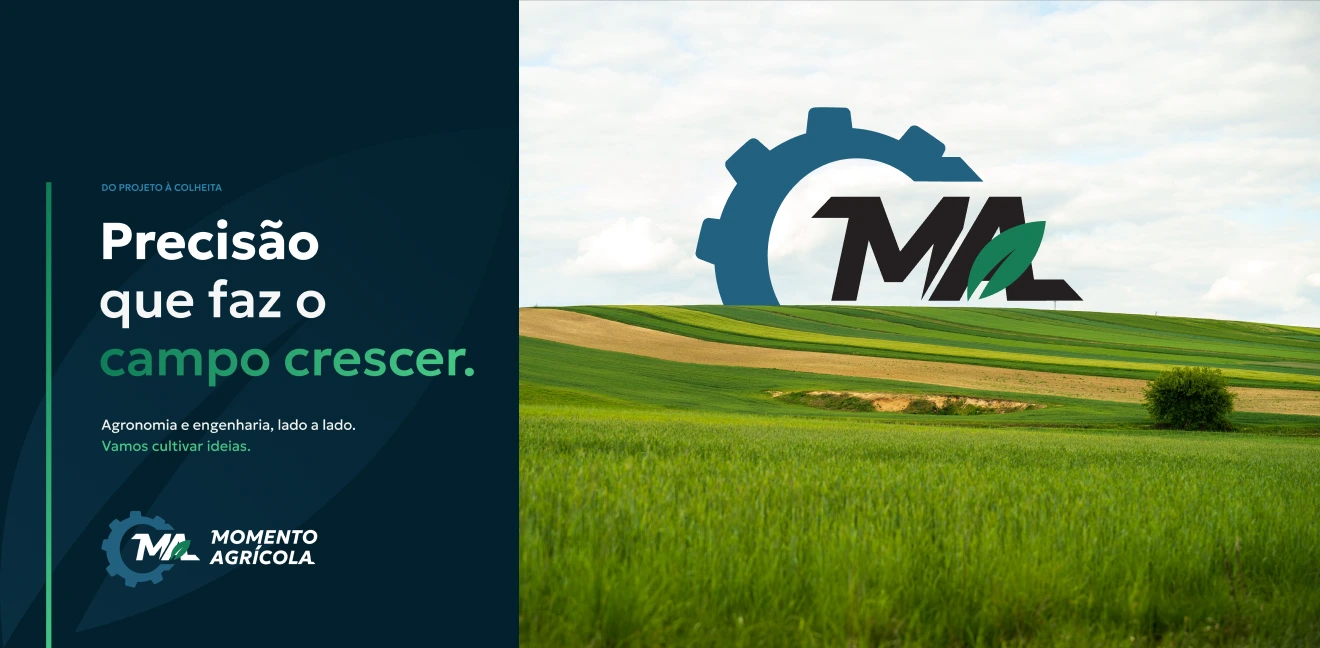
The custom, hand-drawn logo combines three defining elements: the MA initials, a gear, and a leaf. The initials establish a strong, compact silhouette, with diagonal strokes that suggest momentum. The surrounding gear represents the team’s engineering expertise, while the leaf integrated into the A connects the mark directly to agriculture and growth.
A flexible set of logo configurations—from the standalone symbol to horizontal and vertical lockups—allows the identity to adapt to different scales and formats without losing recognition.
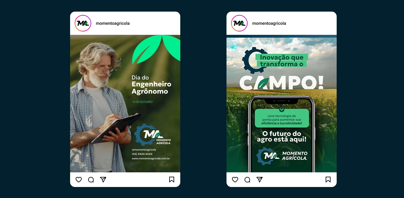
The color palette reinforces this balance. Leaf green reflects vitality and the company’s agricultural focus, while deep blue conveys trust and technical precision. A near-black neutral grounds the system, with brighter greens and blues extending its range for supporting graphics and digital applications.
Typography pairs Geologica with Aleo, combining a contemporary, geometric presence with the more grounded character of a slab serif. Geologica gives headlines and branded materials a confident voice, while Aleo supports longer, descriptive text.
Brand in Use
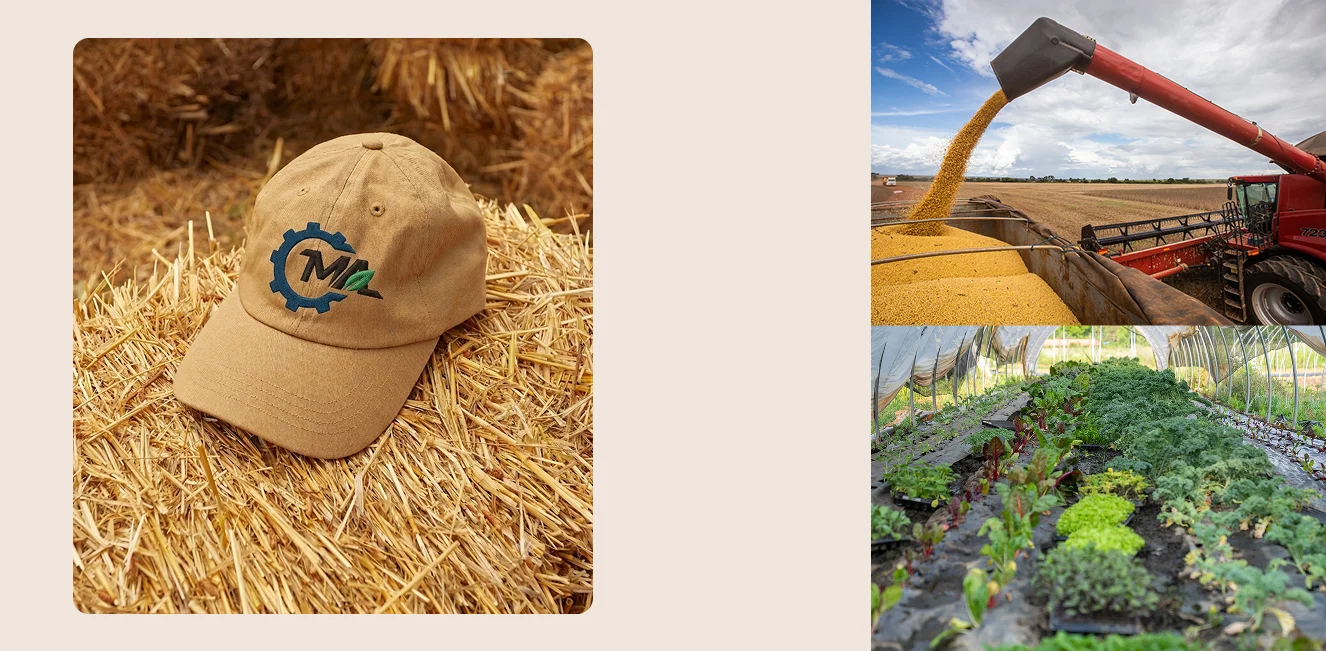
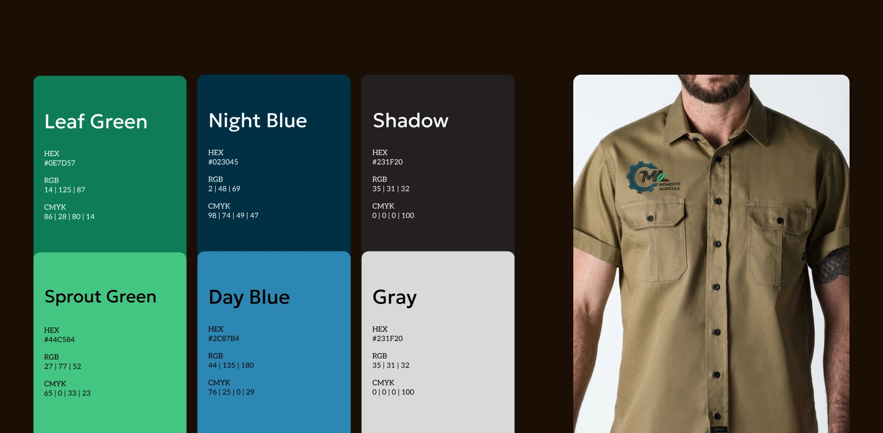
From workwear and caps to business cards, social media, and everyday objects, the applications show how the identity moves between the field and more formal professional settings.
Consistent color, clear contrast, and adaptable logo arrangements create a unified presence giving a multidisciplinary team a recognizable identity built around the way it works: collaboratively, practically, and across disciplines.
1 like · 0 views · Nov 17, 2026
I designed Momento Agrícola's rebranding, a company founded by agronomists and engineers that combines field intelligence, technology, and mechanical solutions.


