
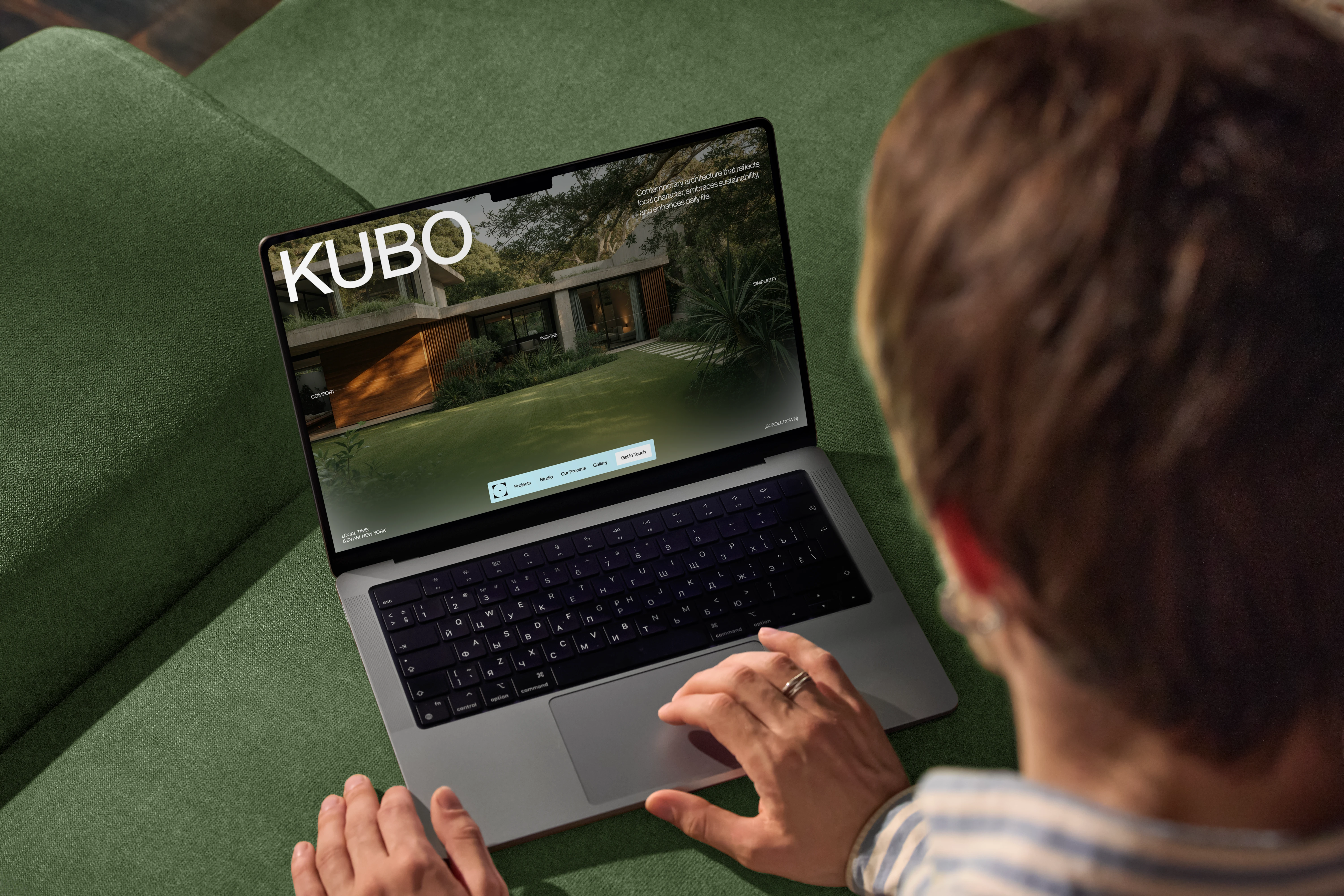
KUBO — Architecture Meets Identity
Overview
KUBO is a multidisciplinary architecture and design studio focused on crafting calm, timeless spaces that seamlessly connect people with their environment. The project represents a complete design exploration — from visual identity and brand strategy to architectural concept and digital presence.
Our goal was to capture KUBO’s essence: simplicity, structure, and serenity. Through a balance of raw materials, natural light, and refined digital aesthetics, the brand communicates a sense of thoughtful modernism rooted in nature.
Approach
We designed KUBO’s brand as an extension of its architectural philosophy — minimal, functional, and deeply connected to context.
The process included:
• Architectural direction — defining spatial language, proportions, and visual rhythm.
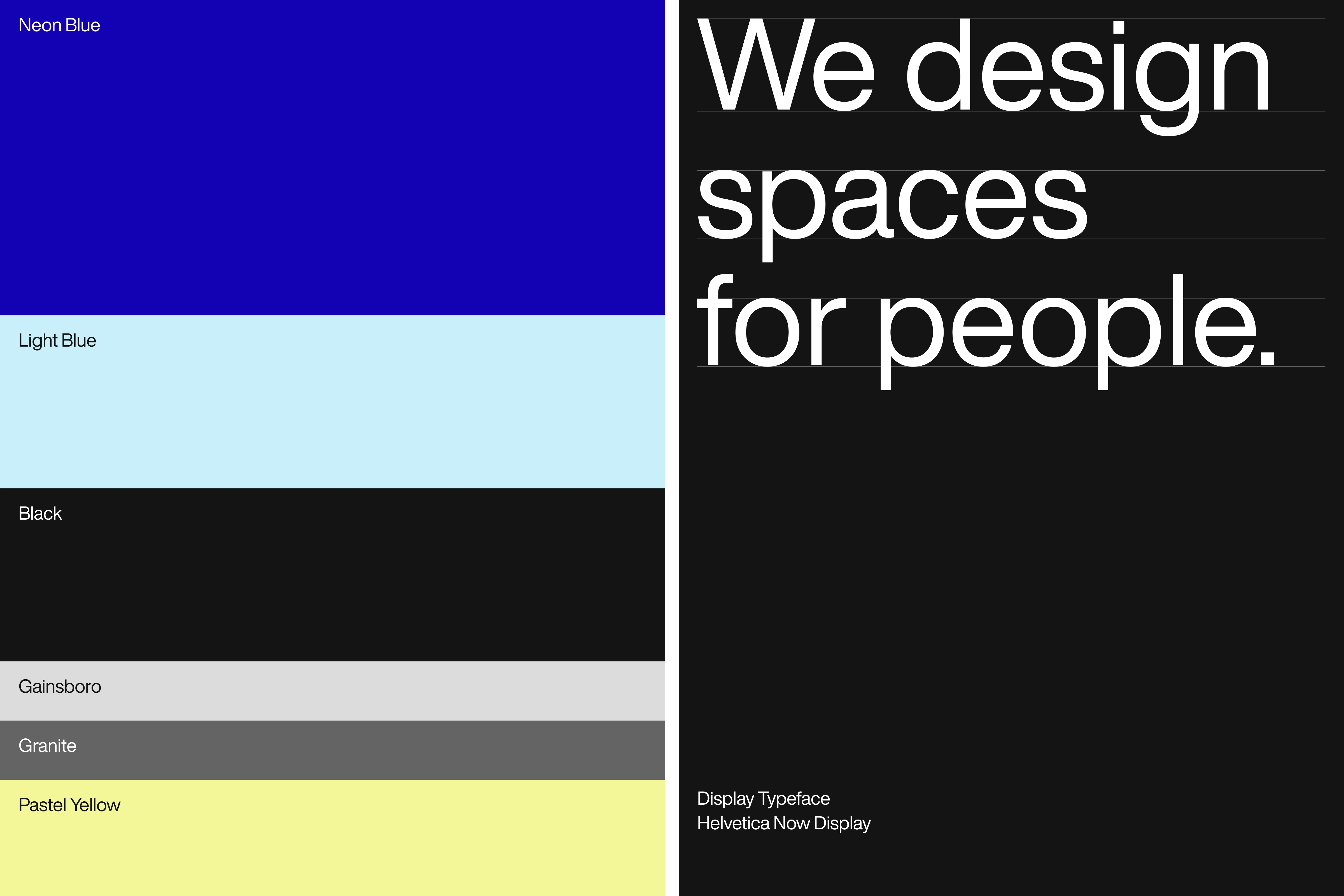
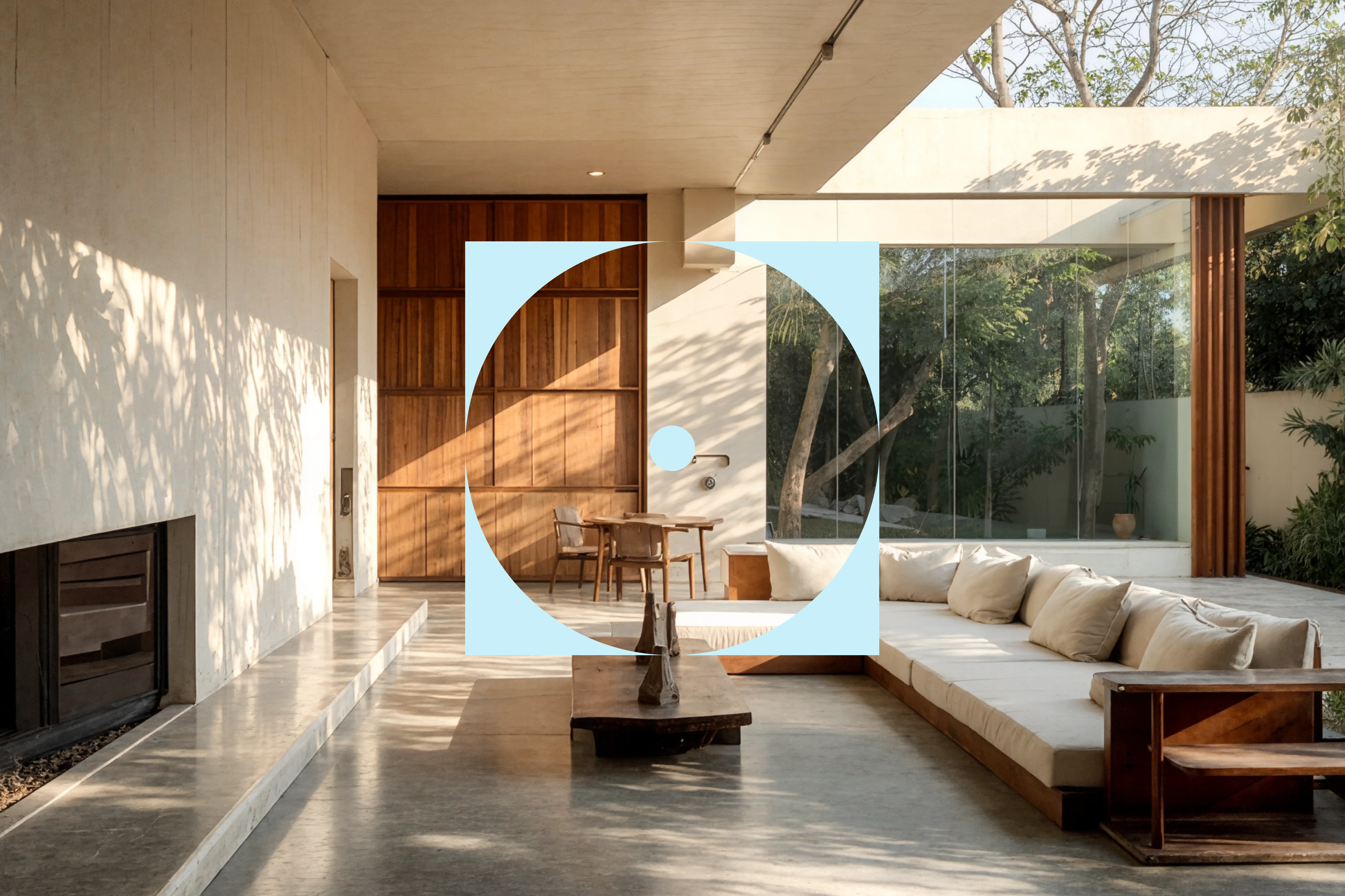
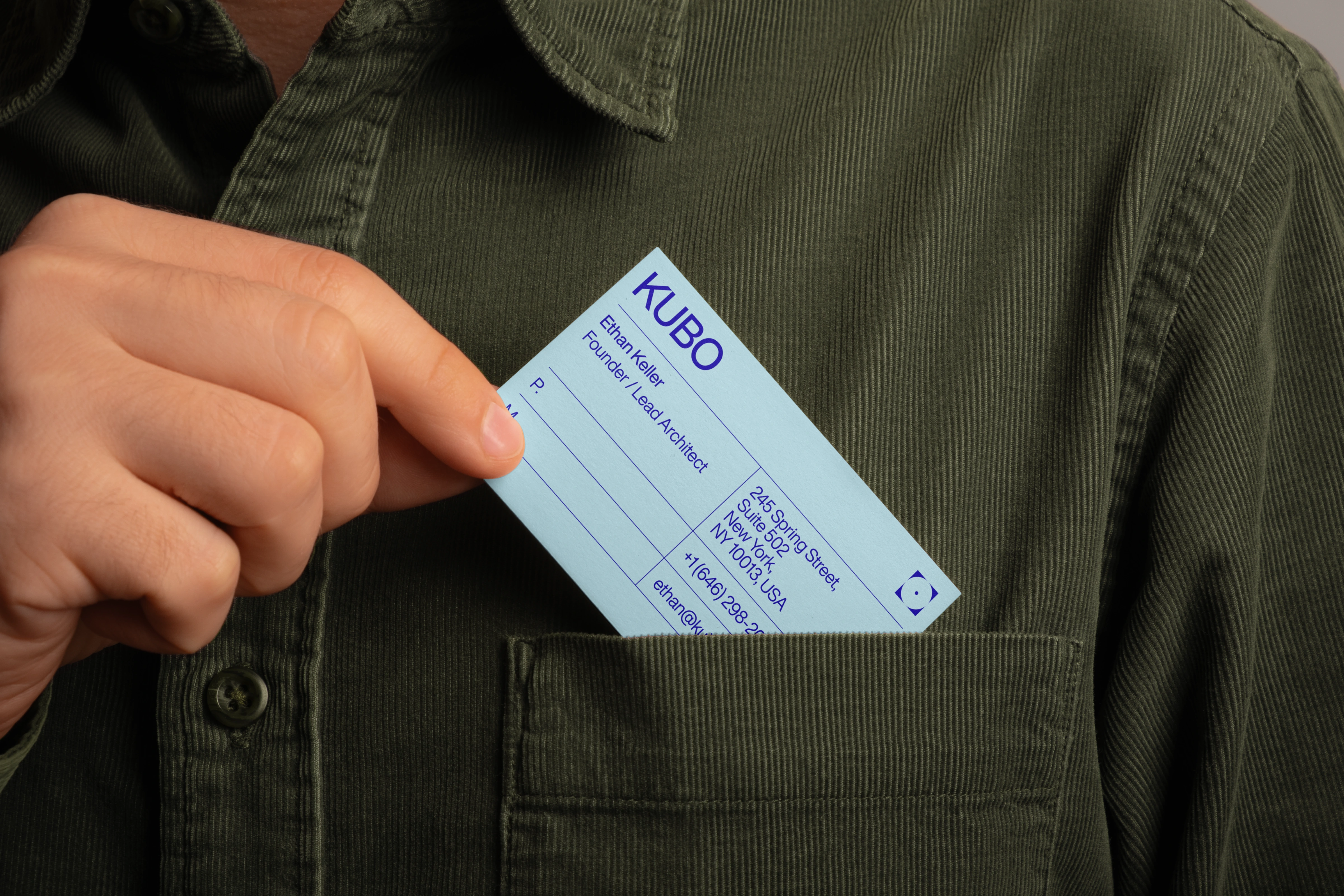
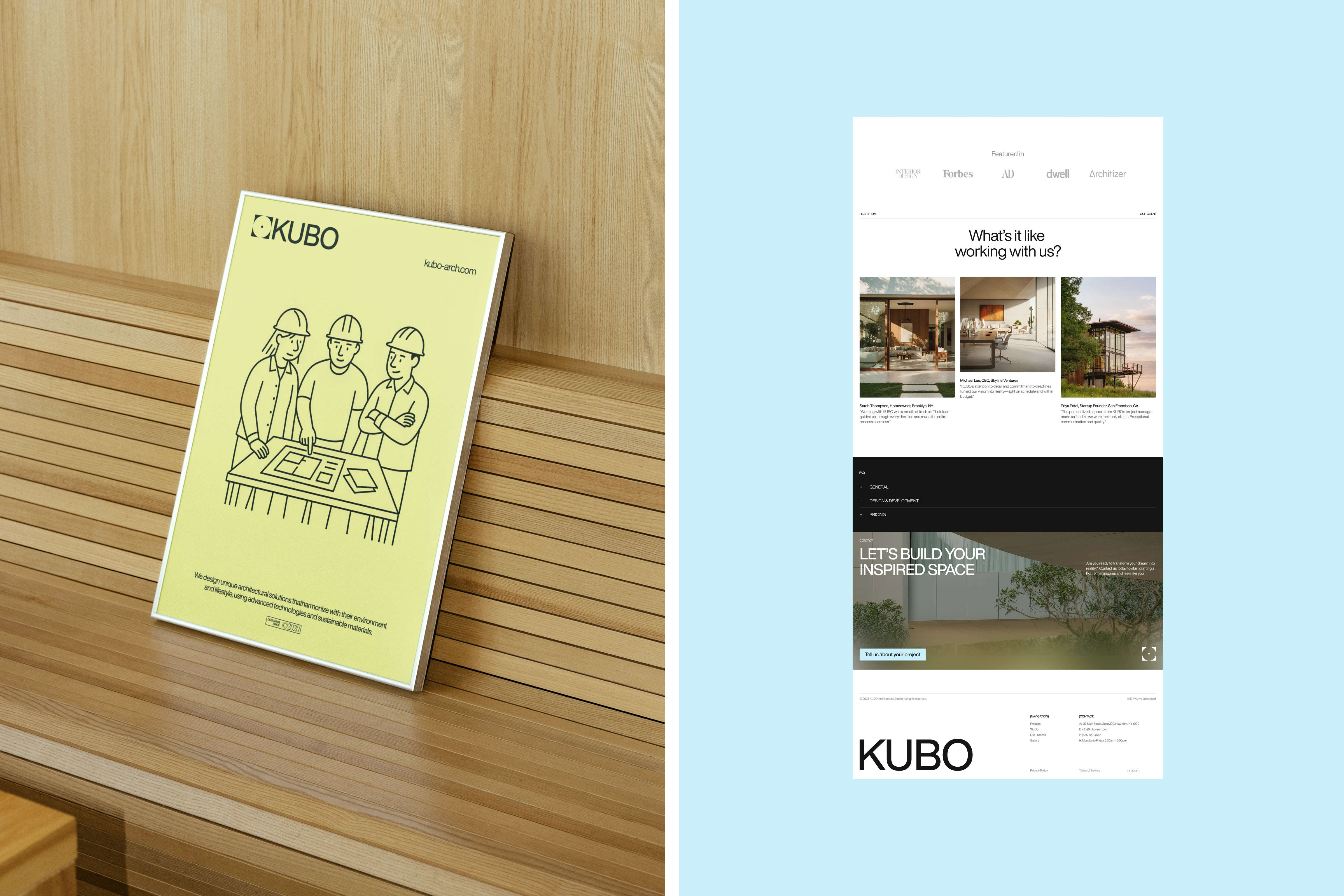
• Brand identity — logo, typography, and color palette reflecting material textures and calm energy.
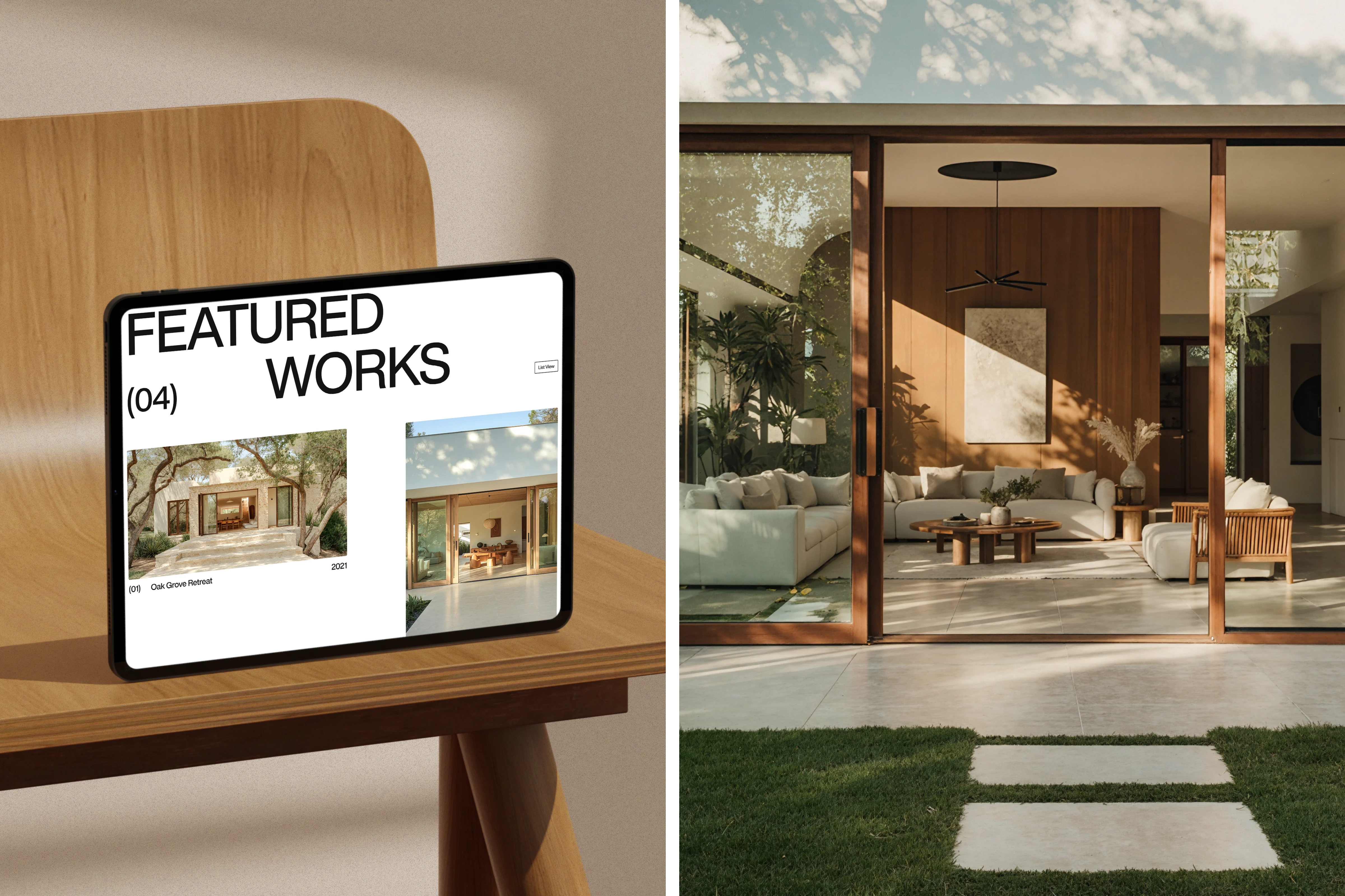
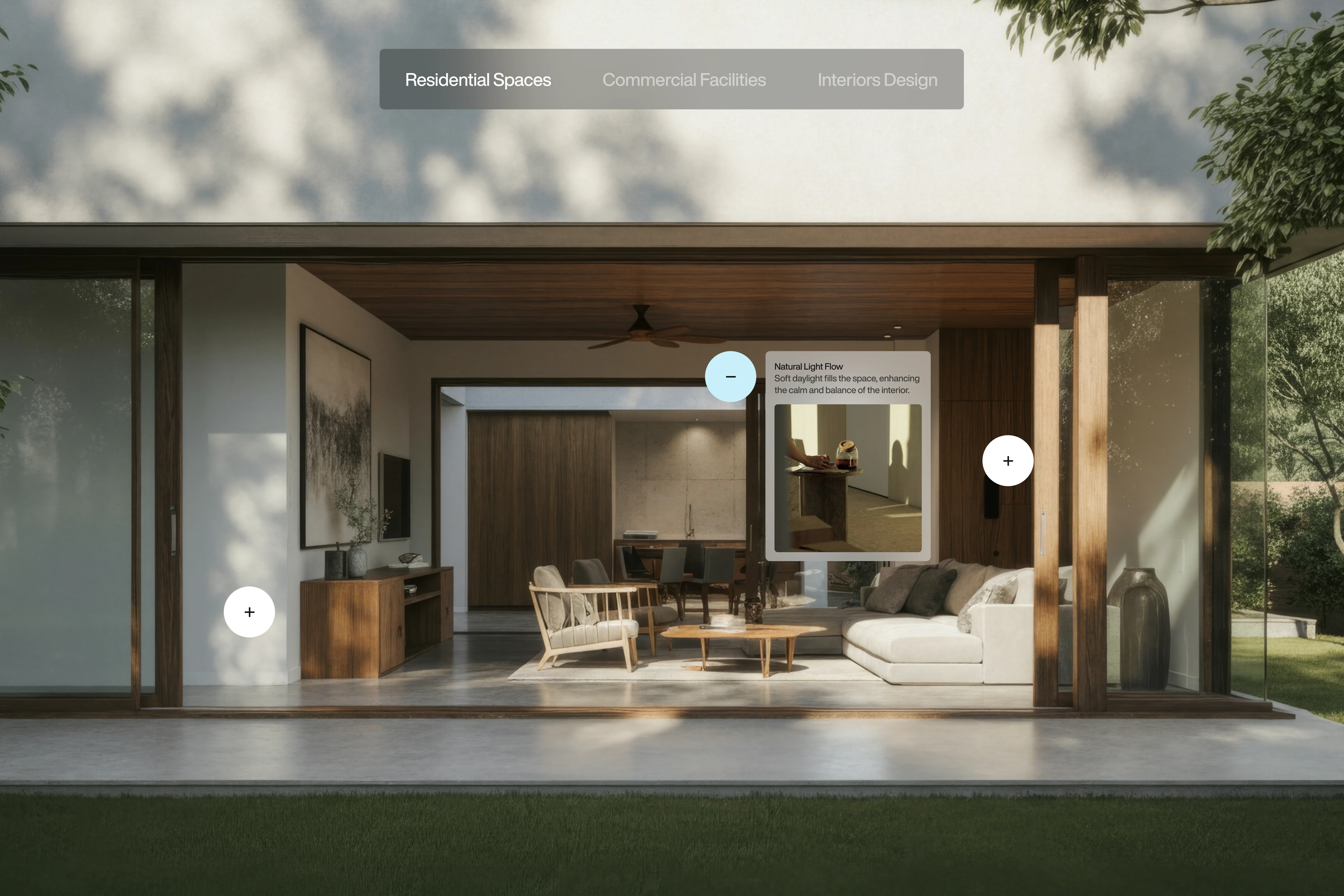
• Digital design — a website that feels like a digital studio space: clean grids, controlled motion, and warm visuals.
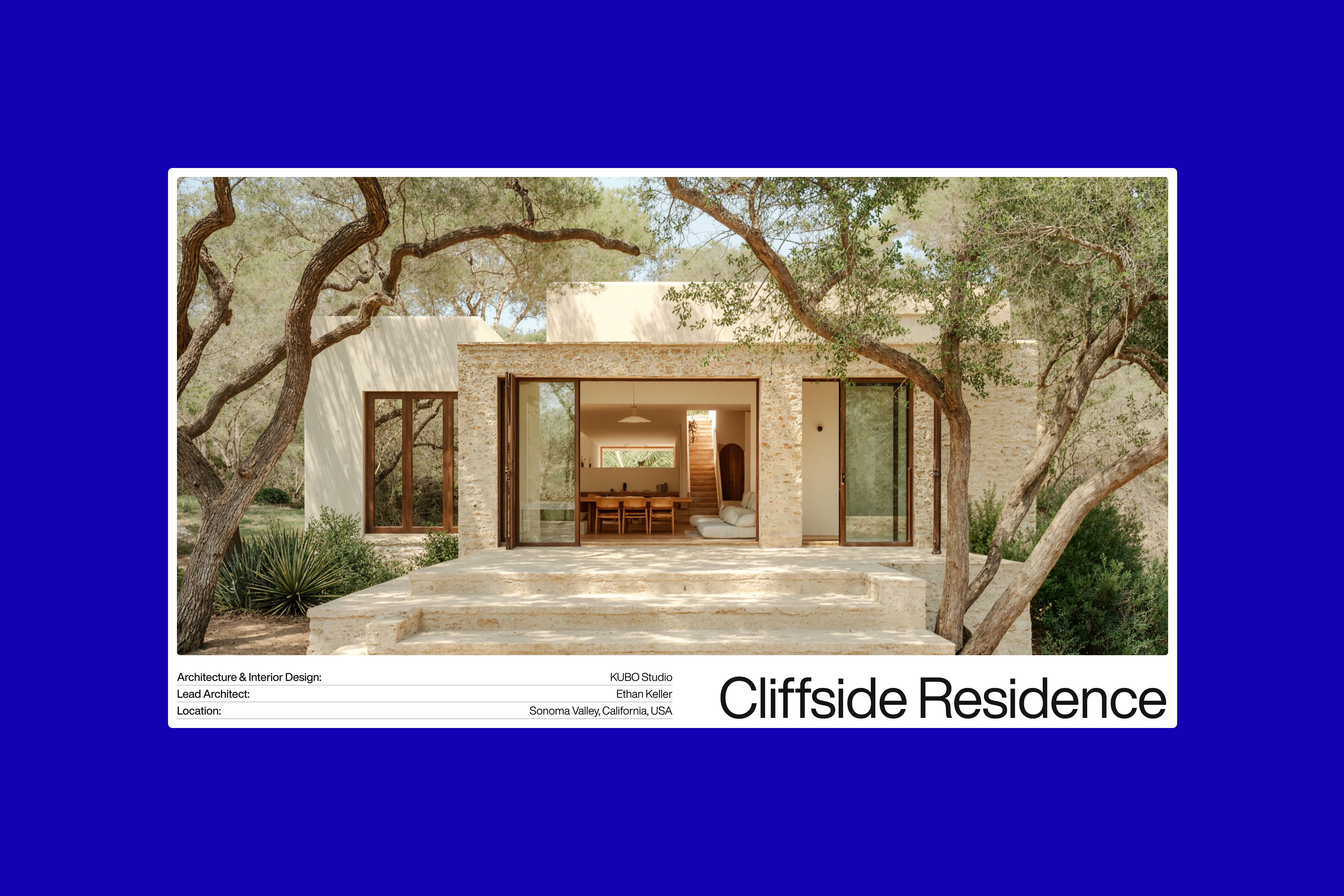
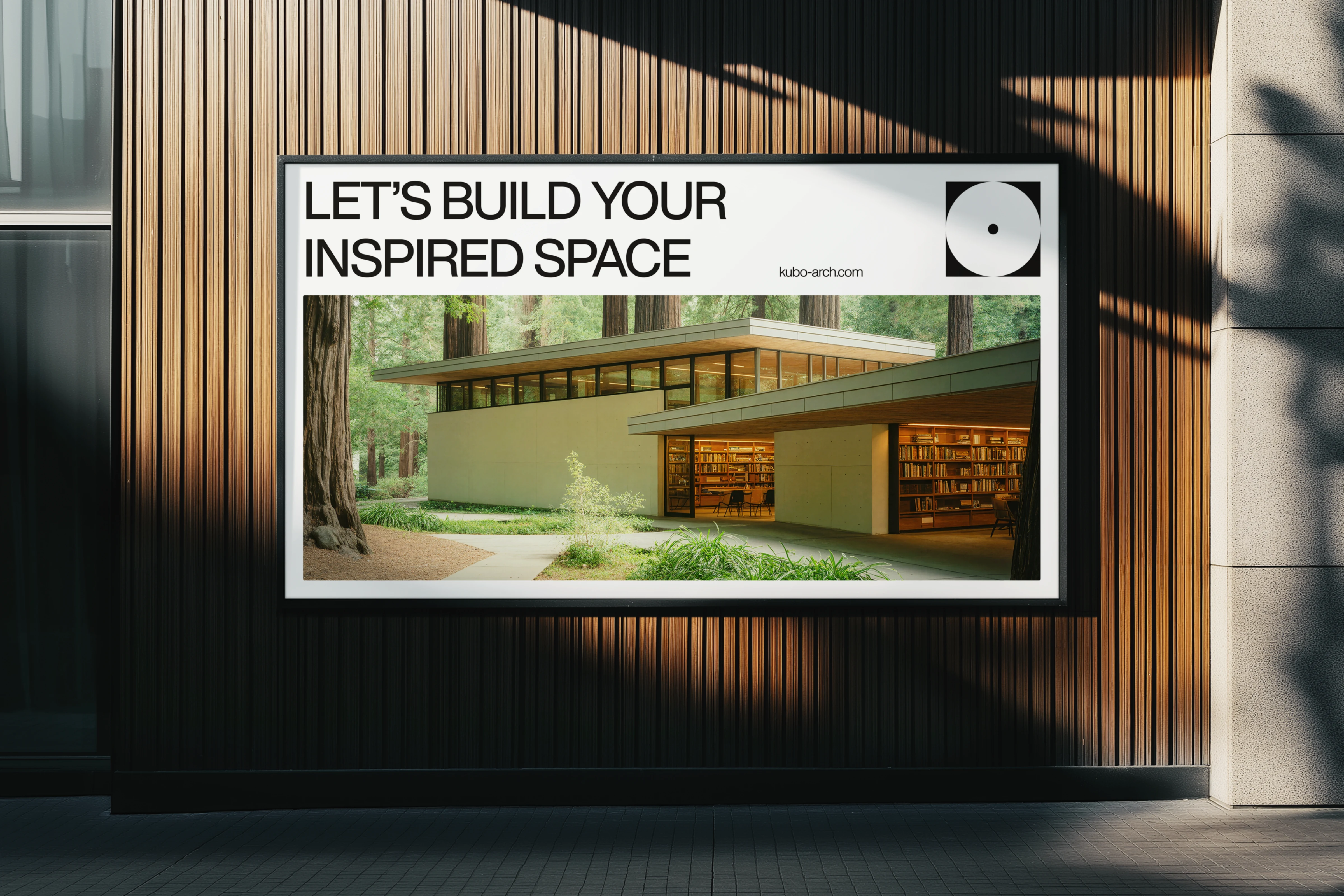
• Visual storytelling — imagery and motion that emphasize light, silence, and structure.
Outcome
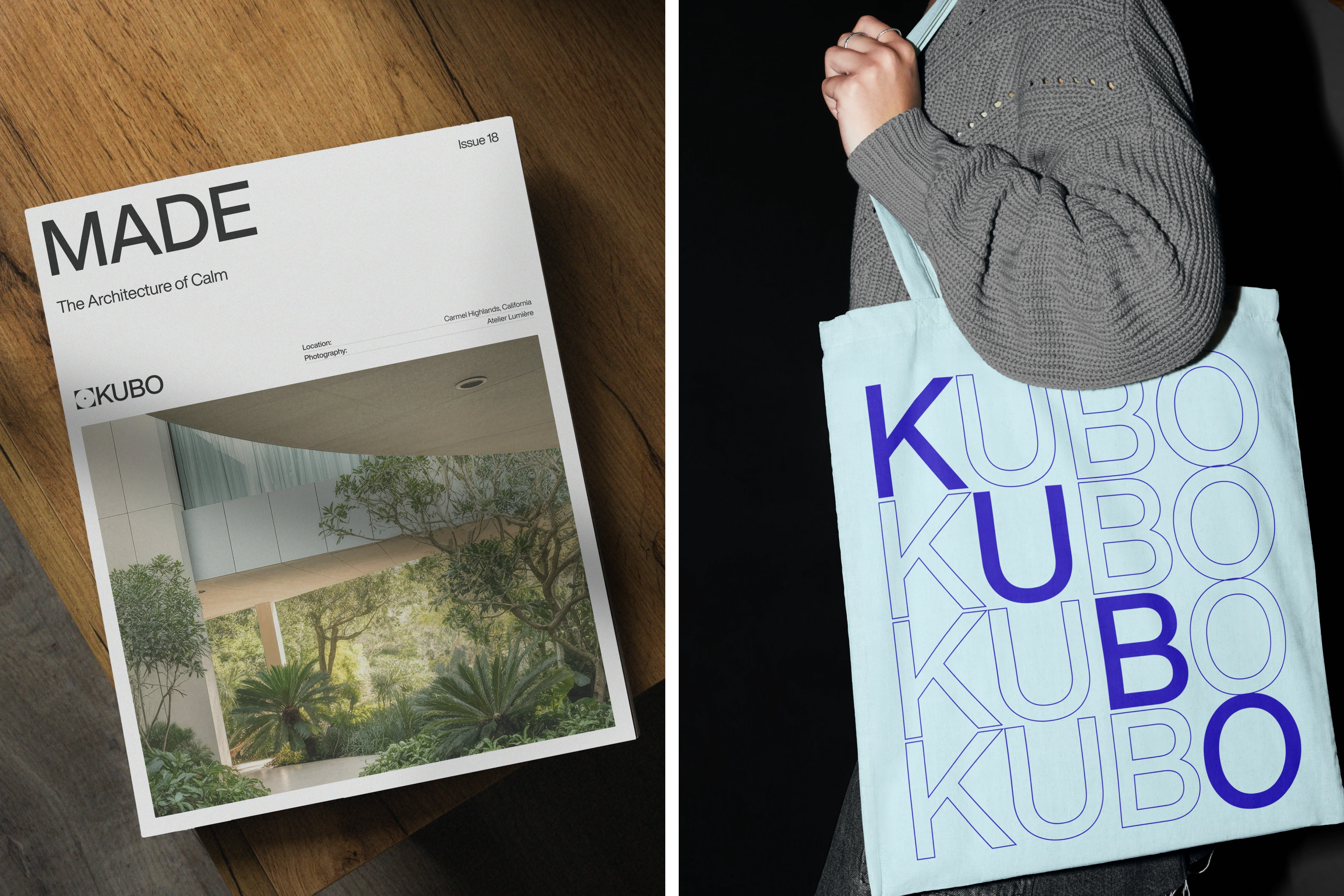
The result is a cohesive brand system that bridges architecture and design — where every element, from layout to typeface, feels intentional and timeless.
KUBO stands as a statement of balance: between form and feeling, nature and structure, simplicity and depth.
1 like · 24 views · Nov 7, 2025
Created KUBO’s visual and digital identity, reflecting the studio’s architectural philosophy of simplicity, balance, and connection with nature.


