
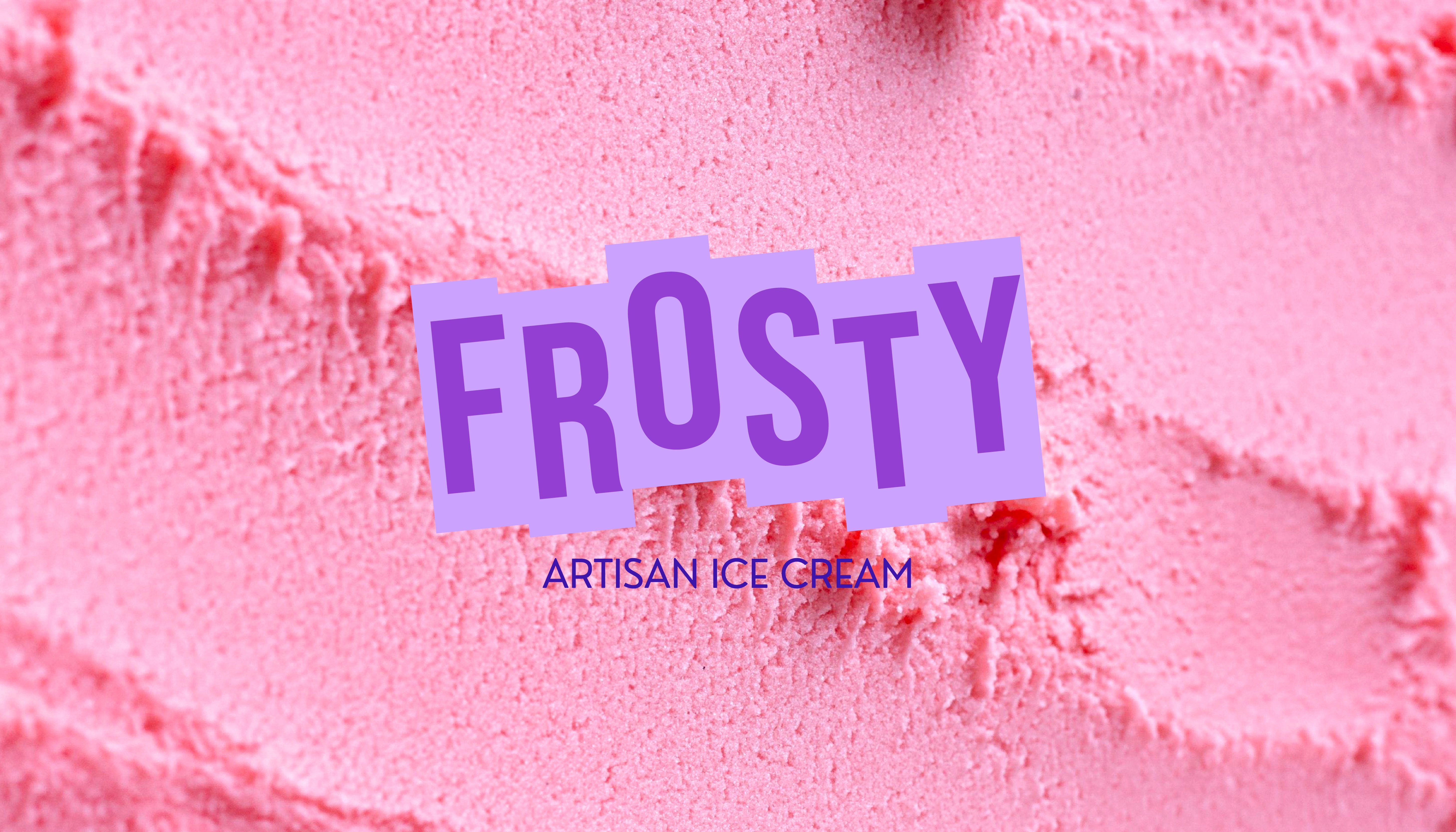
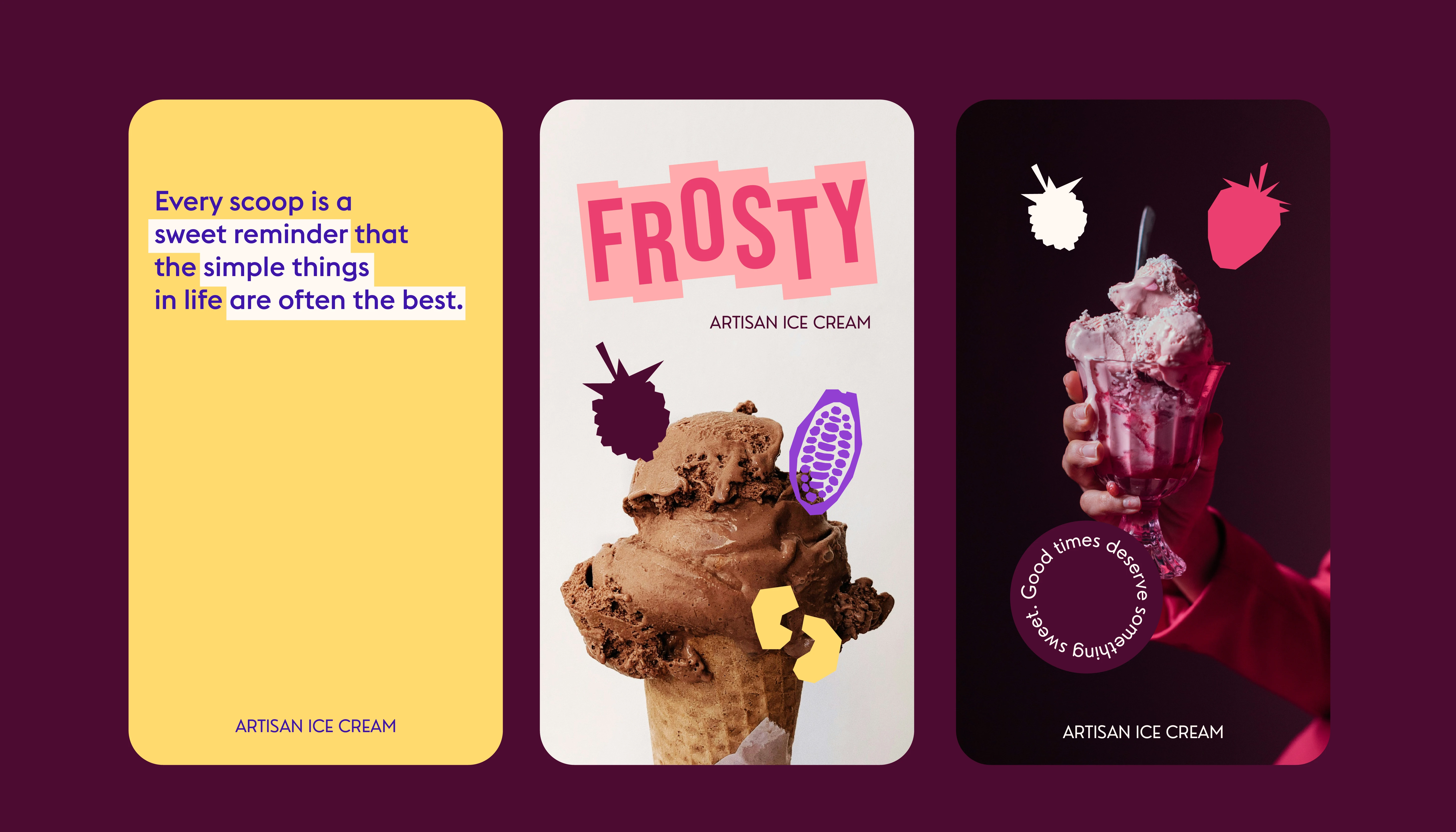
Frosty is an exploration of how minimalist graphic forms and a punchy, high-contrast palette can elevate the tactile experience of artisan ice cream. The visual identity is built on a "flavor-first" philosophy, where the branding doesn't just label the product but embodies the sensory profile of the ingredients through bold, monochromatic color blocking.
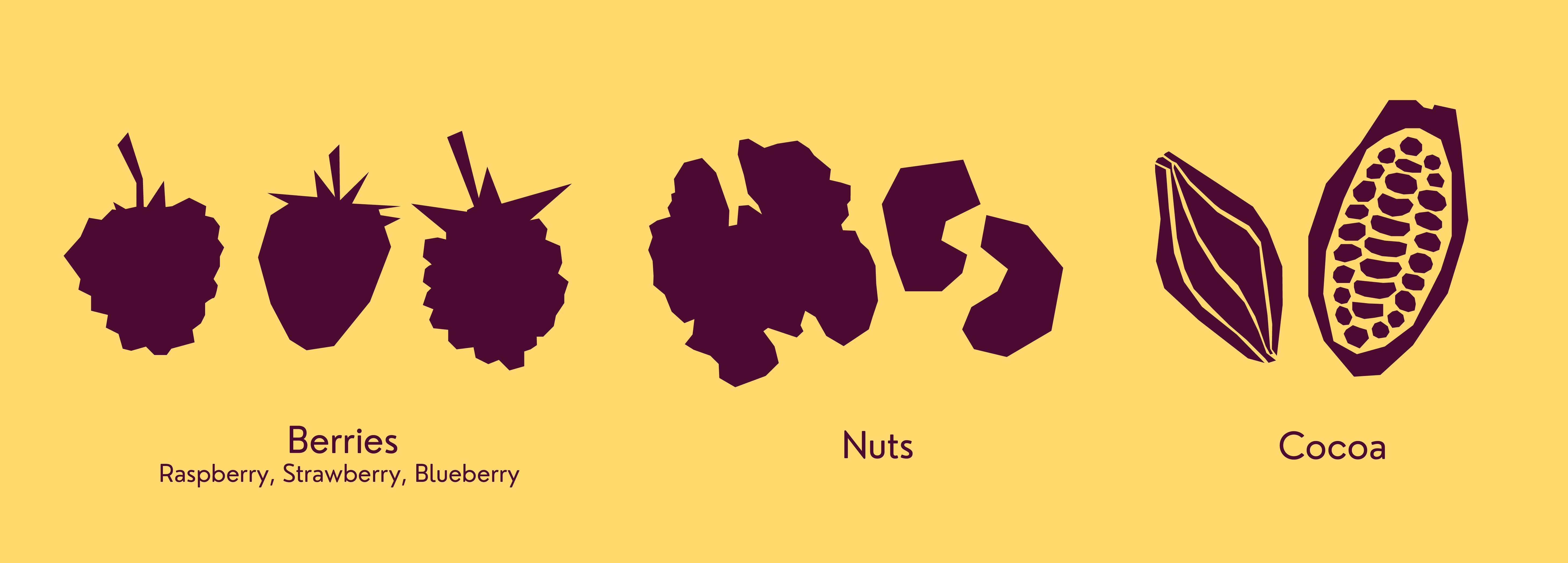
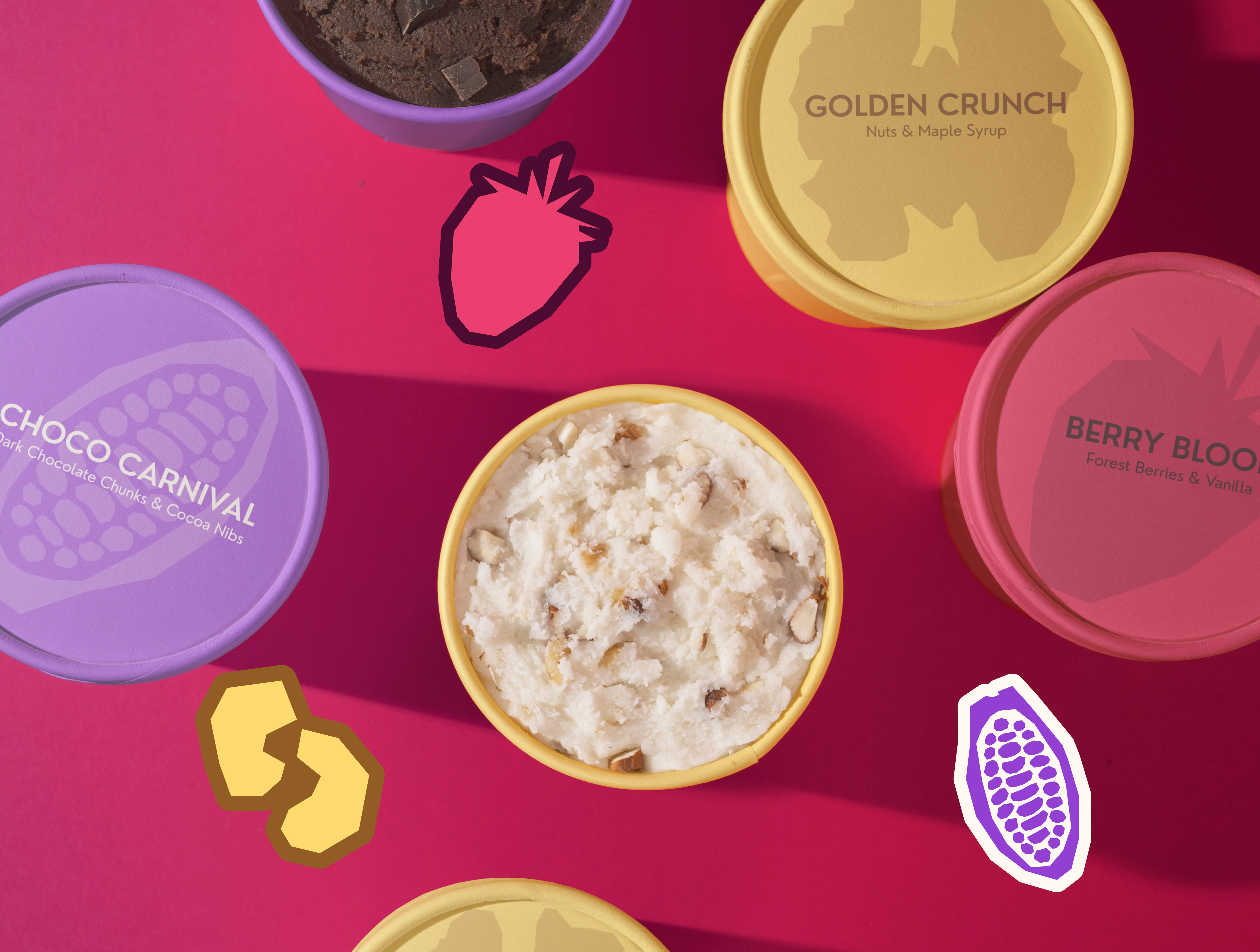
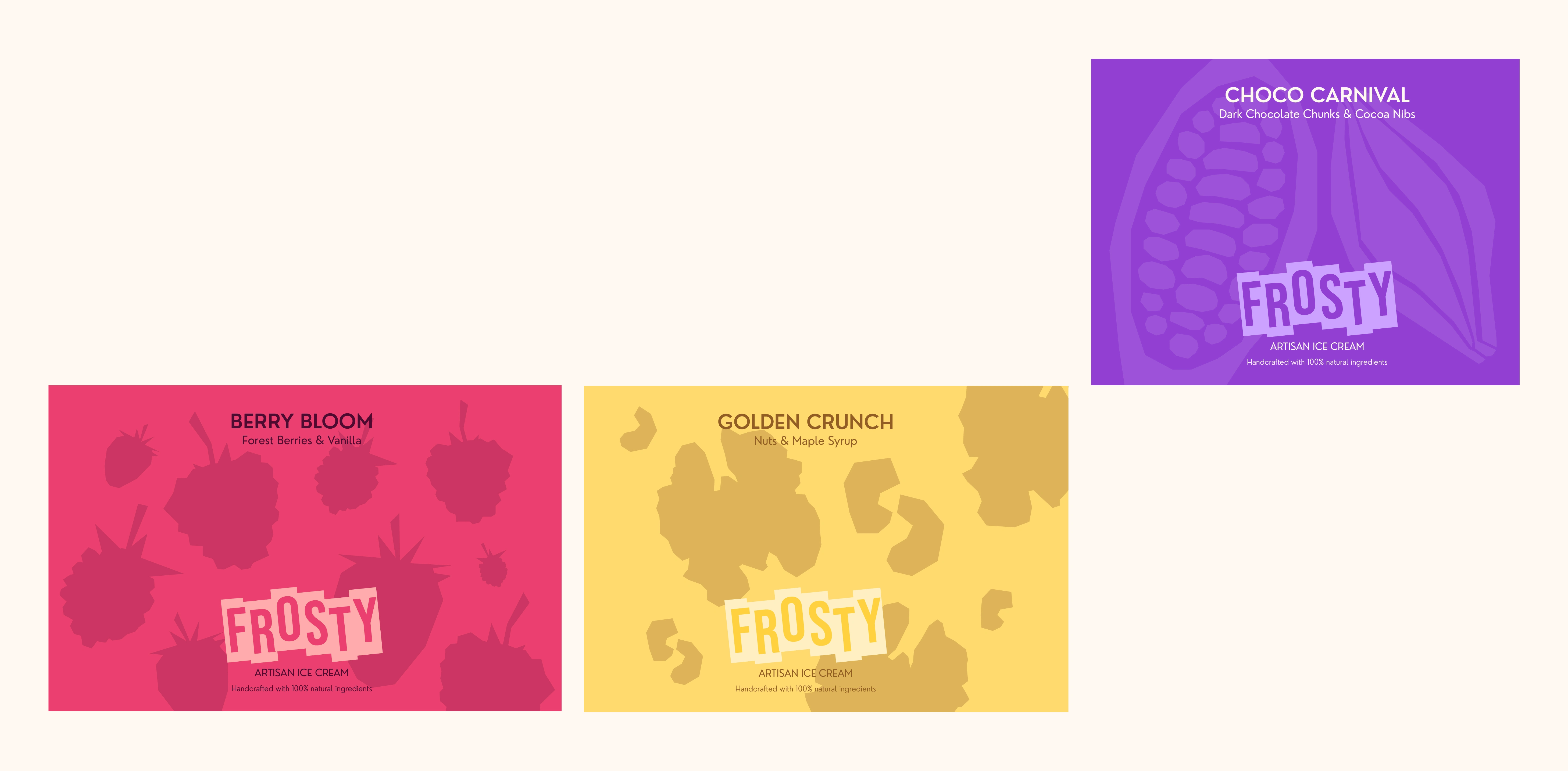
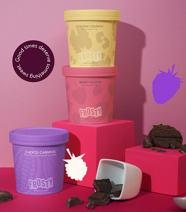
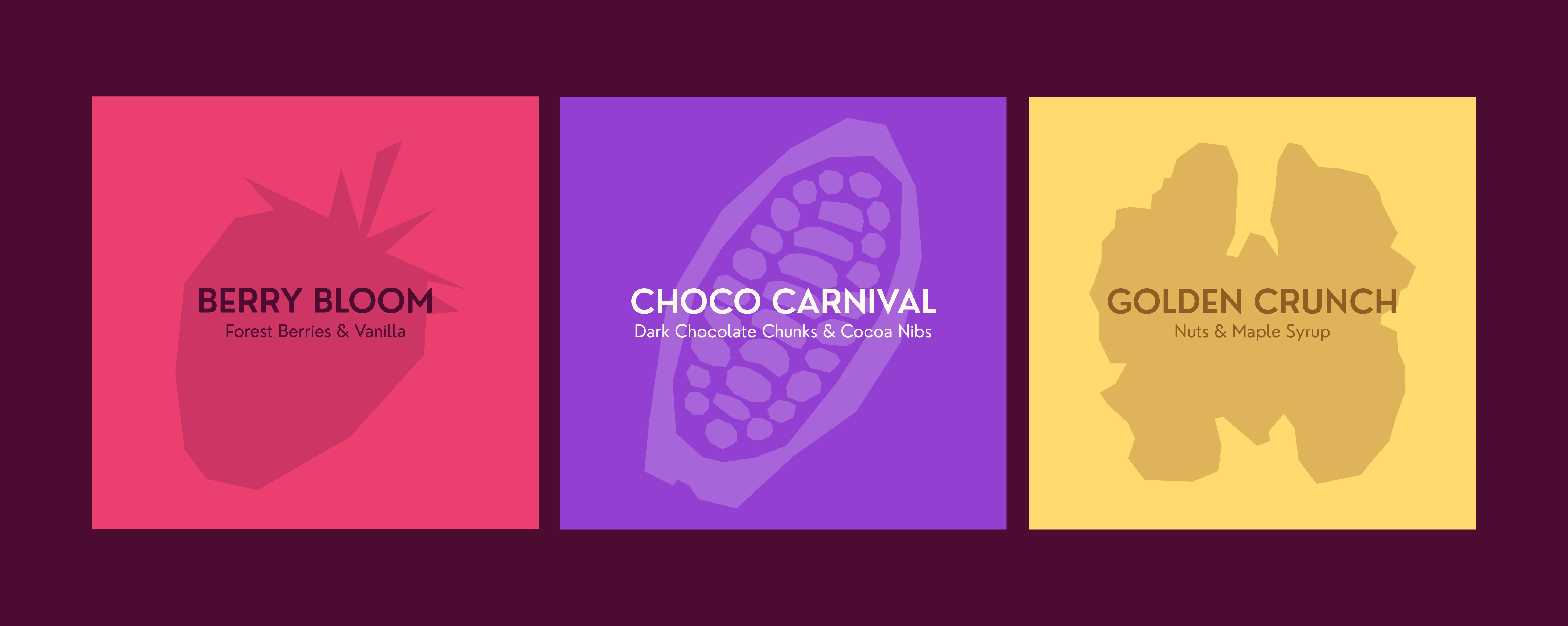
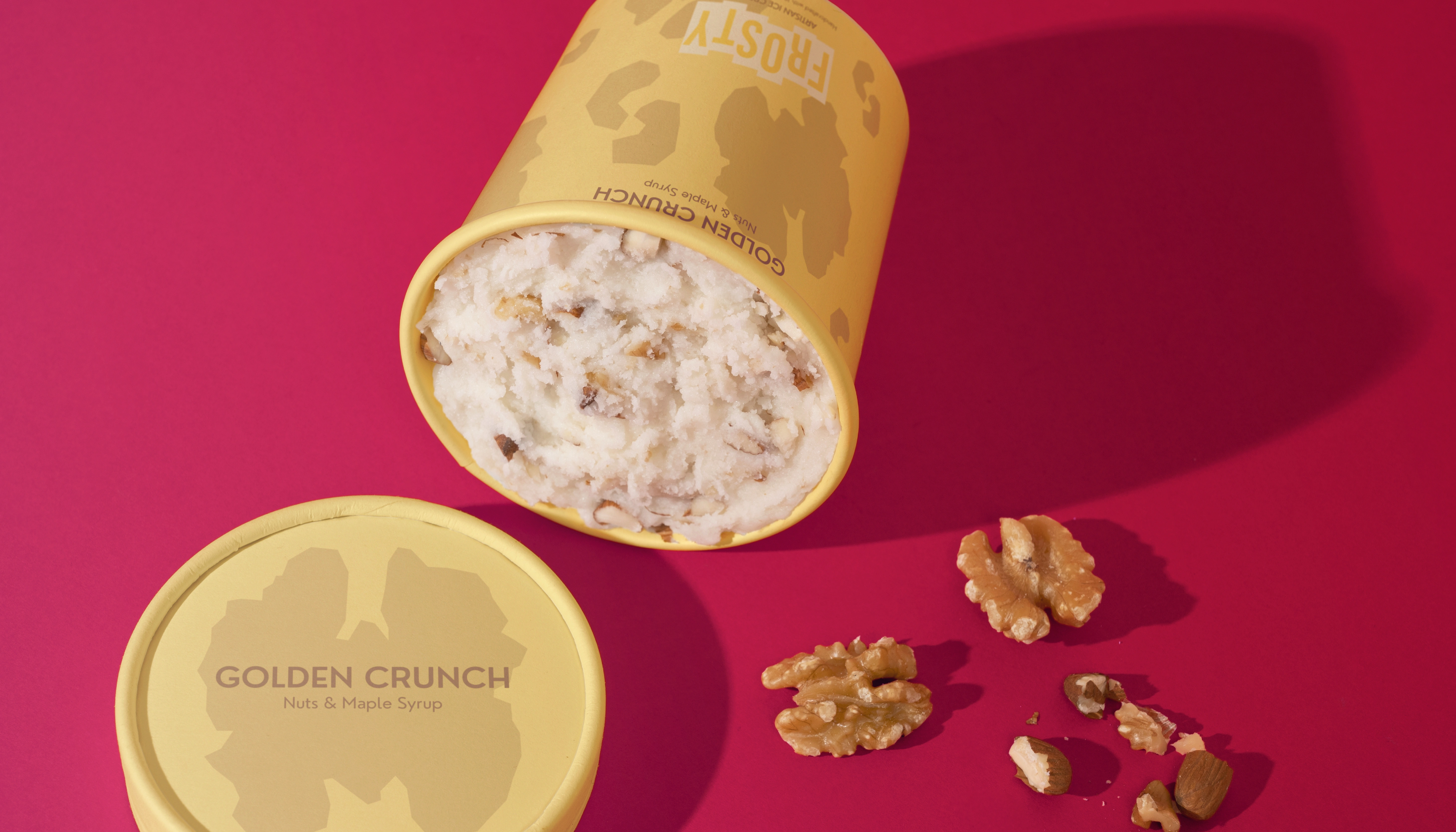
The design system utilizes a custom, heavy-set logotype that anchors the packaging, providing a sturdy, modern counterpoint to the organic, paper-cut style illustrations that wrap each pint. The core of the packaging design lies in its abstract iconography. Rather than relying on traditional food photography, each flavor is represented by a simplified silhouette of the main ingredient: a raspberry for Berry Bloom, a cacao pod for Choco Carnival, and a walnut for Golden Crunch.
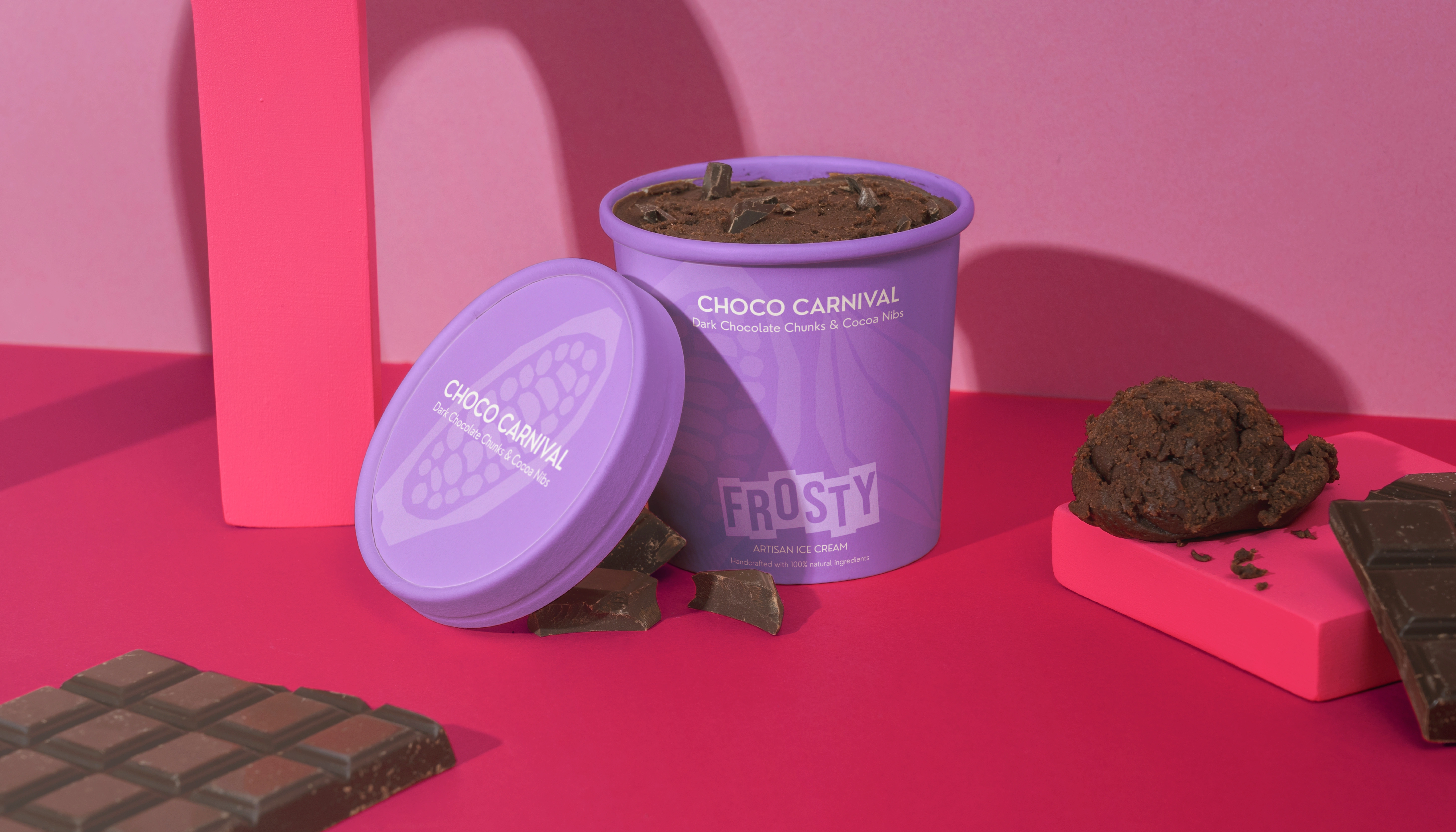
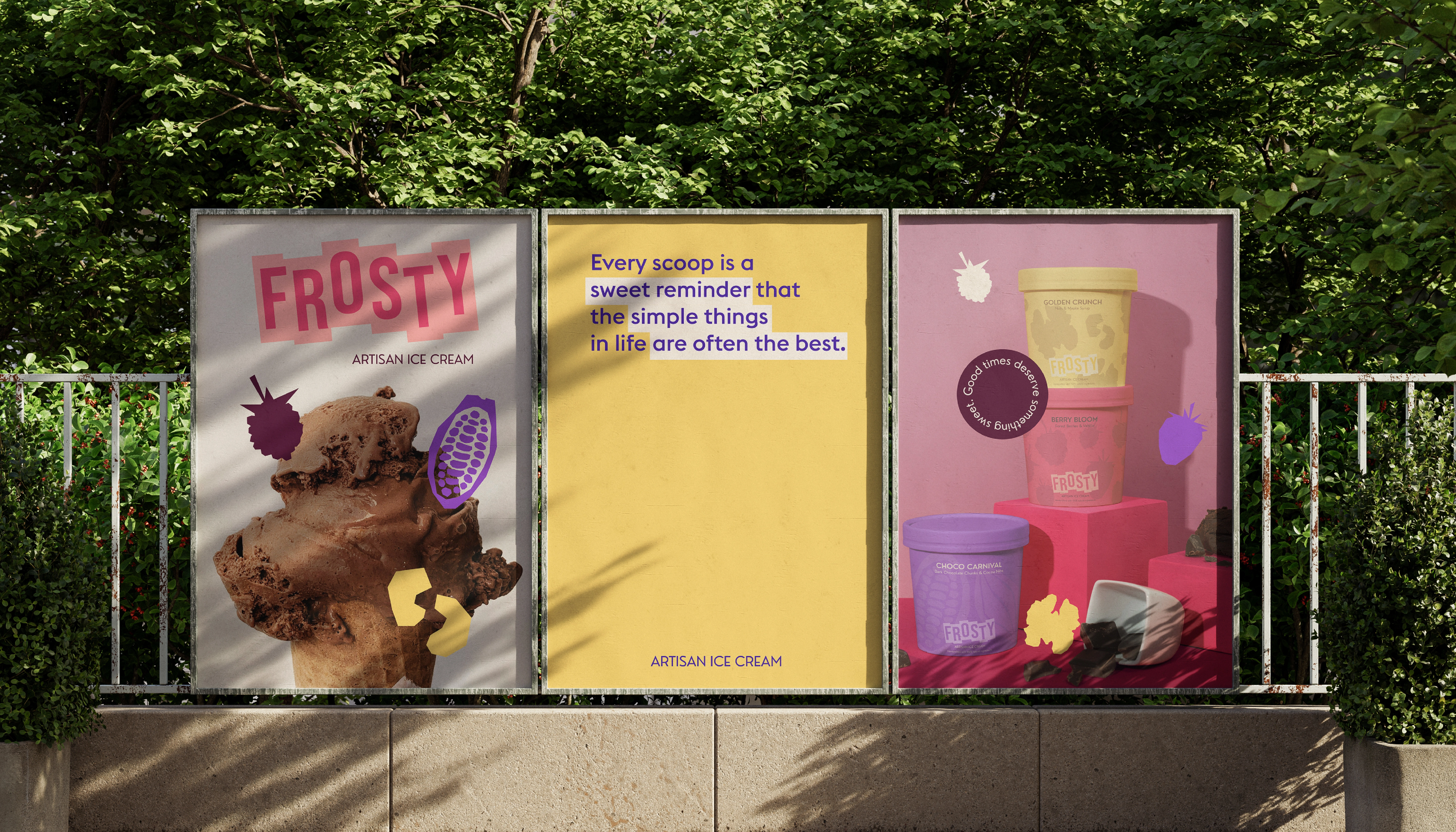
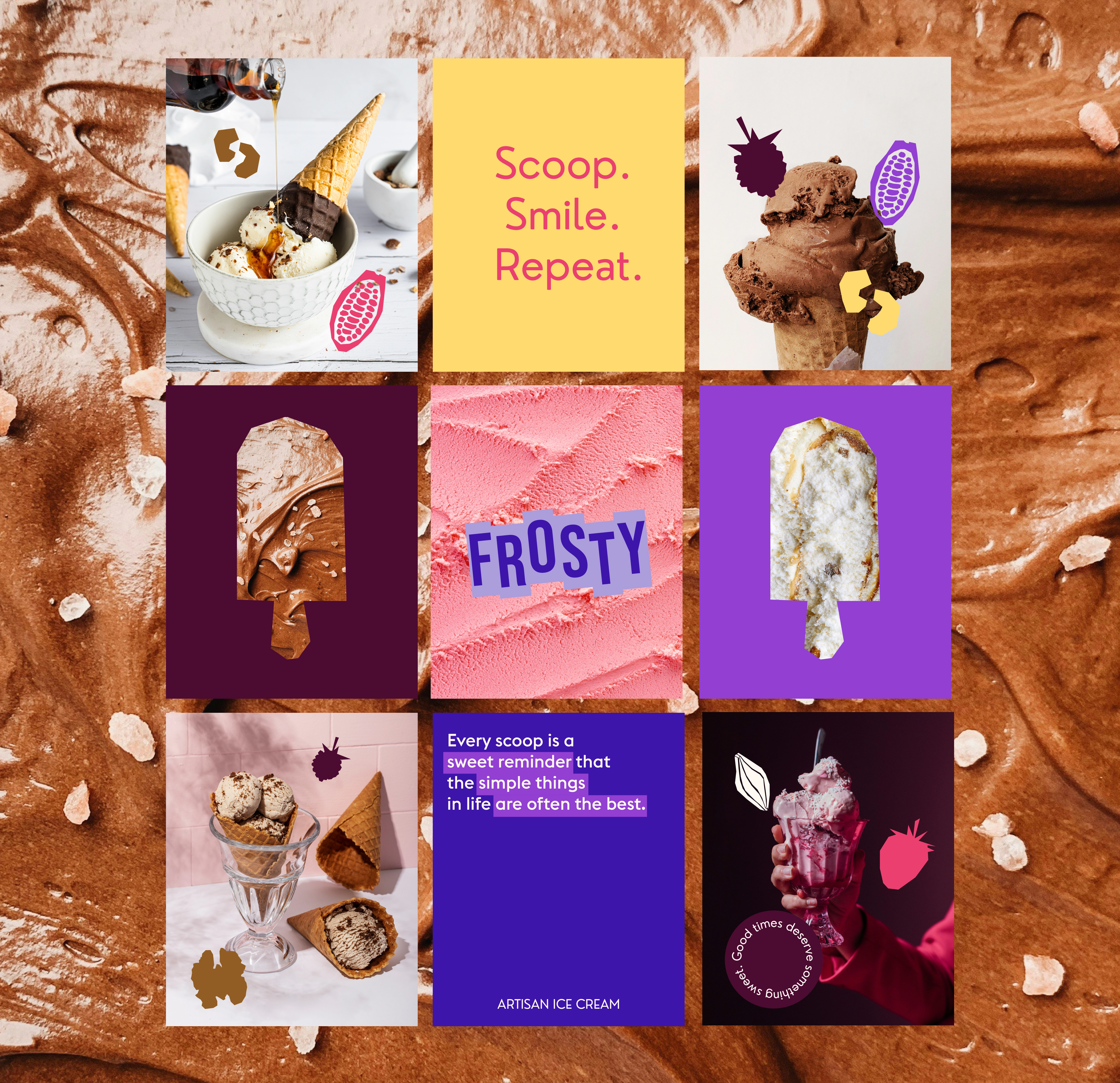
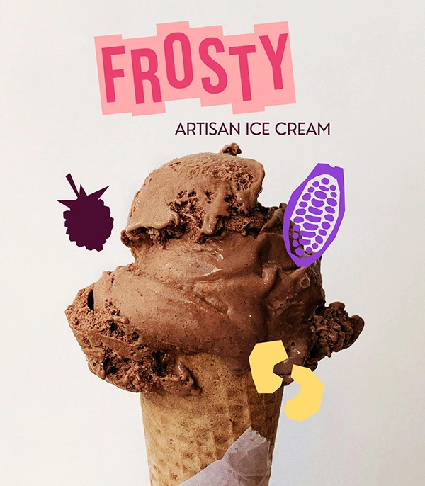
This illustrative language creates a cohesive brand architecture that is instantly recognizable on a crowded shelf. By pairing flat graphic elements with environmental product photography, the branding strikes a balance between premium artisan craft and a playful, accessible energy. The final result is a brand that feels as handcrafted and intentional as the ice cream itself.
0 likes · 0 views · Nov 3, 2026
Developed a minimalist brand identity for artisan ice cream using bold colors and abstract iconography.

