PickWish - Brand Identity and Website Design
As the husband of a teacher, I know all too well that there are so many teachers out there that pay for school supplies for their students and classroom out of pocket. Whether its due to budget cuts at the school, or simply giving back to their students out of a generous heart, there was a clear need for an easier way for people to help. PickWish is a site that connects teachers in need of school supplies to friends and family that are willing to help.

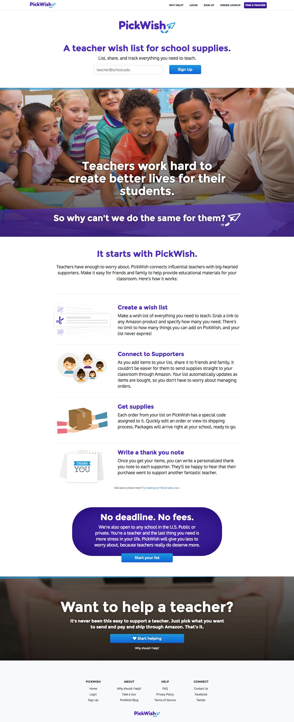
The front face of the website needed to get some really important messaging across. We targeted teachers as well as their friends and families who would be helping them. The main landing page encouraged teachers to sign up, and also helped motivate people to give back.


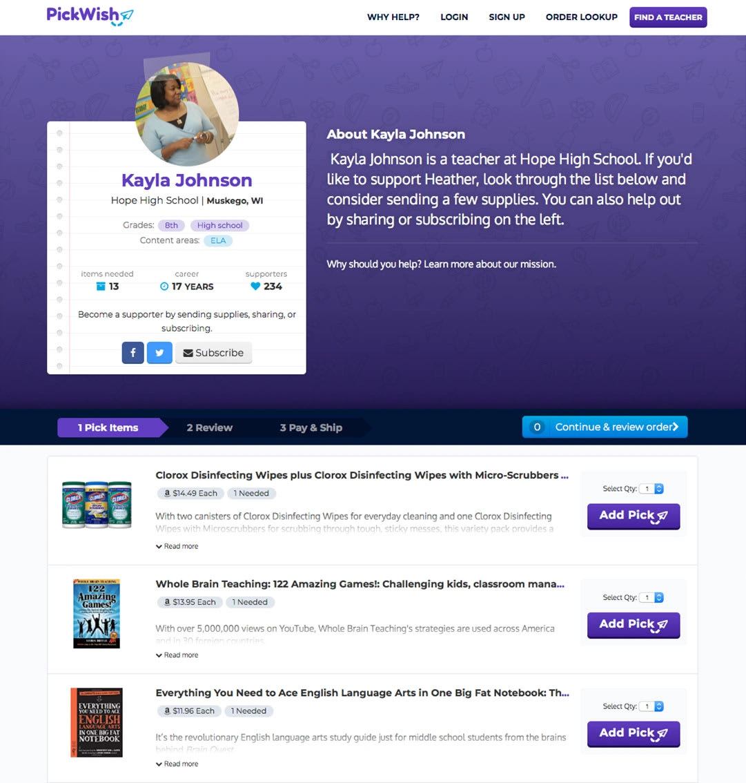
The other important page to design was the teacher profile. This would be the page that potential supporters land on when a teacher shares their profile, and it would also be home to a teachers main wish list. Teachers can fill out all their relevant information including school info, grades taught, and content areas. Supporters can add supplies to their cart, and continue through the checkout process to send supplies directly to the teacher’s school.
One of my favorite parts of any project is integrating the logo into the product through small animations throughout. We used the paper airplane icon in the loading screens in a few different ways. When viewing a teachers wish list and hovering over the “add pick” button, the airplane will turn into a plus icon. Little touches like this really help create an experience for the user that will make them want to keep exploring.
Like this project
Posted Jan 11, 2023
PickWish is a site that connects teachers in need of school supplies to friends and family that are willing to help.


