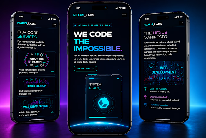
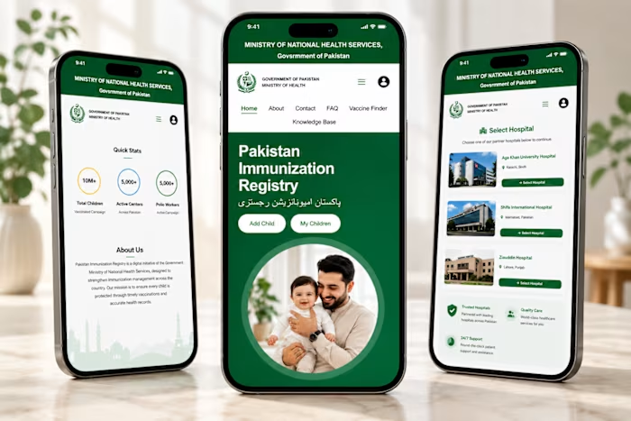
Good interfaces don't shout. They quietly

Zaid Ali


Good interfaces don't shout.
They quietly guide people exactly where they need to go.
This concept explores what a modern educational website should feel like:
clean, structured, approachable, and built for every screen.
Rather than filling the page with unnecessary elements, I focused on creating balance through typography, whitespace, and purposeful layouts.
Design that looks good gets attention.
Design that feels effortless builds trust.
Curious to hear your thoughts:
What's one thing that instantly tells you a website was designed with care?
Like this project
Posted Aug 5, 2026
Good interfaces don't shout. They quietly guide people exactly where they need to go. This concept explores what a modern educational website should feel lik...
Likes
0
Views
4
Timeline
Jan 15, 2026 - Feb 15, 2026