
Background
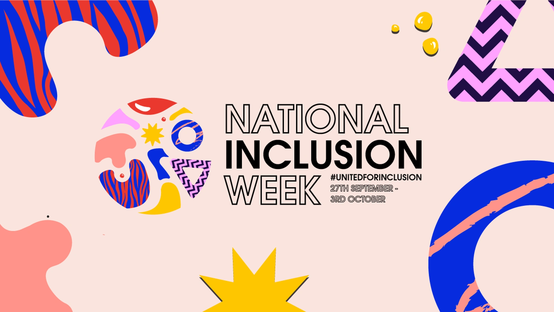
In 2021, Publicis celebrated National Inclusion Week under the theme #UnitedForInclusion, reinforcing the company’s commitment to diversity, equity, and belonging. As part of this initiative, we were challenged with developing the visual branding for the event—one that authentically reflected the spirit of inclusion while resonating across a diverse internal audience.
The Challenge
The key challenge was to visually express diversity without reducing it to clichés or singular representations. The branding needed to acknowledge individuality while clearly communicating a sense of togetherness and shared purpose. It also had to be flexible enough to work across multiple touchpoints throughout the week.
The Solution
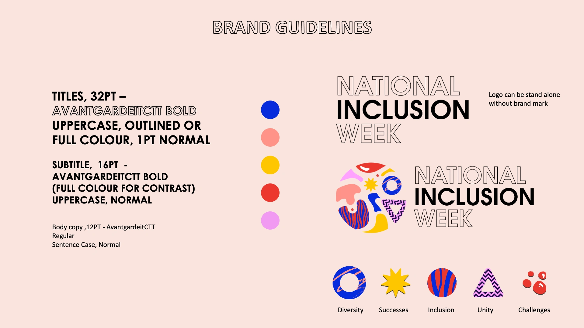
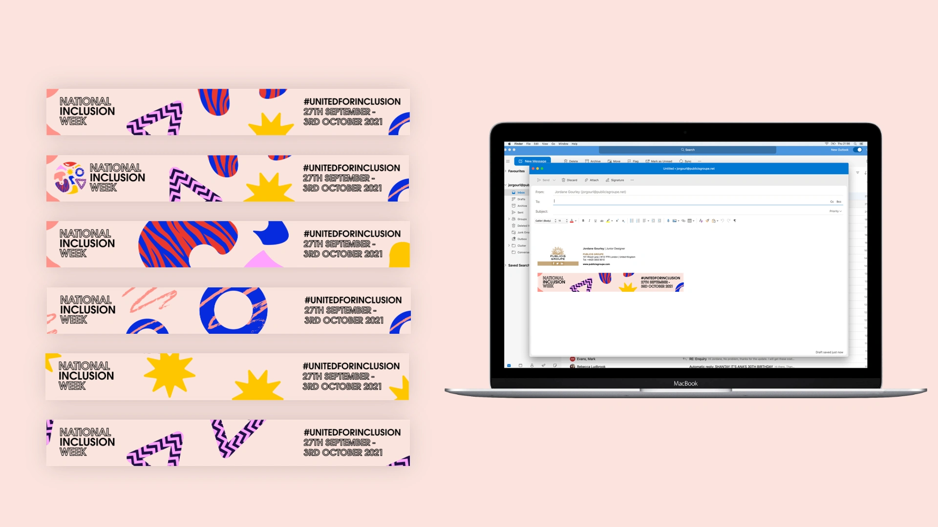
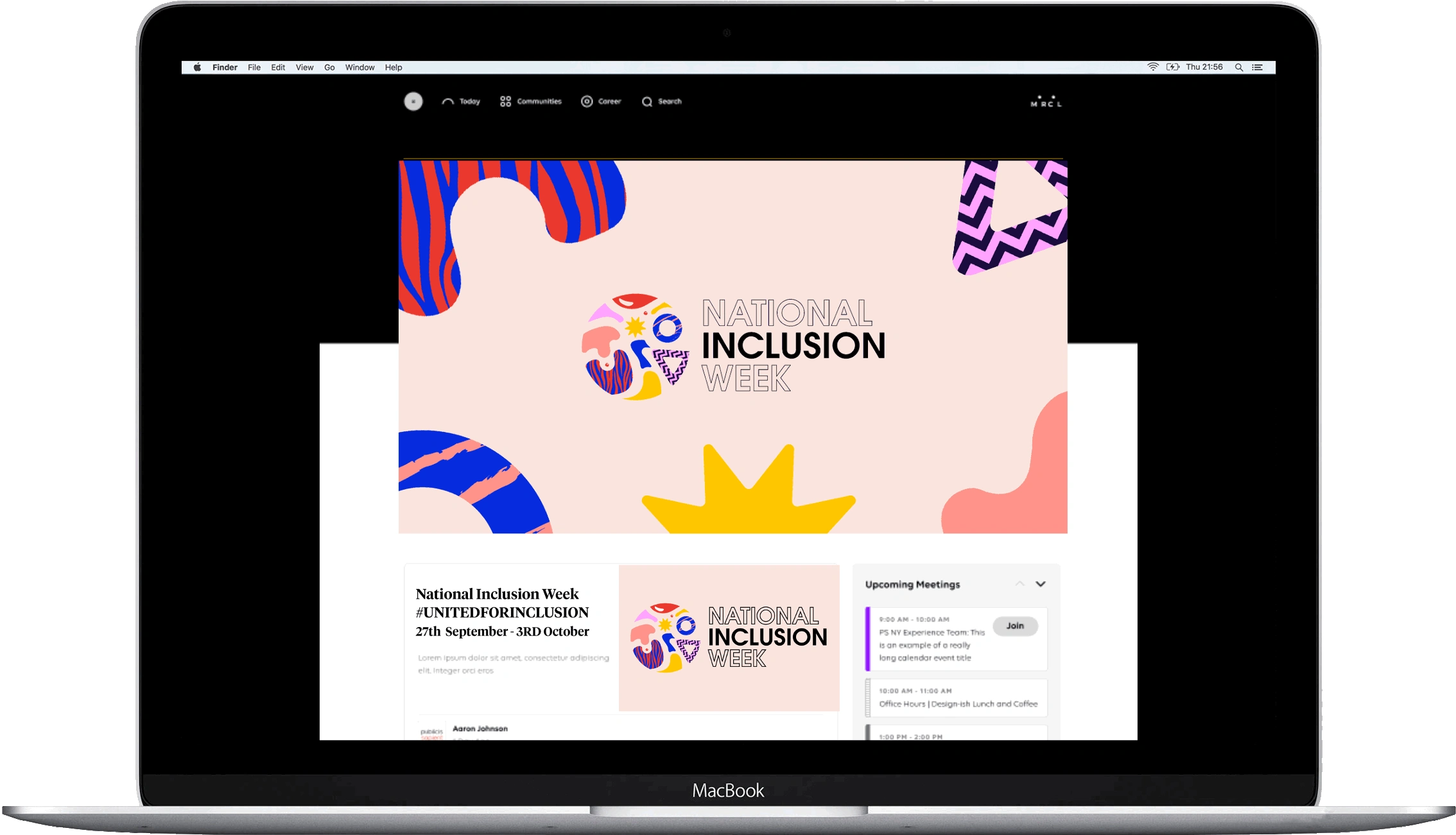
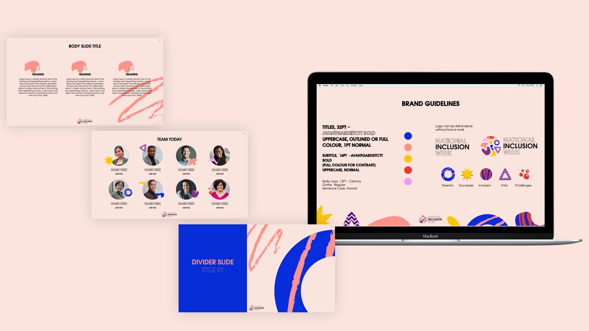
Our creative approach was to represent diversity through a rich mix of colours, patterns, and shapes, each symbolising different identities, perspectives, and experiences. Rather than existing in isolation, these elements were designed to interact and come together, forming a cohesive visual system that represented unity through difference.
Bold colour palettes conveyed energy and visibility, varied patterns reflected individuality, and distinct shapes symbolised the many voices within Publicis. When combined, these elements created a unified visual language that embodied the core message of #UnitedForInclusion—that inclusion is strongest when differences are embraced and connected.
The Outcome
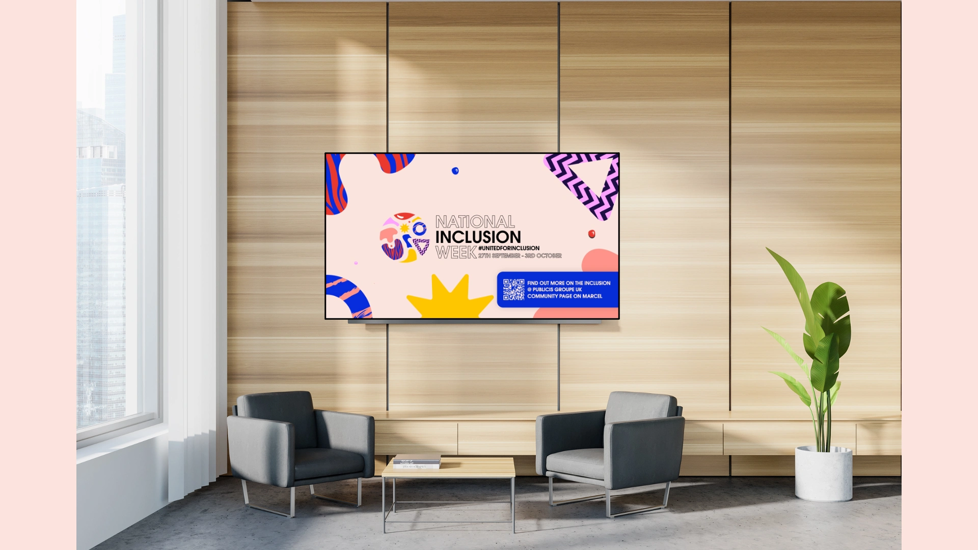
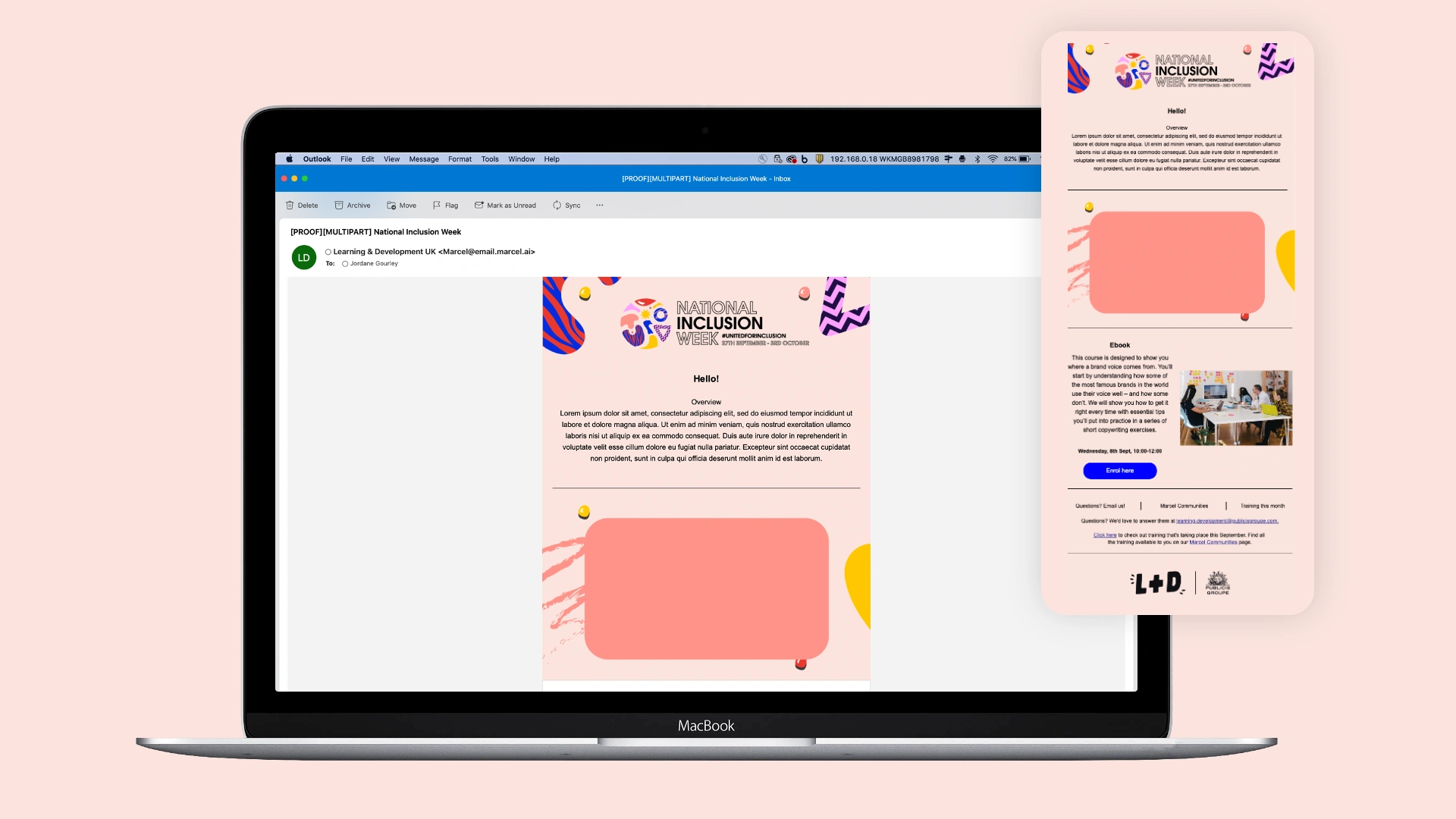
The final branding system was vibrant, inclusive, and adaptable, successfully capturing the essence of National Inclusion Week. It provided Publicis with a strong, recognisable visual identity for the campaign, reinforcing the message that while we are all different, we are stronger when we stand together.
0 likes · 8 views · Jan 12, 2026
In 2021, Publicis celebrated National Inclusion Week, #unitedforinclusion. We were challenged to do the branding for the event.


