Lemme • Social Media Design & Creative Direction

Sian V.


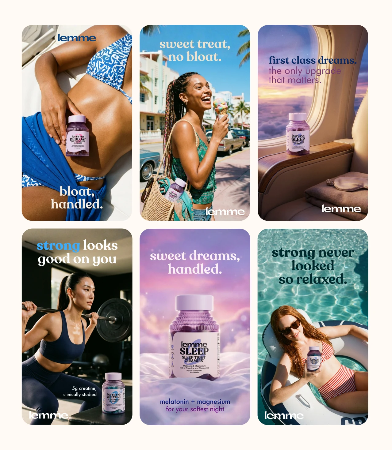
1080x1920 Showreel Format
A complete ad campaign for the supplement brand Lemme. The goal wasn't to make a few nice-looking renders. It was to build a campaign that could actually run: six ad creatives across three products, each one delivered in both 1:1 and 9:16 so it drops straight into Meta, feed and stories without reworking anything. Everything you see was AI-generated, art-directed to sit inside Lemme's real brand, then finished for platform.
1080x1920 Feed Format
The thinking behind it was one summer world holding three very different products together. Lemme's range goes from a digestive gummy to a sleep aid to creatine, which could easily feel like three unrelated brands if you're not careful. So I gave each product its own mood, bright and a little cheeky for Debloat and Creatine, calm and dreamy for Sleep, but kept the color, the tone of voice and the product styling consistent enough that all six read as one campaign. That balance, letting each ad feel distinct while the set still hangs together, is most of the job when you're designing for a brand rather than just making images.
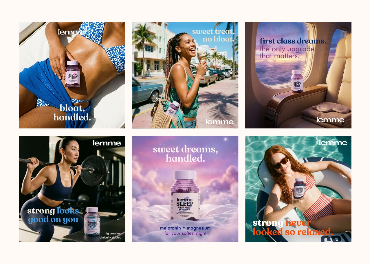
1080x1080 Feed Format Showreel
Every creative was built to sell, not just to look good. Real brand colors, on-brand lowercase copy, accurate packaging down to the label, and a hook written for the half-second someone spends deciding whether to keep scrolling. The mix was deliberate too: some clean product-hero shots, some lifestyle scenes with models, some bright and sunny, one dark and editorial, so the campaign has range across angles and formats the way a real performance set needs to. Each layout was then set up for both square and vertical from the start, so nothing looks cropped or compromised depending on where it runs.
The six concepts span Debloat on a Miami street and overhead on a beach daybed, Sleep as a dreamy floating cloud and a first-class cabin, and Creatine in a dark LA gym and out on a pool floatie. Hooks run from sweet treat, no bloat to first class dreams to strong looks good on you, each written to match its scene and its product. Generated in Nano Banana through Flora, then finished in Photoshop and Figma. Six concepts, twelve files, all ready to run.
1080x1080 Feed Format
Like this project
Posted Aug 2, 2026
Creative directed and designed a social media campaign for Lemme's DTC products. All product images were created using AI.
Likes
3
Views
74
Timeline
Jul 27, 2026 - Aug 2, 2026
Clients
Lemme