Croatia. My Family's Kind of Summer • Ad Creative System

Sian V.

An ad creative system for a luxury hospitality brand from Croatia. Photography courtesy of the brand.
The concept
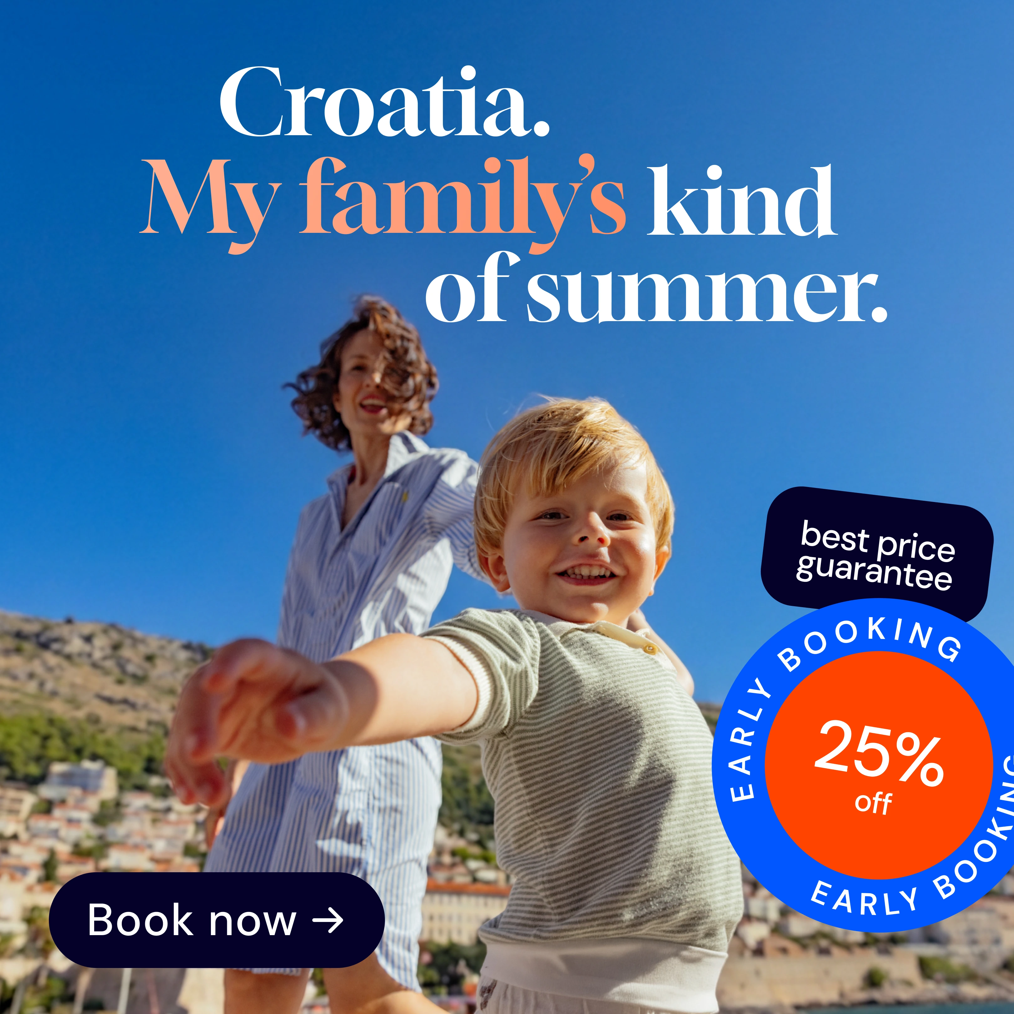
Parents book the trip. What they actually keep is a picture of their child completely at ease, arms out, nothing on their mind. That is the feeling I built the campaign around, and it is why the family segment of an Early Booking push should not lead with a discount. It should lead with the summer the discount pays for.
The claim, "Croatia. My family's kind of summer.", grows out of the brand's existing "My kind of Croatian summer" line. I kept the brand's own mechanic and made one move: I made it personal. "My family's" turns a destination promise into a family memory, which is exactly the segment I was designing for. The line is also built to travel. It stays short and sits in two to four lines, so it survives longer translations to other languages without the layout breaking.
Color palette
The color palette
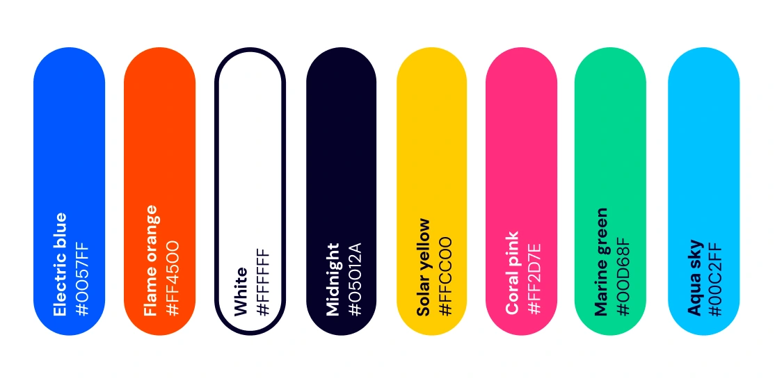
The palette comes straight out of the hero photograph: the deep blue of the sky, the warm orange of late sun, and an almost black tone for depth. Three colors anchor the whole campaign, Electric blue, Flame orange, and Midnight, backed by a set of brighter accents. Every sticker and call to action exists in the full palette, so each placement can be tuned to its own background while the set still reads as one campaign. And because the palette is drawn from the image rather than picked by hand, it can be rebuilt from a new photograph without changing a single rule.
A modular sticker and call to action kit
Stickers
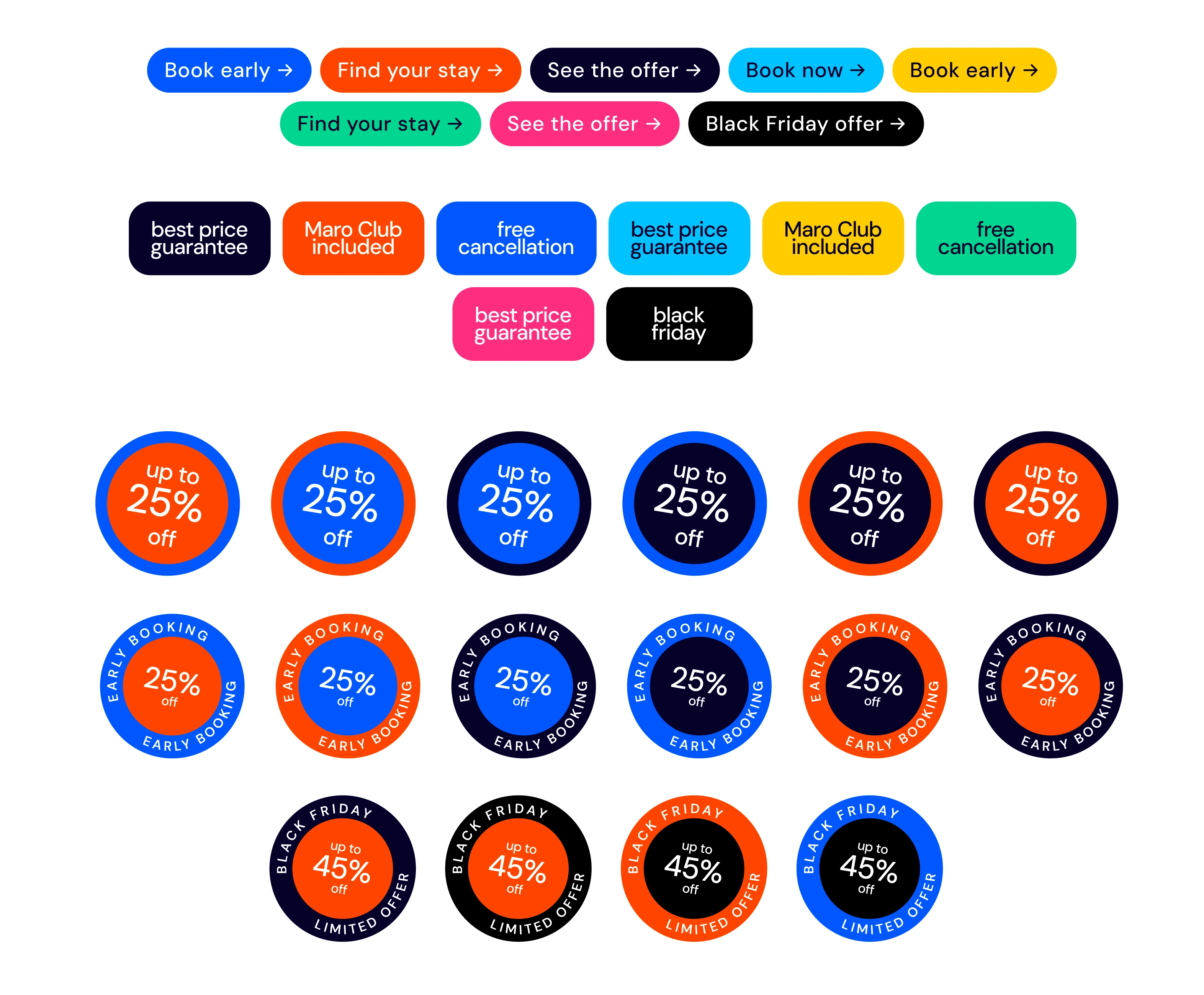
The offer changes through the season, so the offer elements are components, not fixed art. I designed a kit that snaps onto the master layout without touching anything else.
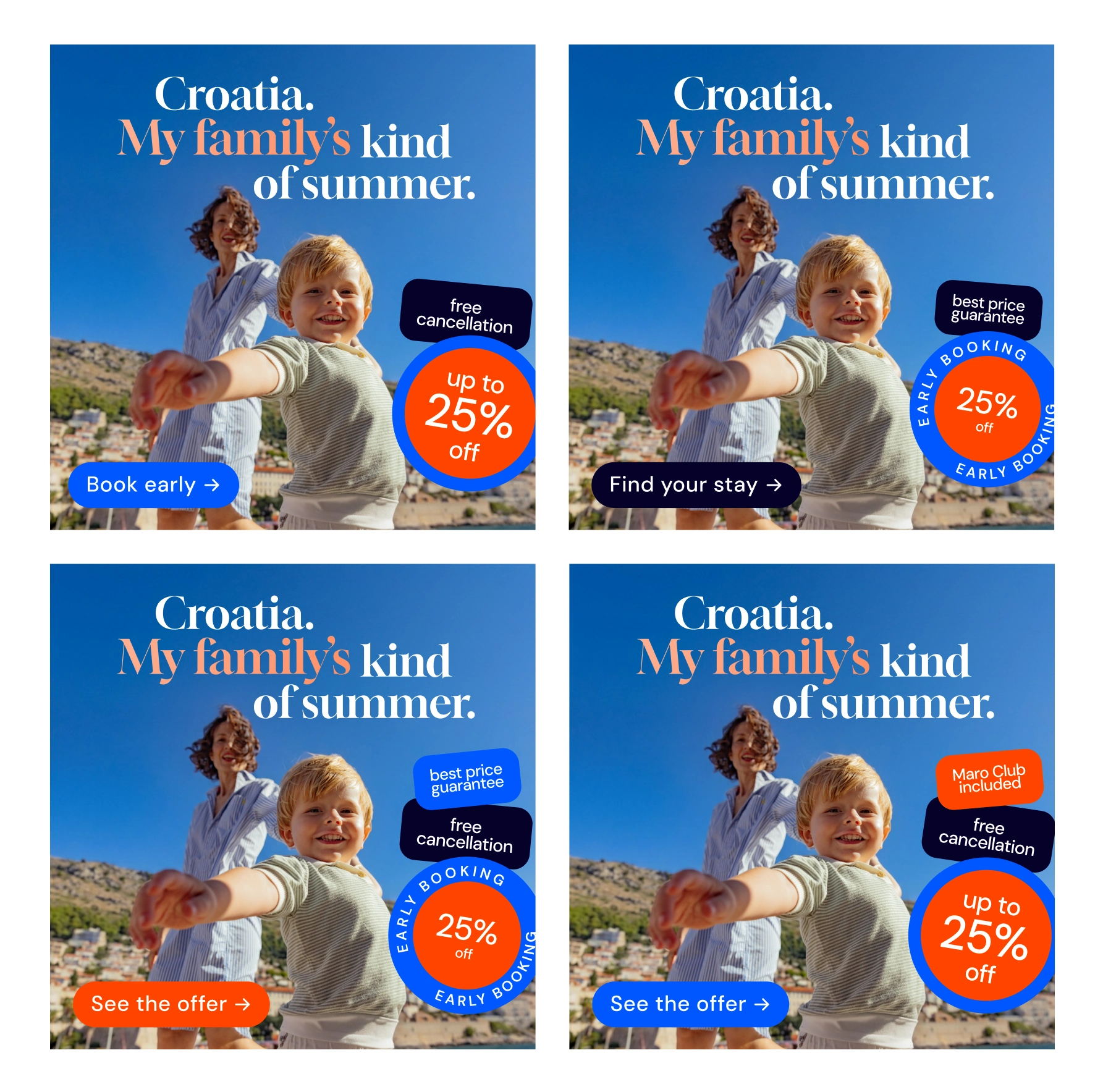
Three families of parts: promotional stickers (Early Booking, Up to 25% off, and a Black Friday variant at 45%), USP stickers (best price guarantee, Maro Club included, free cancellation), and call to action buttons (Book now, Book early, Find your stay, See the offer). Each part comes in the full palette so it can be tuned to any photograph or background, and the stacking logic is fixed: the promotional sticker always sits visually on top, the USP stickers build underneath it, and the call to action balances the composition from the opposite corner.
Stickers applied
One idea, across the funnel
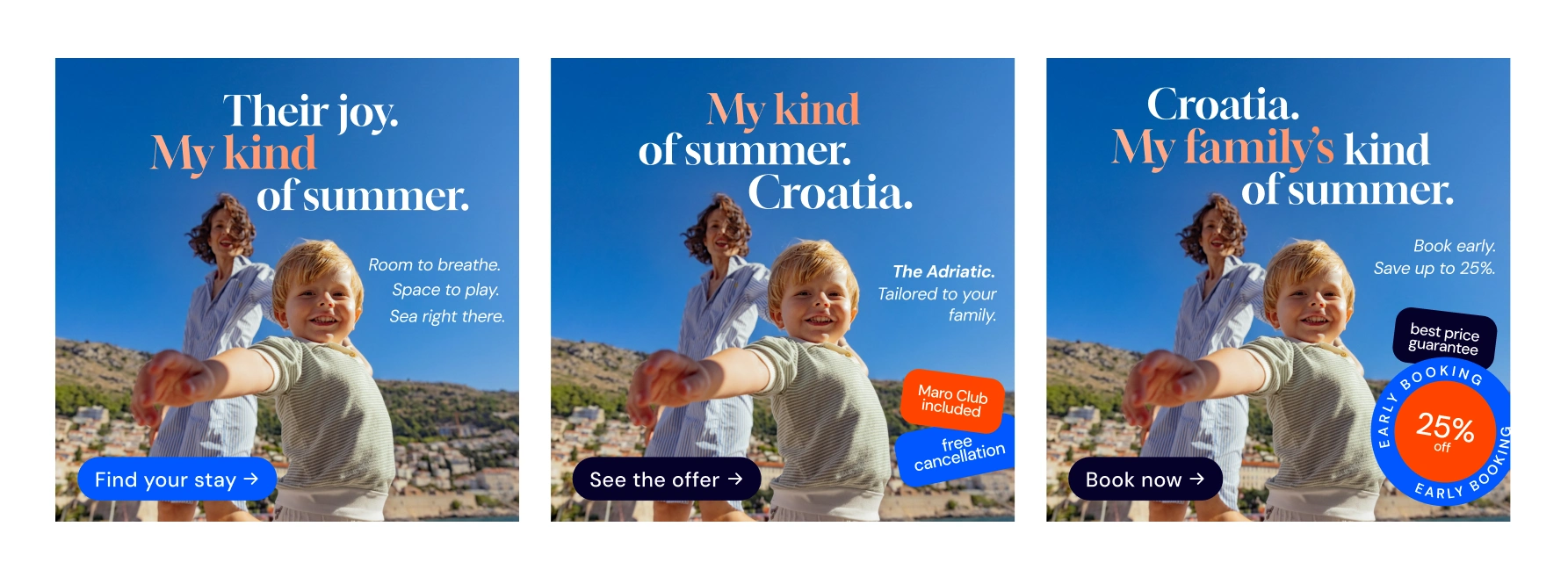
Campaign phases: Awareness, Consideration and Conversion
The same layout and photography carry the whole funnel. What changes is the secondary copy and which offer element leads, so the message meets the person at the right moment without a new art direction each time.
Awareness. The emotional claim, brand first, offer pulled right back. This frame exists to make someone feel the summer, not to sell a price.
Consideration. The same frame, now made specific: a named resort and a line like "Tailored to your family," with USP stickers such as Maro Club included and free cancellation, and a "See the offer" call to action. The reassurance a parent needs right before they commit.
Conversion. The primary claim plus a direct secondary line, "Book early. Save up to 25%." The Early Booking sticker dominates, the best price guarantee sits under it, and a "Book now" button on the darkest background makes this the clearest, most urgent frame in the set.
Built to scale: the format ladder
A campaign concept is only finished when it survives production. I took the master creative down the full ladder of real placements it would actually run in.
The same idea, resized and recomposed to its rules, across the Instagram Reel cover (1080 by 1920), the square feed unit (1080 by 1080), the newsletter hero (600 by 300), the large rectangle (336 by 282), the half page (300 by 600), the wide skyscraper (160 by 600), the web banner (970 by 250), the Google Display unit (300 by 250), the push and messaging visual (360 by 180), and the large mobile banner (320 by 100). No format was re designed from zero. Each one is the system applied to a new dimension.
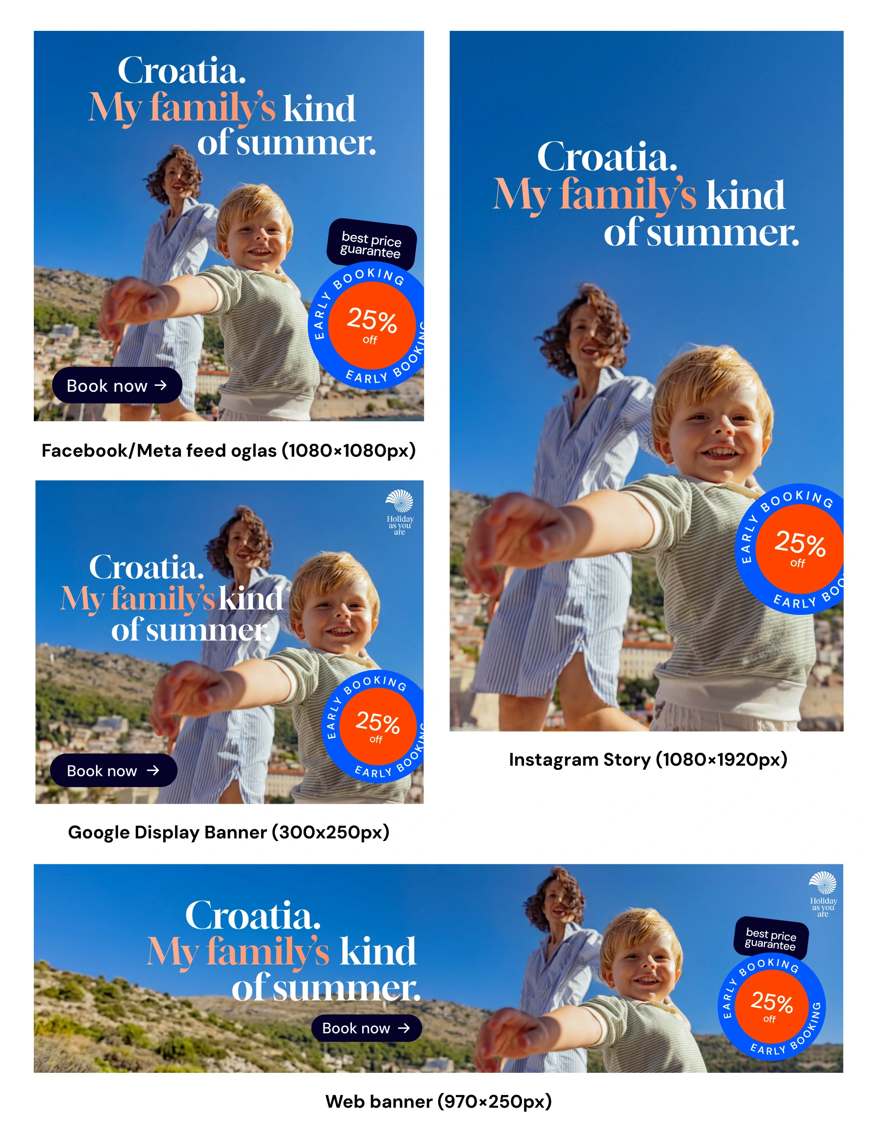
Formats
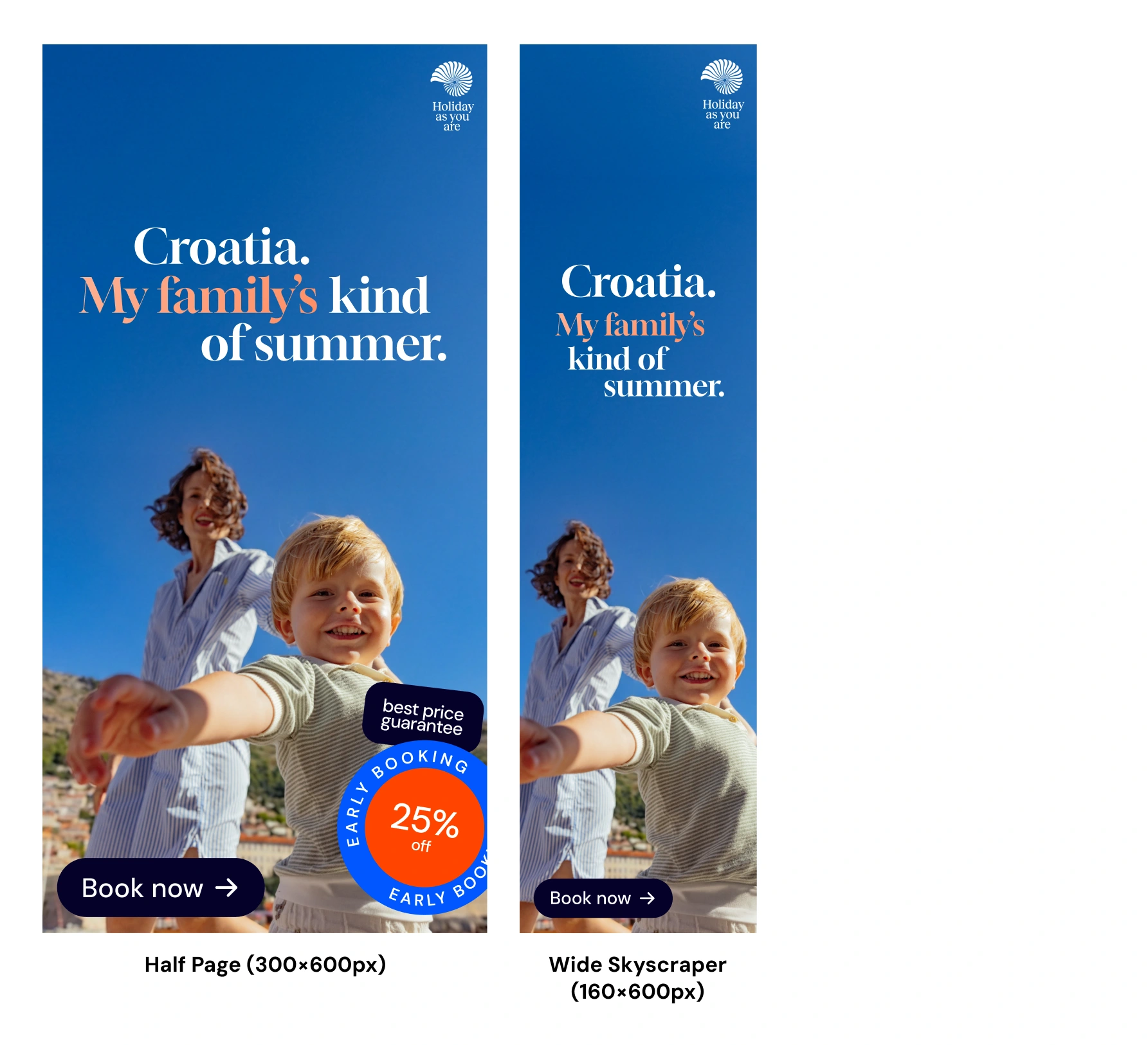
Formats
Instagram carousels
Carousels get their own logic. Here the claim and the feeling build across the cards, and the call to action appears only on the final card, where it closes the story and asks for the click. It keeps the first cards emotional and lets the offer land at the end, when the viewer has already been drawn in.
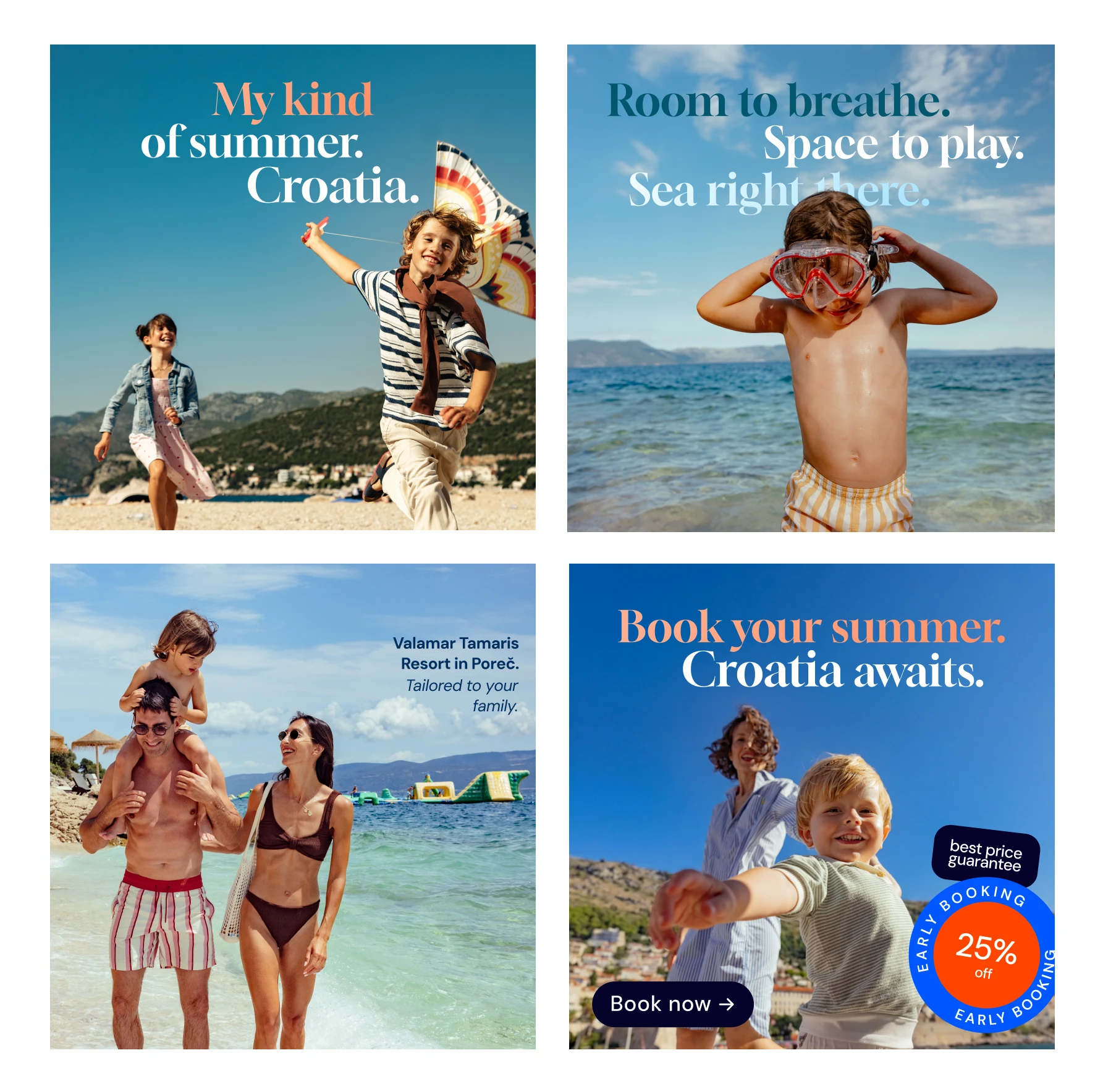
Instagram carousels
Why it holds together
The whole point of the system is that it actually runs. Every piece is a rule instead of a fixed layout, so the campaign scales without anyone redrawing a thing. New format? Apply the rules to a new size. New offer? Swap the sticker. New market? Swap the copy. The claim is the only thing that never moves, so everything still feels like one campaign in every language, while the secondary copy and call to action have room to stretch when a translation runs long.
That's what makes it ready for real production, not just a nice slide. Spinning up a new variant for A/B testing or remarketing takes a swap or two, not a new shoot or a fresh art direction. One idea, one system, built to run at the scale an Early Booking campaign really needs.
Like this project
Posted Aug 3, 2026
A modular ad creative system for a luxury hospitality brand from Croatia: one family campaign idea, scaled across every format and funnel stage.
Likes
0
Views
22
Timeline
Jun 29, 2026 - Jul 5, 2026