SyncTeams – Empowering AI for Everyone | Brand Identity
Jimoh Sheriff

Overview
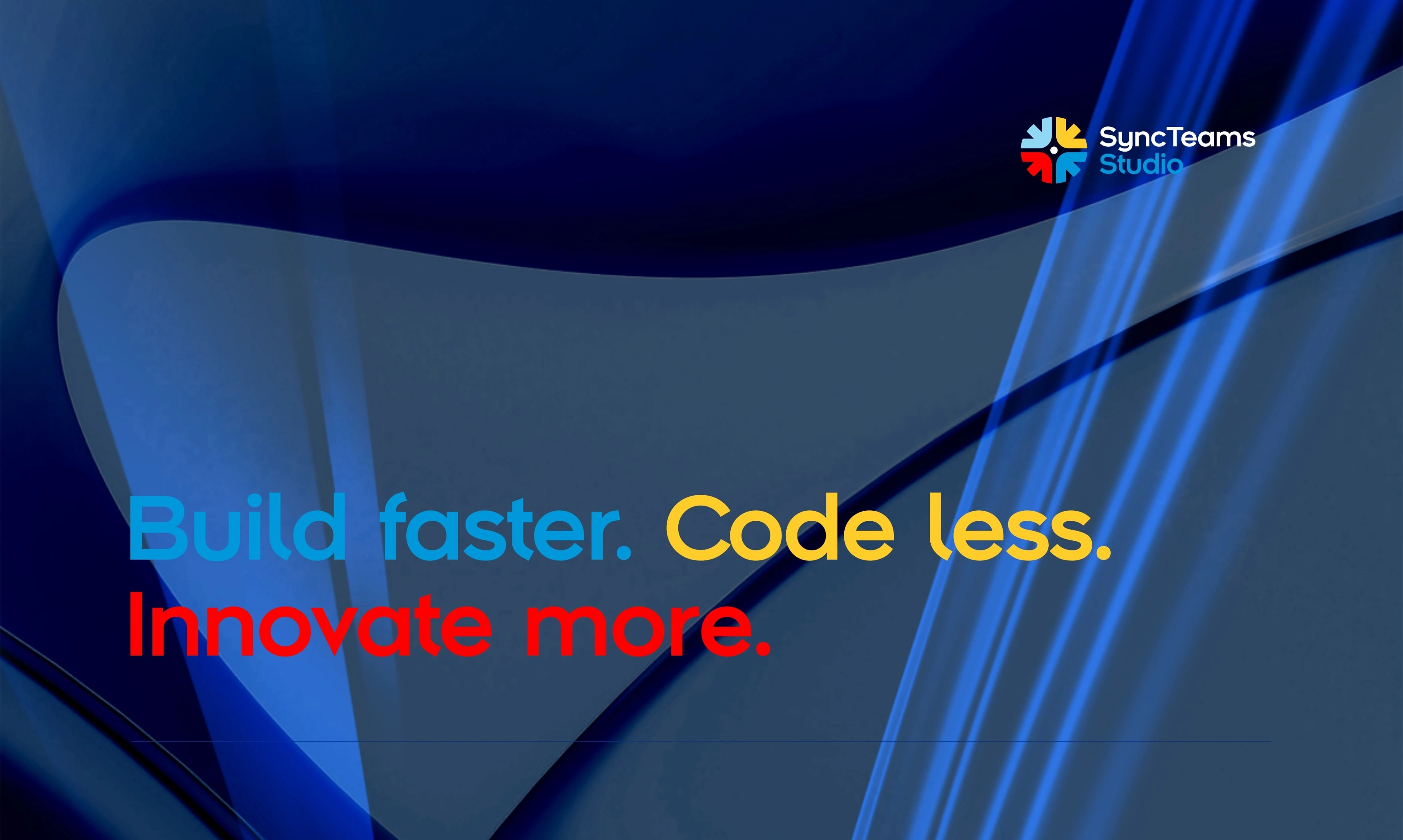
The SyncTeams brand identity was designed to reflect its core mission—bridging the gap between complex AI technology and everyday users. The branding embodies simplicity, innovation, and accessibility, ensuring that non-technical users feel empowered rather than intimidated. The logo and visual elements emphasize fluidity and connection, symbolizing how SyncTeams seamlessly integrates AI into business workflows. A modern, approachable color palette enhances the brand’s friendly yet professional appeal, making AI feel more intuitive and inviting.
Impact
The new branding has positioned SyncTeams as a user-friendly and forward-thinking AI platform. By creating a visually cohesive identity that aligns with its mission, the brand now resonates with a diverse audience—from small business owners to large enterprises. The strong and clear brand presence fosters trust, making AI adoption more accessible. The design choices enhance the user experience, reinforcing the platform’s ease of use and reliability.
Result
Following the rebrand, SyncTeams has seen increased engagement, with more businesses exploring its AI solutions. The brand’s fresh and cohesive identity has helped it stand out in the competitive AI landscape, attracting a broader audience and reinforcing its reputation as an industry leader in no-code AI solutions. The clarity and consistency in its visual messaging have driven higher adoption rates, making AI more practical and approachable for all users.
Crafting a compelling brand narrative—this marketing copy encapsulates the essence of Syncteams Studio. With a clear and engaging tone, it communicates the brand’s core values, mission, and unique selling proposition, resonating with the target audience. Every word is intentionally chosen to establish a strong emotional connection and drive engagement. This copy sets the foundation for brand awareness, customer trust, and market positioning
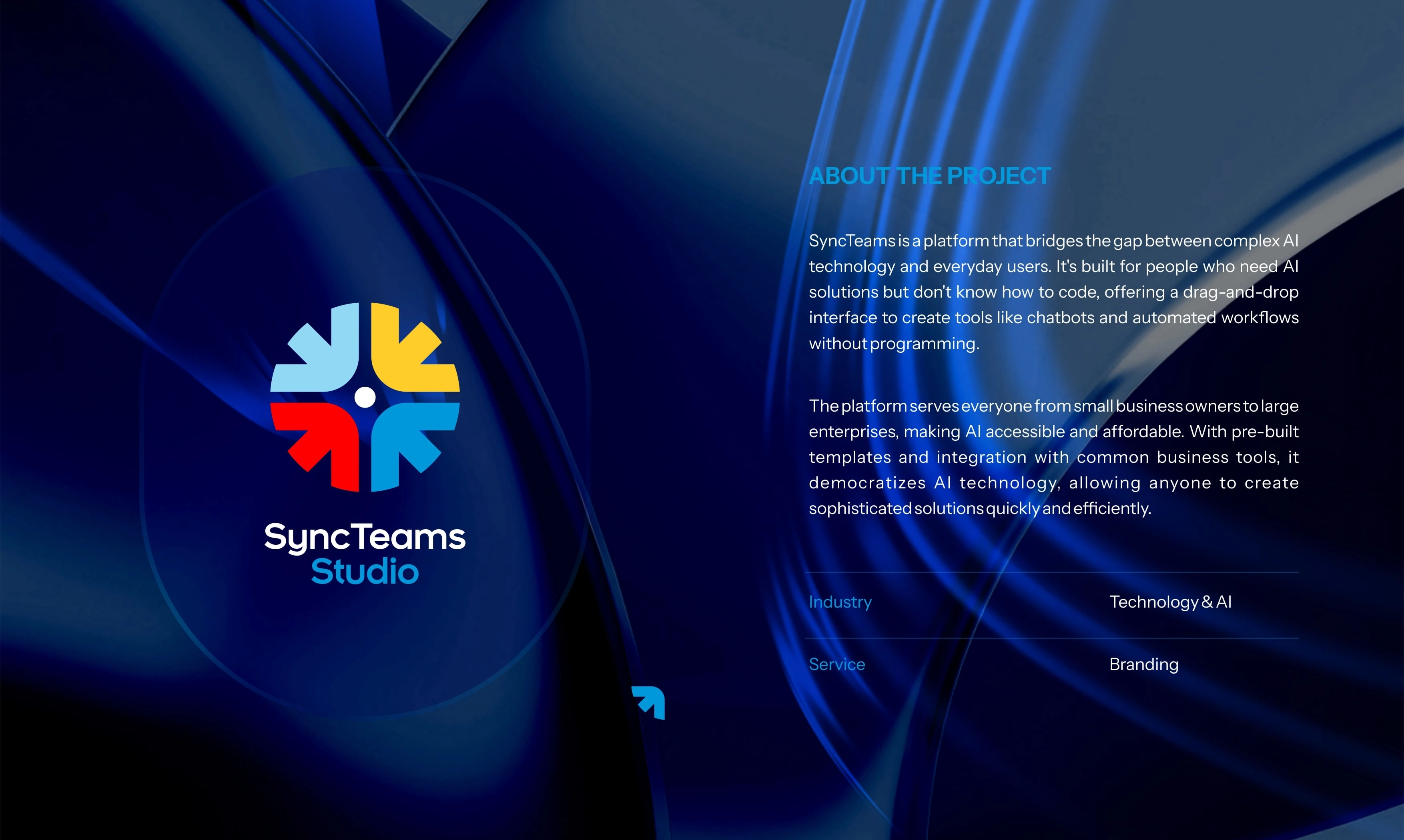
Introducing Syncteams Studio—an innovative no-code platform that leverages AI to bridge non-coders to APIs effortlessly. Designed for businesses, developers, and tech enthusiasts, Syncteams Studio simplifies complex integrations, making automation and connectivity accessible to everyone. Operating at the intersection of technology and user-friendly innovation, the brand is redefining how teams interact with APIs without writing a single line of code. This slide provides a deep dive into the brand’s mission, industry, and the transformative impact it aims to create
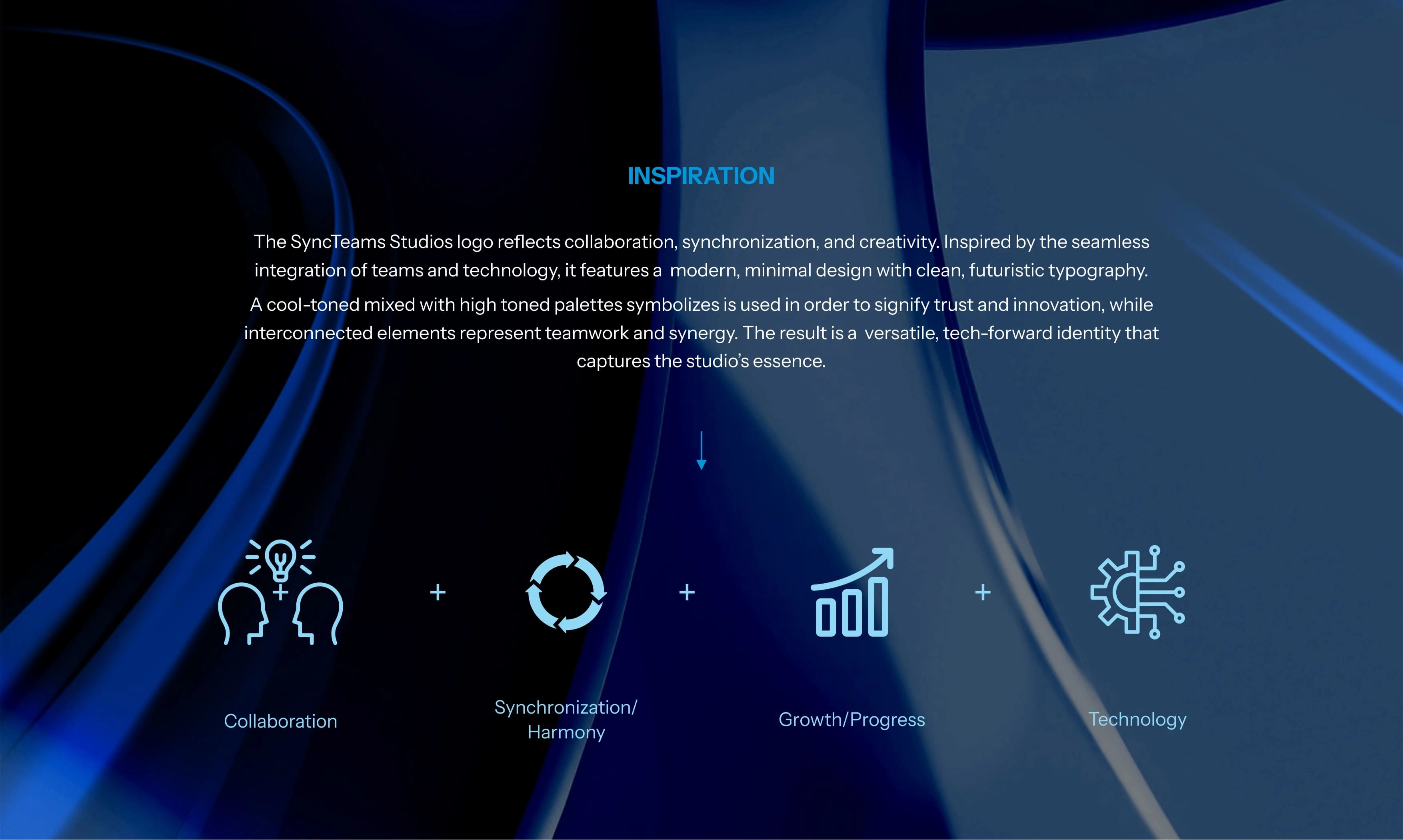
Behind the design—The Syncteams Studio logo is a visual representation of connection, innovation, and seamless integration. Inspired by the brand’s mission to bridge non-coders to APIs, the design embodies fluidity and structure, symbolizing effortless collaboration between technology and users. Every element, from the typography to the icon, reflects the brand’s commitment to accessibility and intelligent automation. This slide breaks down the creative thought process, ensuring the logo not only stands out but also tells the story of Syncteams Studio’s purpose and visio

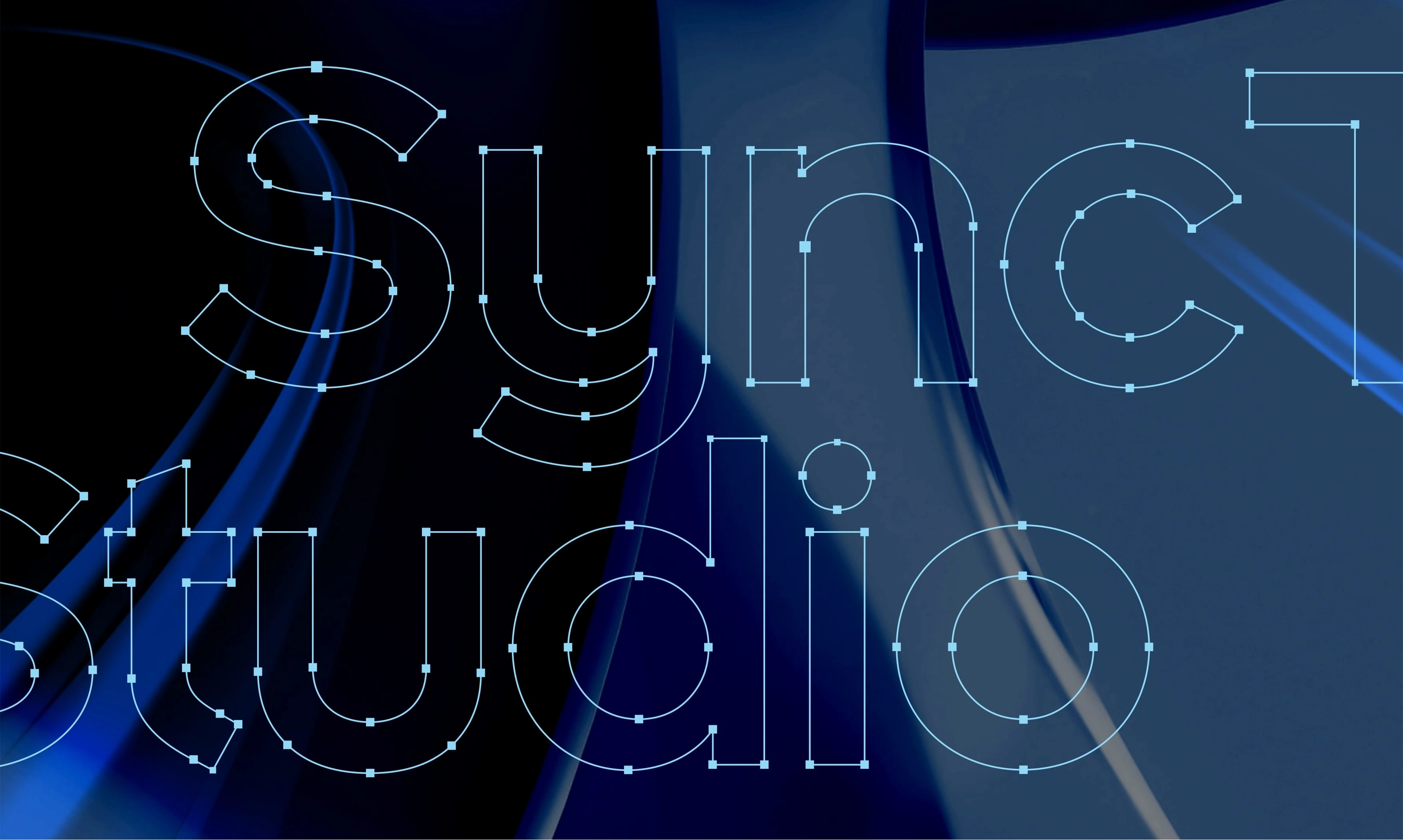
"Precision in design—This logo grid showcases the meticulous construction of the Syncteams Studio logo. Every curve, alignment, and proportion is carefully calculated to ensure visual balance, scalability, and consistency across all brand applications. The structured grid system reinforces the brand’s commitment to seamless connectivity and technical precision, mirroring the efficiency and reliability of the platform itself. This foundation guarantees a logo that remains timeless, adaptable, and instantly recognizable
A symbol of seamless connectivity—The Syncteams Studio icon is a distilled representation of the brand’s core values: integration, simplicity, and innovation. Designed with clean lines and a modern aesthetic, it embodies the effortless bridging of non-coders to APIs. This standalone icon is crafted for versatility, ensuring strong brand recognition across digital platforms, app icons, and marketing materials. A bold yet minimal mark that speaks volumes about the brand’s mission
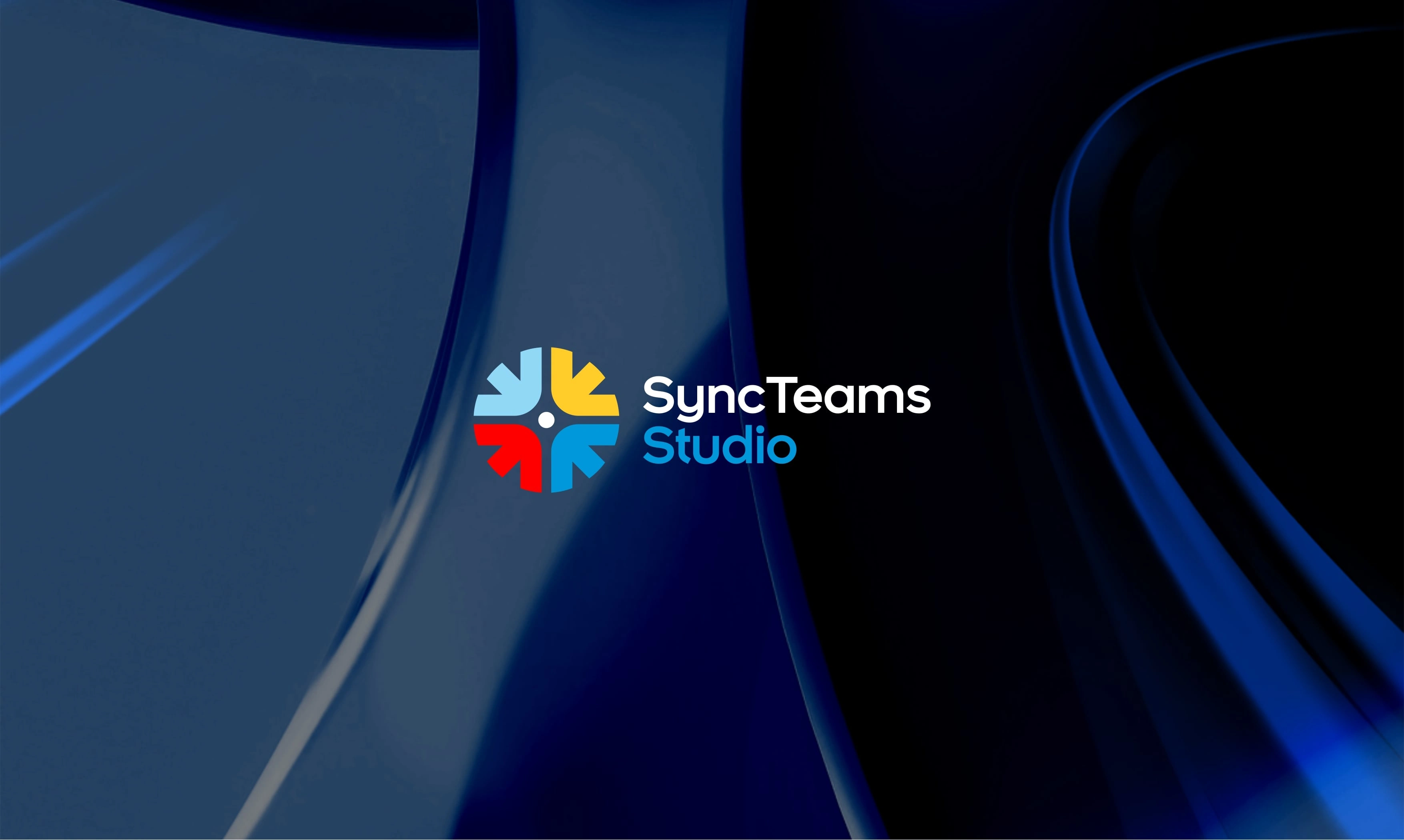
The complete identity—The Syncteams Studio logo seamlessly combines the icon and wordmark, creating a cohesive and recognizable brand identity. The icon symbolizes connectivity and innovation, while the typography reflects clarity, professionalism, and modernity. Together, they establish a strong visual presence that is both memorable and adaptable across various brand touchpoints. This balanced composition ensures instant recognition and reinforces Syncteams Studio’s position as a leader in AI-driven no-code solutions
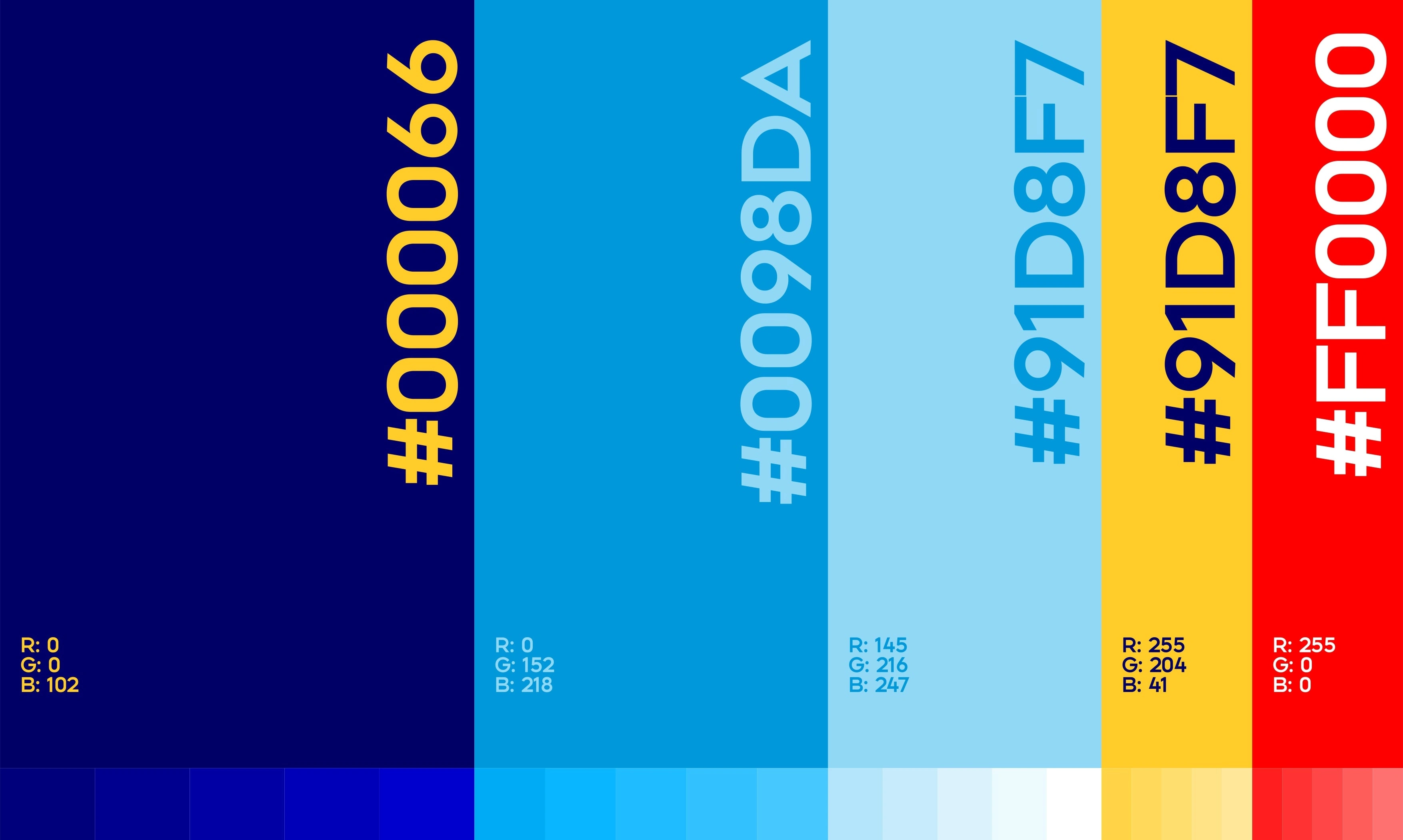
Defining the brand’s visual language—The Syncteams Studio color palette is carefully curated to reflect innovation, trust, and accessibility. Each hue is chosen to create a sense of clarity and professionalism while maintaining a modern and dynamic appeal. The primary colors establish brand recognition, while the supporting tones enhance versatility across digital and print applications. This palette ensures a cohesive and visually engaging brand presence across all touchpoints
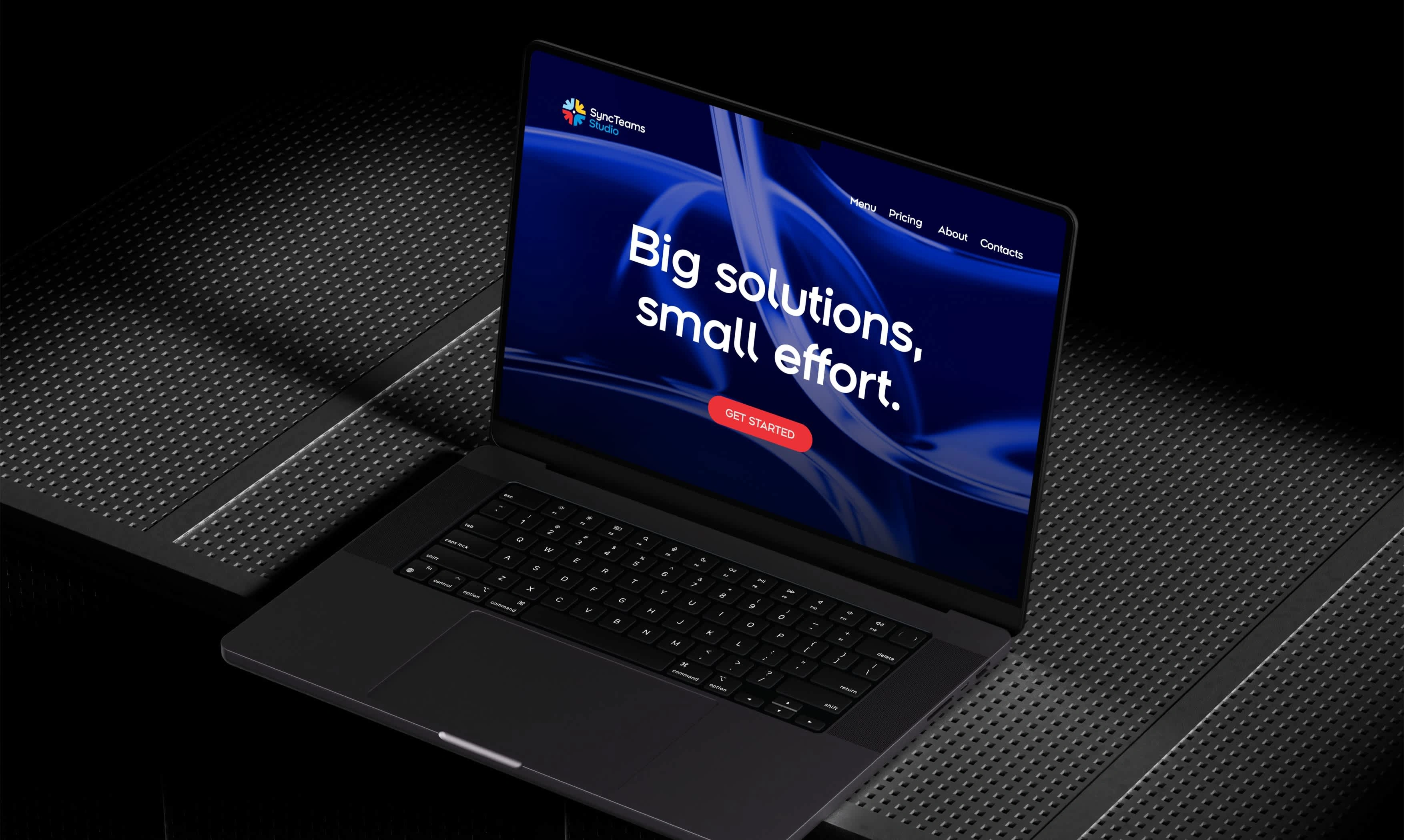
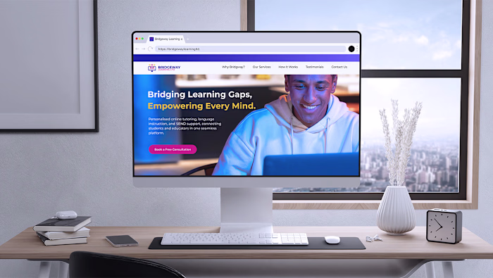
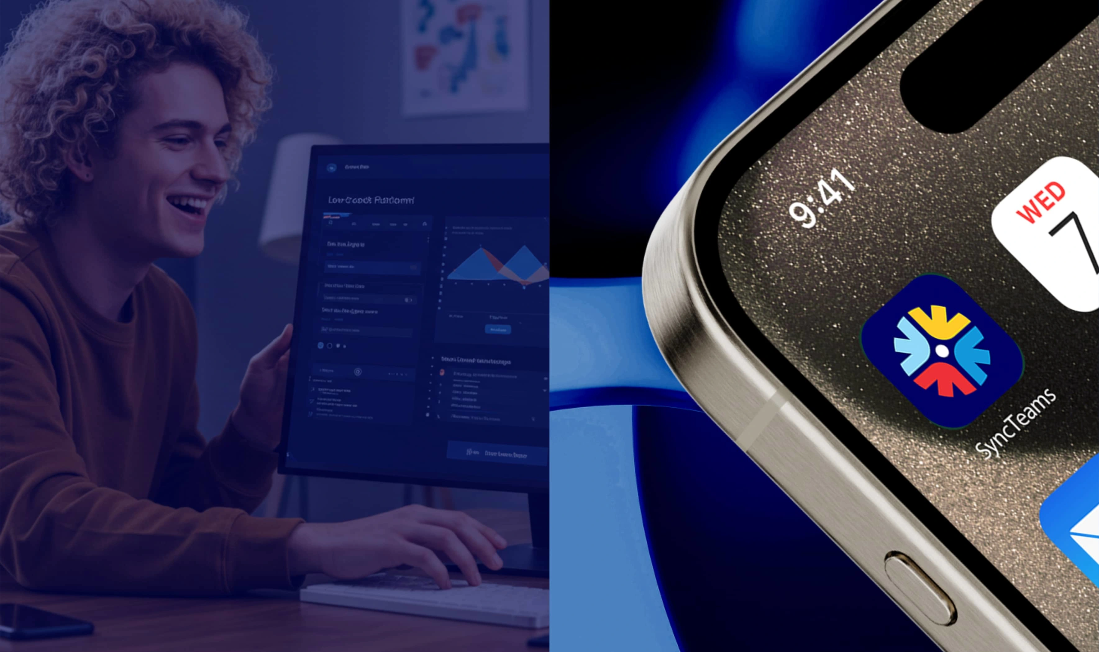
Bringing the brand to life—This showcases the Syncteams Studio logo in a real-world digital environment. Displayed on a laptop screen, it illustrates how the brand identity seamlessly integrates into professional and tech-driven settings. The clean and modern presentation reinforces Syncteams Studio’s role as an innovative no-code AI platform, ensuring a strong and memorable visual impact across digital interfaces and user experiences
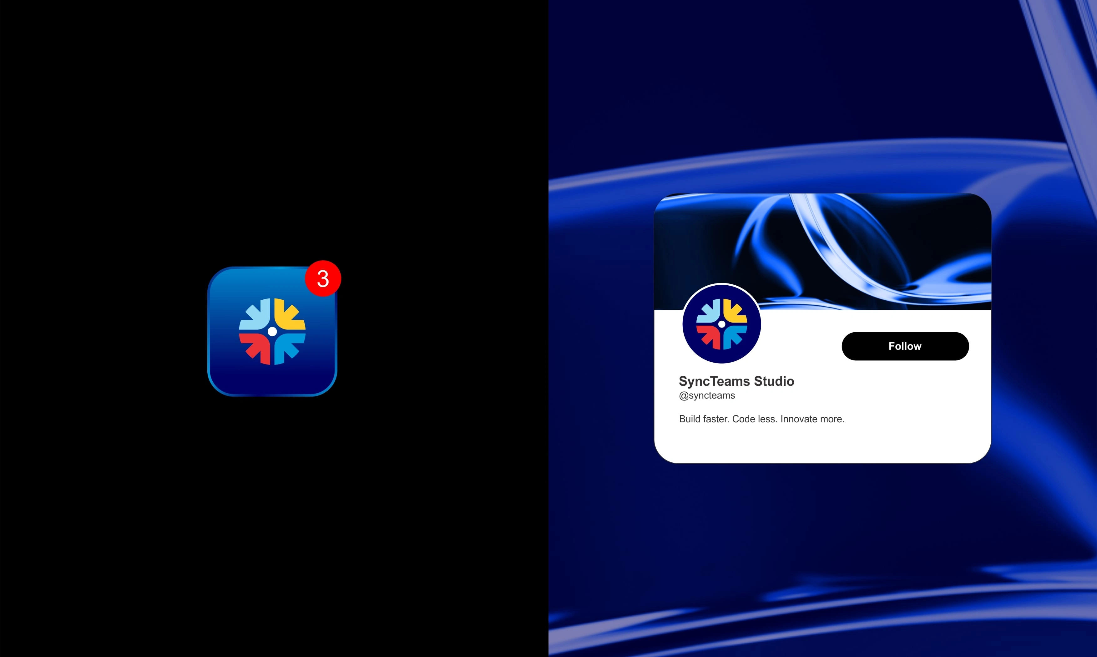
Designed for digital presence—This slide highlights the Syncteams Studio icon optimized for social media profile pictures and app icons. Its clean, scalable design ensures instant recognition across various platforms, from mobile apps to professional networks. The minimal yet bold aesthetic maintains brand consistency while standing out in crowded digital spaces. Whether on an app store or a LinkedIn profile, this icon reinforces the brand’s identity with clarity and impact
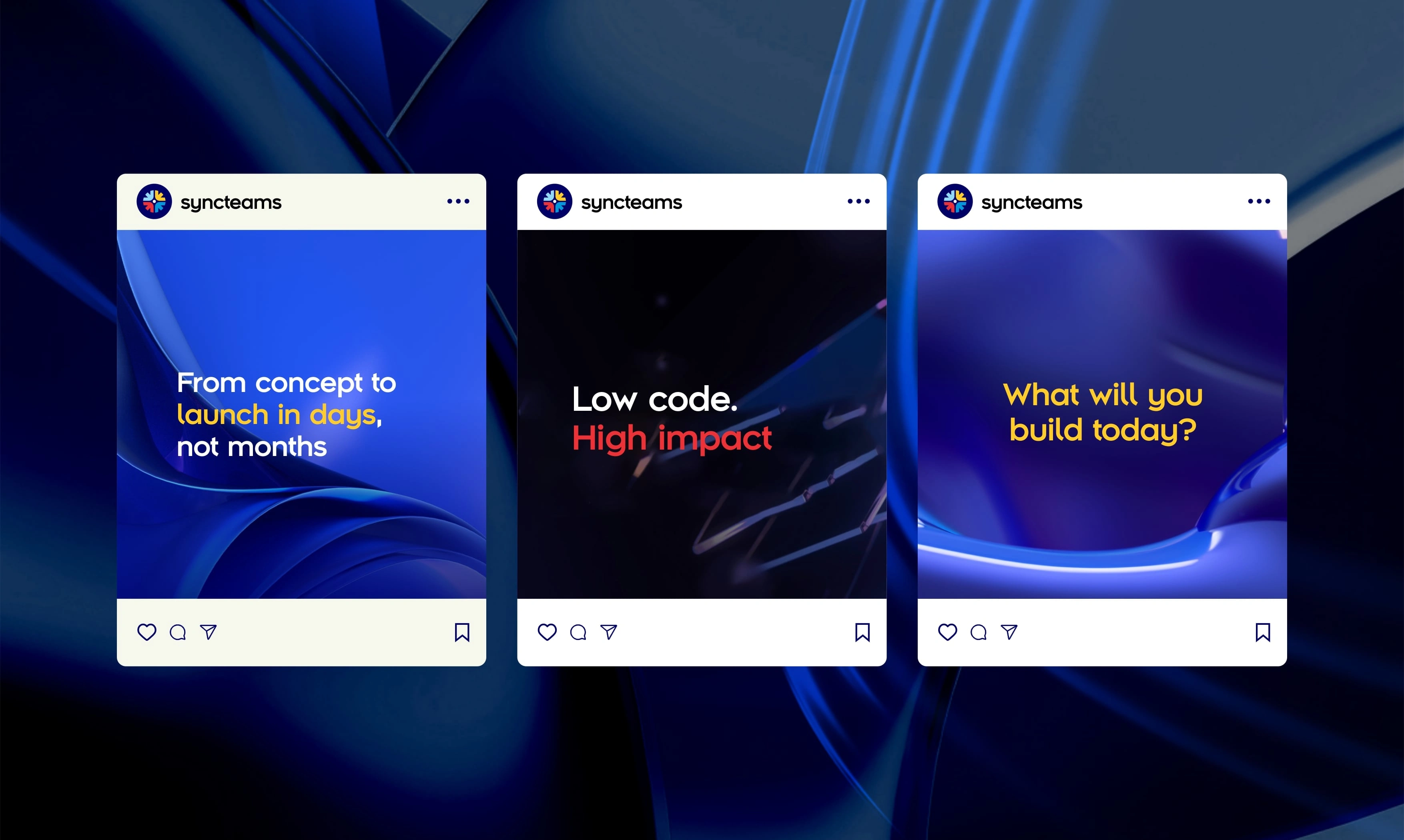
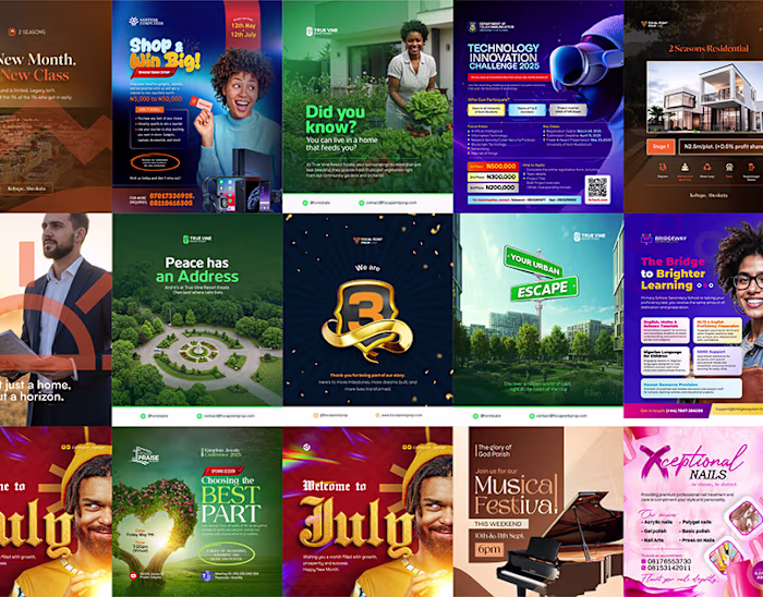
Building a strong digital presence—This slide showcases Syncteams Studio’s social media marketing designs, crafted to engage, inform, and attract the target audience. Each design maintains brand consistency through color, typography, and visual elements while effectively communicating key messages. Whether for product launches, feature highlights, or community engagement, these creatives establish a professional and compelling brand identity across digital platforms
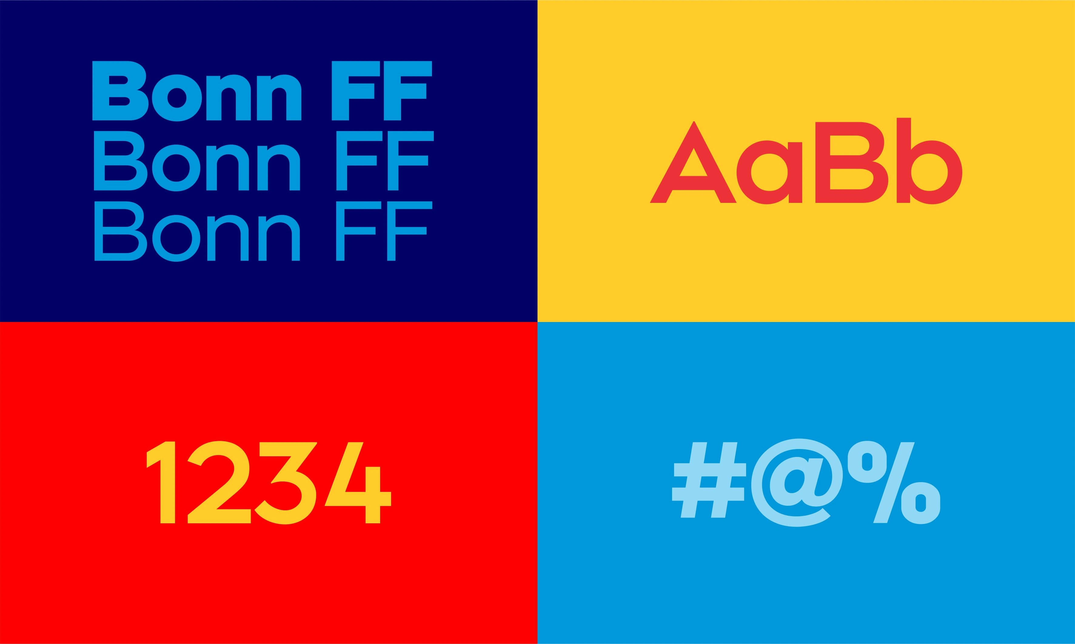
"Typography that speaks the brand—Syncteams Studio’s type selection is a key element in shaping its visual identity. The chosen fonts balance modernity, clarity, and professionalism, ensuring readability across digital and print media. The primary typeface reflects innovation and approachability, while supporting fonts enhance versatility for different brand communications. This typography system strengthens brand recognition and creates a cohesive visual experience across all touchpoints
Like this project
Posted Mar 13, 2025
Complete brand identity design for Syncteams, a no-code platform leveraging AI to connect non-coders with APIs
Likes
1
Views
5
Timeline
Jan 13, 2025 - Mar 29, 2025