Brand Fanatics Visual Identity System

B.F. — Brand Fanatics
Visual Identity System + Branded Expression Study
Overview
B.F. (Brand Fanatics) is built around a simple truth: brands become iconic when they create momentum around themselves. This identity captures that momentum visually — a system driven by form, balance, and fluidity. The project explores how a minimal shape language can scale from micro to macro, creating a recognizable identity across real-world and digital touchpoints.

Made with Kittl
Concept
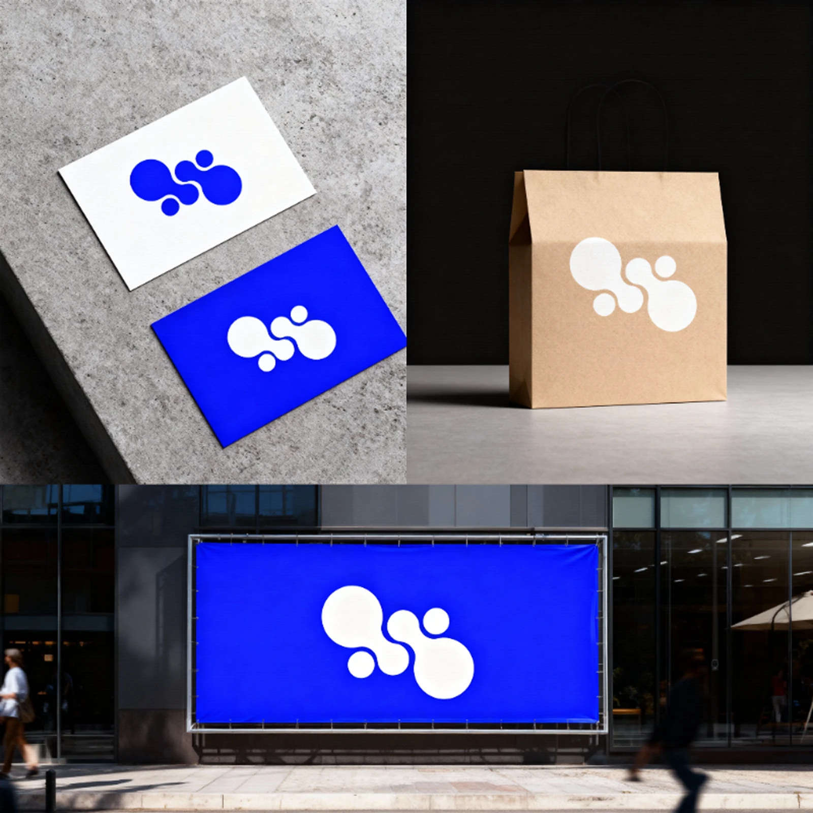
The B.F. mark is constructed from four interconnected circular forms. These shapes represent community, collaboration, and the energy orbiting around strong brand culture. The form is intentionally bold, soft-edged, and unmistakable at any scale. By pairing a high-contrast palette with sculptural geometry, the identity becomes both playful and authoritative — a modern emblem for creators and fans.
Design Approach
The logo operates as a modular symbol that adapts across applications without losing its core personality. Its strength lies in its simplicity: a form that reads instantly, works across multiple environments, and becomes a flexible asset in brand storytelling.
Key principles:
• Radial balance and fluid composition
• High-contrast blue-white palette for immediate recognizability
• Soft, volumetric feel for contemporary appeal
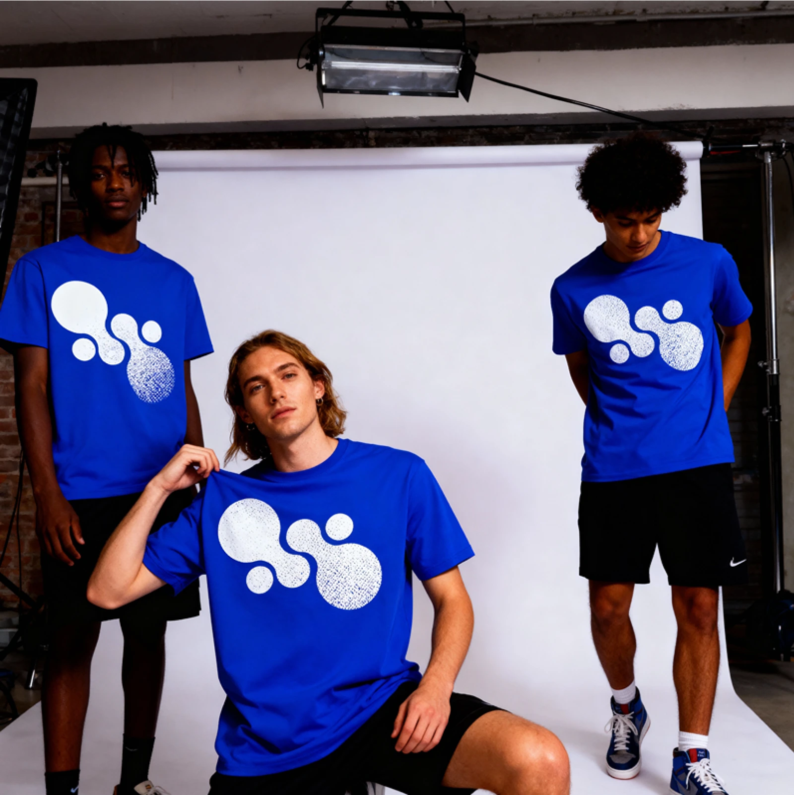
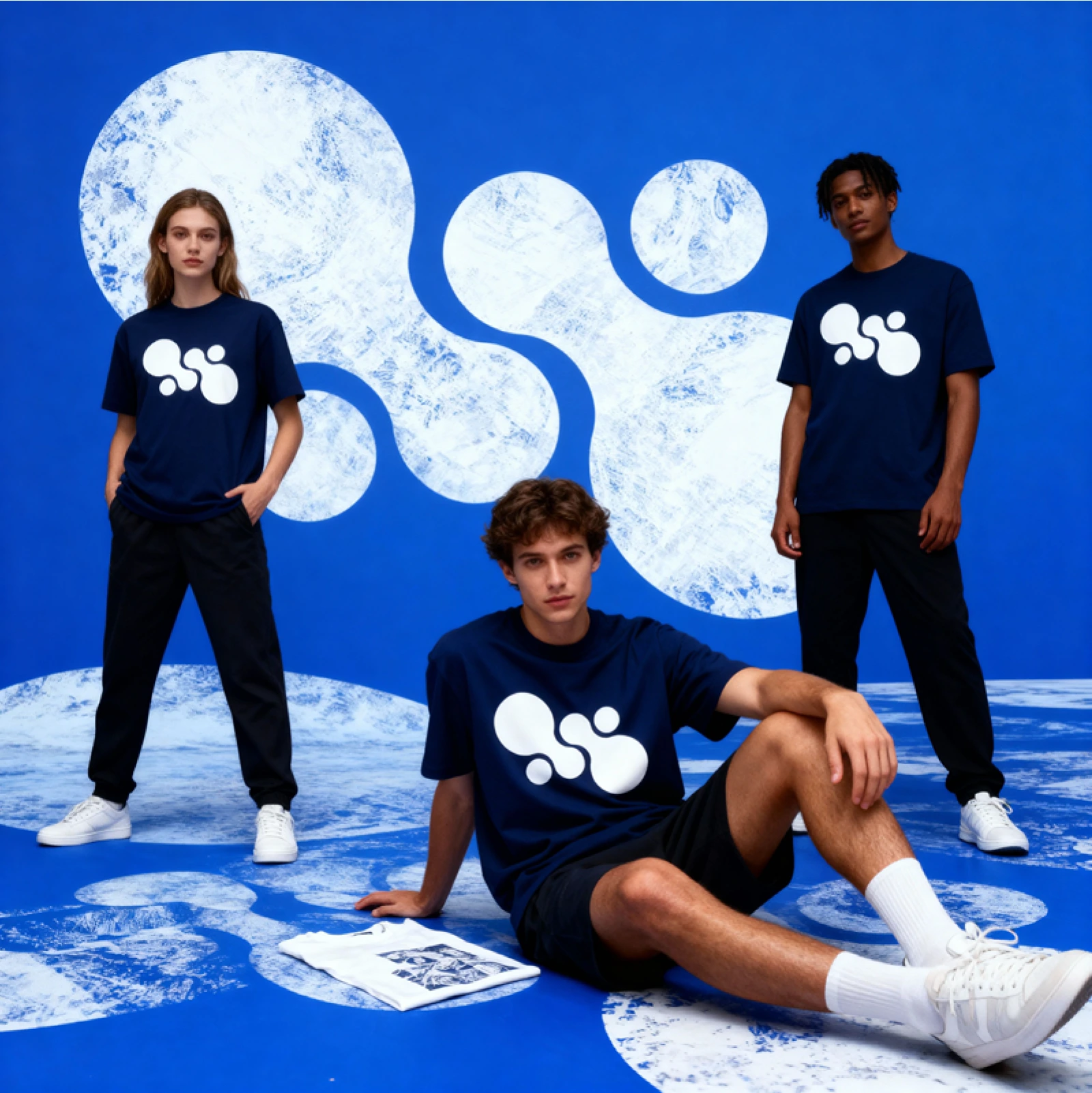
• Geometry that maintains impact in print, fabric, signage, and digital screens

Logo Presentation

Brand Photoshoot

New Tee design Teaser
Like this project
Posted Nov 11, 2025
A complete visual identity package for B.F. — Brand Fanatics, including logo design, system development, and branded mockups ready for real-world use.


