Yungrace Brand Identity and Website Design
Sin Ying Lau
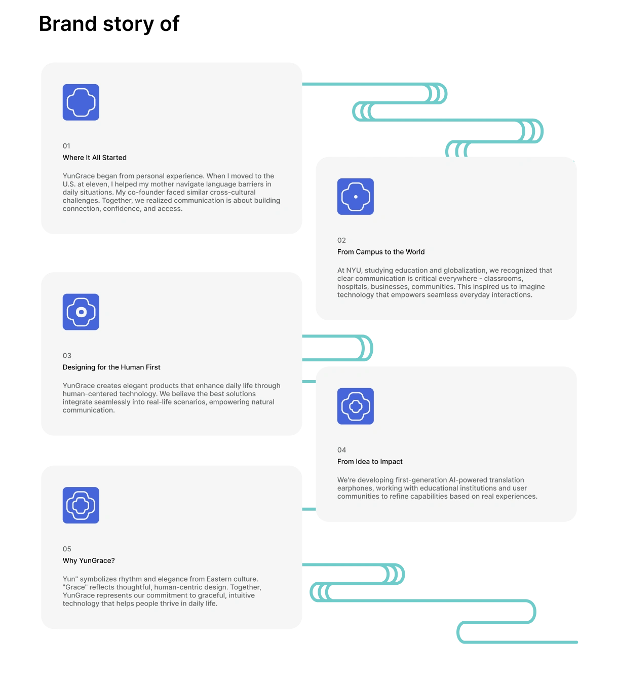
Yungrace Background
Yungrace Logo
Yungrace is a translation earbuds brand rooted in the beauty of Chinese classical literature. The name derives from "韵" (Yun) - representing rhythm and harmony in traditional Chinese poetry, combined with "grace" - embodying the elegant flow of cross-cultural communication.
I designed the complete brand identity and website to bridge Chinese cultural heritage with modern technology, making translation feel natural rather than mechanical.
"How do we create a premium translation earbuds brand that honors Chinese culture while appealing to global users?"
Yungrace's vision was clear but complex. He wanted swan symbolism because swans represent premium elegance and can soar far distances - matching their global ambitions. But he also wanted tech-forward aesthetics to communicate cutting-edge AI. And everything needed to feel authentically Chinese without alienating international users.
The earbuds existed as prototypes, but they were unbranded and still evolving
The client briefed me that "Yungrace" comes from Chinese classical literature, specifically the concept of "韵" (Yun) representing rhythm and harmony in poetry. They wanted swan symbolism because swans embody premium elegance and can fly far distances - reflecting their vision for global brand reach. Additionally, they emphasized the need for a tech-forward aesthetic to communicate innovation and cutting-edge AI technology.
This gave me three key elements to balance: Y+G letterforms, swan shapes, Chinese motifs, and modern tech aesthetics.
The client wanted to combine Y+G letters with swan symbolism and Chinese motifs. I created four versions to explore different approaches:
Problem: The prototypes existed but were unbranded and still evolving.
Classroom Scenario
Living Abroad Scenario
Self Learning Scenario
Travelers Scenario
Yungrace Class Scenario
This approach enabled me to create website visuals and marketing materials during the product development phase. I focused on genuine human interactions rather than typical product photography.
Website Design: Cultural Elements in Digital Form
Used flowing Yun (云) patterns as background elements throughout the website to reflect the poetic foundation. They create visual movement without interfering with the content.
Yungrace Cloud Motifs Example
Created flower transition animations for brand story sections. The flowers start from closed buds (花苞) and gradually bloom to full flowers, representing the journey from blank concept to fully executed product.
I chose two typefaces - Dopamine Sans for its graceful, flowing characteristics that complement the poetic brand foundation, and Inter for clean, readable body text. This combination balances elegant brand expression with practical readability across both Chinese and Latin text.
I have created 3 animations using LottieLab. These animations made abstract translation processes feel tangible and helped users understand features.
Visualized real-time voice conversion as flowing forms that transform gracefully from one language to another
The complete brand identity and website were delivered and launched. The design successfully integrated Chinese cultural heritage with modern tech aesthetics, creating a distinctive brand presence in the translation earbuds market.
What I learned: Using AI-generated imagery to solve product visualization challenges opened new possibilities for early-stage marketing, allowing the brand to move forward before final product photography was available.
Like this project
Posted Jul 1, 2026
Designed Yungrace brand identity and website, integrating Chinese culture with modern technology.
Likes
1
Views
0