Built with Framer
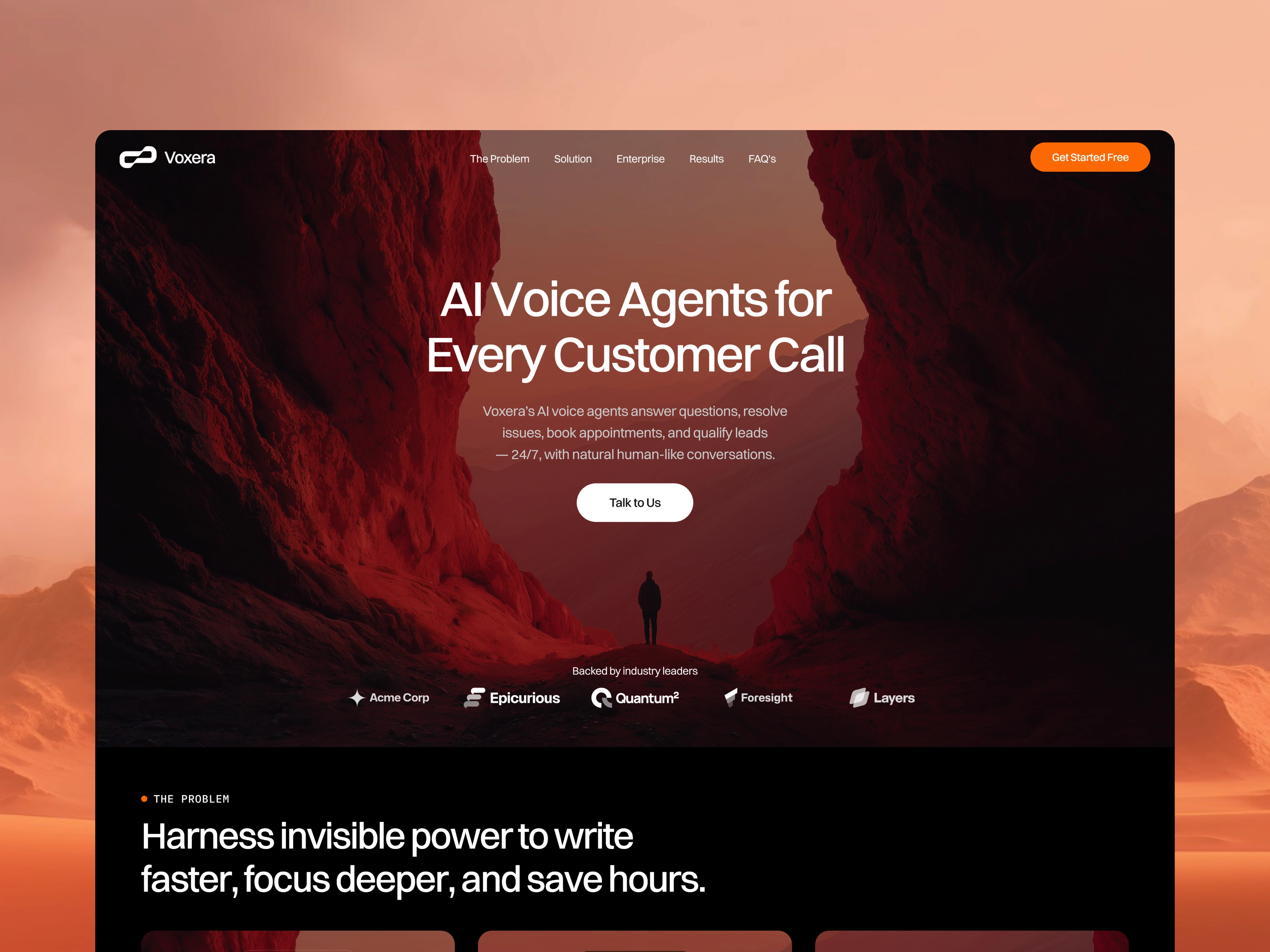
Voxera - AI Voice Agents for Every Customer Call
Fawaz Ahamed
Problem
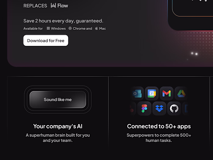
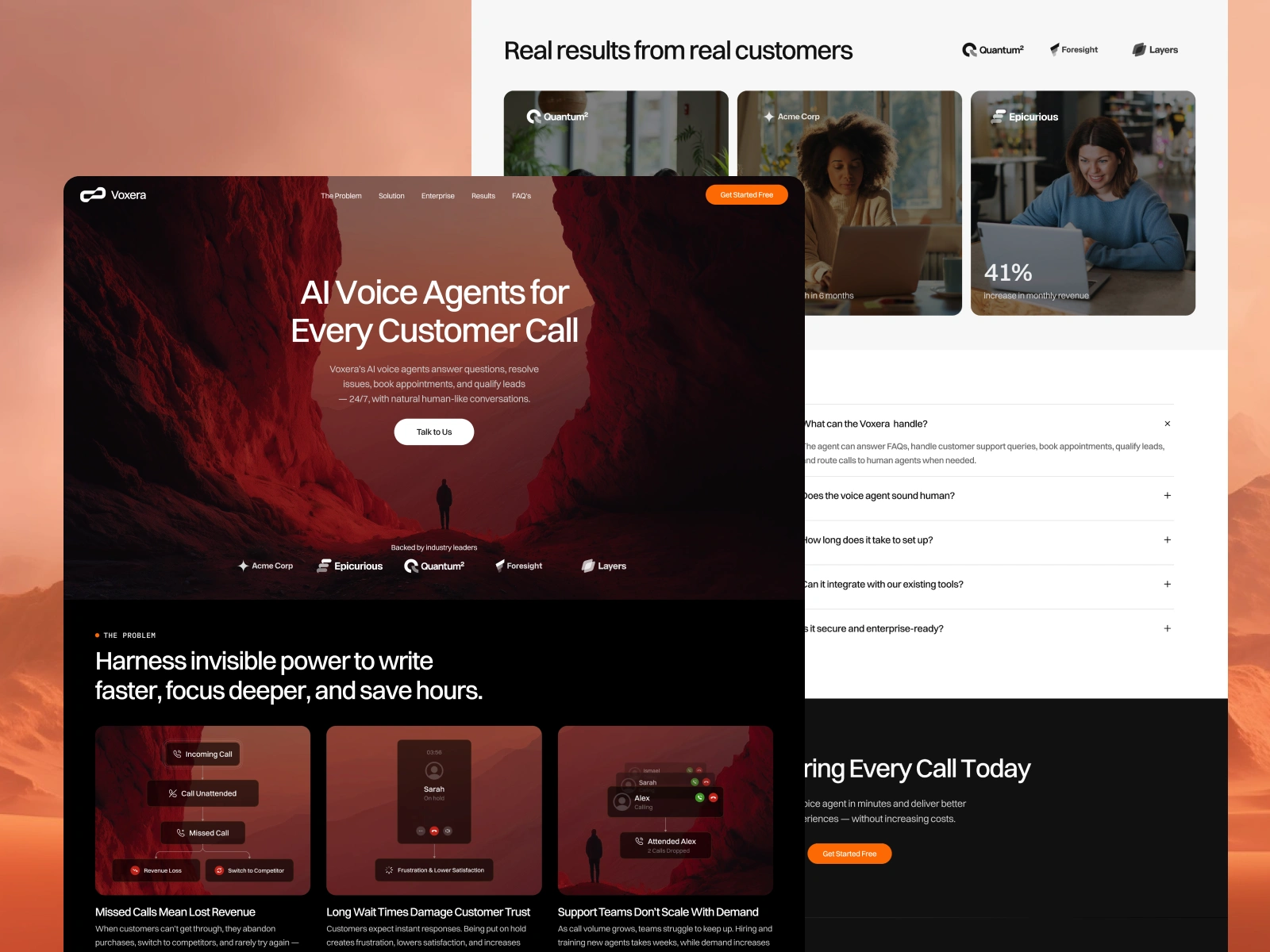
Voxera AI is a voice AI platform focused on automating conversations and enhancing customer interactions, but its current landing page does not clearly convey its core value or differentiation.
My Approach
To solve this, I applied my landing page framework focused on clarity, positioning, and conversion. Instead of jumping into UX issues, I structured the page using a repeatable process I follow for high-performing SaaS websites:
Define clear positioning above the fold
I ensured the hero section immediately answers what the product does, who it’s for, and why it matters—removing ambiguity within the first few seconds.
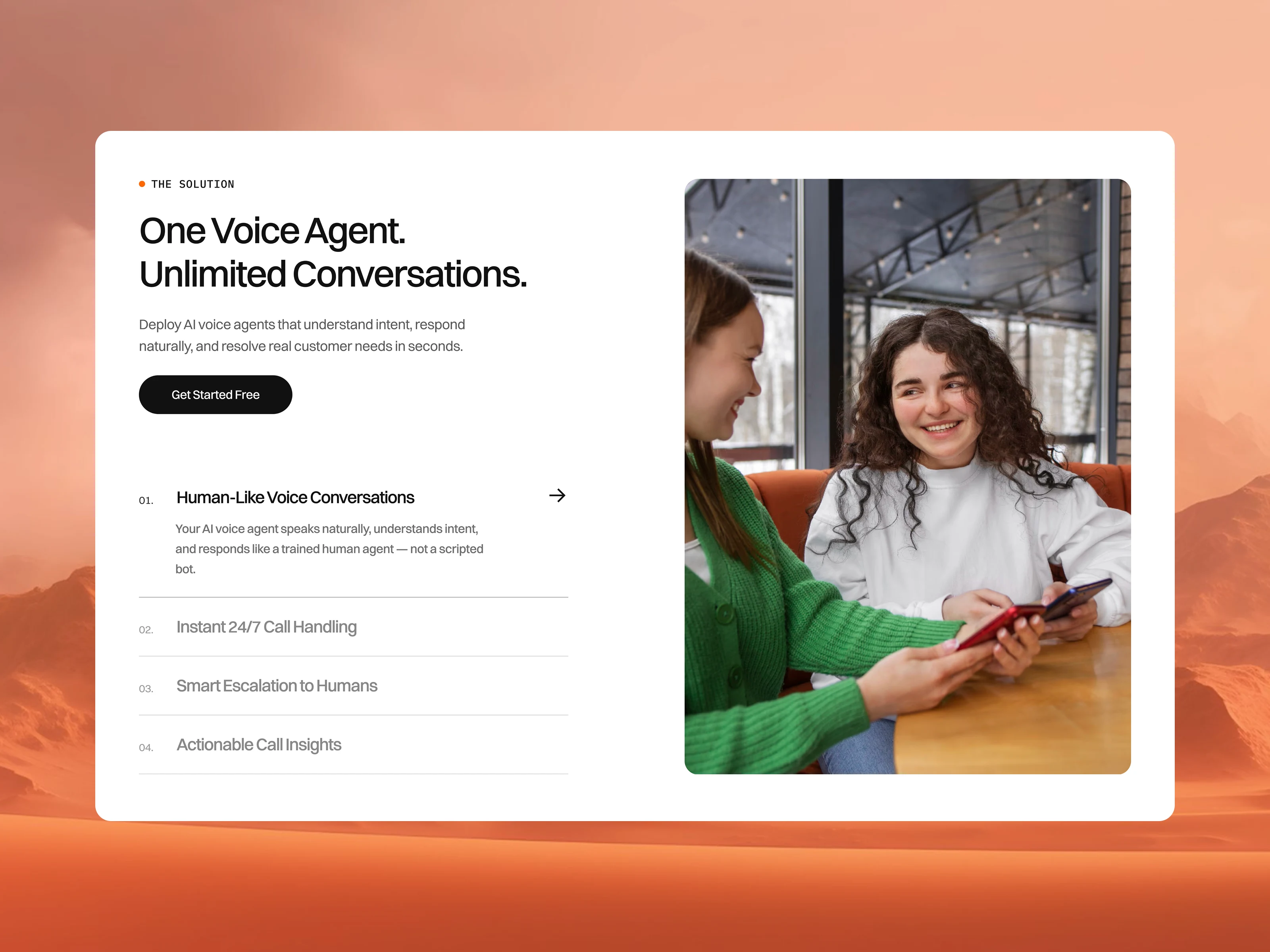
Translate features into real-world use cases
Rather than listing capabilities, I reframed content around practical scenarios (sales calls, customer support, automation workflows) so users can see direct relevance.
Build a structured content flow
I designed the page to guide users logically—from understanding → exploration → validation → action—reducing drop-offs and confusion.
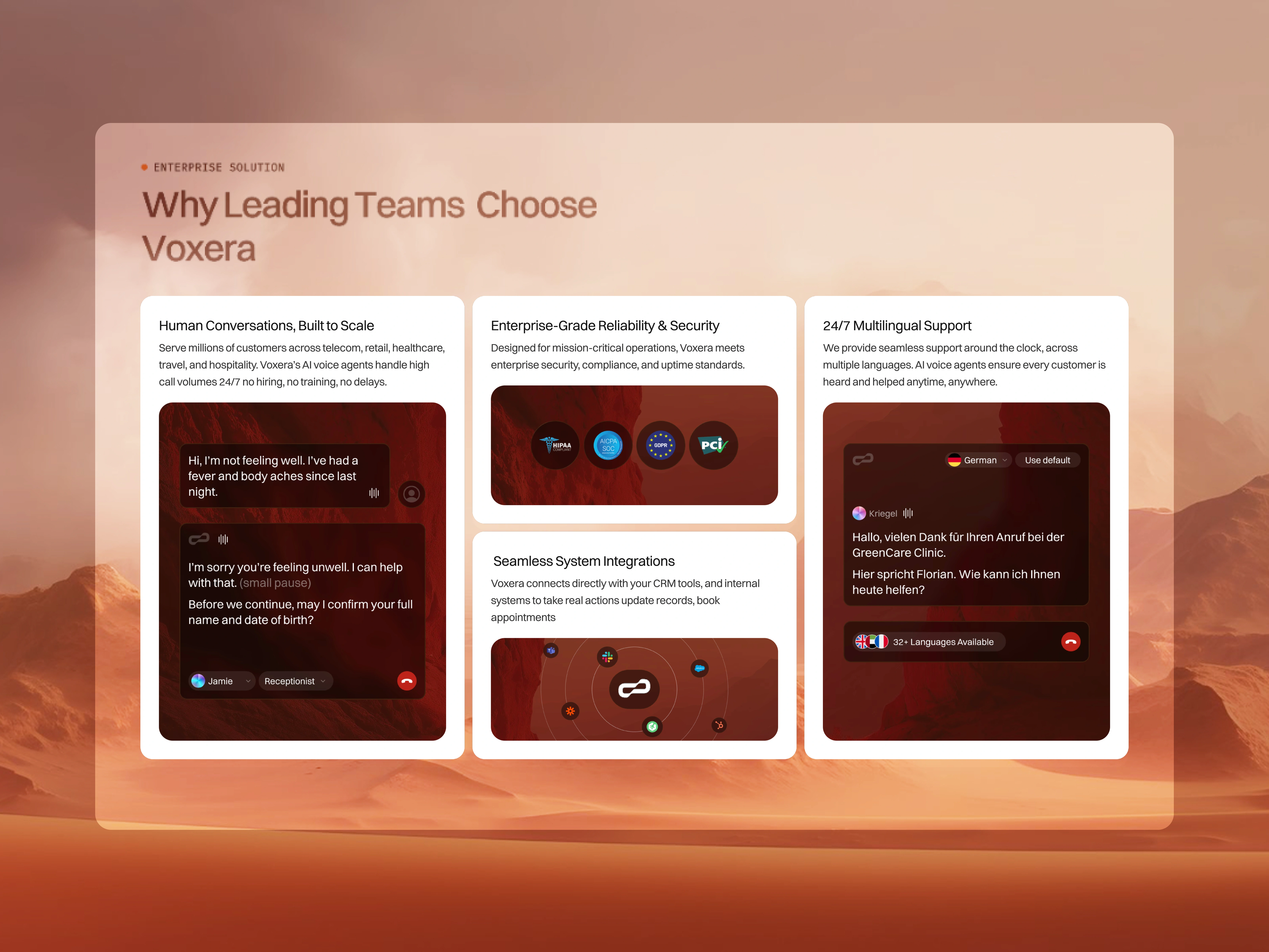
Strengthen trust and credibility
I introduced sections for proof points, integrations, and outcomes to help users feel confident about adopting the product.
Design for scannability and decision-making
Content was broken into clear sections with strong hierarchy, making it easy for users to skim while still capturing key information.
Solution
Solution
Using this structured approach, I Designed the Voxera AI landing page to be more intuitive, conversion-focused, and aligned with how users evaluate AI products—making it easier for visitors to understand, trust, and take action.
Like this project
Posted Apr 10, 2026
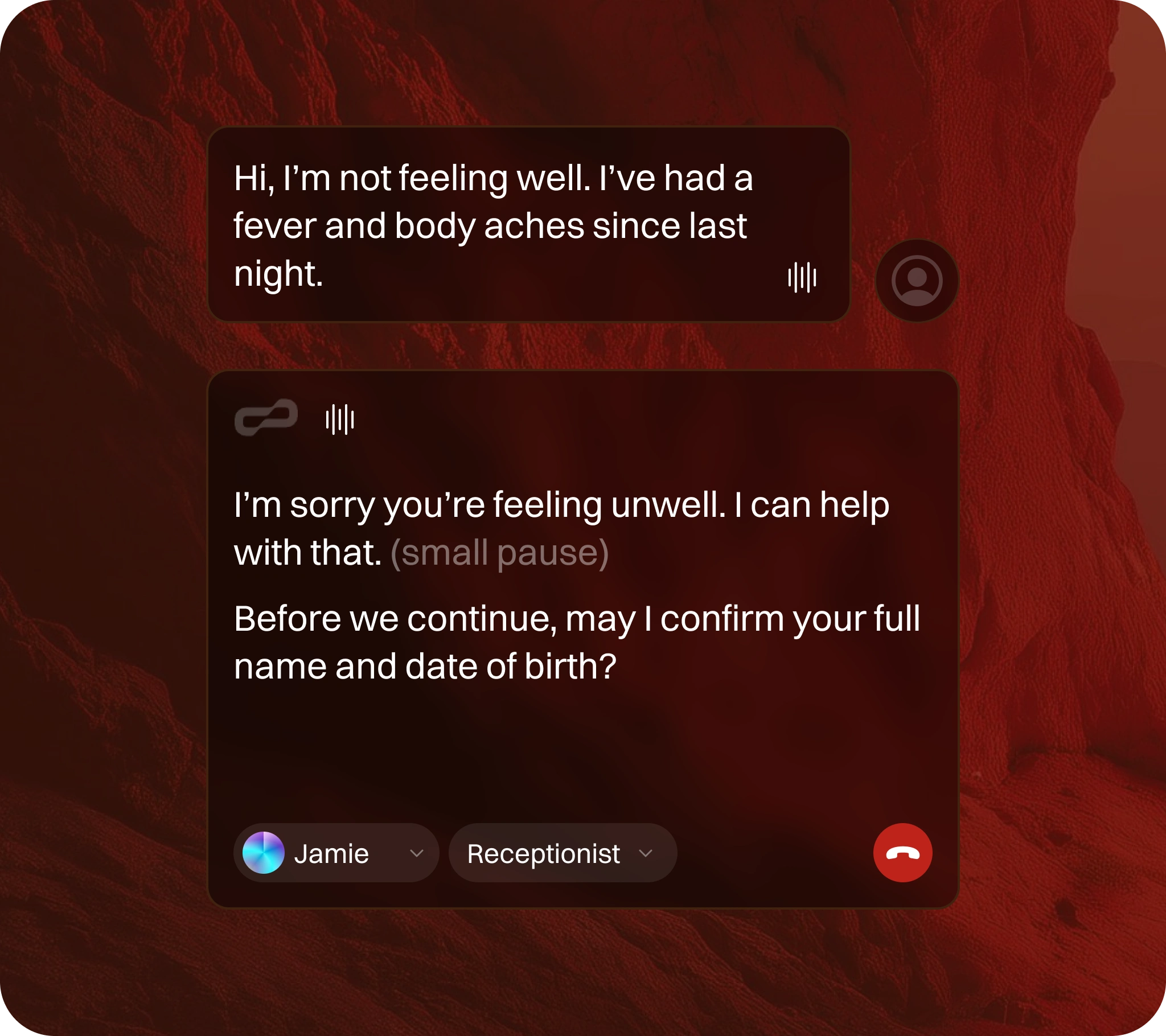
Voxera’s AI voice agents answer questions, resolve issues, book appointments, and qualify leads — 24/7, with natural human-like conversations.
Likes
1
Views
27