The wordmark uses an elegant

Himanya Pal


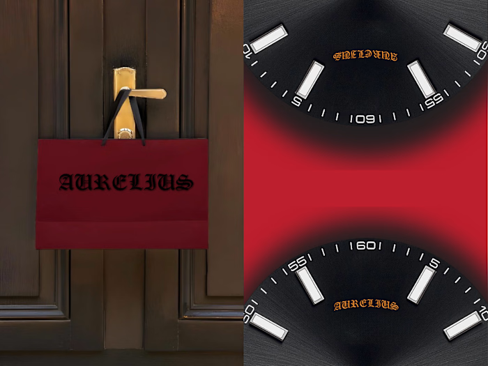
The wordmark uses an elegant classical serif typeface, referencing the typography traditionally associated with museums and cultural institutions. The refined typography contrasts with the aggressive guardian imagery, reinforcing the idea that beneath a calm exterior there can be something much more powerful.
Red is deliberately used as an accent rather than the dominant color. It appears in the eye, cracks, doors, typography and graphic details. This creates a visual language where, black is the contained inner world
& red is the awakened instinct.
The admission ticket extends the identity into a physical visitor experience. It treats entering the museum as entering someone's inner world, making the idea of privacy and access tangible. The ticket can almost be interpreted as permission to enter what is normally protected.
The tote translates the identity into an everyday object while maintaining the museum's mysterious character.
Like this project
Posted Sep 5, 2026
The wordmark uses an elegant classical serif typeface, referencing the typography traditionally associated with museums and cultural institutions. The refine...