Prodigius | Healthcare Platform UI/UX Redesign
Michelle Pani
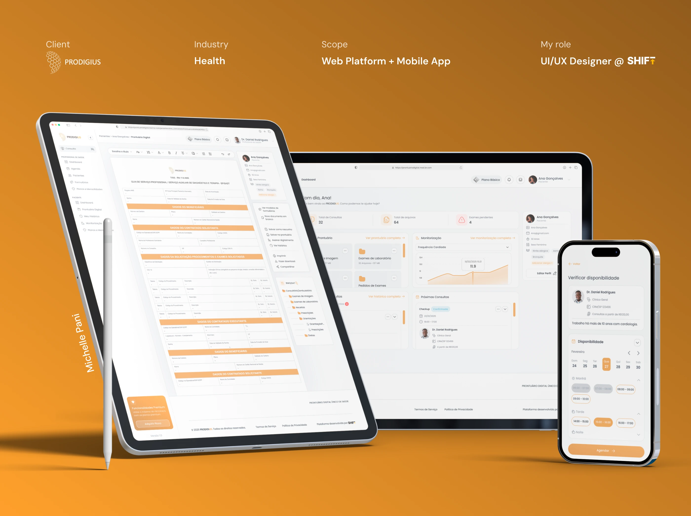
Prodigius: transforming a healthtech platform from unusable to elegant
Role: UI/UX Designer | Timeline: 3 months | Tools: Figma | Scope: 90+ screens (web + mobile)
Prodigius is a B2B2C healthtech platform designed to digitize medical workflows for doctors, clinics, and patients. Clinics and healthcare providers pay for the core service, while patients have free access to their medical records, consultations, and health monitoring (with optional premium subscriptions for expanded features like additional file storage). The platform handles everything from appointment scheduling and video consultations to prescription management and patient monitoring groups across both web and mobile.
I worked on this project through Shift Sistemas, the software house where I currently work. The challenge? Prodigius had been built without any design foundation: no prototype, no design system, just developers free-handing screens. The result was a confusing, visually outdated platform that nobody wanted to use. My job was to completely reimagine the UI/UX across web and mobile, creating the platform's first cohesive design system and making complex medical workflows actually usable.
→ Impact at a glance ˎˊ˗
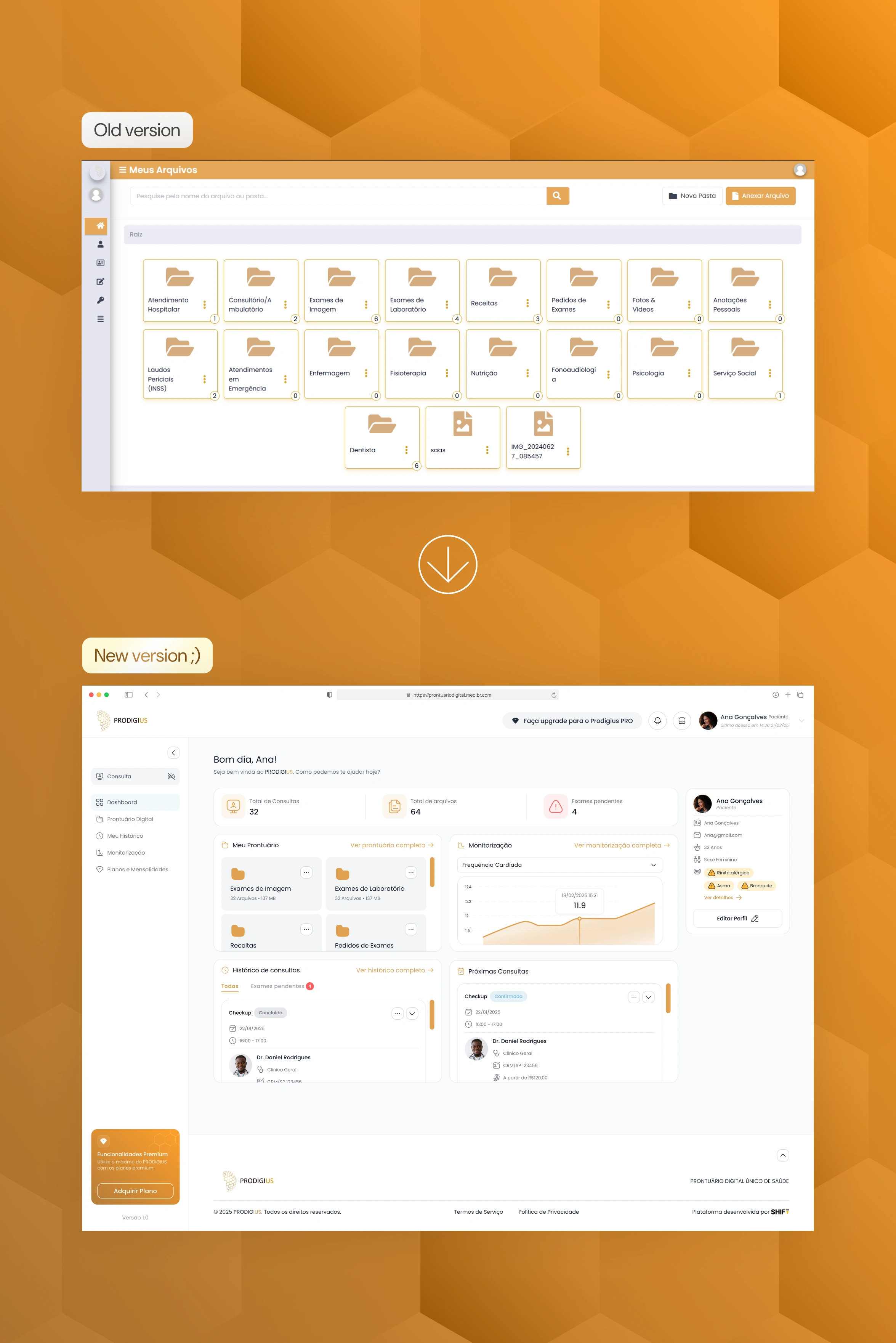
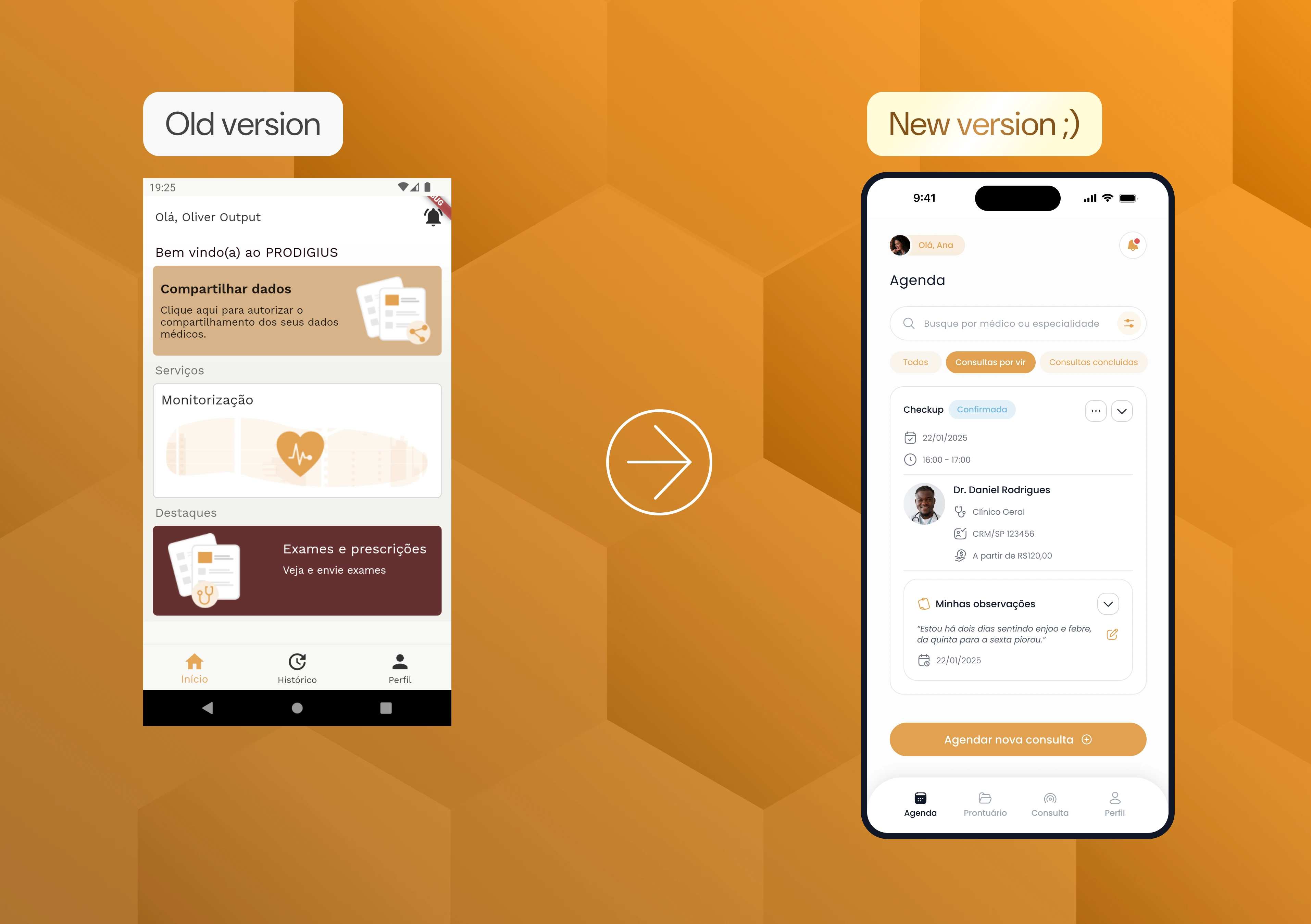
Before and after of the patient home screen!
The transformation:
Modernized outdated 2015 aesthetic to contemporary, premium design
Simplified confusing navigation into intuitive workflows
Created platform's first-ever design system across 90+ screens
Redesigned for doctors, clinics, and patients across web and mobile
→ The challenge ˎˊ˗
Prodigius is a B2B2C healthtech platform designed for doctors, clinics, and patients. Clinics pay for the service; patients use it free. But there was one major issue: nobody was using it.
The original system suffered from:
Visually outdated interface - Clashing orange and tan colors, low-quality icons, and a design aesthetic stuck in 2015
Confusing navigation - Users couldn't figure out how to complete basic tasks like booking consultations or viewing medical records
Inconsistent UI patterns - Developers had "free-handed" the entire interface without any design system or prototype, resulting in a chaotic user experience
No mobile optimization - Despite healthcare professionals needing mobile access, the experience was broken
For a paid platform targeting medical professionals, this wasn't just a cosmetic problem: it was a business-critical failure. Doctors and clinics expect premium tools.
This didn't deliver.
→ Key design decisions ˎˊ˗
1. Visual Design Overhaul
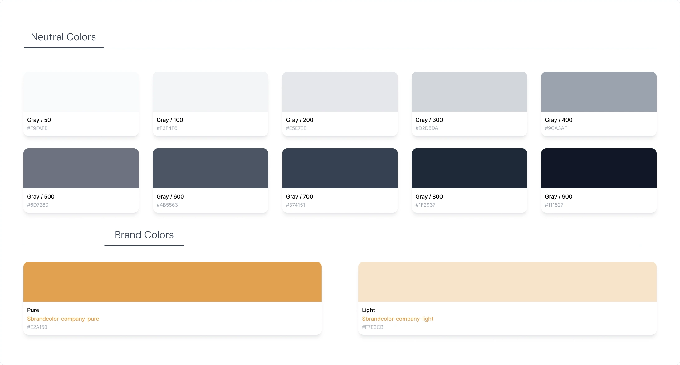
Color guide snipet
What I changed: Refined the existing gold color palette with better combinations, improved contrast and hierarchy, replaced harsh icons with friendlier curved alternatives.
Why: The platform needed to feel premium and trustworthy for paying medical professionals, not like outdated free software.
2. Information Architecture & Navigation System
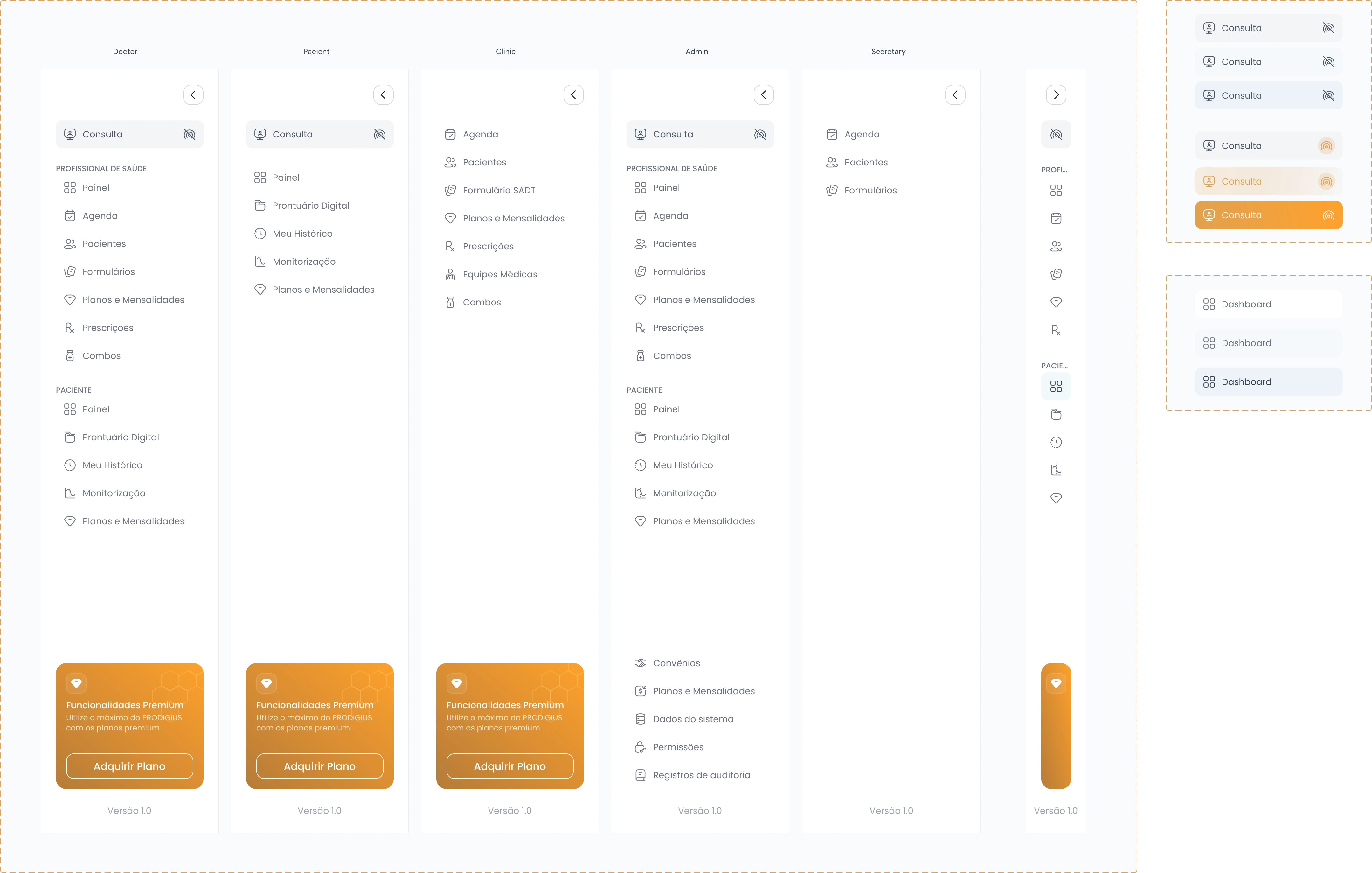
New side bar design!
What I changed: Created a role-based navigation system with customized sidebars for each user type (Doctor, Patient, Clinic, Admin, Secretary). Each role sees only the features relevant to them, organized into clear sections (e.g., Doctor: Consulta, Painel, Agenda, Pacientes, Formulários, Prescrições, etc.).
Why: The platform serves five different user types with completely different needs and permissions. A one-size-fits-all navigation would be overwhelming and confusing. By tailoring the sidebar to each role, users can quickly find their specific tools without wading through irrelevant options.
3. Mobile Experience Rebuilt
Before and after of the mobile app home screen!
What I changed: Redesigned the mobile home into a clean agenda view with appointment cards showing comprehensive information (date, time, doctor details, clinic location, price, and patient observations) all organized in scannable cards. Moved primary navigation to a persistent bottom tab bar
(Agenda, Medical Records, Consultation, Profile) for easy access to all key features.
Why: Users need quick access to their appointments with all relevant details at a glance, plus seamless navigation between core features. The old interface was cluttered with everything competing for attention. Bottom navigation follows mobile UX best practices and keeps essential functions always accessible while letting the agenda view stay focused and uncluttered.
→ Design system ˎˊ˗
The visual strategy was simple: modern, minimalist, and subtly luxurious.
Why? Because Prodigius is a paid platform competing for doctors' and clinics' budgets. It needed to feel premium, trustworthy, and contemporary (not like free software from 2015).
Design Decisions:
Color palette: Refined gold accent with improved combinations for better contrast
Typography: Poppins (kept existing font for easier dev implementation)
Icons: Curved, friendly alternatives for approachability
Layout: Card-based with clear hierarchy
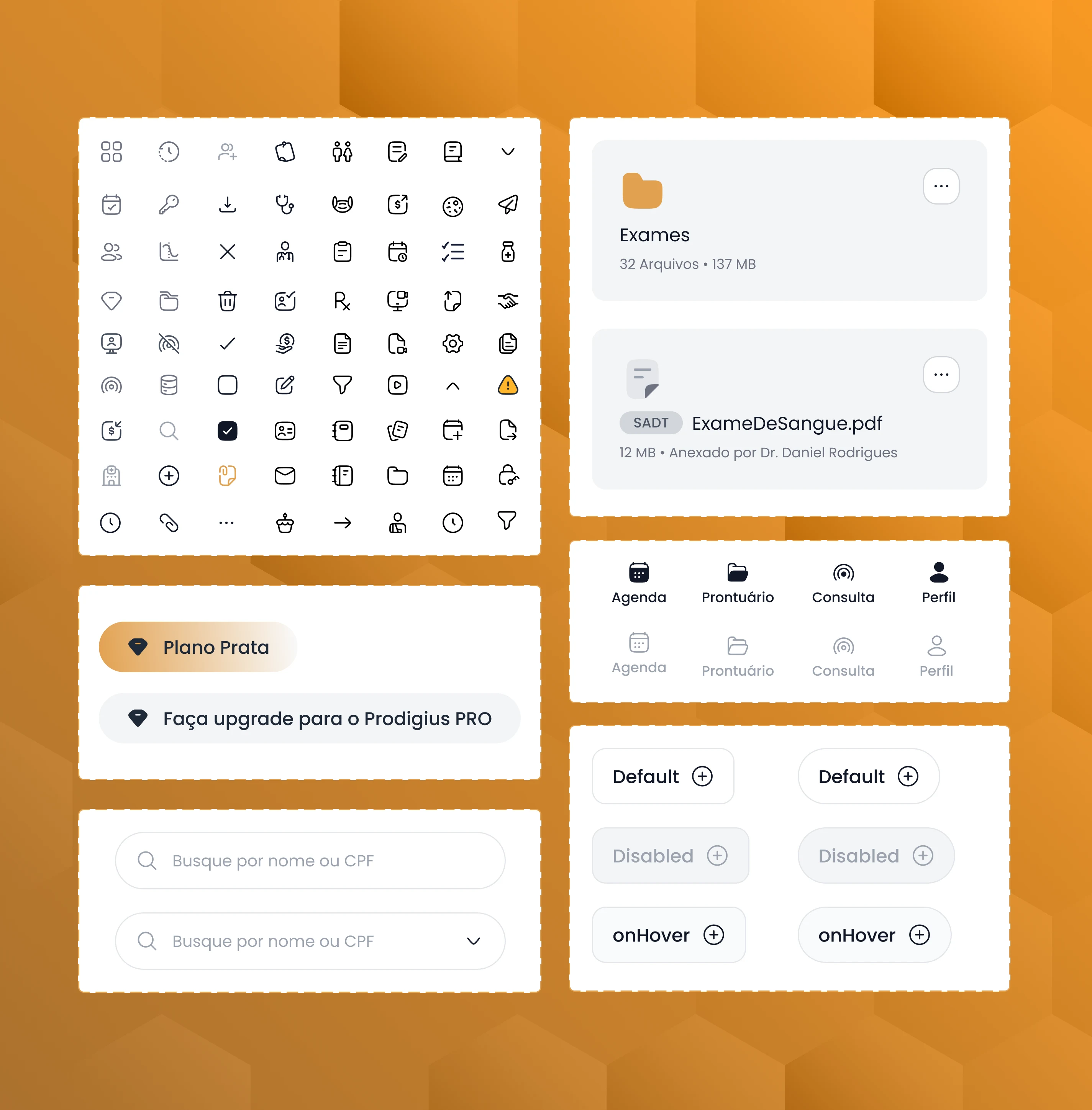
Snippet of the design system
→ Final designs ˎˊ˗
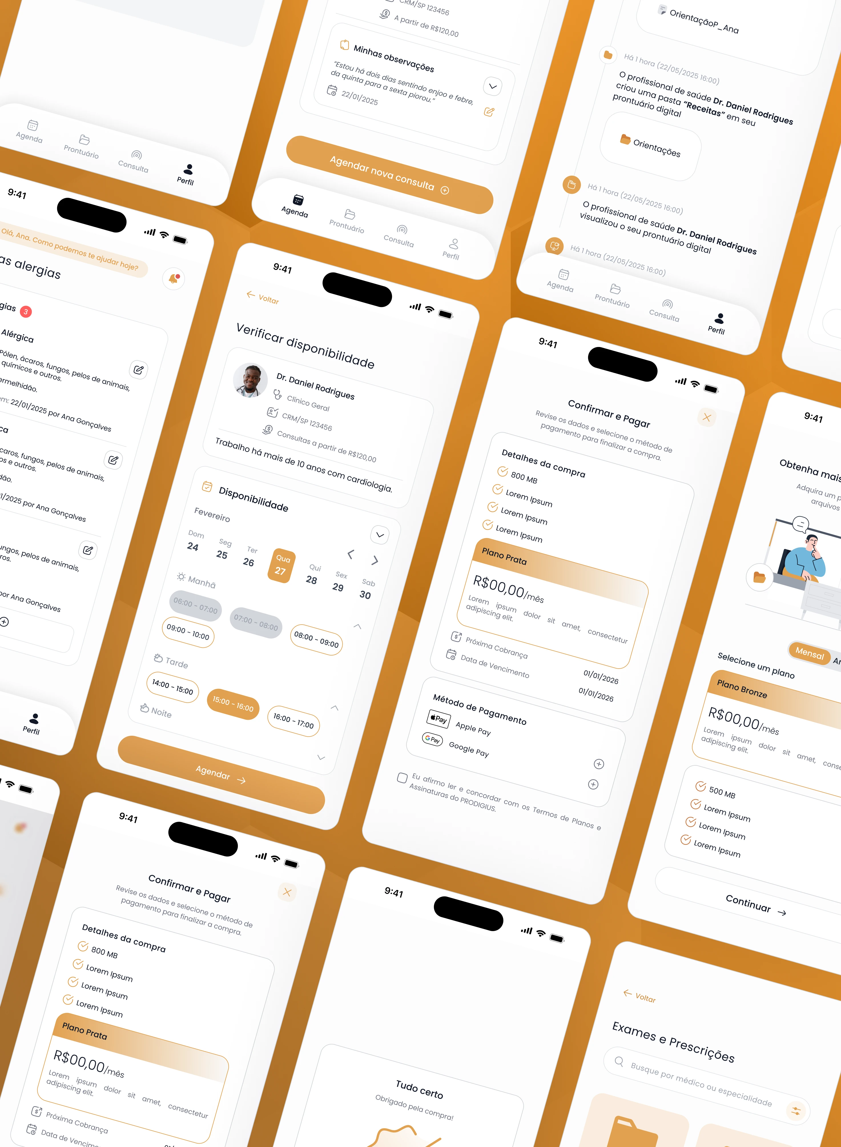
Mobile screens
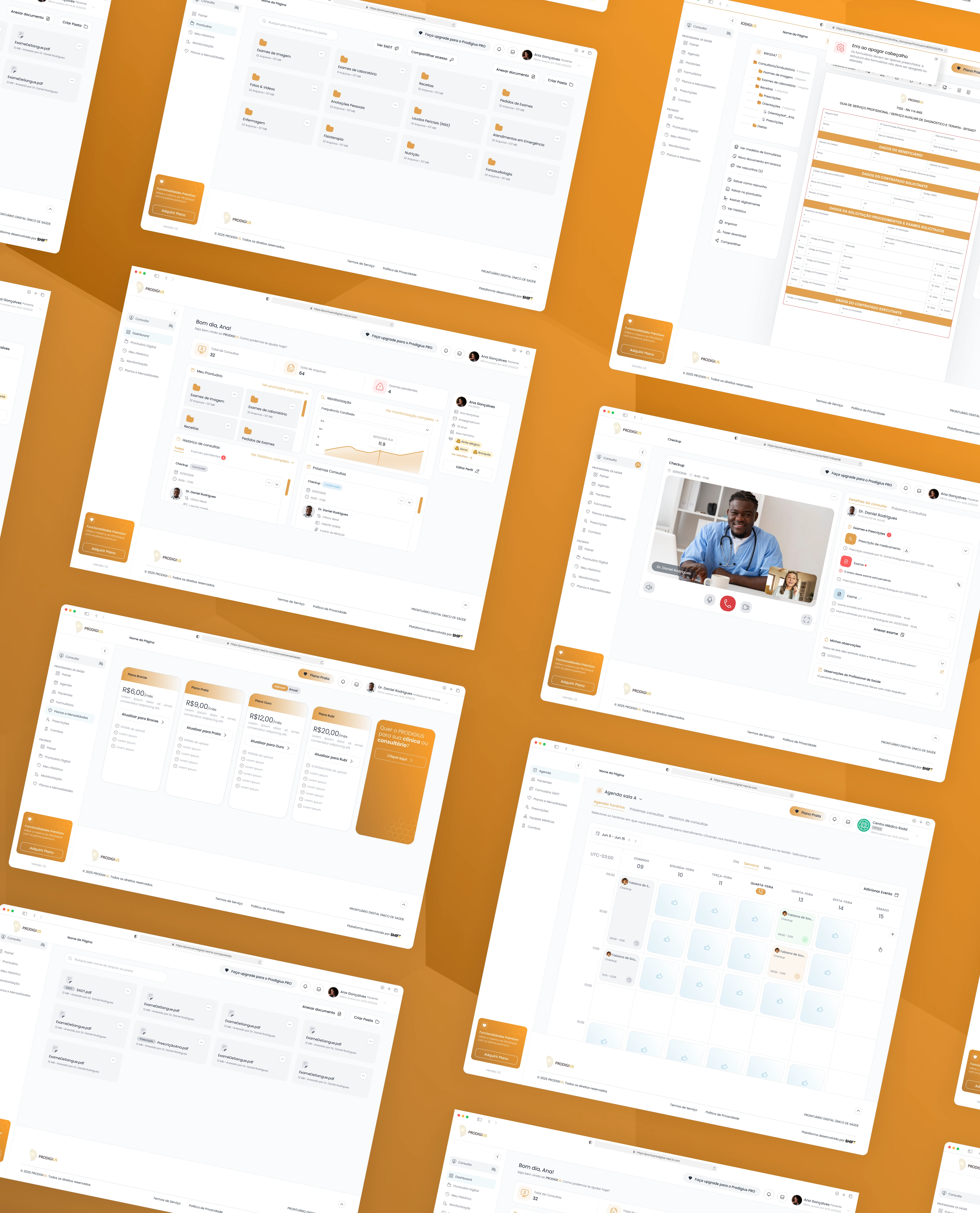
Web screens
→ Reflection ˎˊ˗
The main challenge? Scale. Designing 90+ screens for a complex medical platform in 3 months was intense.
Biggest learning: Figma file organization matters. I organized screens by the developers' PBI (Product Backlog Item) names for easier handoff, but in retrospect, organizing by user type (doctor/patient/admin) and then by user flow would have been clearer.
What surprised me: How much "client management" is part of design. I spent significant time explaining why certain requested changes didn't make UX sense and negotiating better solutions. That skill (advocating for users while keeping clients happy) was as important as the design itself.
What I'm proud of: This system went from completely unusable to actually elegant. It looks like a modern SaaS product that medical professionals would trust and pay for.
Prodigius went from a platform nobody wanted to use to a polished, professional healthtech product ready for market.
While the platform is still in active development and hasn't launched to end users yet, the redesign established:
A cohesive visual identity worthy of a premium B2B product
Intuitive workflows that don't require training to understand
A scalable design system that supports ongoing development
Mobile-first design that meets healthcare professionals where they work
Need a designer who can transform complex systems into elegant, usable experiences? Let's work together.
Or...
Want to see more screens, dive deeper into my process, or discuss this project in detail? I'd love to chat, feel free to reach out.
Let's bring your project to life.
Prodigius is a healthtech platform I redesigned while working at Shift Sistemas. Platform is in active development. All designs shown are my original work.
𐔌՞ ܸ.ˬ.ܸ՞𐦯
Like this project
Posted Dec 27, 2025
Took a broken healthtech platform from 'unusable' to market-ready with a UI/UX overhaul across 90+ screens and the platform's first unified design system.
Likes
1
Views
49