Brand Identity System - Gridelk Web Design Studio

Pedro AGB


Built the complete brand identity system for Gridelk. My own Framer web design studio. Logo system, color palette, typography, brand voice, UI components, and physical and digital applications. Every decision justified. No decoration for its own sake.
Overview:
Gridelk is my web design studio specializing in conversion-first Framer websites and industry-specific Framer templates. Before putting the studio in front of clients and the world, I needed a brand identity that reflected exactly what Gridelk stands for: precision, intentionality, and zero decoration for its own sake.
This project was self-initiated; I designed the full brand identity system from the ground up, applying the same rigor and depth I bring to every client project. The result is a complete, production-ready identity system built to scale across digital and physical touchpoints.
The Challenge
Most web design studios brand themselves the same way: a wordmark, a bright accent color, and a generic "we build beautiful websites" positioning. The challenge was to build something that stood apart visually and strategically. A brand that communicated precision and business outcomes before a single word was read, and that would resonate specifically with B2B founders and local business owners who are serious about growth.
The Approach
The process started with positioning, not aesthetics. Gridelk's core value is that every design decision serves a business outcome. so the brand identity had to demonstrate that principle from the inside out. Every choice made in this system has a reason behind it, and no element exists purely for decoration.
Three pillars guided every decision:
Precision: sharp corners, strict grids, exact spacing, zero rounding for softness' sake. The brand should feel like it was built by someone who sweats the details.
Restraint: a strictly black, white, and grey palette with no color accents. In a world of acid greens, gradients, and neon, restraint itself becomes a statement.
Systematic thinking: every element from the logo to the type scale to the UI components is part of one coherent system, not a collection of individual decisions.
Logo System
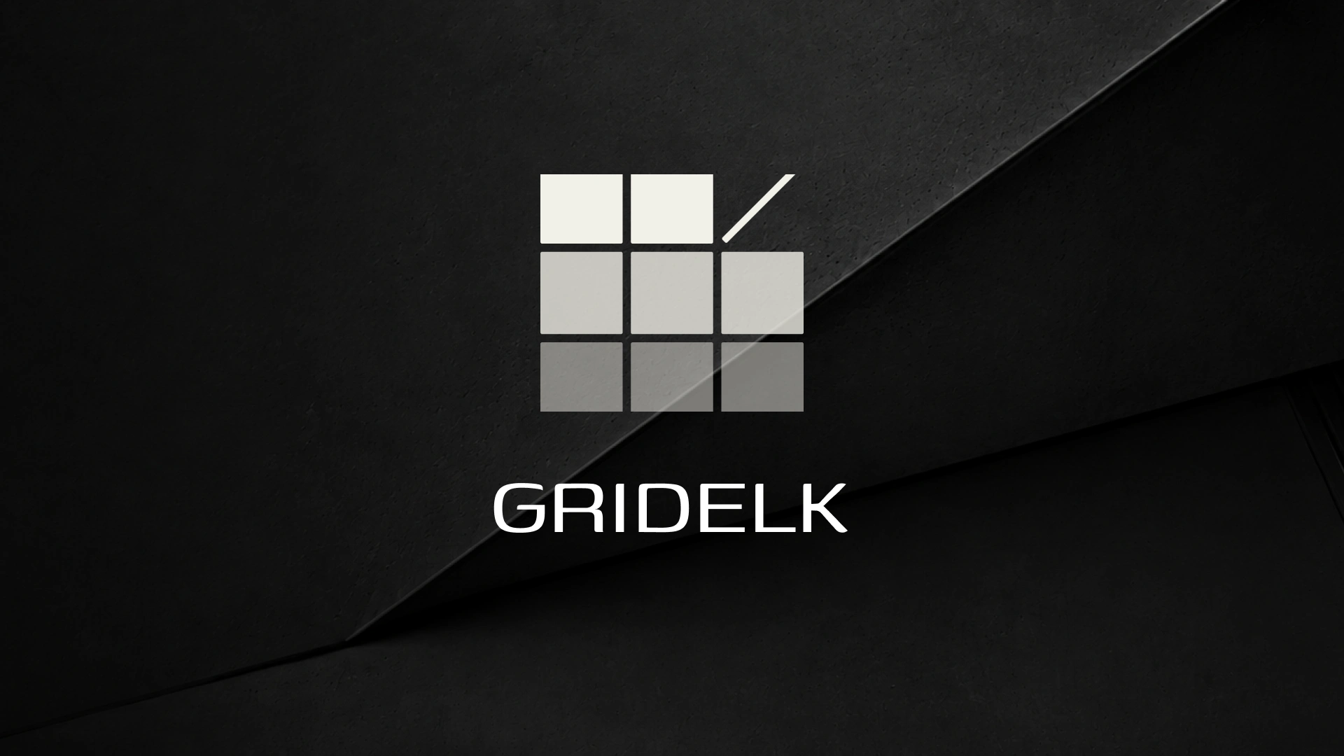
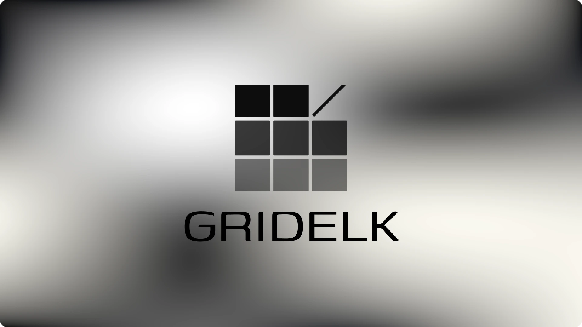
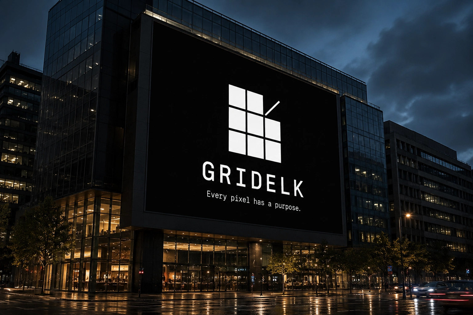
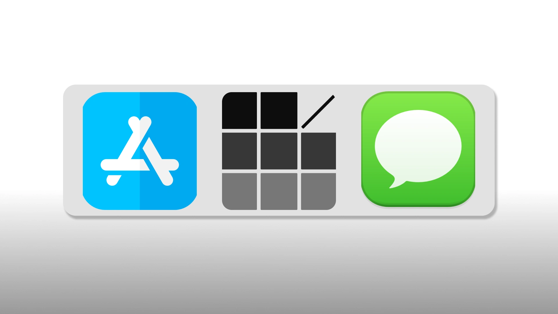
The Gridelk mark is a 3×3 grid of squares with a diagonal slash cutting through the top-right corner. The grid references the studio name directly; GRIDELK, while the slash introduces tension and direction, preventing the mark from reading as static or decorative. The opacity fades across rows (100% → 45% → 20%) create depth and suggest progression. a system in motion, not at rest.
Corner radius is set to 3px. tight enough to read as architectural and precise, not rounded enough to suggest approachability or softness. This is a deliberate choice for the B2B audience.
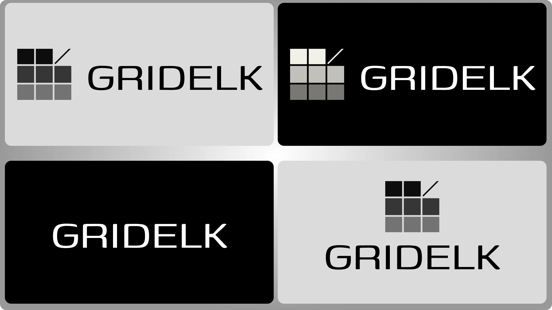
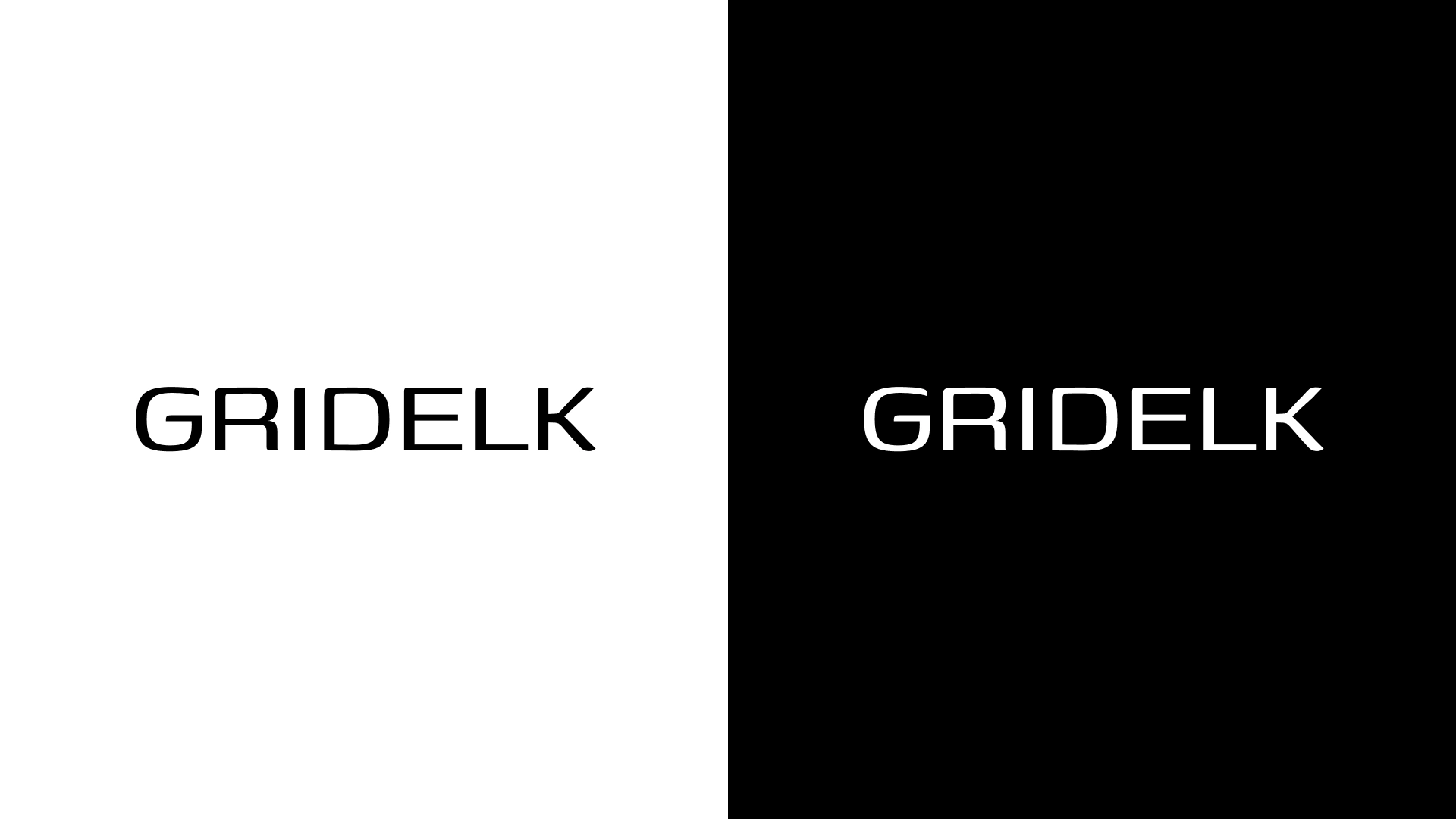
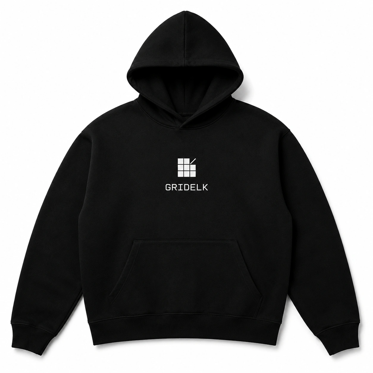
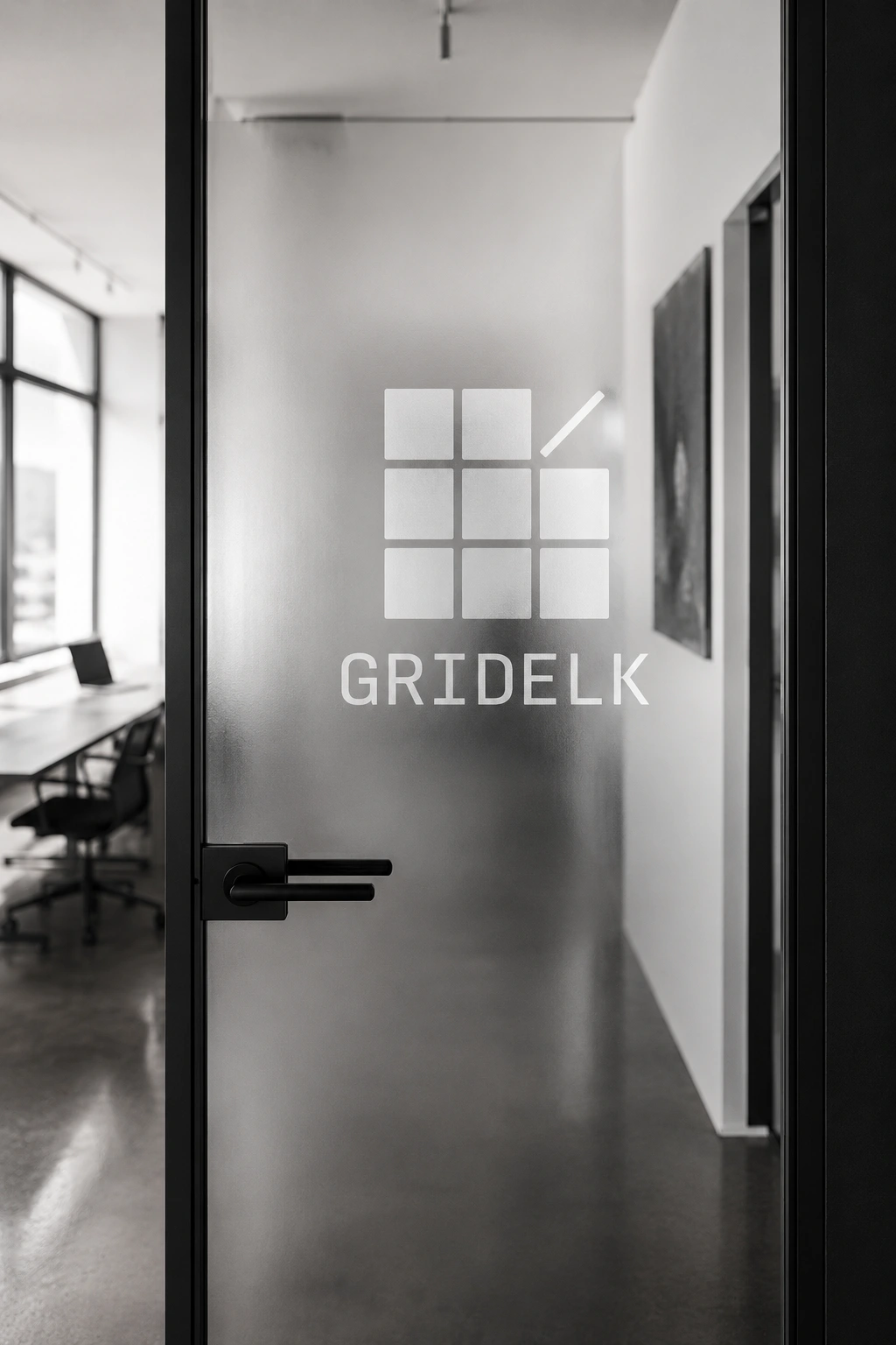
Four lockups were developed: horizontal primary, stacked secondary, mark only, and wordmark only. Covering every application from a Contra profile avatar to a frosted glass studio door.
Color System
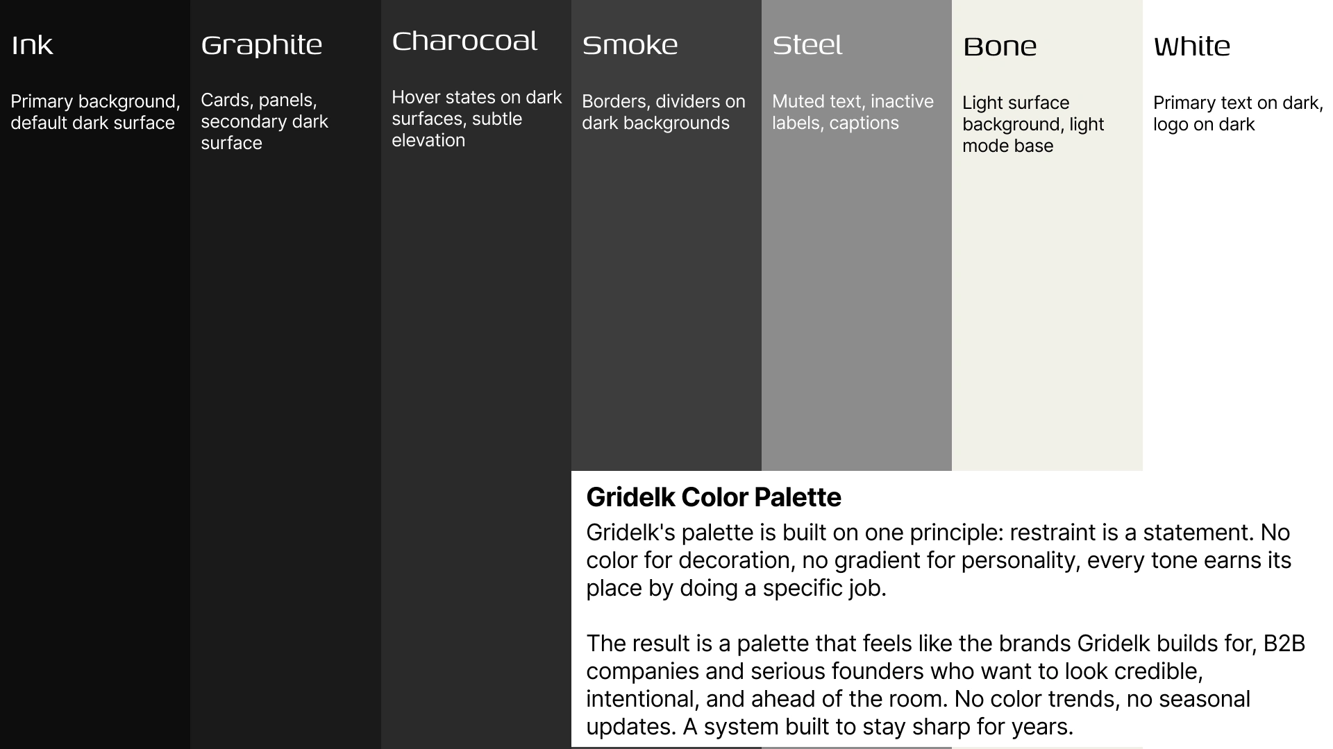
The palette is built entirely in black, white, and grey. No accent color. The decision was intentional: color trends date a brand; a strict monochromatic system stays sharp indefinitely.
Ink (
#0D0D0D) anchors everything a near-absolute black that signals confidence and precision. White (
#FFFFFF) sits against it at maximum contrast. Between them, a structured grey scale Graphite (
#1A1A1A), Charcoal (
#2A2A2A), Smoke (
#3D3D3D), Steel (
#5C5C5C), Silver (
#8C8C8C) creates hierarchy and depth without introducing noise. Bone (
#F2F0E8) provides the one warm note for light-mode surfaces.Every tone has a single defined role. Nothing overlaps. Nothing competes.
Typography
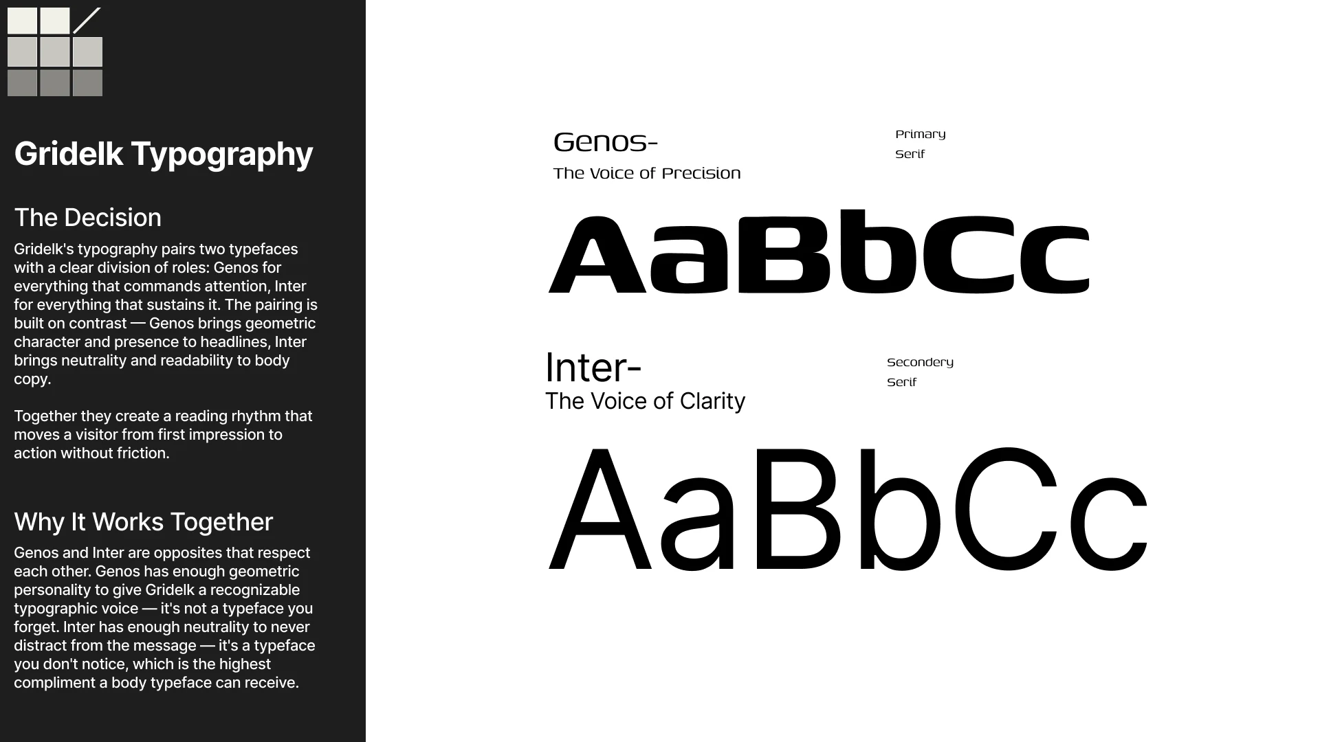
Two typefaces, one clear division of labor.
Genos (headings) a geometric variable sans with a slightly condensed, high-impact structure. At display sizes it commands attention; at heading sizes it holds hierarchy without effort. It gives Gridelk a recognizable typographic voice that separates it from studios defaulting to the same neutral grotesques.
Inter (body) designed specifically for screen readability. At reading sizes it disappears entirely into the content, which is the highest compliment a body typeface can receive. It never competes with Genos; it serves it.
The pairing creates a natural reading rhythm: Genos stops you, Inter moves you forward. By the end of a page, you have read everything without feeling like you were being sold to.
Brand Voice
Precise over poetic. Outcome-first. Confident without arrogance. Short sentences. Active voice. No filler.
The Gridelk tagline: "Every pixel has a purpose. Every site, a step closer to your goal."
Applications
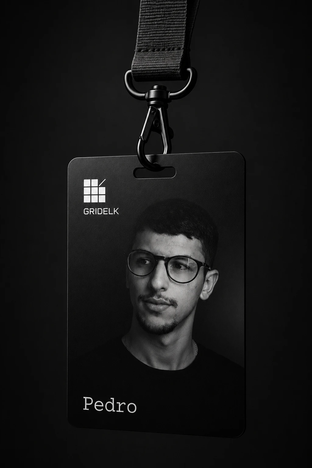
The identity was applied across physical and digital touchpoints to stress-test the system across contexts:
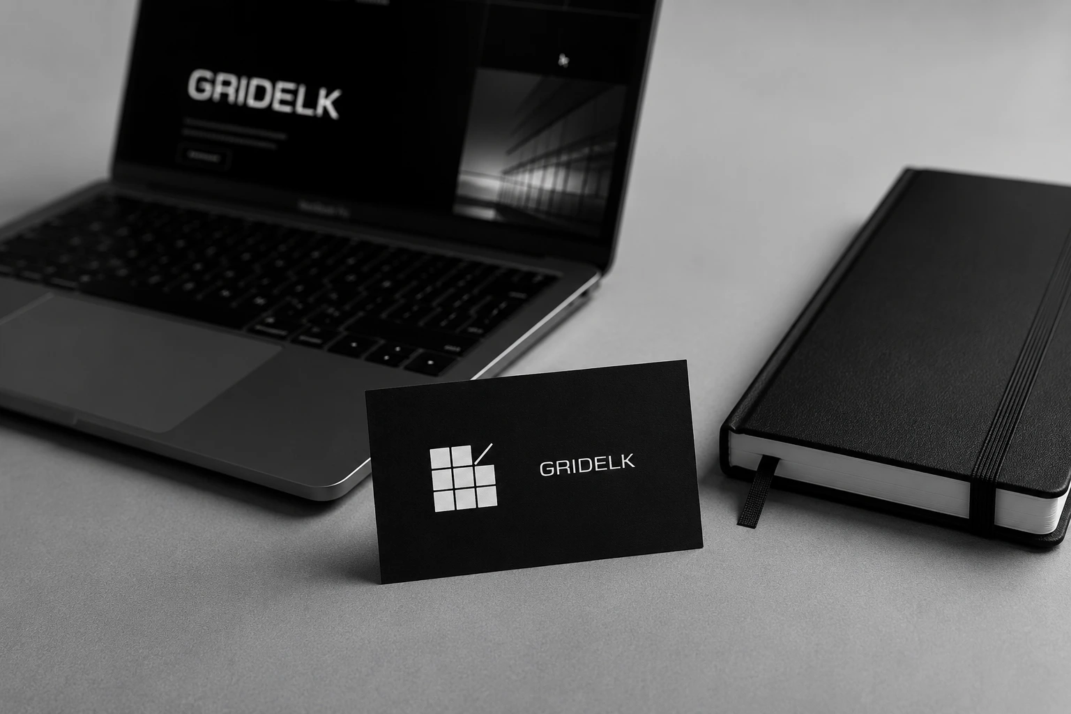
Business card (front and back, debossed print finish)
Embossed black leather notebook cover
Frosted glass studio office door
Premium black hoodie flat lay
Minimal desk scene brand flat lay
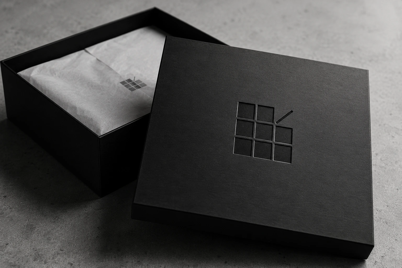
Engraved black rigid gift box
Outdoor LED panel installation
Result
A complete, production-ready brand identity system that reflects what Gridelk actually does: build precise, conversion-first websites for clients who are serious about growth. The brand doesn't decorate; it communicates. Every element from the logo construction to the type scale to the palette serves a specific purpose, exactly the same standard applied to every client project that comes through the studio.
Ready to build something that works? My DMs are Open.
Like this project
Posted Jul 27, 2026
Building a precision-first brand identity for a Framer web design studio serving B2B companies and local service businesses.
Likes
0
Views
6

![[ Visara ] Ophthalmology &](https://media.contra.com/image/upload/c_fill,w_700/yruzr9pdfjimd9lmygxu.avif)