Manoir de l’Aumônerie
Check out the FIGMA prototype for Desktop here.
Check out the FIGMA prototype for Smartphone here.
Check-out the final website here: https://www.manoirdelaumonerie.fr/
Introduction
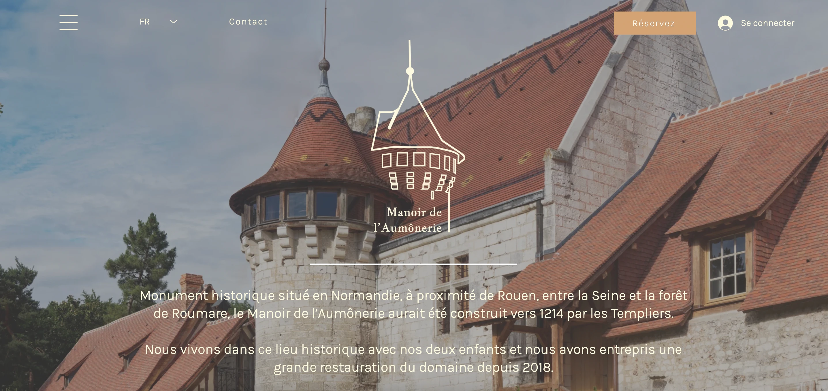
Le Manoir de l’Aumônerie is a historical castle in Northern France that rents out cottages as a business. The owners of the place are living there since 2018 and have begun a huge process of renovation of the place, with the financial help of public and private sponsors.
Their website was created when they got there in 2018 and the owner knew it needed to be a little spruced up in look and feel and in user experience.
Our challenge is to re-design a new version of their commercial website (especially english version) more fluid and easy to use. They would like to have a very clear interface for their web visitors that could be interested by their activities to participate to the restoration.
This project was an end-to-end mission from Design through development of this castle's website. We used the Design Thinking Process to design the best solution on Figma and I used the CMS Wix to implement everything we designed earlier. Let me take you through the different steps :
PROCESS OVERVIEW
UX DESIGN
1- EMPATHIZE: Survey & Interviews, Competitors Analysis, User Pain Point, User Persona
2- DEFINE: User Journey Map, HMW Statement, Problems & Hypothesis
UI DESIGN
3- IDEATE: Site Map, User Flow, Moodboard, Style tyle
4- PROTOTYPE: Logo Design, Design System, Mid-fi prototypes
5- TEST: Testing results, Iteration & Implementation, High-fi prototype, Next steps
WEB DEVELOPMENT
6- DEVELOPMENT: Wix.com
UX DESIGN
This research phase is meant for us to understand the company and its travelers needs. Through a thorough interview with the owner and surveys/interviews with their main target users, we have had a good sense of the castle's ambiance and how it should be reflected in the website.
UX Deliverables
User research outcomes
SURVEY RESULTS
We first conducted a survey targeting their first audience: middle-aged couples with kids looking for a peaceful place to spend a few days vacation. We emphasized our survey on how they react to the Manoir de l’Aumônerie’s current website. The main outcomes of the survey were:
63% think the website looks old-school
26% think the website doesn’t look professional
63% don’t find the booking process fluid and straightforward
42% don’t understand clearly what is their offer from the homepage
60% don’t like the colors of the website
75% don’t think the pricing is clear when booking
80% don’t buy souvenirs online
INTERVIEWS
For more qualitative data, we decided to interview people from their target audience as well, here are the outcomes of the different interviews:
Description of what she would like to see from going to a historical building for vacation↳ comfort, intrigue, a sense of luxury (depending on holiday), culture specifics, a welcoming and inviting feeling; something cozy for winter and airy and bright for summer; a child-friendly place with activities for kids; at the same time a relaxing moment but also a special experience.
Booking on hotel websites↳ want the prices and availability of options to be shown right away; if decide on a specific date, not showing options unavailable; wants to see special terms & conditions easily to have a sense of booking protection; wants to see that it’s safe to book and pay online.
Would describe the current website as↳ wordy, not descriptive of the experience, very confusing navigations, wasn’t sure about what is there to do at the Manoir, too many words, overwhelming“I feel like in a vicious circle because my stress gives me migraines. The only way I know how to cope with my migraines is to go walk in the garden and that makes me even later on my work and I feel more overstressed again.”
User Persona
This user persona is the fictional representation of our ideal user. It is based on the user research previously done. It incorporates their motivations, frustrations, and observed behavior patterns. In our case, his name is Jean-Baptiste:
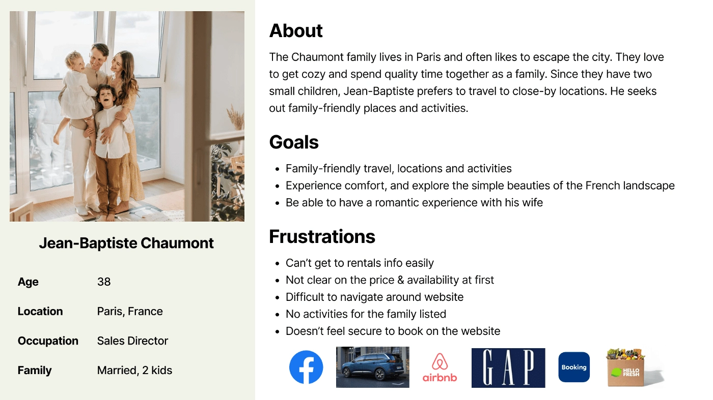
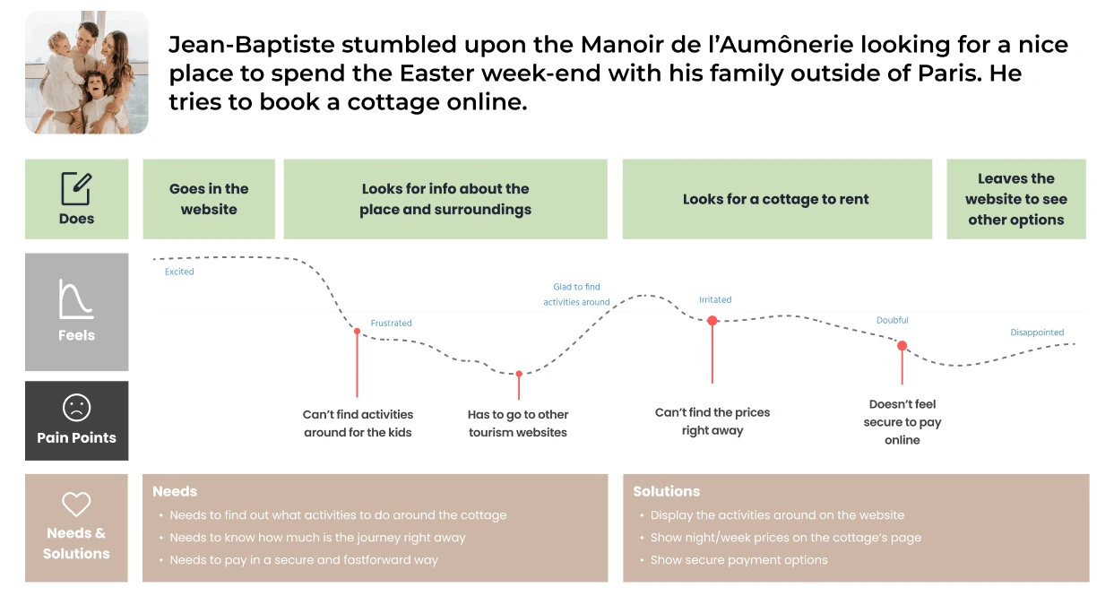
To best describe the User Persona of the place’s visitors, we chose a Parisian family, the Chaumont. The father, Jean-Baptiste is looking for a family-friendly place to travel to on weekends, with children's activities but with a romantic atmosphere too, not far from Paris.
USER PAIN POINTS
He can’t get rentals information easily
The prices and availability dates are not clear
The navigation is confusing
There are no activities around listed anywhere so he can’t know what he could do with his kids and wife
He doesn’t feel secure paying online
Competitor Market Research
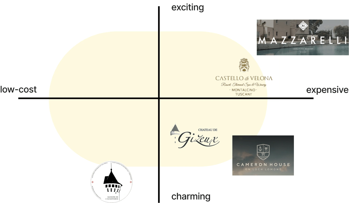
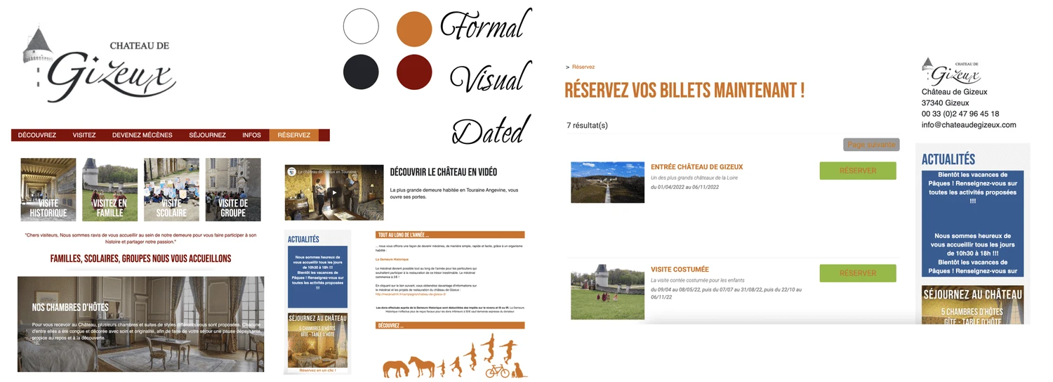
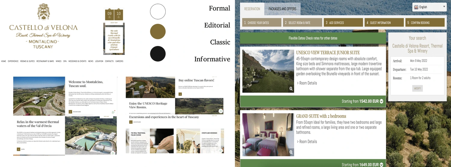
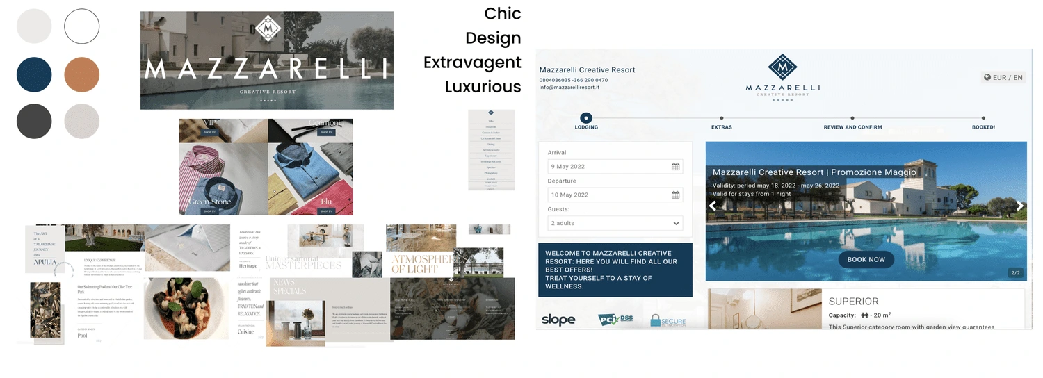
I have selected a few historical places, either near Paris or not far from other European capitales, and mapped them in terms of their experience and pricing points. We have analyzed their website’s look and feel and how they have managed their booking process.
We have studied their visual identities on their websites, as well as their booking processes.
User Journey
Here is one anecdote story that could be Jean-Baptiste’s journey and illustrates how he’s feeling while looking for the right place to rent.
HOW MIGHT STATEMENTS
Those statements are questions that allow us to reframe the user’s pain points into opportunities and innovate on the problems found during the user research phase.
Problem 1:“The navigation is confusing”
↳How Might We have clear navigation on the website with everything easy to find & read?
Problem 2:“There are no activities around listed anywhere so he can’t know what he could do with his kids and wife.”
↳How Might We leave a cozy, fun, family-oriented, charming impression?
Problem 3:“He can’t get to rentals information easily, the prices and availability dates are not clear and he doesn’t feel secure paying online“
↳How Might We make a secure / straightforward booking process?
Problem Statement
“We have observed that the website is not currently optimal for people to navigate through and find the relevant information to book a cottage easily which is causing lack of interest to potential visitors.”
Hypothesis Statement
“We believe redesigning the website of le Manoir de l’Aumônerie with attractiveness and charm for couples and young families will achieve an increase in the bookings through the website.”
UI DESIGN
UI Deliverables
This phase is meant for creation and validation upon the results of our research.
User Flow
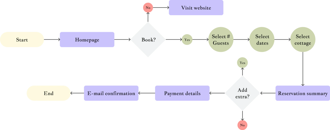
From our user experience research, the booking process was the most urgent to tackle since it seemed to be their main revenue stream and felt too complicated to even tech-savvy users. We decided to implement a “Book Now” button straight from the homepage on the navigation bar so that the user can decide to move forward in the booking process at any time.
Site Map
In order to make clearer navigation for the visitors to go through, we decided to divide the pages into the navigation links and the burger links.

Moodboard
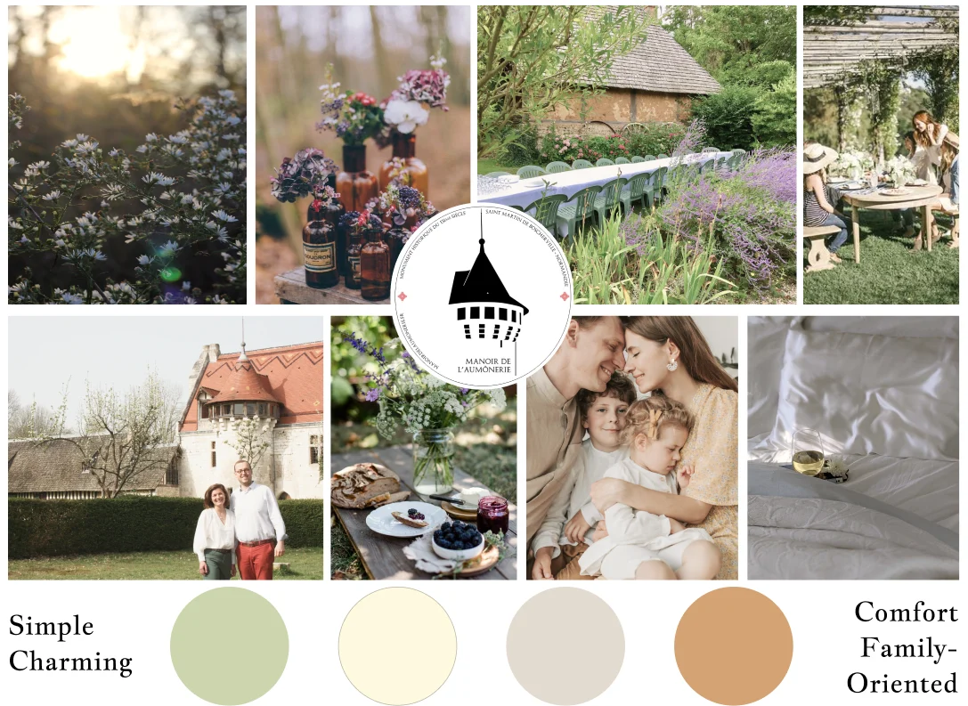
We decided to focus on warmer colors that would depict a calming moment at the Manoir. The terracotta brings back the color of the iconic tower roof. The other colors are soothing and natural to reflect nature and the countryside.
Style Tiles
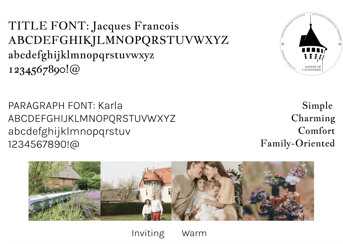
We have chosen two main fonts for the typography of the website. Jacques François is a serif font that looks old and authentic and has a medieval feeling to it. On the other hand, Karla is a sans-serif font that looks minimalistic and modern. It shows a historical brand well established in its time.
Brand Identity
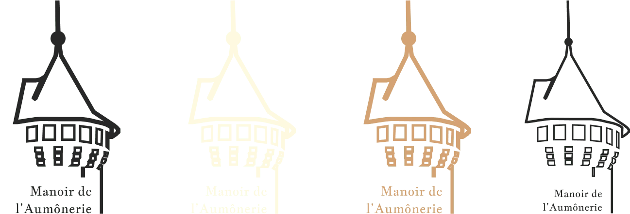
The existing logo was quite important to the owners. It showed the symbol of the place, which is the iconic tower of the Manoir. I wanted to keep that, but at the same time make it look more modern and a logo that could look well on either pictures or colored backgrounds.
Mid-Fi Prototype
We have made our mid-fi prototype whimsical since it is easy to use with already made basic components that you just drag and drop on pages. We didn’t want to test the look and feel here but only the process flow.
We made our mid-fi only for the booking process, which is our main user flow.

The testing of the mid-fi prototype
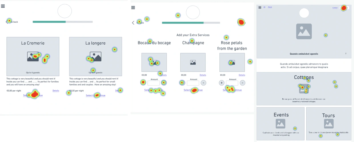
We tested out our mid-fi booking process in order to check if our flow and design is straightforward for users. These are the heat maps of our booking process.
ITERATION & IMPLEMENTATION
People were not very sure where to click
People are more used to clicking on images to select
Skip & go back were not clear enough
↳ We decided to take into consideration the feedbacks we have had from our users on the high-fi wireframes.
Design System
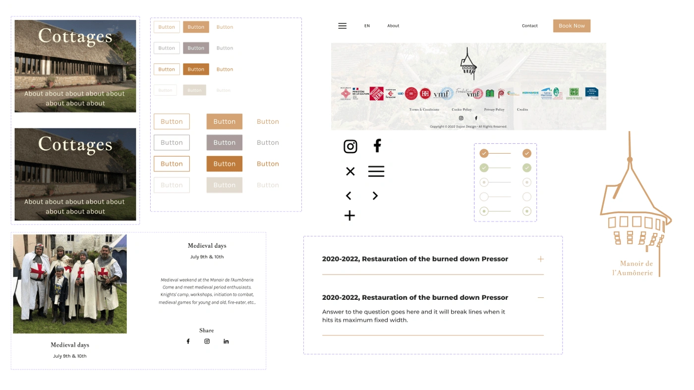
We created a whole design system in order to facilitate animations of the components while hovering on buttons for example or making accordions.
Creating the design system also made it so much simpler and faster to design high-fidelity prototypes, not redesigning the nav bar or other redundant components for each page.
High-Fi prototype
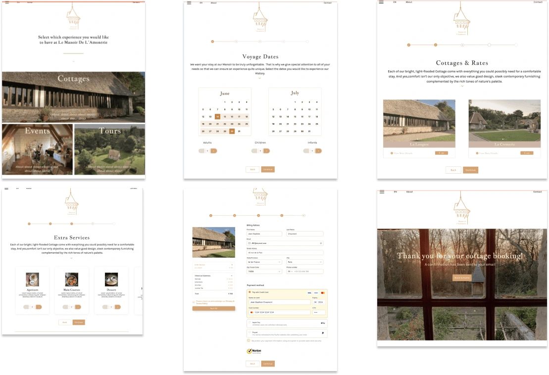
We have made a Desktop and Smartphone version but since our scope mentioned that it was a Desktop priority, we decided to dedicate a lot more time to make the Desktop version as perfect as can be.
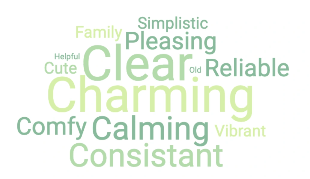
Desirability Test
I have made a desirability test, showing the latest version of our homepage for le Manoir de l’Aumônerie’s website. I gave the testers a list of positive and negative adjectives to chose from. Looking at our homepage, they would chose the ones that reflect the most how they feel while scrolling through the page.
WEB DEVELOPMENT
Looking for the best solution to implement easily the design and make my client independent on the website's maintenance once I finish the project, I've decided to make the website on Wix.com
Th development process was a constant back and forth with the client, getting in feedbacks and implementing them live. The whole developing process lasted about 60 hours.
Here is the final result: https://www.manoirdelaumonerie.fr/
Like this project
Posted Oct 1, 2022
This is a end-to-end mission from UX Design to UI Design to Web development of this wonderful French castle's website.
