Built with Framer
Emerald – Preventive Health Platform (Framer)
Nima Zaeimzadeh
Verified
Hero – First Impressions Matter ✨
The new Emerald homepage, designed in Figma and developed in Framer, greets you with a calming gradient backdrop that blends soft purples and blues, instantly setting a tone of trust and sophistication. Front and center, the headline “Your longevity starts with awareness” delivers the brand’s mission in a single line. Subtle scroll-triggered animations make the text and CTAs gracefully appear, inviting visitors to either book a test or dive deeper into the details. This opening moment is both visually stunning and strategically built to convert curiosity into action.
Meet the Experts 👩⚕️👨⚕️
Right after the hero, credibility takes the spotlight. Large, high-quality portraits of Emerald’s trusted professionals fade into view, each enhanced by soft hover effects that reveal additional insights. This section isn’t just about showing faces — it’s about building a personal connection. By placing real experts front and center, the homepage reassures visitors that they’re in capable, human hands.
Health Insights 📊
Next, the design shifts to an airy, minimal section featuring floating info cards. These cards present key facts — such as how Emerald’s approach can lower long-term health risks or save money over time — in a way that’s easy to absorb. Light background accents give the space a refreshing, uncluttered feel, making the data approachable without sacrificing professionalism.
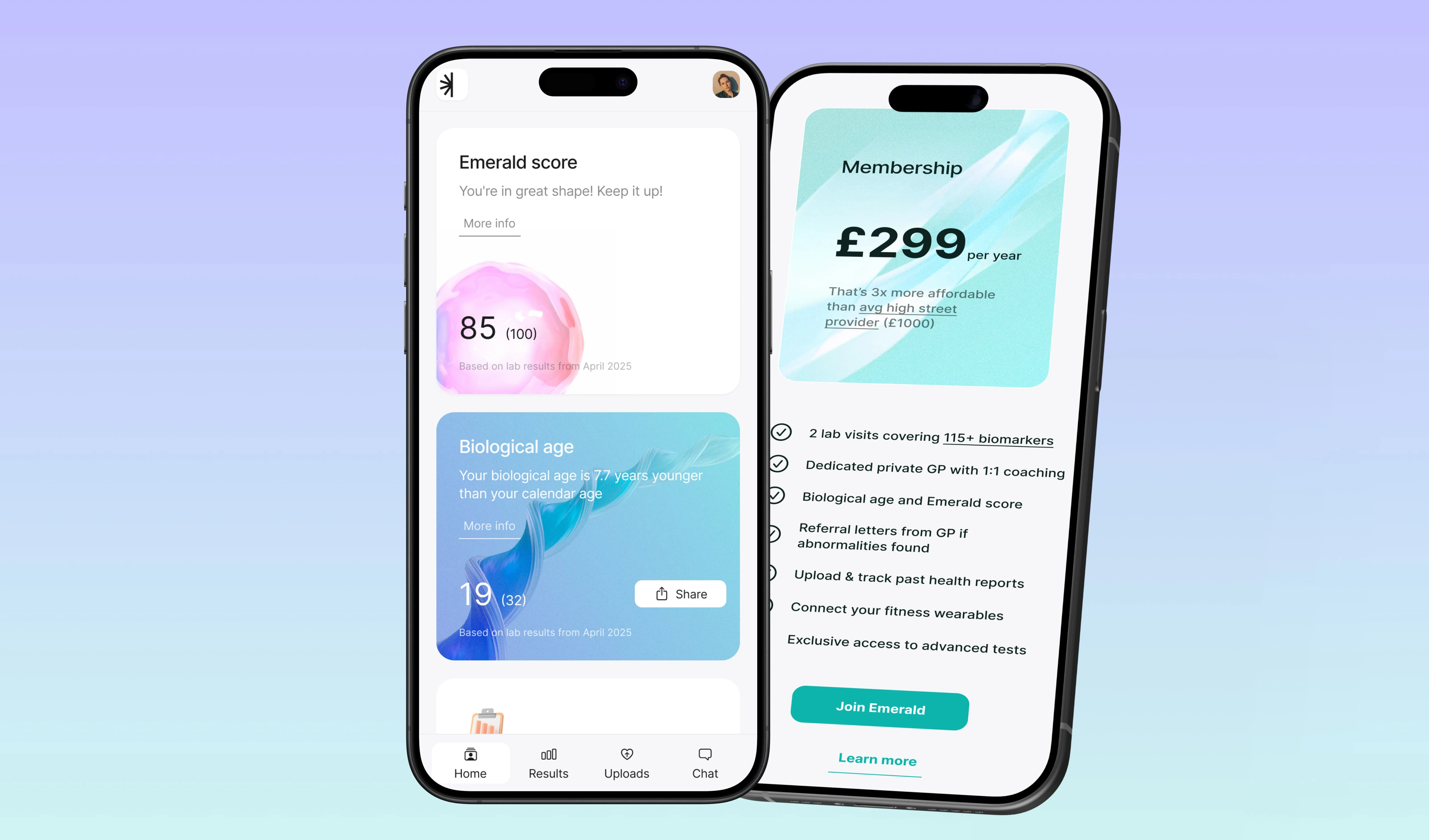
Transparent Pricing 💳
Clarity is king here. A sleek pricing card with a bold £299 label stands in the spotlight, supported by concise details of exactly what’s included in the service. The vibrant “Book Now” button draws immediate attention, while the surrounding space keeps the focus clear. This section communicates honesty and openness — essential for building trust in healthcare services.
Biomarker Testing 🧬
Emerald’s science-forward side shines here. A dynamic display showcases up to 115 biomarkers, with partner logos arranged in a visually pleasing, grid-like layout. Hover effects bring them to life, adding interactivity without clutter. This section turns something complex and clinical into an accessible, visual experience that sparks curiosity.
Find a Clinic 🗺️
For those ready to take the next step, a fully interactive UK map is right there. Visitors can pinpoint the nearest clinic with a single click, revealing location details instantly. This feature bridges the gap between online exploration and offline action, making the journey from interest to booking seamless.
How It Works ⚡
Clarity meets simplicity here. A step-by-step guide walks users through the entire process, from booking their test to receiving results. Accompanied by crisp screenshots of Emerald’s modern dashboard, this section reassures visitors that they’ll be supported at every stage. The clean layout reflects Emerald’s commitment to efficiency and ease of use.
Personalised Results & Care ❤️
Beyond the test, the experience becomes deeply personal. Illustrated cards in warm tones explain how results are tailored to the individual, interpreted by certified GPs, and paired with actionable advice. The blend of professional authority and approachable design gives this section a human touch that’s rare in medical websites.
Emerald vs. Standard Tests 📋
In a bold dark-mode contrast, a comparison table lines up Emerald’s services against standard blood tests. Tick marks highlight the clear advantages, making it visually effortless to understand the value Emerald delivers. This section is all about reinforcing decision-making confidence.
Testimonials & FAQs 💬❓
Emerald lets its community speak for itself. Real testimonials, complete with profile photos, create a sense of authenticity and trust. Below, an accordion-style FAQ answers the most common questions with smooth expand-and-collapse animations — a functional yet elegant way to keep the page uncluttered.
Final Call to Action 📲
The homepage closes with momentum. A gradient section introduces the Emerald mobile app, showing users how they can carry their health journey in their pocket. Two clear buttons — “Join now” and “Get started” — make taking the next step frictionless. It’s the perfect final push to turn visitors into clients.
From the first Figma wireframe to the final Framer animation, this homepage was built with purpose: to educate, inspire trust, and make booking a health test as intuitive as possible. Every section serves the bigger mission — guiding users toward awareness, action, and better health.
🔗 Explore it yourself: https://withemerald.com/
Ready to elevate your brand’s storytelling?
Let’s talk! 🚀
Like this project
What the client had to say
Nima was great. He took on an urgent project on the same day and delivered it with high quality, in time and was responsive.
Alexander Badalyan, Alexander Badalyan
Jul 30, 2025, Client
Posted Aug 10, 2025
Emerald Preventive Health Platform in Framer: Intuitive UI/UX with wellness tracking, seamless navigation & vibrant visuals to boost user health.
Likes
18
Views
190
Timeline
Jul 29, 2025 - Jul 30, 2025
Clients
Alexander Badalyan