Sync Flow UI Redesign for Enhanced User Experience
Jake Titmus
What is Sync flow?
Sync flow is a white label, onboarding and config tool that comes with our Sync products in our Embedded Accounting Automation set of products. It is essentially a mapping tool that our clients SMB customers use to map the data from their Commerce, Expense, Payroll or Payables data and categories into their accounting platform.
The designs and research we did here is more specific to Sync for Commerce but it is and will be used for our other sync products, Sync for Expenses, Sync for Payroll, Sync for Payables.
Our sync products are B2B2B and therefor we have limited access to our end users as they are our clients customers.

We wanted to make sync flow easier for our users and subsequently have a higher completion for our clients.
The main things we wanted to fix as part of this project were:
Make sync flow easier for merchant users
Help merchants understand what they are doing
Improve merchant completion rates.
Simplify the screens so that users aren’t overwhelmed
Set sensible defaults where possible
Give the user more visual feedback
Automate as much as we can for the user as possible.
Discovery
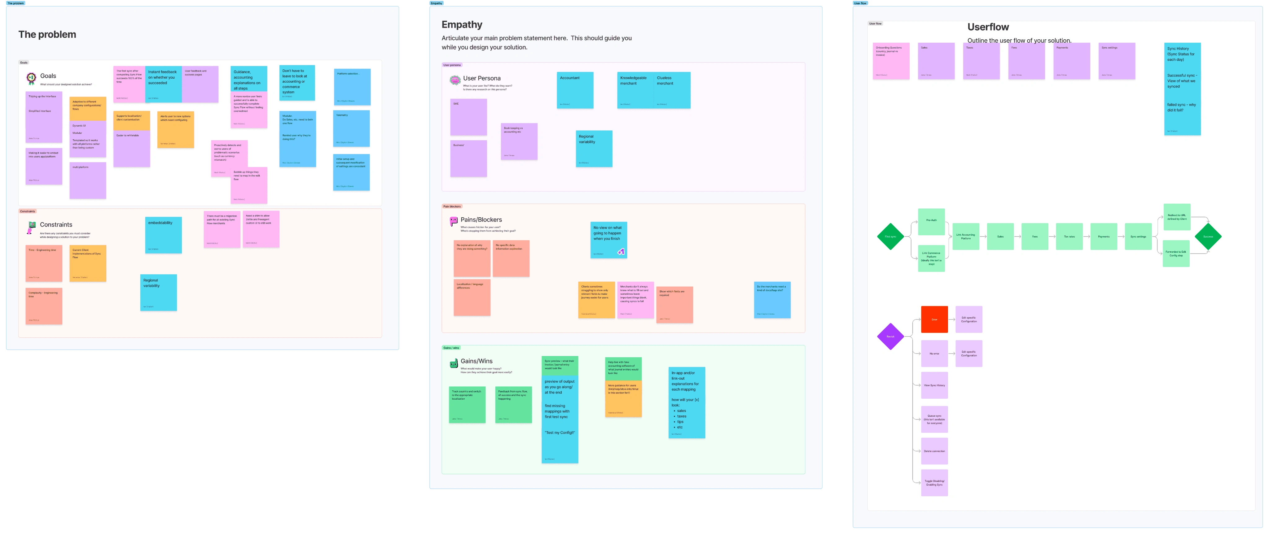
I hosted a discover workshop inside Figjam where we had members from Product, Engineering, Client Experience and Support. In this session we spoke about:
The problem
Goals
Constraints
Empathy
User personas
Pains / Blockers
Gains / Wins
Possible Solutions
User Flow
Sketches

Personas
In the discovery workshop we outlined some rough user personas but I wanted to dig into these a little bit more so we fully understood who our users were and why they were struggling with the current flow.
Data
Very primitive conversion 'funnel' for Clover SfC Sync Flow UI:28% of companies that start the journey of setting up Sync for Commerce end up with an actual, successful, sync.
We loose 55% of merchants during Sync Flow UI. A further 18% end up with a config that's invalid (so we disable it after 31 days).This is why we have been prioritising work to make Sync Flow UI much, much better.
Current Sync flow Ui
The current Sync flow Ui is outdated, clunky and was mainly thought about by developers, thats why a lot of the language is thought about in a technical way and presented as such, rather than being slick, easy to understand and human.
The current designs don't offer any pre populated information in the dropdown, or group together the fields to allow the user an easier, more simple setup, config flow.
The flow UI is also quite busy and bloated with none useful information which confuses the users.
This Ui is also a white label product so our clients have the ability to customise it through their branding, colours and custom text. In the screenshots below this is a test version of the flow where some of the text has been customised and the colours have been edited.

Making sync flow a White label product which is, embeddable.
One of the key challenges we faced was creating a product that could seamlessly blend into the client's website while still maintaining the usability and components from Codat.
Without being too technical, we made an SDK for our clients to embed the flow into their products.
We wanted the Ui to be as flexible as possible and for our clients to be able to embed Sync flow into any of their products seamlessly. For this we have designed and built it in a way that would work across many different breakpoints, and container types depending on our clients application.
To further add to the customisability of sync flow, we added the ability to customize various areas of text and three levels of styling to the branding settings. This allowed clients to have their tone of voice shine through while still maintaining the integrity and UX of the Codat app.
The user can also make all of these changes with code by using our SDK and customising text, styles and the container.
If you add both of these together then you get a wide range of brands and software types that our Ui can now seamlessly fit into and replicate a cohesive experience inline with their own brand and design language.
New designs
We wanted the Ui to be super easy and informative for the user. Below i will show the new Ui in comparison to the old version of the Ui and speak through some of the key benefits and improvements of each section.
We removed the progress Ui from the left of the page as each of our clients would have their own progress components and steps inside their own products. This also allowed us to have a more simple screen for our main persona, the clueless merchant who isn't very technical literate, we want the ui to be as plain and easy as possible.

Sync schedule
Sync schedule is essentially the user setting up when the sync takes place on each date and when the data is synced from. We found that the old designs (left) have very technical and hard to understand questions / phrasing, it also asks for information which we can pull from the users accounting and commerce data, rather than asking them where they are based, this would be able to be detected by the API calls we make.
To improve this page we have:
Improved the language used to be more human.
Sync schedule > Select the date you'd like us to start processing your sales data and reflecting it in your accounting platform.
Start date > Today / Historic date
Today - Automate account your commerce data from today onwards, until you ask us to stop processing it.
Historic date - Choose a date in the past and we will automate your accounting using data from the date you selected onwards, until you ask us to stop processing it.
Improved the way we frame the questions
Giving the user a choice of starting from today or a historic date, this allows the user to understand what is being asked more effectively and what their choice will impact rather than just choosing a date with no context to why they are choosing it, like the old designs.
Simplify the data required
We now only ask for the data that we need, such as when they want the data to be pulled from rather than asking them where they are based and the time zone, this requires the user to enter duplicate information and adds another step which will lead to more dropoff.
Added a speedy setup tag to help guide the user
We have suggested a sensible default so that the user can "speed run" the setup using our speedy setup suggestions.
Making the Ui fluid - Using progressive disclosure
We have decided to make the calendar appear when the user needs it and not stay there all the time, this is so that the ui can have less content, and be less overwhelming for our "clueless merchent"
This means we are only asking the questions we need to ask and presenting the user more important, relevant information, while cleaning up the Ui. This all allows the merchant to make a more informed decision about when and why they want to start processing their data.
How would you like to record your daily sales data in {{Accounting platform}} ?
We have a sync setting that asks the merchant how they would like their data represented in their accounting platform. Our old Ui for this was again very Dev-talk and doesn't make sense to commerce merchants who are doing their accounting.
To improve this page we have:
Improved the language used to be more human.
Sync Settings > How would you like to record your daily sales data in {{Accounting platform}} ?
Added benefits to each option
We explain why the user would want to select each of the options and what the benefit is, we also kept the speedy setup to allow for a sensible default which was based off of what most users had selected in the past and which one is easier.
Preselected option and Ui change
Rather than having a dropdown we opted for two cards with a radio button, similar to the other steps in the flow. There is no point making the user click on a dropdown to see the options when there is only two, we can add more context, preselect an option and allow for a more intuitive Ui by using this pattern.
Let's get your sync configuration just right! Choose which type of setup you’d like to do.
The main chunk of what sync flow does it creating a mapping of Commerce categories to Accounting accounts, in the old ui this was a very lengthy process which everyone had to go through, even if they weren't very confident with accounting or technology.
Because of this the conversion was failing for two reasons.
The user didn't complete the flow
The user didn't set up the config/mapping correctly
Old flow
New flow & Logic
To improve this flow we have:
Added a new page that sits before the flow
This page asks the user how they would like to map their accounts:
1. Do it for me
This is a new option where we create all of the accounts inside of their platform for them, this allows an easy no stress option for someone less tech literate and new to accounting - Our 'clueless merchant'.
2. Simple config
Another new option which groups each section of the old Ui into groups, this allows the user to map all of sales to one accounting account and allows for a easier mapping process but still have control over how it is set up.
3. Advanced control
This is essentially a reimagined view very similar to the old Ui which allows our more competent or picky users to map each of the commerce categories to individual accounts, allowing for a more customisable config.
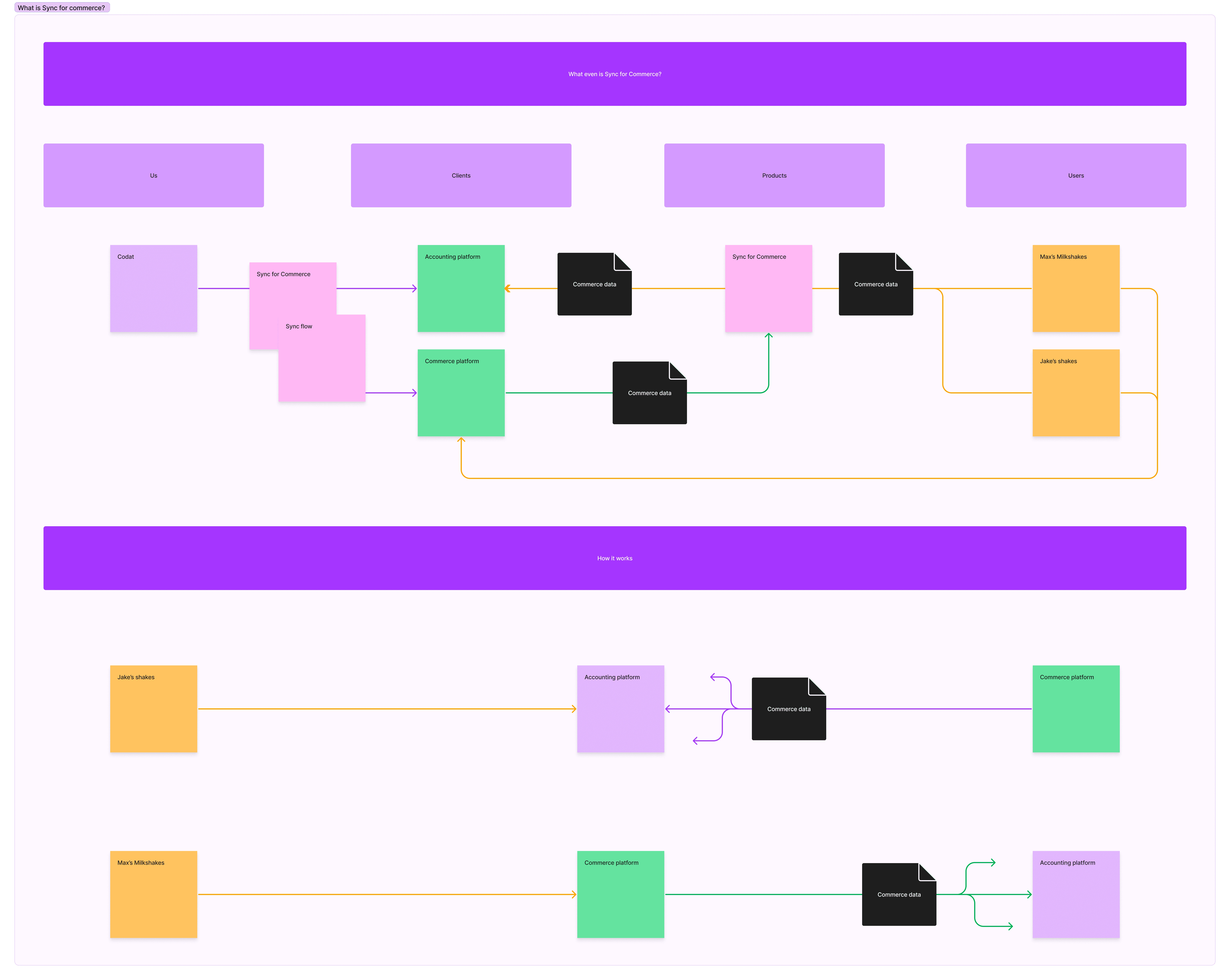
Added a visual aid to explain what is happening to the data
We have added in a Ui element which shows their Commerce platform and Accounting platform. This element shows the flow of data
We have also added relevant icons to help show the different categories of data
Outcome
We are currently waiting for the data to come back on the new designs from being in use and some of the work to be completed however the data that we have seen so far has lead to more syncs being set up, and completing more successful syncs which means the designs have been a success, however the data is still not in a place to share.
Our clients are also super happy about the customisation they have access to and the embedablility of the flow.
Like this project
Posted Aug 16, 2025
Redesigned Sync flow UI for better user experience and customization.