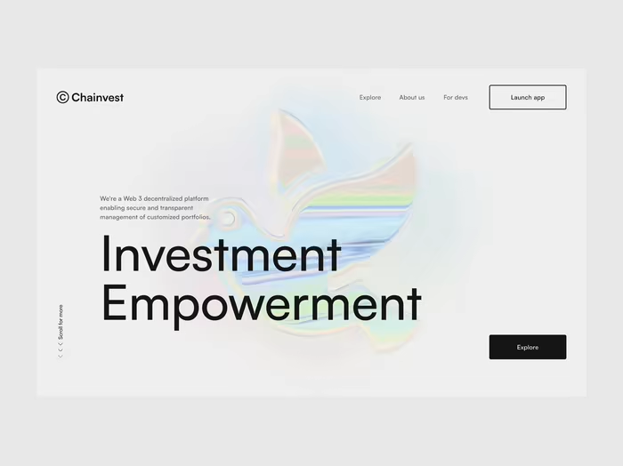
Built with Framer
Wraith AI - Framer Website for an AI Interview App
Andrei Butenko
$2.5K+ earned
Wraith AI is a real-time interview assistant that helps users think clearer, answer better, and stay composed during live calls.
I designed and built Wraith AI’s launch website in Framer, refined the brand, and redesigned the app icon to help the product feel clearer, stronger, and more credible before launch.
Live site: wraithai.app
The situation
Wraith AI already had an ambitious product idea. It was being built by an indie founder who wanted to compete with more established tools by focusing on real interview use cases and rethinking the UX of products in this space.
At the time I joined, the product was still pre-launch and not yet available in the App Store. The founder needed a stronger marketing website to explain the product clearly, support direct downloads, and start bringing in early users.
The product direction was strong. The surface around it was not.
The founder had relied heavily on AI for design, using references from Dribbble and X to shape the output into something usable. But the result had the usual problems: inconsistent layouts, weak composition, messy code, and a brand that didn’t feel distinctive or credible enough for a product built around high-pressure interview scenarios.
The challenge
The job was to create a distinctive website with strong product storytelling, one that could surface the real problems people face during interviews and show that the app was built to solve them. But if the brand stayed weak, the site would still feel like a cleaner wrapper around the same underlying problem.
So I proposed expanding the project beyond the website and updating the visual direction first.
Rebuilding the visual foundation
The core idea clicked pretty early: Wraith AI needed to feel like "an invisible assistant" - helpful, stress-free, and never distracting.
That became the filter for the visual direction. From there, I created a new app icon from scratch and explored how it could work together with the broader visual direction as one coherent feeling.
The founder liked it right away, and it gave the project a much stronger visual anchor
App icon redesign
Explaining a product that was still being built
For SaaS and software products in general, I almost always believe that showing the product is stronger than describing it. A clear preview, a small demo, or a visual walkthrough usually does more than paragraphs of feature copy ever can.
The issue here was that some of Wraith AI’s features were not fully ready yet.
So instead of waiting for the product to catch up, I worked with the founder to define how those interactions should look and feel.
We mapped out the intended experience, then I created motion previews in Jitter to communicate that experience visually. These became stand-ins for real product demos and helped the site explain functionality that was still in progress.
Screenshot to solution
Follows the conversation
Invisible during sharing
Adjust window appearance
Interview summary
Building the website
I built a conversion-first storytelling landing page that quickly explains how the app works during interviews and what problems it solves.
Tech side in Framer:
Responsive Framer build
Section-based structure and component-driven setup for easier scaling as new features are launched
CMS setup
Content optimization for stronger SEO
Custom code components and microinteractions
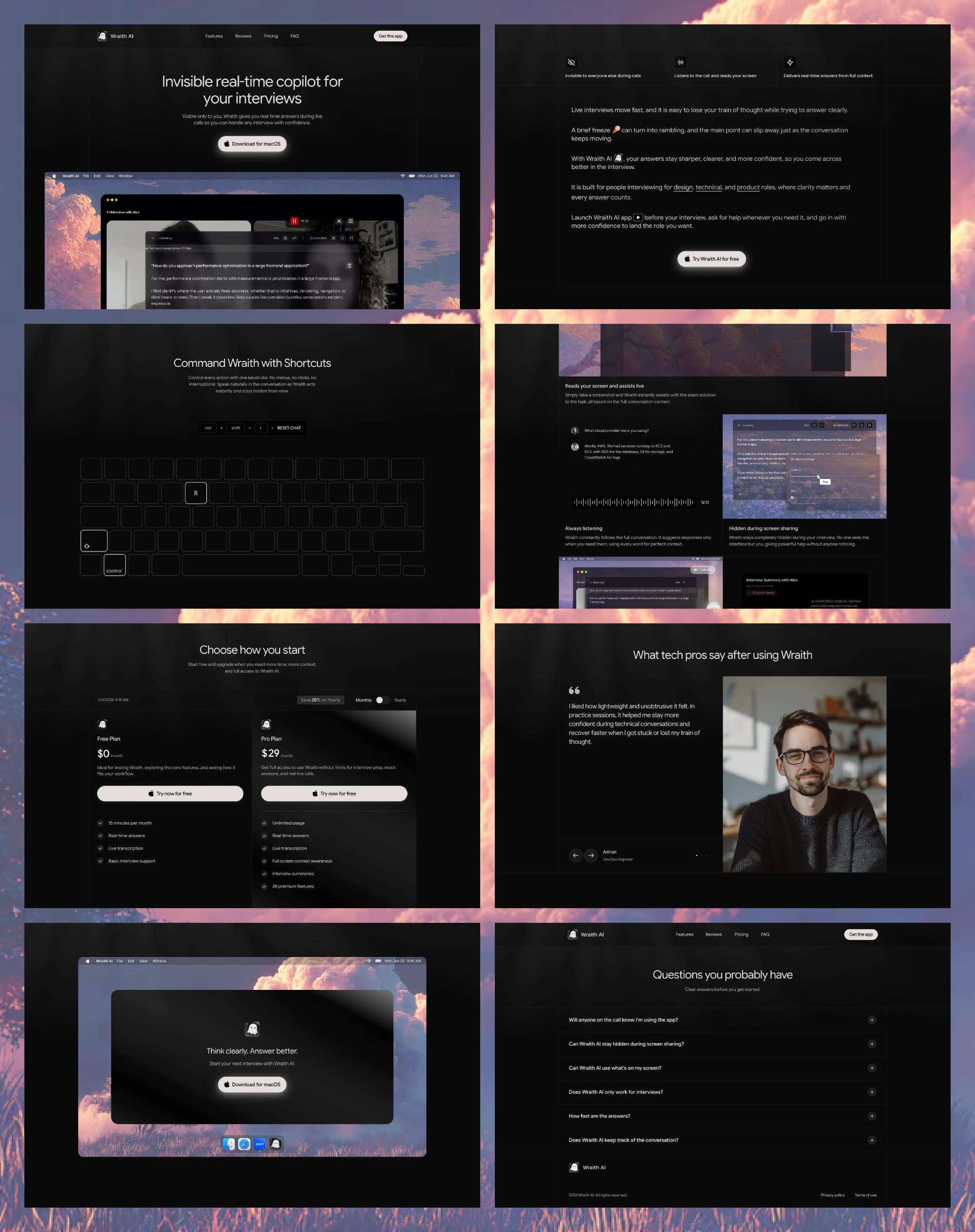
Landing page sections
The outcome & takeaway
The final result is a premium launch-ready website, a sharper visual identity, a redesigned app icon, updated product design foundations, and a Framer build structured to stay useful as the product changes.
Most importantly, it gives Wraith AI something that AI-generated websites never manage to deliver on their own: a sense of coherence. Product, pain points, and positioning now work together as one story.
The final result feels intentional instead of stitched together. It explains not just what the product does, but why it matters and why someone should care enough to try it before the product is even distributed through a traditional store.
The Framer build is also ready for change. As the product evolves and early feedback starts coming in, the founder can easily update pricing, messaging, features, and testimonials without rebuilding the site.
Like this project
What the client had to say
Always a pleasure working with Andrei. He is a great communicator, very responsive, and one of the best experts I’ve worked with. He delivered high-quality work and fully understood our vision. Highly recommend him for Framer projects.
Stan Kulish
Apr 23, 2026, Client
Posted Apr 29, 2026
Built a Framer marketing website for an AI interview assistant app, turning scattered AI-made ideas into a clear, conversion-focused landing page.
Likes
5
Views
194
Earned
$2.5K+
Timeline
Mar 12, 2026 - Apr 19, 2026