Built with Framer
Your <embedded> Design Partner • My Personal Portfolio
Daniel G Bright
The Backstory
For years, I put off designing my own site. Between client projects, late-night Framer builds, and helping startups make their first real splash online, my personal site kept getting pushed further down the to-do list. I had one, sure, but it didn’t say much. It didn’t feel like me. And it definitely wasn’t converting.
Eventually, I realized if I wanted to keep attracting the kind of clients I love working with - fast-moving, ambitious, and a little design-obsessed. I needed a site that matched that energy.
The Build
No Figma. No whiteboarding. Just straight into Framer. I treated my own site the same way I build for startups - fast, focused, and designed to launch.
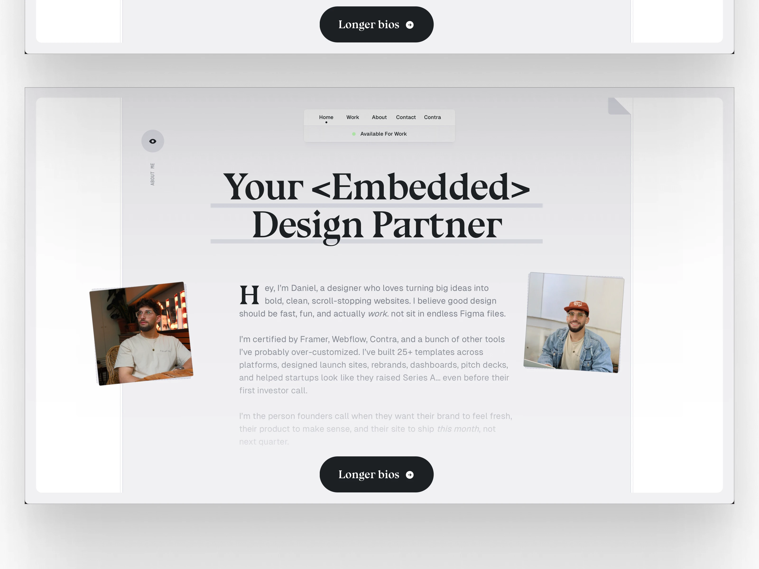
The home section leads with the line “Startups move fast. Design should too,” because that’s exactly how I work. Right underneath, a short and honest intro that gets to the point. You know who I am, what I do, and there’s a call-to-action waiting for you. No scrolling through fluff.
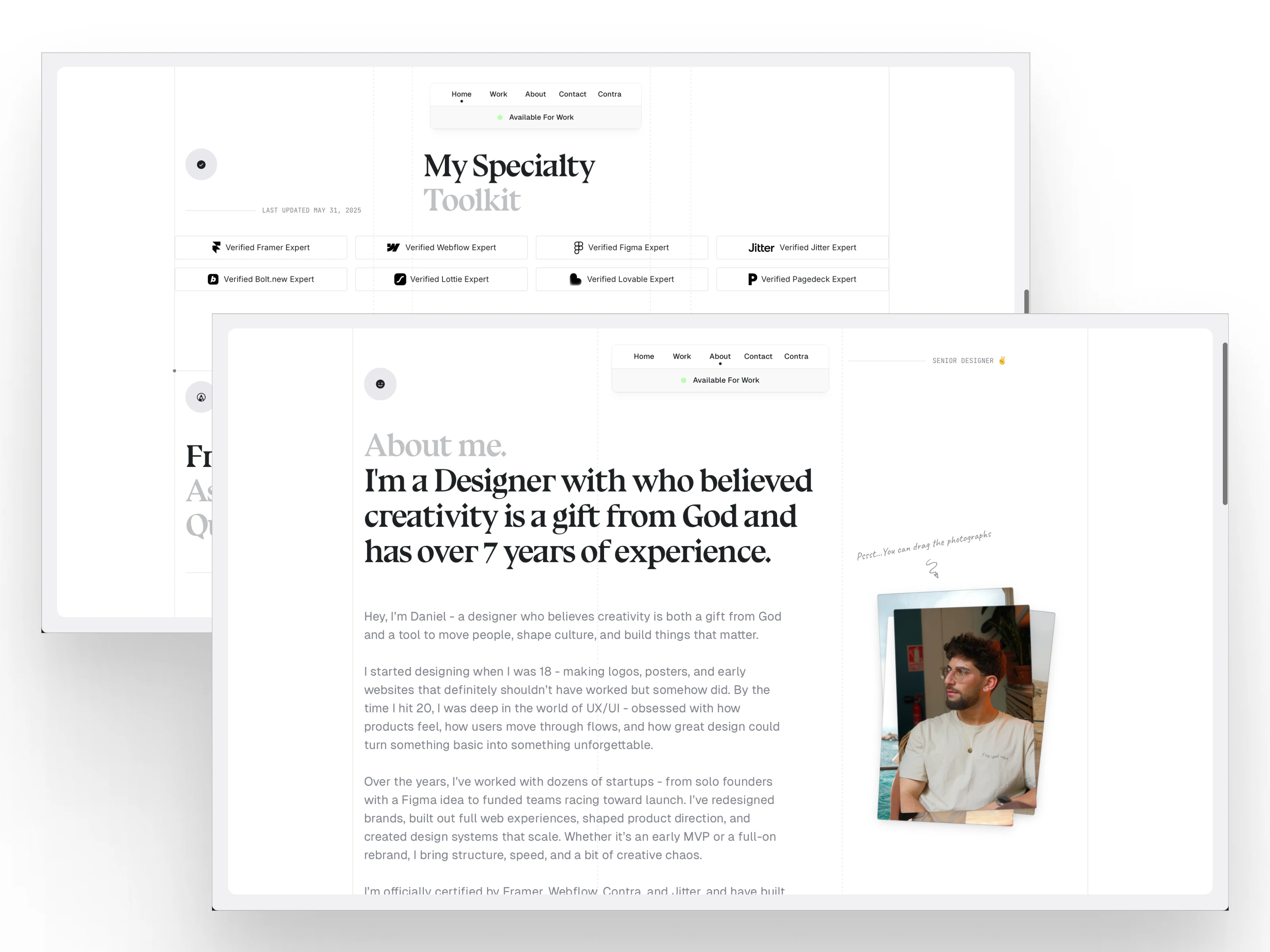
The About page tells my story in a way that’s not trying too hard. I wanted it to feel human, with a bit of wit and warmth. That’s also where I highlight the tools I work with and the platforms I’m certified in — Framer, Webflow, Jitter, Lottie, Contra, Bolt, and more.
The Work section is a visual scroll of my favorite projects. I didn’t want to throw up dozens of logos just to look busy. Instead, I focused on the projects I’m proud of — with mini case studies that explain the thinking behind each one. Less marketing jargon, more what-actually-happened.
The Fun Stuff
I added an FAQ because honestly, I get asked the same questions all the time. Things like “Do you also build the site?” or “What makes your work different?” Having this section saves everyone time and helps set expectations upfront.
I also included a Calendly embed for quick, low-friction calls. Because if someone’s interested, I want them to be able to talk to me now — not next week after a four-email chain.
The Outcome
Now when I send someone to danielgbright.com, it doesn’t just show what I do, but it reflects how I think. It’s clean, responsive, no-BS, and easy to navigate. And most importantly, it’s brought in new clients who’ve said, “Your site made me want to work with you.”
Which, if you’re a designer, is pretty much the dream.
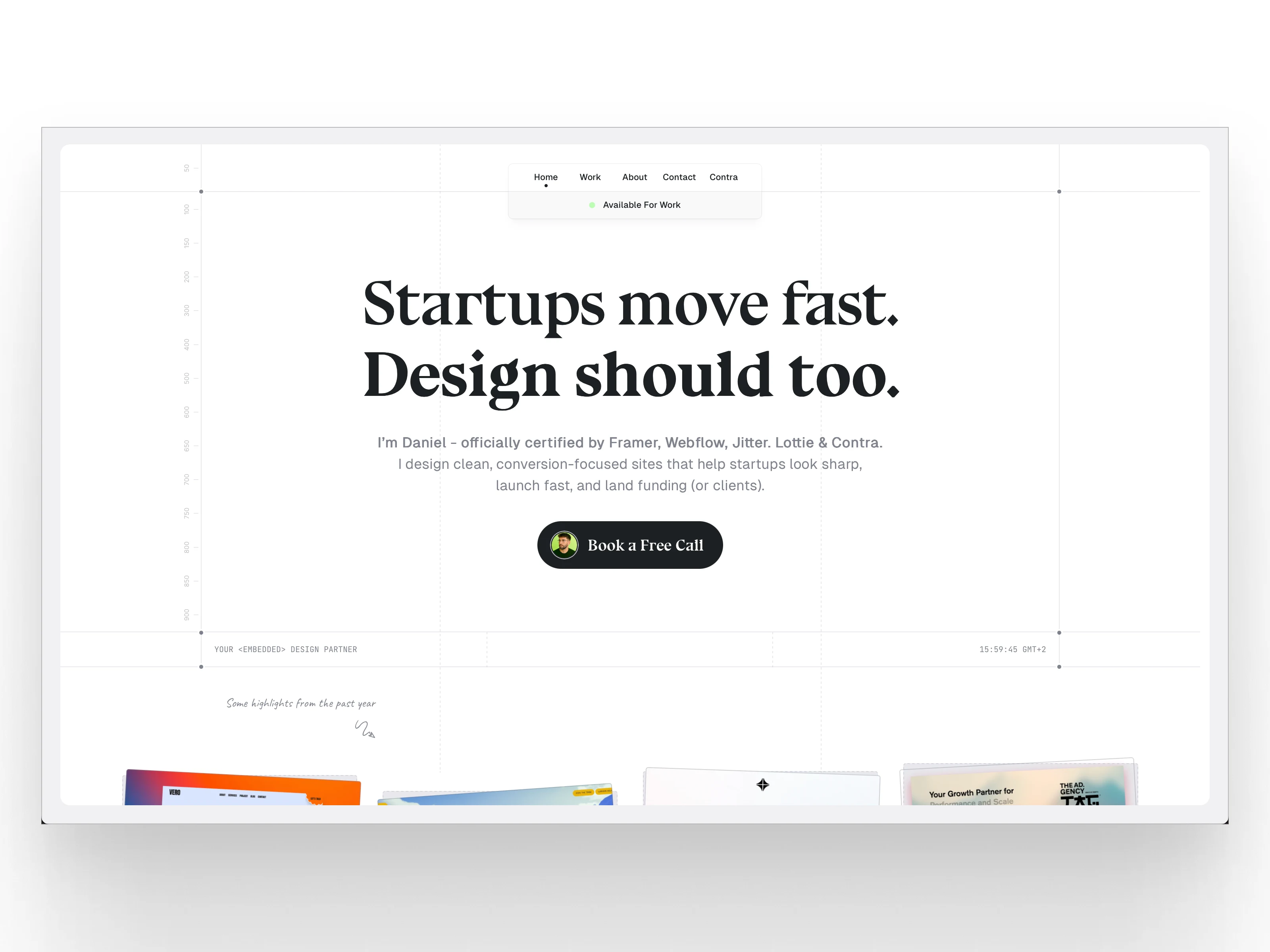
Hero
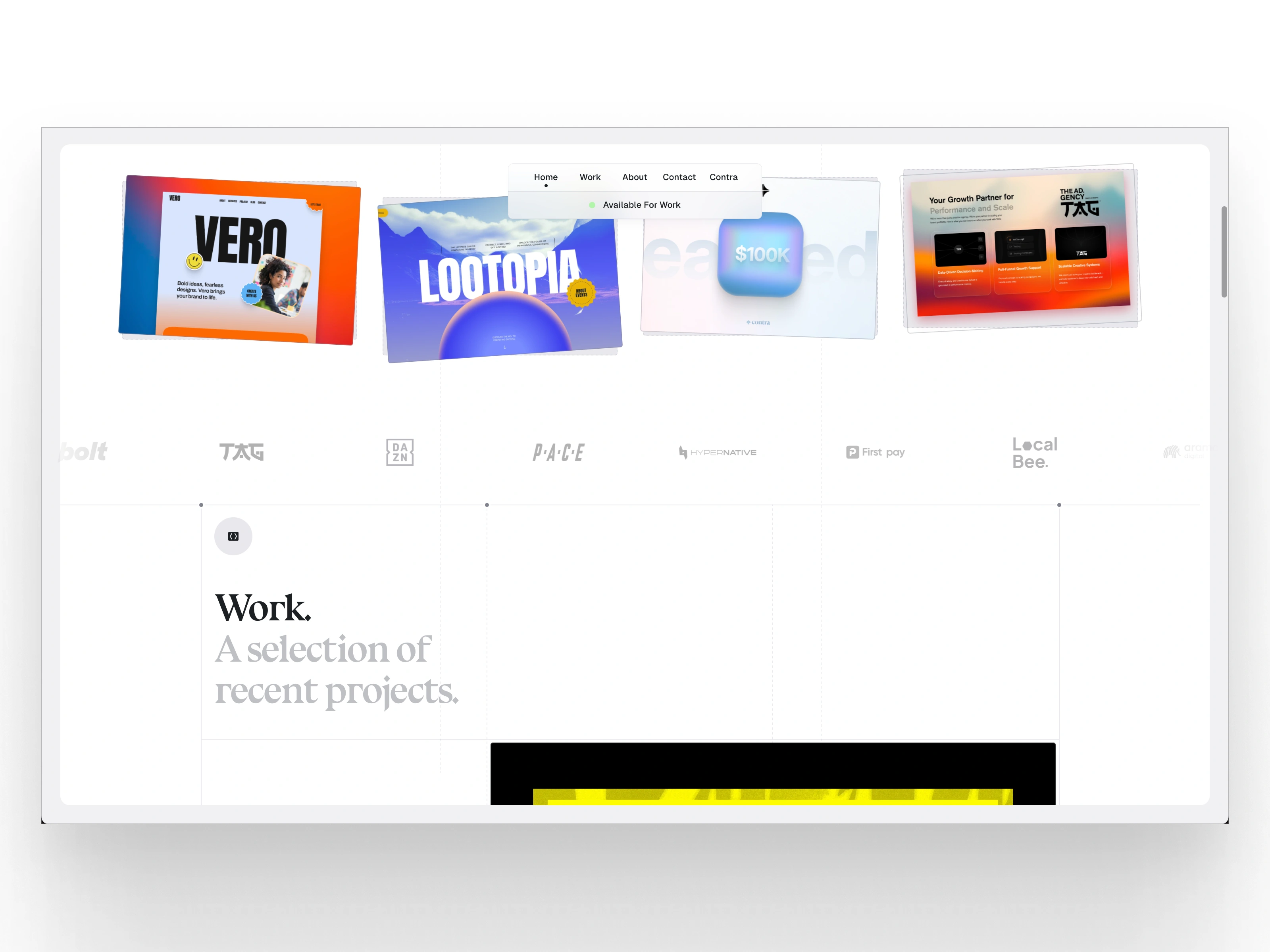
Work and Clients
About me
Short Bio
Like this project
Posted Jun 4, 2025
I built this portfolio in Framer to do exactly what I help startups do, move fast, look sharp. With personality to reflect how I think and work.
Likes
26
Views
756
Timeline
May 16, 2025 - May 30, 2025
Clients
BrightStudios®