Qliq Chat's messaging experience

Karthik Ramamurthy
Mobile Designer
Product Designer
UI Designer
Figma
QliqSOFT
Revamping Qliq Chat's messaging experience
Oct 2019 - Aug 2021 • B2B2C/SaaS
My responsibility:
user experience and UI Design of the iOS app
feature design and solving the users' pain points
cross-functional collaboration
ux audits and maintenance
Transformation of a messaging app to all in one healthcare platform
To comply with my non-disclosure agreement, I have omitted and obfuscated confidential information in this case study. All information in this case study is my own and does not necessarily reflect the views of Qliqsoft.
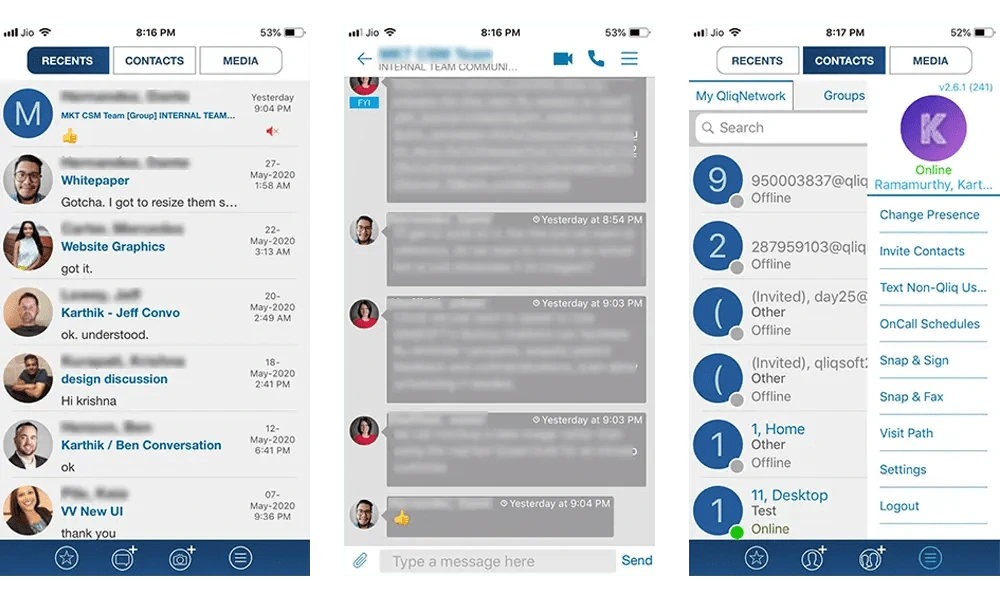
Screens from the old iOS App.
I became a part of wonderful project to redesign the Qliq Connect (now Qliq Chat) app's experience and rethink the product strategy for Qliqsoft.
In a span of 8 years Qliqsoft has transformed the healthcare industry through real-time communication between doctors and nurses.
Having four app audiences, our goal was to cover the needs of all doctors, nurses, patients and care-givers . At the same time, we had to remain user-friendly and accessible.
The iOS app designed in 2011, hasn't been updated and deemed a usability challenge to users.
First, I learned about US healthcare and how it works through colleagues at the company and my friends working in US. I learnt that the healthcare at US is different than the way it works in India.
The challenge
The challengeComplex to Simple
We focused on turning complicated workflows into an impressively simple learning experience. Our approach here is an easier navigation, clear in-app communications and plain UI.The purpose of the project was to redesign the whole experience to additionally cater to the patients & caregivers in addition to doctors and nurses.
High level points
• Level up the app navigation for the ever increasing user base
• How might we make it easy for the senior citizens (patients) to interact with the app
• How might we organize the information architecture to include more features.
Insights to Deliverables
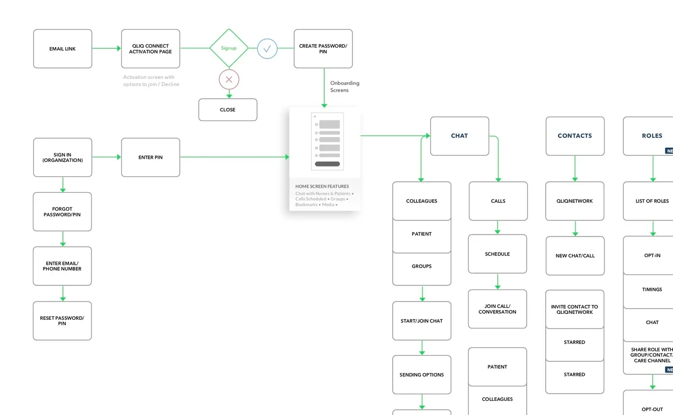
One of many Personas: User flows for every feature
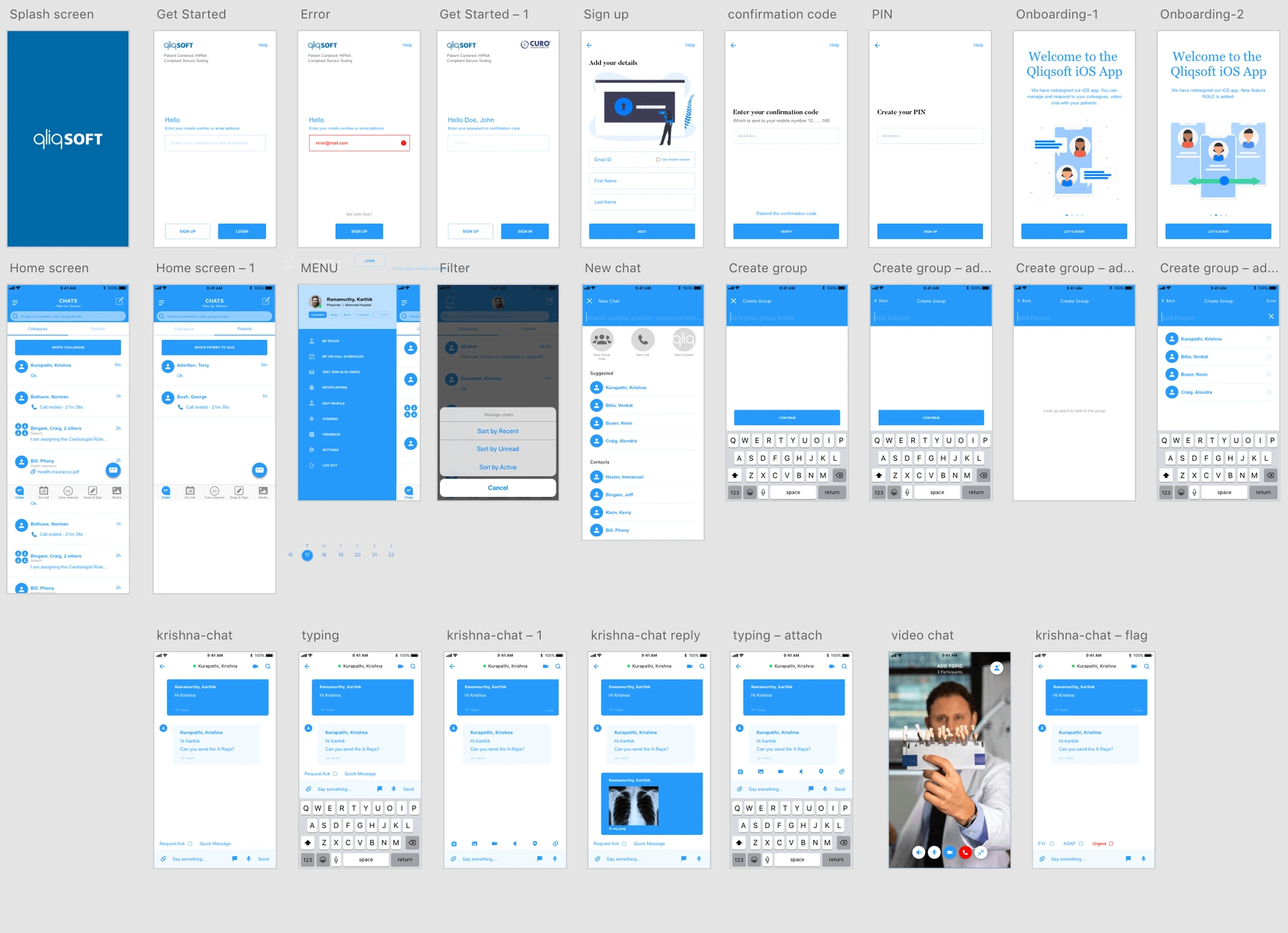
Wireframes
Final Output
Barcode scanning
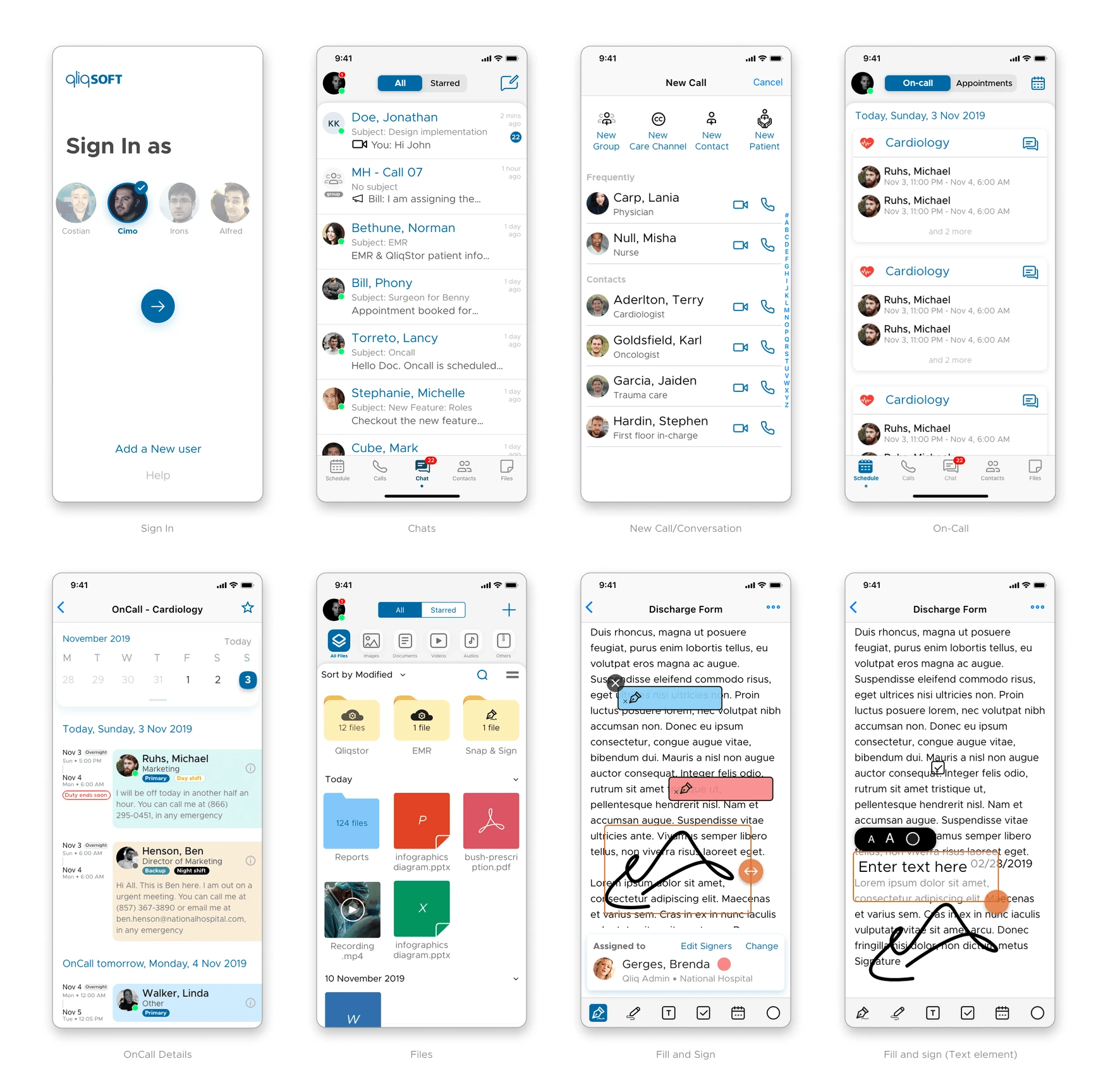
Sample of Redesigned Screens


