Rise Sync Branding & Landing Page


Brand Design
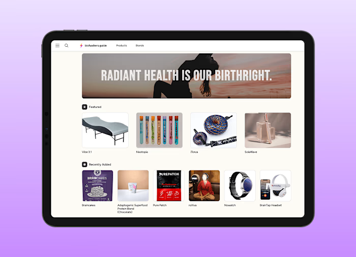
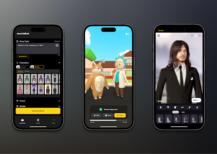
Created this new branding and landing page for Rise Sync, an excellent affordable coaching program. The goal was to create an impactful and simple landing page that explains the program and funnels people into the free discovery call.
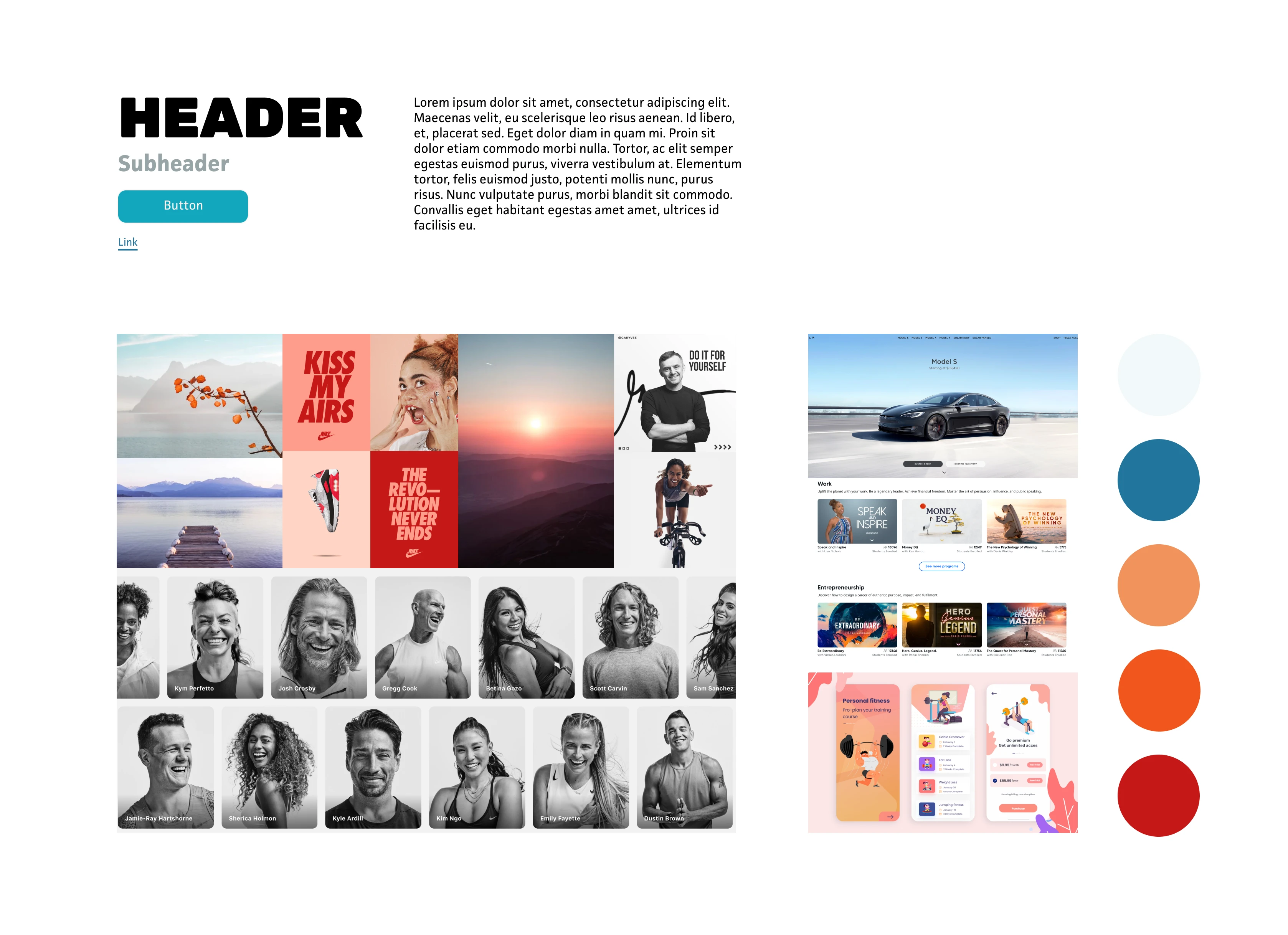
I designed this in Figma and implemented it in Webflow. The last screen is a style tile from the beginning of the project.
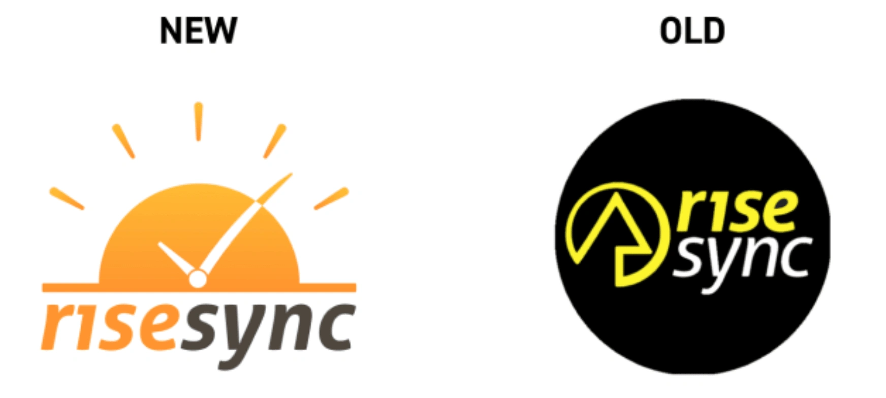
Redesigning the Rise Sync logo was a fun challenge. My objectives were to make it more modern, immediately recognizable, and easier on the eyes.
When I considered what a new Rise Sync logo could look like, the synchronicity of how sunshine rays appear similar to tick marks on a clock seemed like a simple and irresistible concept. I first laid out the shapes in black and white, then experimented with a variety of colors and gradients. I settled on an orange/yellow hue to make sure the icon was easily recognizable as the sun. I received feedback to make the design more playful, so I curved the minute hand arm and thinned out the sunshine rays to give them a hand drawn look on the final polish pass. Despite my exploration with a few fonts, the client opted to keep his existing one.
Like this project
Posted May 10, 2025
Redesigned Rise Sync’s landing page—bringing clarity, energy, and trust to an affordable coaching program that helps users level up fast.
Likes
1
Views
4

