Helbiz X 24 Bottles Collab
Alex Kosik
Scope
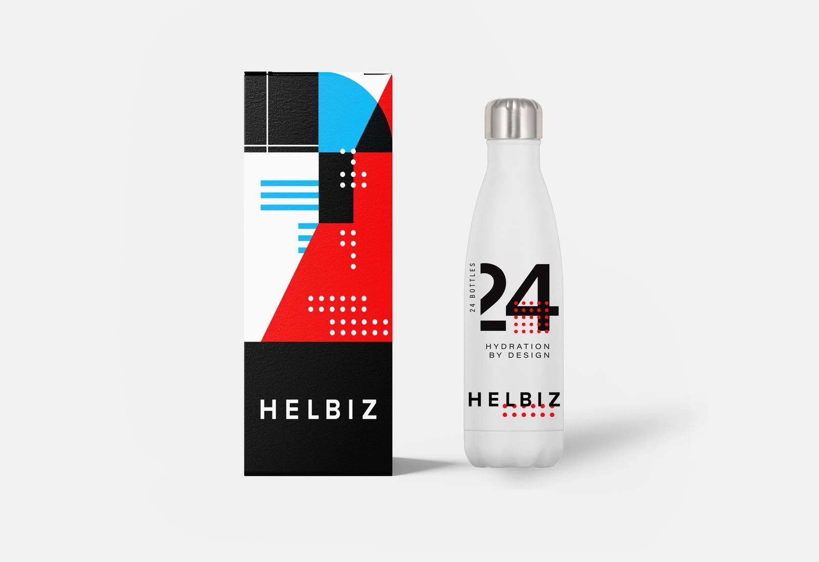
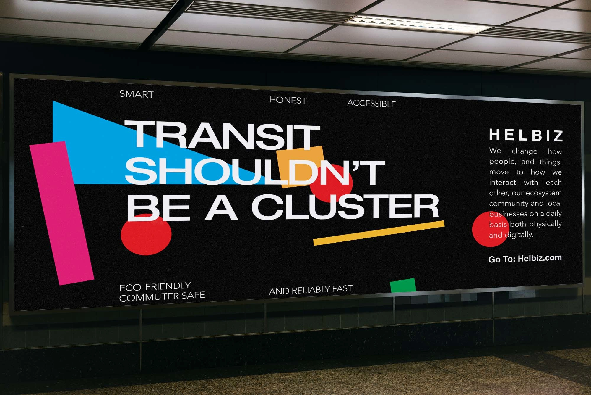
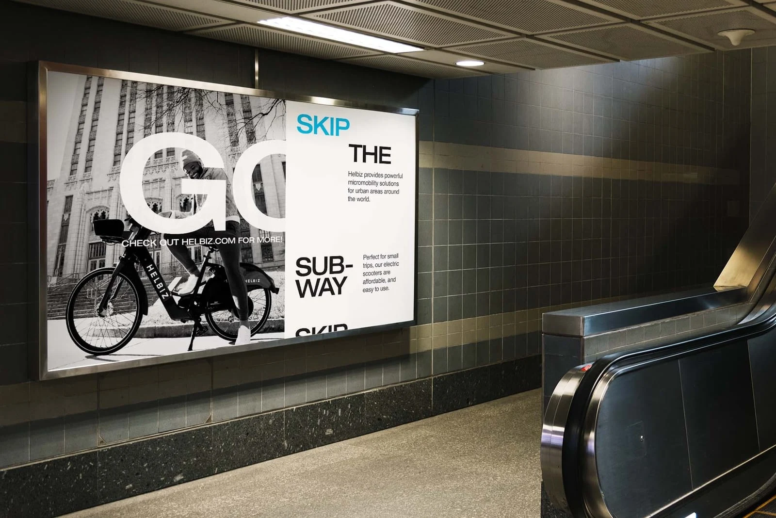
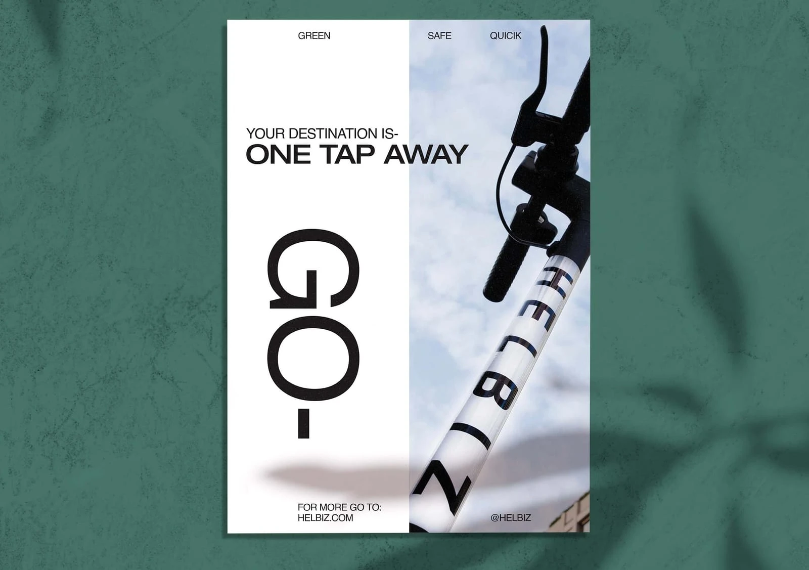
Helbiz functions as a company highlighting micro-mobility while 24 Bottles provides access to daily sustainability. So, the visual language must merge the two.
The composition blends urban typography and bold forms with circular curves. The design collaboration conveys the coexistence of the urban ecosystem, the rhythm of mobility, and the circular curvature of eco-friendly sustainability; creating an elegant system that is playful, modern, and functional.
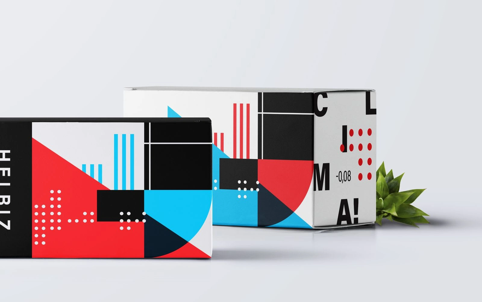
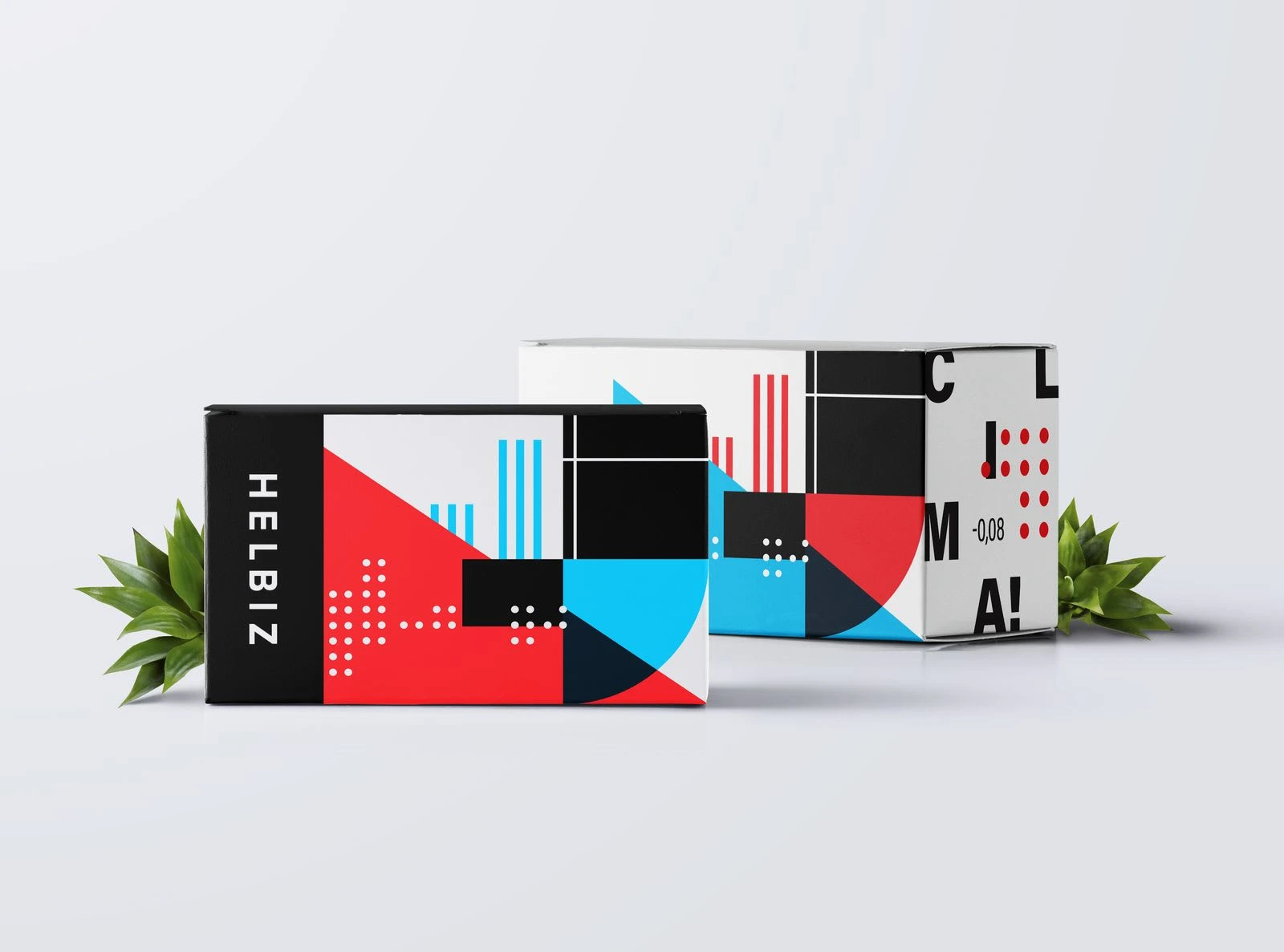
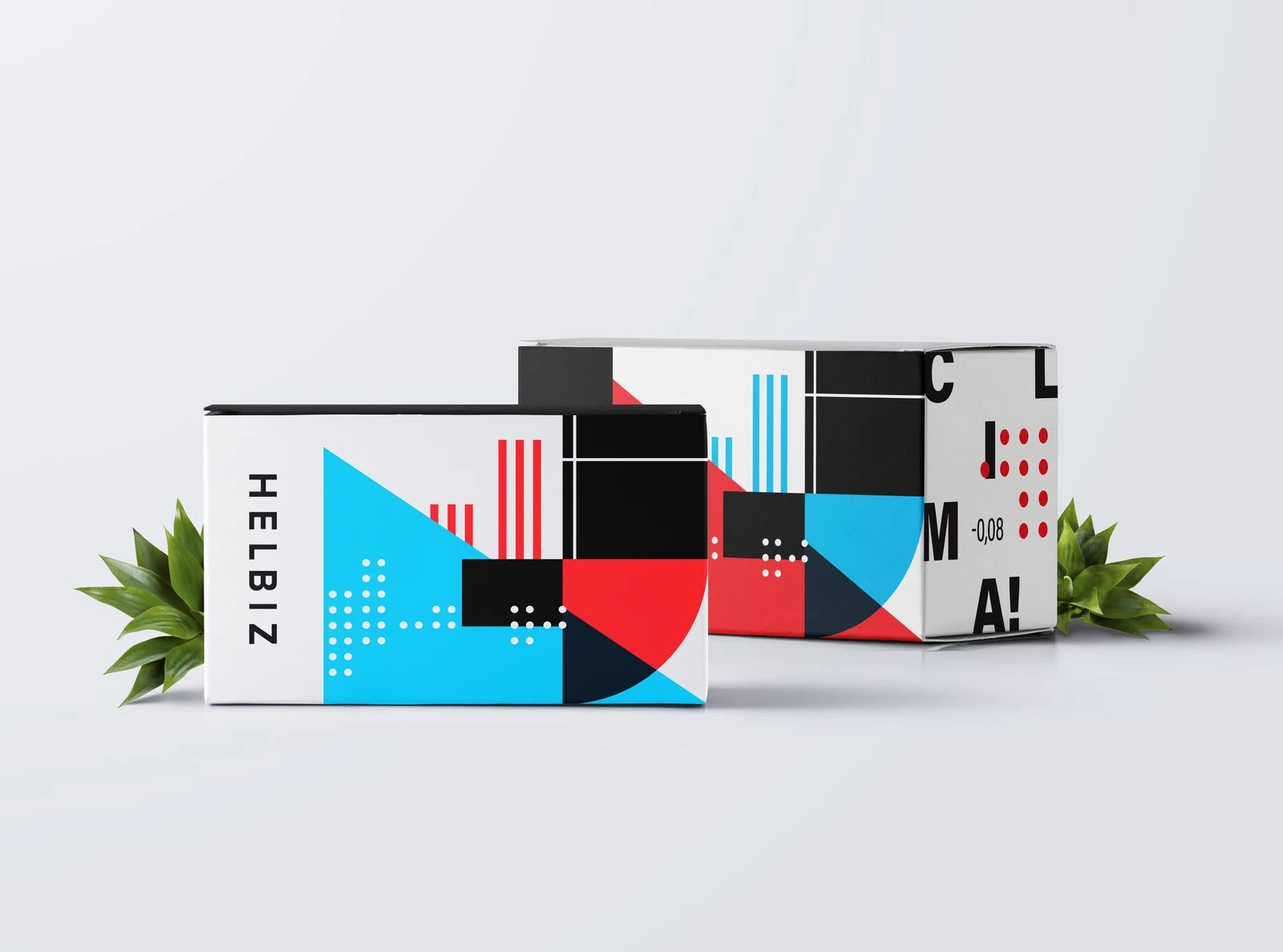
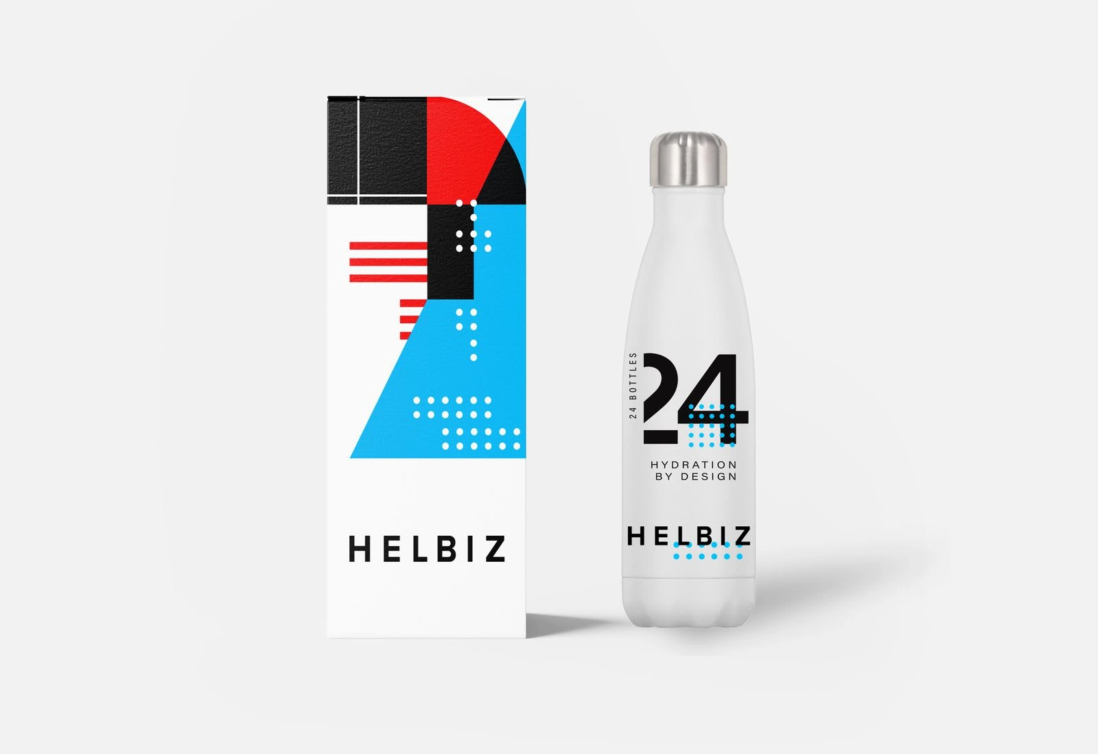
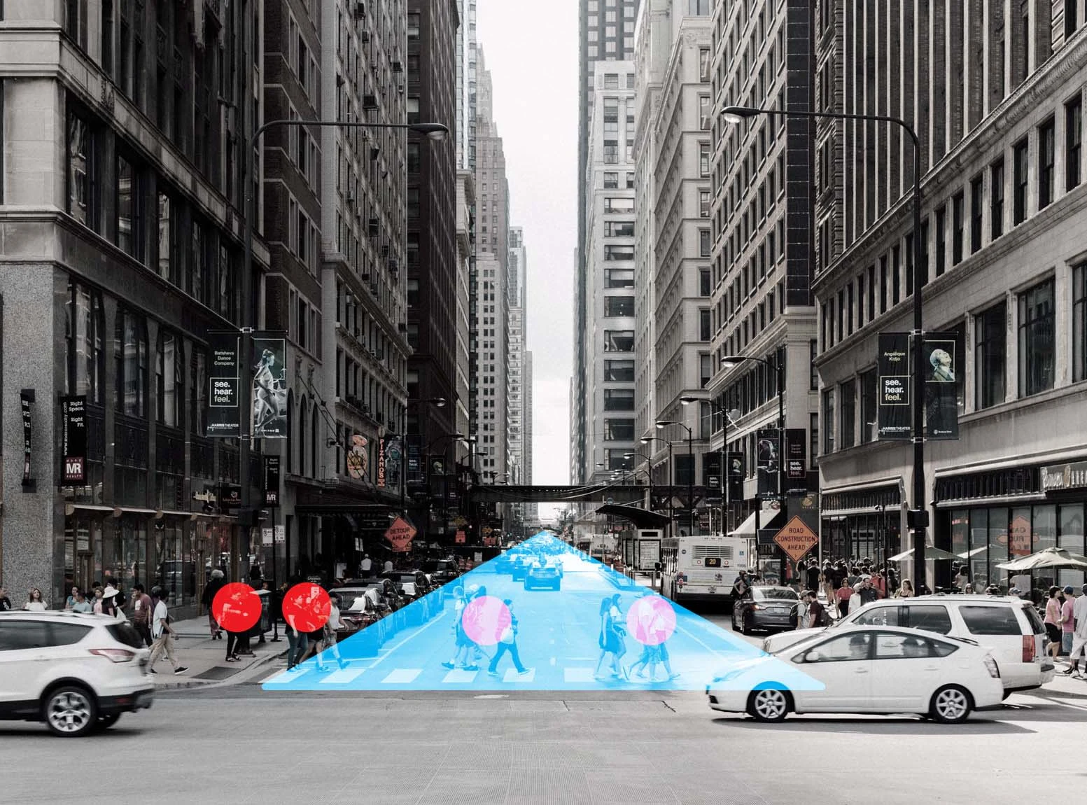
System Explained
As per meaning, a bold triangle is used on the front of the box, as a symbol of intersection. Like streets in an Urban environment, the triangle’s position and scale force the other design elements to yield to its position. Circles are then used to represent people and organic traffic. Their orientation suggests movement to further expand on the concept of people moving throughout a city space. The ecosystem of an urban environment is forced to deal with a city’s physical space as a means of navigation. The same way the triangle intersects the packaging.
The triangle more specifically represents high-traffic streets in Urban environments. The box as a whole serves as a visual metaphor for the Urban ecosystem. The system functions off of the concept that the urban can encompass eco-friendliness, sustainability, and high-functioning movement and mobility.
Like this project
Posted Aug 15, 2023
Full design system bridging two existing companies into a single campaign with a unique vision and brand strategy for print, digital, packaging, and motion.