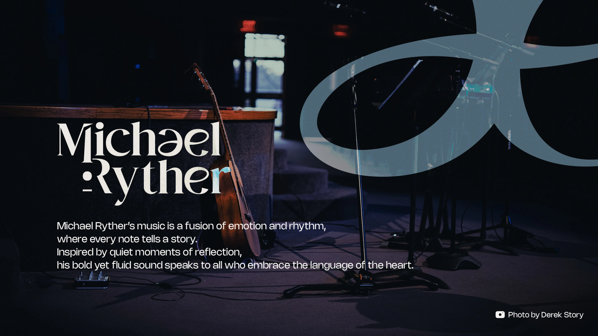
Michael Ryther - Logo Showcase
Fahmi Daniyal
The Concept
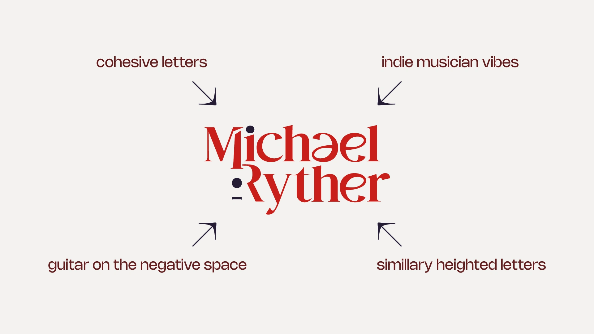
Michael Ryther’s music is an extension of his emotions. His songs are heartfelt stories, and the challenge was to create a logo that reflects that depth without leaning on overused musical symbols.
The guitar, central to his artistry, is woven into the design in a subtle yet intentional way, blending seamlessly with the letterforms. The typography, with its unique balance of elegance and rhythm, mirrors the flow of his music, bold yet fluid, structured yet expressive.
The final mark captures Michael’s essence: a blend of tradition and individuality, classic yet unconventional. Just like the songs that call us back to something familiar yet deeply personal.
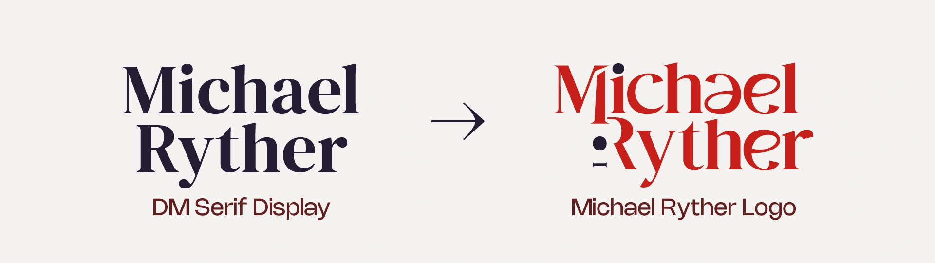
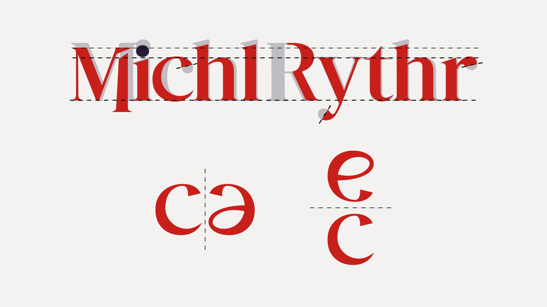
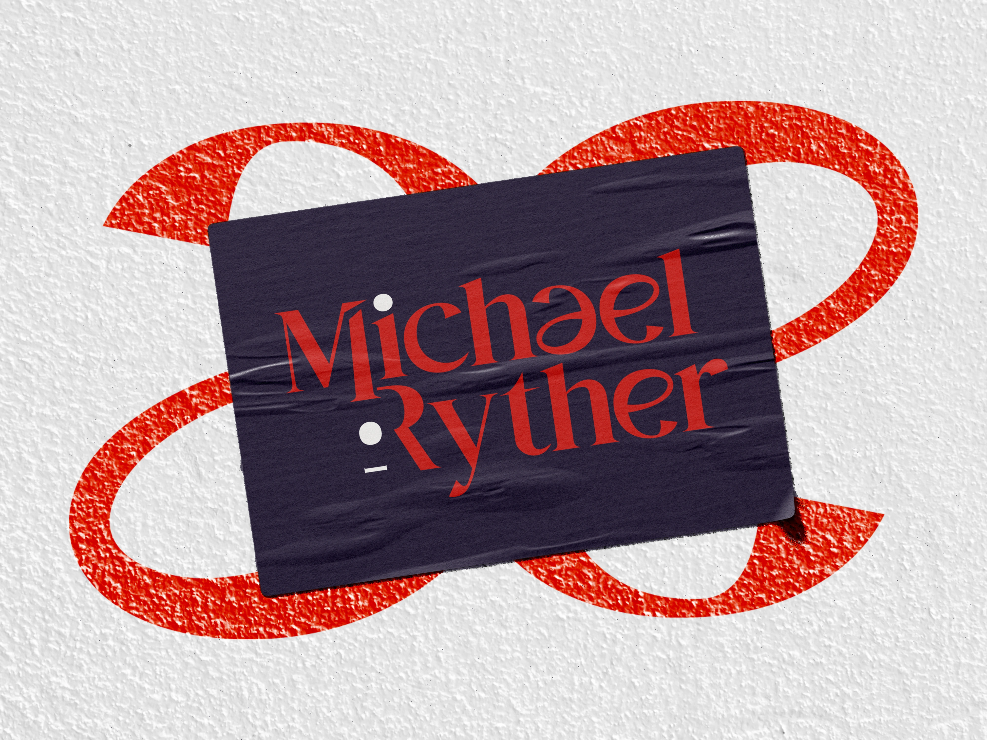
The Michael Ryther logo is built from a refined version of DM Serif Display, with key adjustments to enhance balance and cohesion. The rounded ends are cut for a sharper look, and the boldness is refined with precise angles. Letter dimensions are tweaked for consistency, creating a more unified appearance.
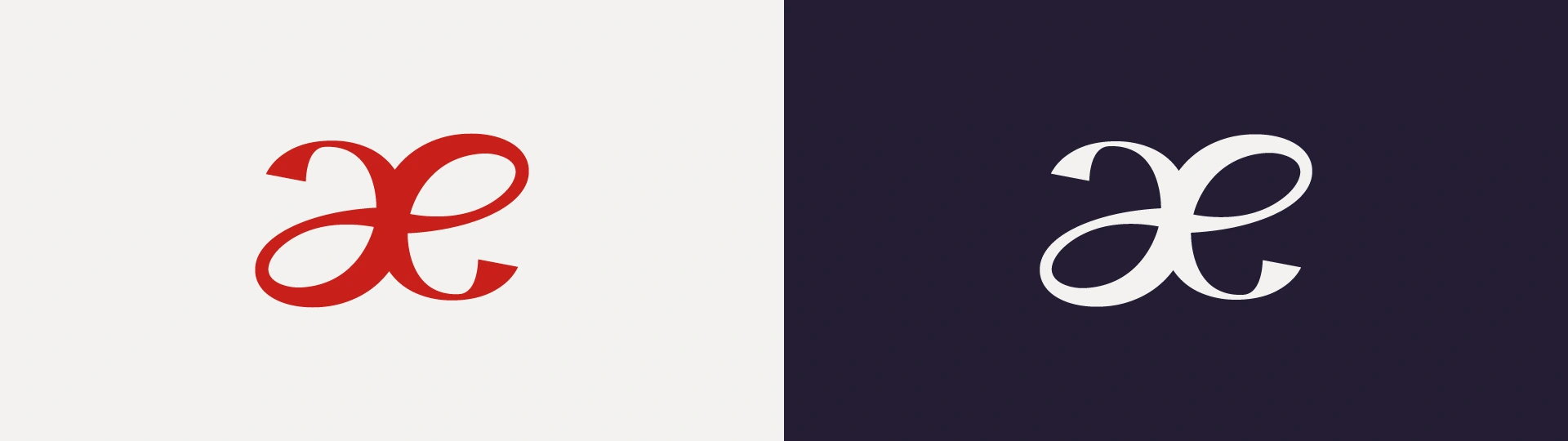
For added harmony, the “a” and “e” are crafted from the “c” by mirroring and modifying strokes, ensuring all characters feel naturally connected.
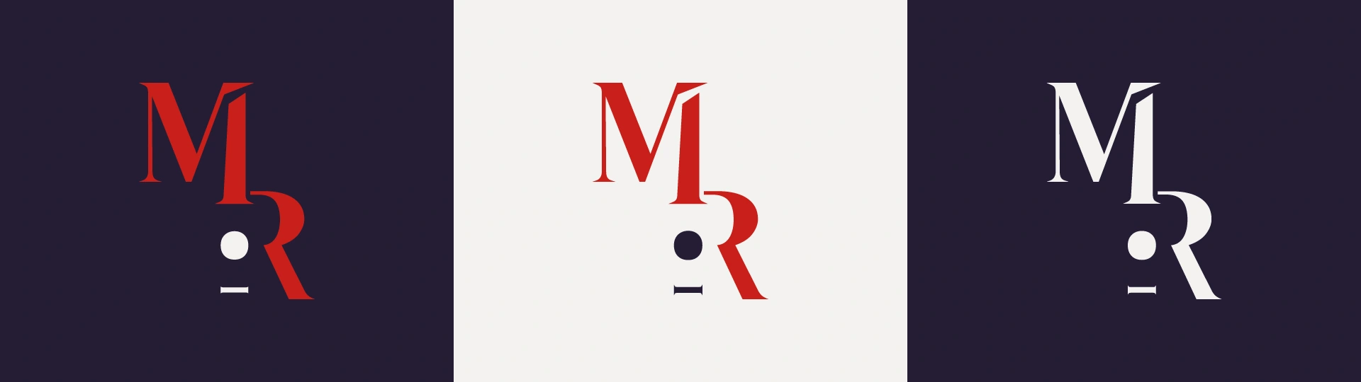
Michael Ryther got two icons for the logo.
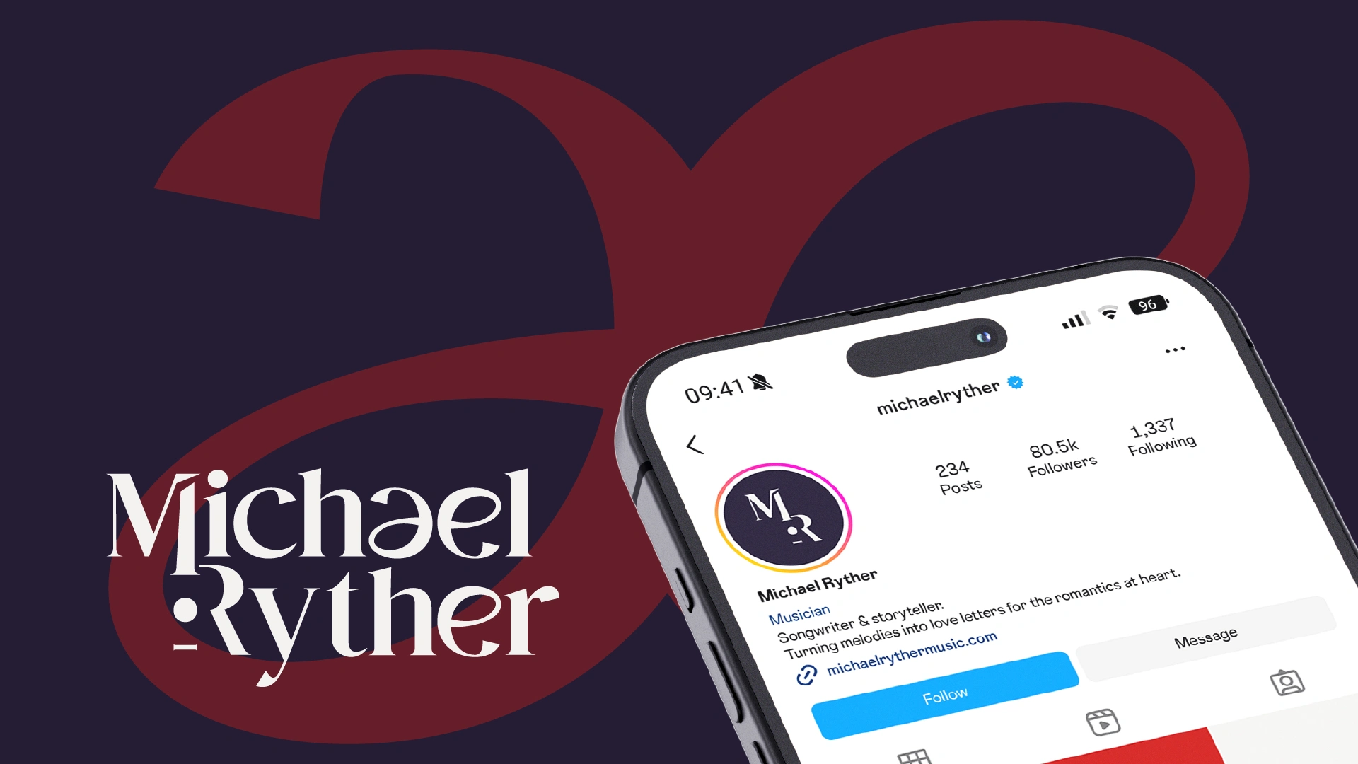
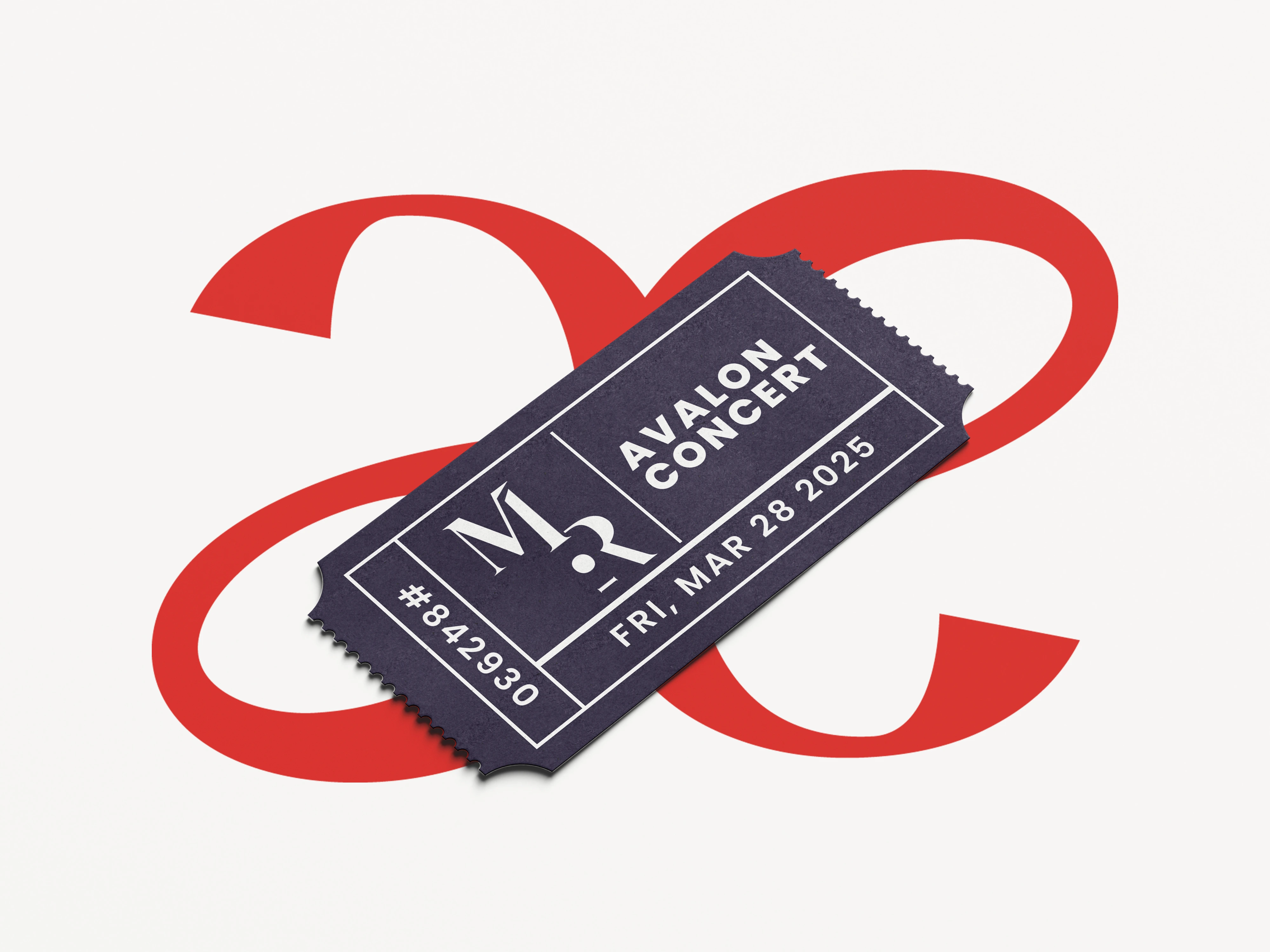
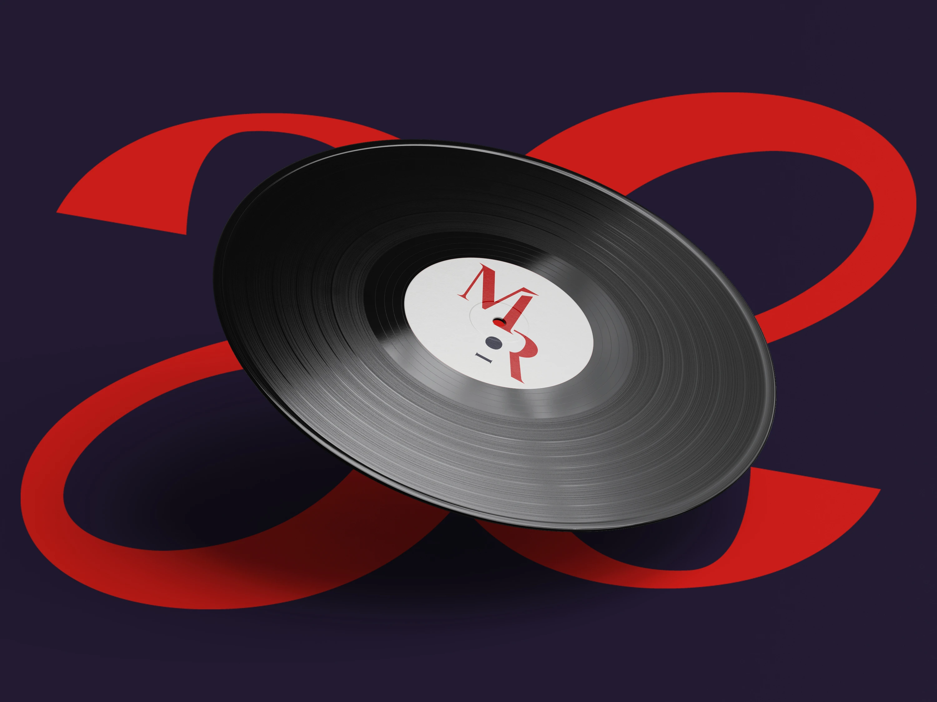
The MR Guitar serves as the main identity, representing Michael Ryther’s name and musical background with a bold, structured look, making it ideal for logos, profile pictures, and merchandise.
The Ribbon acts as a complementary ornament, adding a fluid, artistic touch that enhances the brand’s creative personality.
Together, they balance structure and expression, ensuring a cohesive and versatile visual identity across different applications.
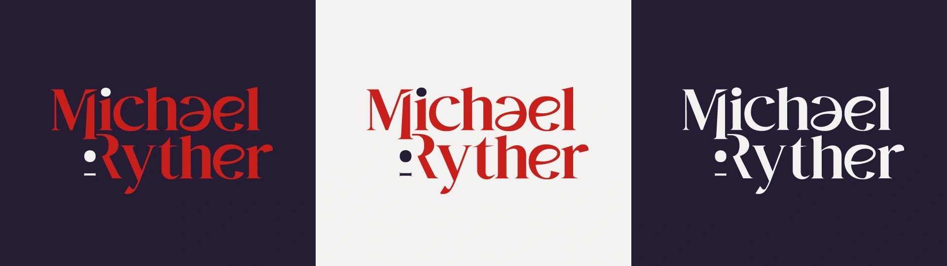
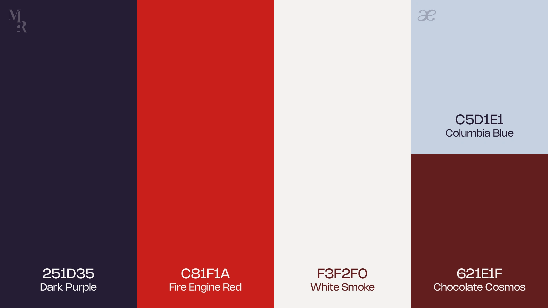
Michael Ryther’s color palette is designed to reflect his music—bold, heartfelt, and timeless. The mix of deep and vibrant tones creates a strong, expressive identity while keeping a sense of warmth and authenticity. Each color works together to capture the energy and emotion in his sound, making the brand feel both classic and full of life.
Like this project
Posted Mar 23, 2025
Michael's music carries a unique sense. But what makes this logo truly his? Look closer, and you’ll see the music within.