Protocol+
Talia Bernstein
Info
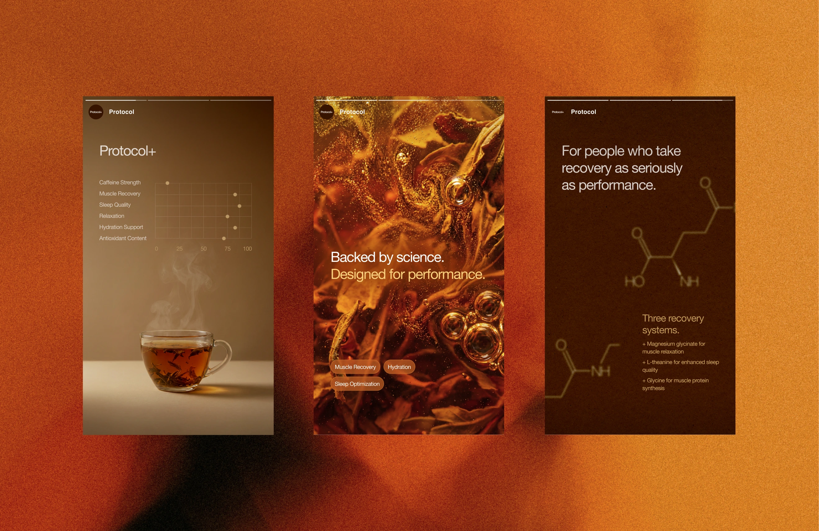
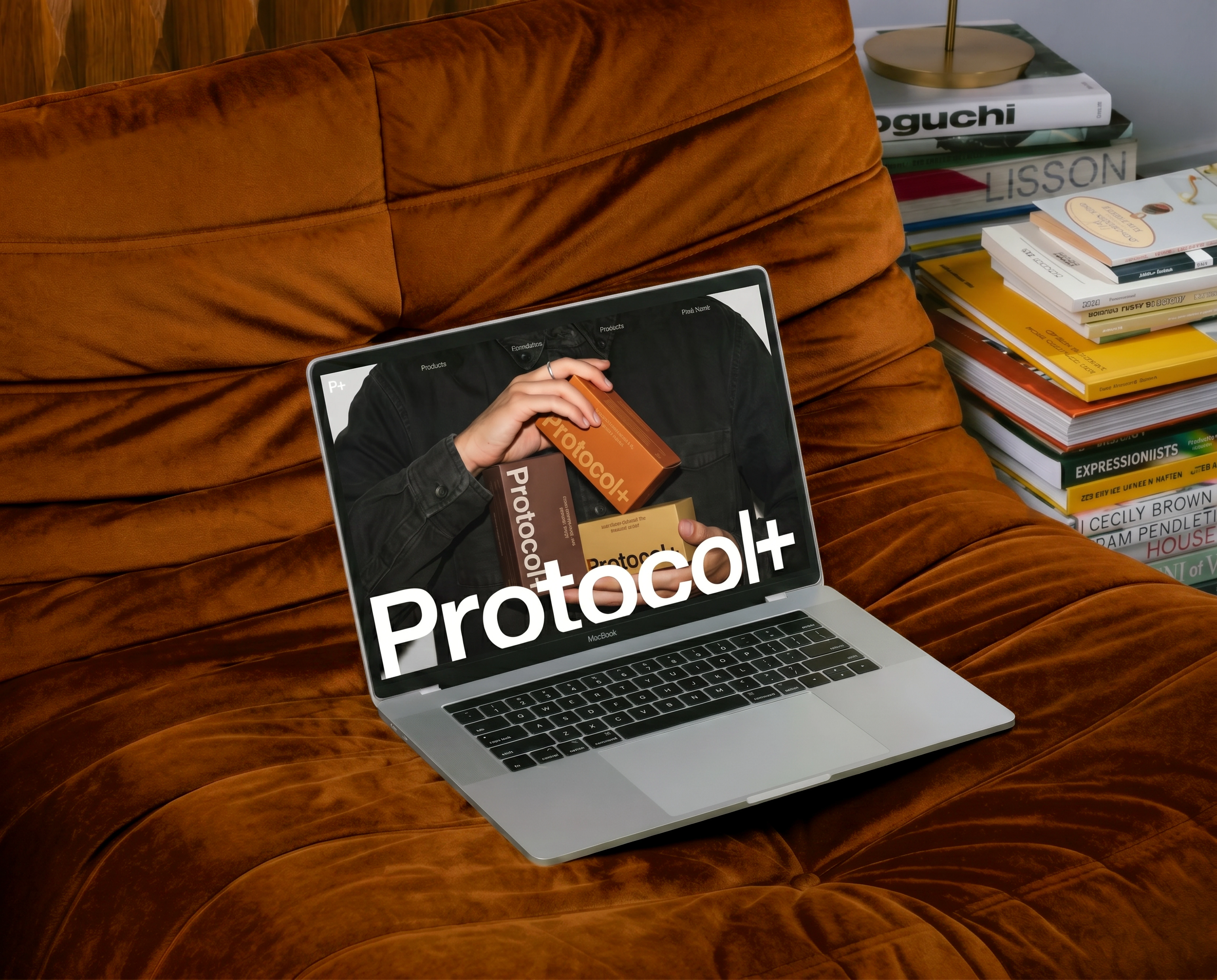
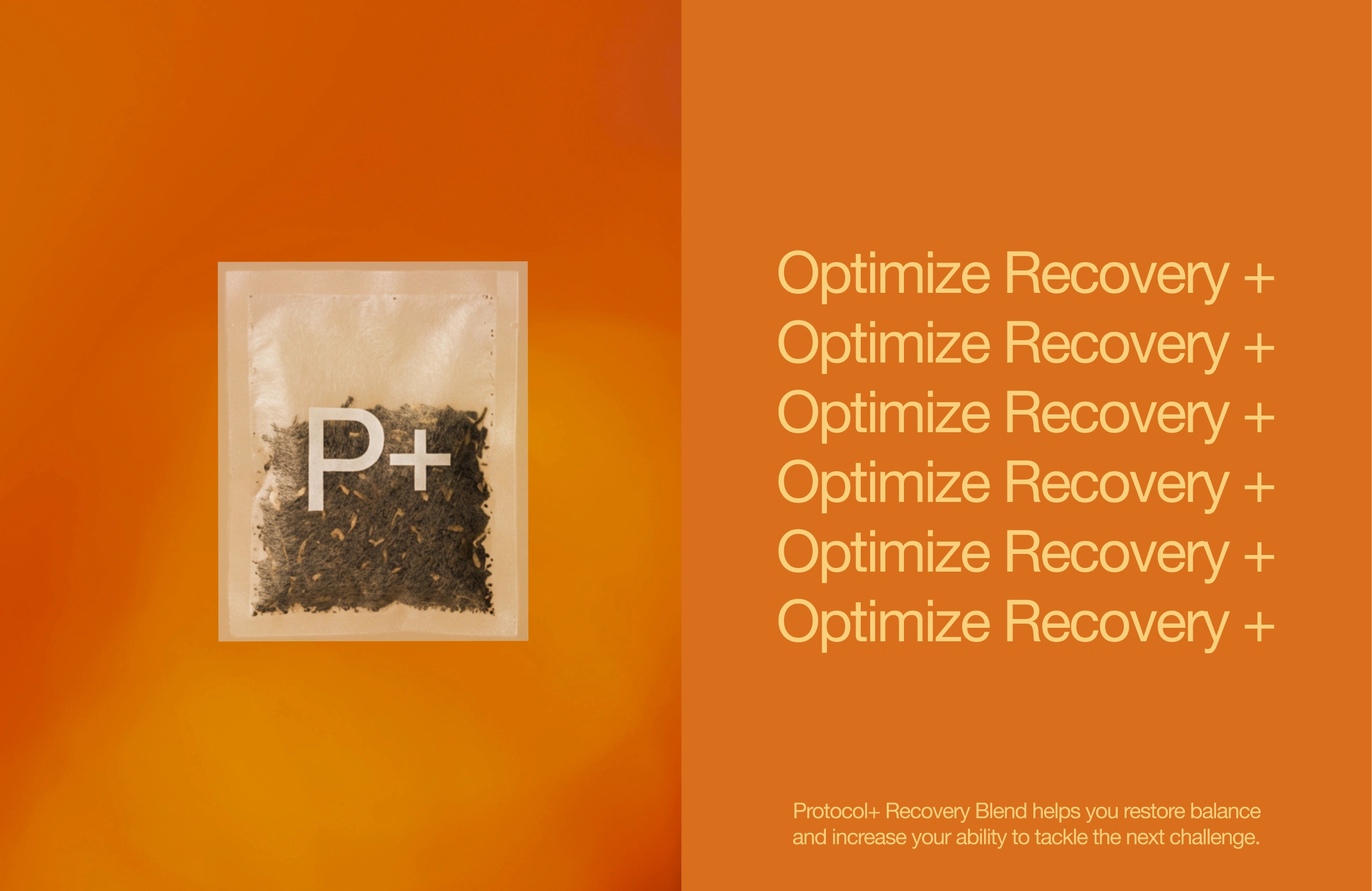
Protocol+ repositions wellness tea for analytical, performance-driven consumers. By rejecting the traditional tea aesthetics in favor of precision and measurability, the brand speaks to athletes and ambitious professionals who treat recovery as rigorously as their training.
The Brief
Traditional wellness teas often lean soft, calming, and emotional, alienating a key growing segment of consumers who approach their health through data and optimization. This audience needs science-backed recovery tools that feel as serious as their ambitions.
The Approach
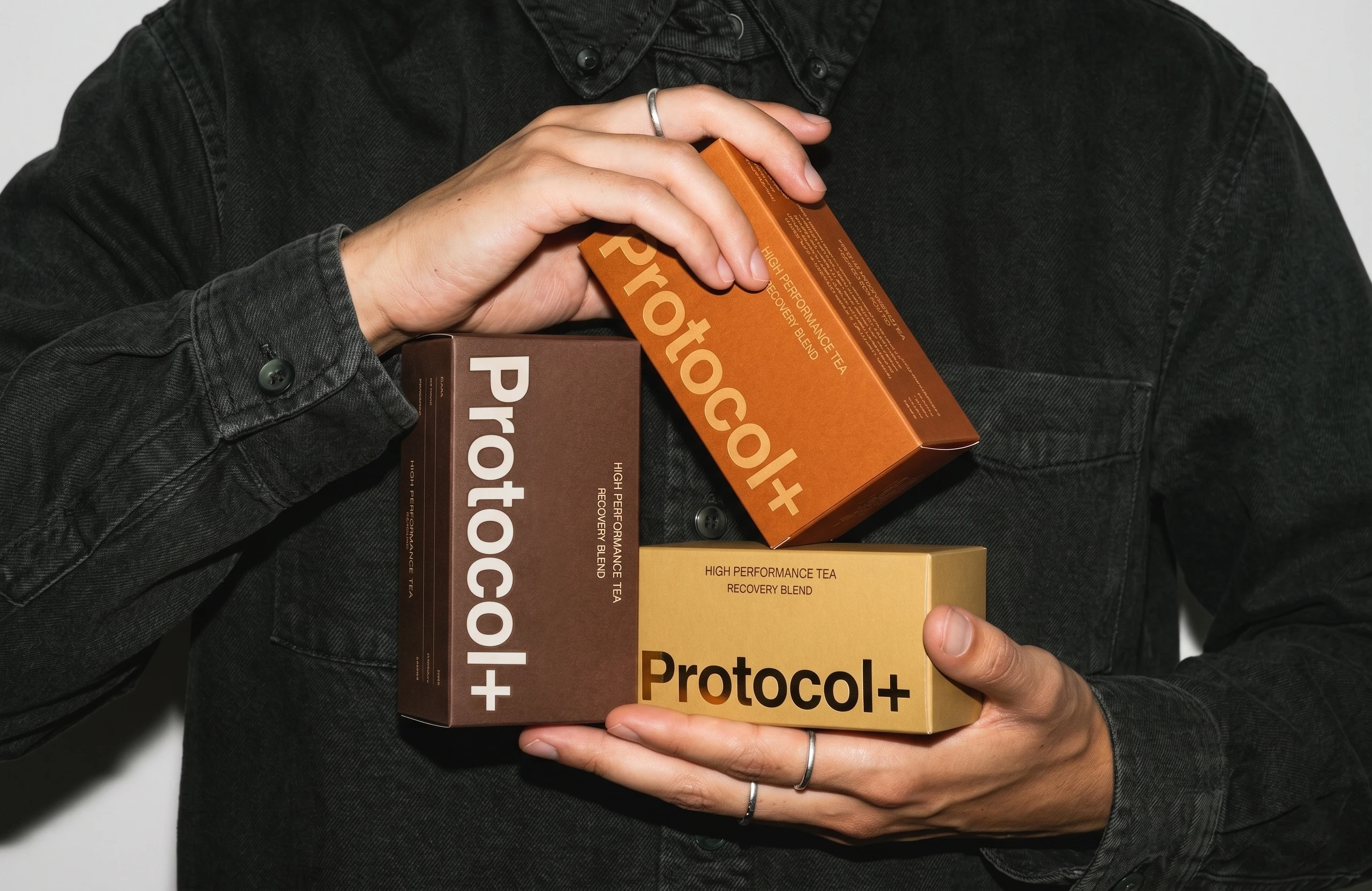
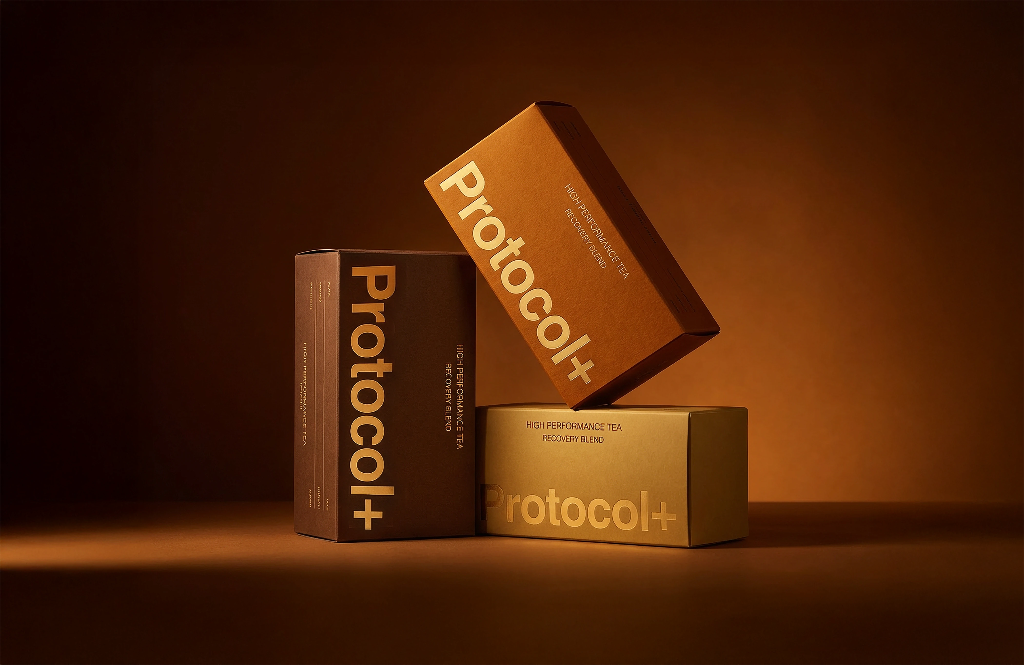
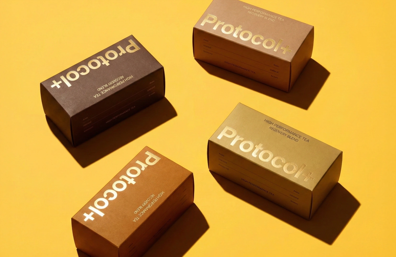
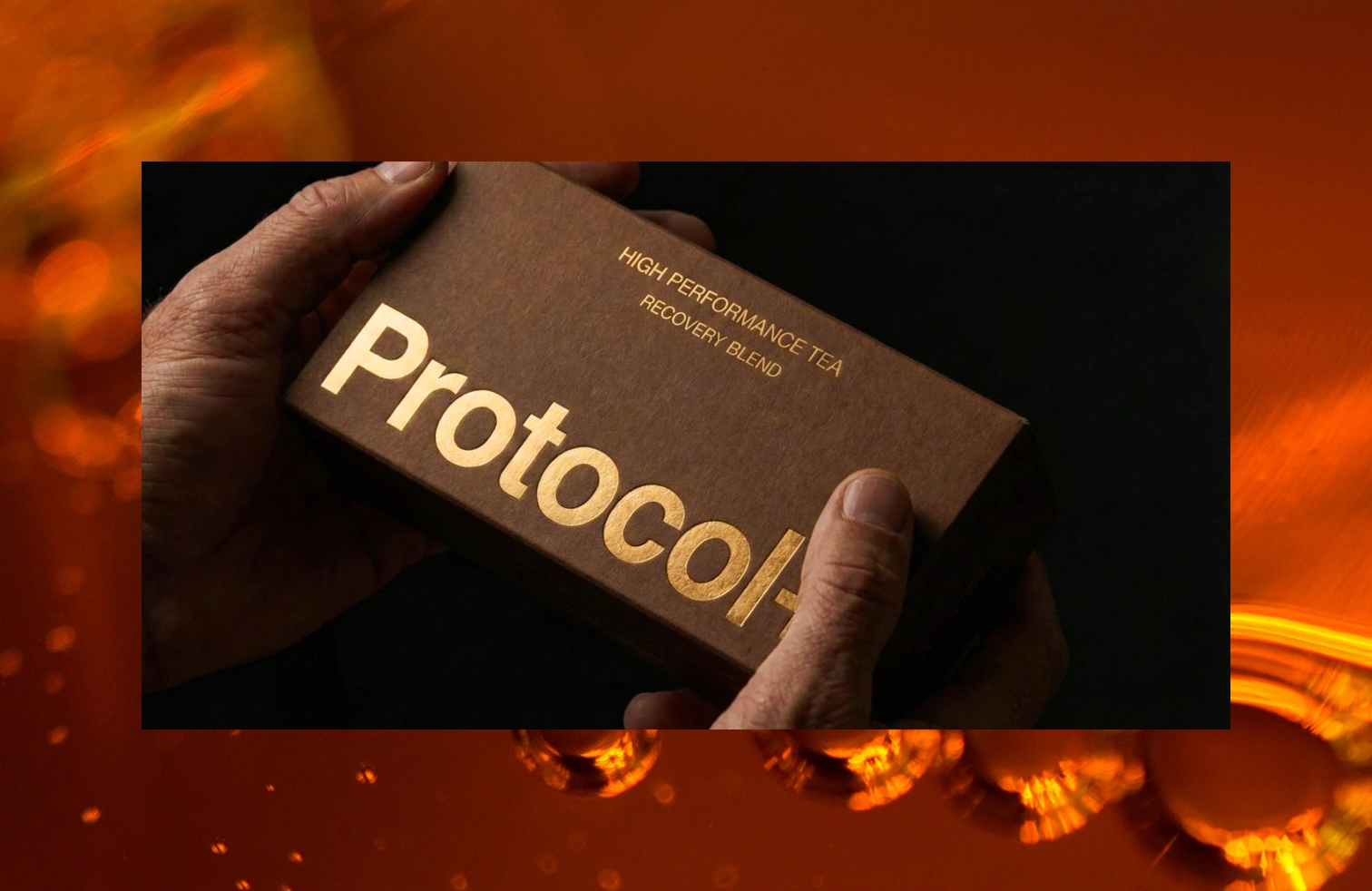
The rebrand centers on clinical precision with a human touch: warm-toned color blocking, scientific photography, and copy that emphasizes measurable benefits (sleep quality, hydration metrics, stress management). Packaging uses tactile, lab-inspired materials to reinforce credibility. The result positions Protocol+ as the recovery brand for people who don't do "self-care." They do ritualistic systems.


Like this project
Posted May 27, 2026
Wellness tea for analytical, performance-driven consumers. Protocol speaks to athletes and ambitious professionals who treat recovery as rigorously as training.