dotts Website Launch: Simple Feedback Tool
Leon Eikmeier
New Project: dotts – Simple Feedback Tool
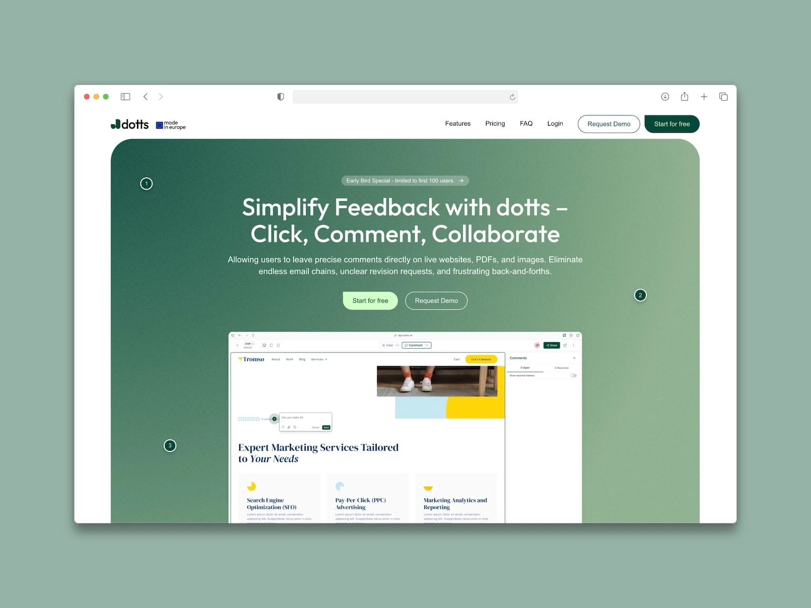
Just launched the website for dotts, a minimal and intuitive feedback tool that helps teams and clients leave visual comments directly on websites, images, or PDFs — all without the clutter.
The dotts team wanted a clean, no-frills product site that reflects the tool’s simplicity and ease of use, while still looking polished and professional.
What I did:
✅ UI/UX Design
✅ Webflow Development
✅ Clear product storytelling
✅ Scroll-based interactions
✅ Responsive & fast-loading layout
✅ Focus on conversion with a strong CTA structure
We kept the design light and minimal to match the product philosophy: just dot it. 💬
If you’re building a SaaS and need a landing page that converts without overwhelming — let’s chat!
Like this project
Posted Aug 6, 2025
Launched a minimal and intuitive feedback tool website for dotts.
Likes
0
Views
7
Timeline
Jun 4, 2025 - Jul 10, 2025
Clients
dotts